
Case Study 102

Title: 5 Secrets of Story Structure

Author: K. M. Weiland

Designer: K. M. Weiland

Genre: Self-publishing

Graphics: The graphics are minimalistic: a background with a slight color gradient and parts of two pencils. That’s it.

Only the pencils can carry meaning (the background could have been any of a number of colors). What meaning do the pencils convey? Writing, certainly, but they don’t necessarily imply writing a novel, which is what this book is about.

Nowadays, few book writers write with pencils. Nearly all of their words are composed at keyboards. If the designer wanted a graphical element that indicated book writing, something other than pencils might have been more appropriate as leading viewers toward the theme of the book.

Beyond that, the book is about writing novels, so a generic image of a novel—at least an image that implies fiction rather than non-fiction—would have been a step up, yet even that wouldn’t quite do it.

The book focuses on how to structure a story, so an image that indicates structuring, organizing, or building might have been better still.

Typography: Each of the three typographical elements—title, subtitle, and author name—needs adjustment. Let’s start with the title, which is a mishmash: two colors, two fonts, and four sizes for just five words.

Each color is a poor choice. Neither pops well against this background, the red for the usual reason and the yellow because it’s too close in tone to the greenish background.

The oversized “5” is fine, and the large “Structure” is fine enough in terms of size, but it crowds the edges of the cover, and its letters are crammed together. Some of the letters actually touch one another. “Structure” should be in a more condensed font that could be set as tall but with adequate space between letters and away from the edges.

“Secrets of Story” comes in two sizes and two styles, roman and italics. If the italics were chosen for emphasis, it’s not clear why the preposition would be emphasized. It’s the least important word. Similarly, there is no obvious reason why “Story” should be smaller than the other words in the phrase: it’s no less important.

The italics should be removed entirely and the words put into a sans serif font, even if not the same sans serif font used for “5” and “Structure.”

As for using red in the title, that actually reduces clarity. It’s easy for the eye to go to the red first, resulting in “Secrets of Story 5 Structure.” Or the yellow text could be read by itself, since it’s much larger than the red text, making the title seem to be “5 Structure.” These problems could have been avoided by using a single color, such as black, for the title.

The subtitle needs a thicker font. If white is to be used against a light-colored background, the letters need weight, and fatter strokes will provide that.

The author name should not be in red but in black, like the revised title. Its font (which may or may not be the same one used for “Secrets of Story”: it’s hard to tell) is too thin-stroked and ought to be sans serif.

After those fixes, the author name needs to be moved in from the right edge of the cover. Although this book appears only as an ebook and not as a paperback, it should adhere to paperback conventions: keep in mind what might happen if the paperback is trimmed too tightly, with the right edge of the cover going the way of the blade. If graphics or text are too close to the edge for a paperback, they’re too close for an ebook too.

Overall: This short book’s cover likely was thrown together quickly by the author-designer. It’s understandable that she may not have thought it worthwhile to invest time or money in producing a more professional cover, but a few alterations (particularly to the text) could help the cover substantially.

Case Study 101

Title: From Pit to Park

Author: Janet Roberts

Designer: Ebook Design

Genre: History

Graphics: This is an account of how an abandoned English pit mine was turned into a park. The designer wanted to show the “before” and “after” and chose to do so partly by using a free-standing image and partly by making the text itself into images.

The free-standing image is in two parts. The left side is half of an illustration of a spoked wheel, the whole illustration being used as the letter O in the title. 

What does this wheel represent, other than the pit mine in general? Was it part of a pulley system by which ore was hauled to the surface? Was it something else? There’s no indication.

The wheel isn’t solid black. It actually uses a black-and-white photo for its fill. The photo seems to be an old one of a mine worker. The same man appears more clearly in the second T of the title. You have to look close to see him there and closer still to see him in the wheel. At thumbnail size you can’t see him at all. 

The right side of the free-standing image is a circle, with lines mimicking the left side, but this circle isn’t a spoked wheel. It’s a recent photo of the park that has replaced the mine. It’s the only part of the graphics that doesn’t require the viewer to pause to figure out what he’s seeing.

Typography: The title comes in three segments. The initial word, “From,” is easily overlooked since it is so much smaller than the other words. It would be better to make all four words the same size and to put them in two lines: “From Pit/ to Park”. That would require a more condensed font, but it would prevent readers from seeing the title as having only three words.

It would have another advantage. It would remove the preposition “to” from the end of a line. Prepositions should be kept, whenever possible, with the remainder of their phrases.

The biggest problem with the title is the transformation of the letters into images. It doesn’t work well. When the cover is seen at thumbnail size, the words “Pit to” seem to be mottled gray, and “Park” seems to be green and dark green. It’s only when the cover is seen at a larger size that one perceives that the upper line has that black-and-white photo as its fill while the lower line uses the same recent photo as is used in the free-standing image.

Since the spoked wheel is used below, as part of the free-standing image, there is no good reason to shoehorn it into the title as the letter O. It confuses the reader, who will be confused enough trying to read text that really consists of photos. 

The subtitle doesn’t stand out well because it is dark green letters against a light green background. It would have been better to make the subtitle black. If it were to remain green, the lone word now in black, “to,” also should be green. It presently draws too much attention to itself. 

The best text is the author name, but it ought to be at least twice as large. At least it’s legible, even at a small size. 

Overall: This seems to be a case of the designer trying too hard, adding symbolism in too many places. If the type were kept to straight type, with the proposed modifications, and if the free-standing image were the only image in sight, this cover would be far better.

Case Study 100

Title: The Perpetual Paycheck

Author: Lori B. Rassas

Designer: Littera Designs

Genre: Business

Graphics: The symbolism of the hundred-dollar bills needs no explanation, but it has to be said that this is a dull graphical treatment.

It’s not so much that we’re seeing currency rather than paychecks (which would go better with the title). It’s that the bills aren’t interesting in themselves, individually or as a group.

An online search for “stack of falling currency” yields many images that not only look more motion-filled than the one used here but that would occupy the upper portion of the cover more fully.

These seven bills show the motion of falling leaves, not the motion of a heap of money falling into a worker’s hands. The bills are too spread apart to give the sense of a continual, strong income, which is what the author seems to be holding out to readers as a live possibility.

Typography: This is one of those rare covers on which red text works. The key is that the red letters are set against a light background, in this case yellow. None of that red-on-blue stuff that one can find too many examples of in certain genres, at least in fiction. The misuse of red is rare on non-fiction covers.

The title is easy on the eyes: a simple sans serif font for text enlarged as far as it will go without intruding on the cover’s edges.

The author name is in the same font as the title and is even easier to read, since it’s black. The letters have been kerned widely, to stretch the name to match the length of the longest word in the title, “Perpetual.” This works well. Fortunately, the author name is kept sufficiently far from the lower edge, keeping it from looking cramped.

The text that has a problem is the lengthy subtitle. If something seems awry, it’s because something is. The second and third lines have letters that are kerned more widely than those of the first line. Was this done so those lines wouldn’t look short in comparison to the first line? If so, then it was a needless worry.

When the lines are set with varying letter-spacing, the eye stumbles as it reads along. It’s important to keep each unit of the cover—title, author name, and subtitle—internally consistent.

Step back from the monitor and look at the cover. The three blocks of text look bottom-heavy. They seem pushed together. It would have been better to leave more space between each element, adding about the height of each subtitle line both above and below the subtitle. That would push the title up to about the top of the lower-left hundred-dollar bill, but that would be fine. The graphic easily enough can be adjusted to accommodate the text—which shouldn’t overlay any of the bills because that only makes the red letters harder to read.

Overall: The cover leaves no doubt about the book’s genre or its promises. The subtitle in particular includes key words that people looking for new jobs likely would use in search engines. All that is to the good.

The text needs adjustment, though not much; the graphic needs replacement. Fortunately, there is much similar stock art to choose from.

Case Study 99

Title: Orange Berets

Author: James “Doc” Crabtree

Designer: Heidi Crabtree

Genre: Memoir

Graphics: This is an account of an Army major’s time spent with the peace-keeping force assigned to the Sinai. The personnel wear orange berets to mark them out as members of a multinational force.

The photo presumably is of the author, although the opening pages of the book don’t specify that. Immediately you know that the photo has something to do with the military (the man clearly isn’t a civilian) and that the locale must be where camels are found, and that suggests the Arabian peninsula.

So far so good. The photo has narrowed the genres and geography. It’s focused on the camel’s snout, which, unfortunately, extends beyond the photo’s top. The man is not in focus and thus becomes a secondary figure.

In a photo editing program this otherwise black-and-white image was given two bits of color, the beret and a shoulder patch. Making the beret orange makes sense, but why is the patch also orange? Given the book’s title, it would have been better to restrict the added color to the beret.

The larger problem with the cover photo is that is isn’t larger. The photo takes up less than half the cover. If it had been taken in portrait format, there presumably were parts that were snipped out, particularly below what we see here but perhaps also above. The ideal would have been for the photo to occupy all or nearly all of the cover acreage.

If its proportions wouldn’t quite fit, or if it had inappropriate or irrelevant elements that couldn’t be omitted or obscured through photo editing, then it would have been fine to have it occupy all but the bottom-most area of the cover. That area would be where certain textual items could be placed.

Even if the photo couldn’t be expanded beyond what we see here, in terms of what it showed, it could be expanded to fill the awkward blocks above it and to its left. The top block actually detracts from the photo, since its coloration overpowers the orange of the beret.

Below the subtitle is a smaller image. Even when that image is expanded to its largest size at Amazon, it isn’t clear what is being shown, other than that it is a flag. Is it the flag of the multinational force? Even if so, how does it coordinate with the title and the larger image, and what does it add to the cover, other than occupying what otherwise might have been blank space?

Lastly, the background, that large swath of orange. This seems to be an example of a designer getting carried away with making connections. If “orange” is in the title, why not make the cover mainly orange? The chief response is that the orange of the background overpowers the orange of the beret. Had the background been nearly any other color, the hint of orange in the photo would have caught the viewer’s attention, but now the color of the beret looks like an afterthought.

Typography: The title font is unobjectionable. It’s read easily, and it has a little more character than would a font such as Helvetica. It is the other font, the one used for the subtitle and author name, that needs attention. It’s a typewriter font. Was the designer wanting to suggest that the memoir includes accounts of clerical work in the Sinai? It’s hard to say.

One thing that can be said is that the typewriter font looks weak against the title font. Perhaps that mostly is a consequence of size. If the subtitle and author name were enlarged, they might not seem so overshadowed by the title. If the image of the flag were removed, there would be plenty of room for the subtitle to be set in three lines, even if the main photo were enlarged enough to get rid of the orange areas on the left and top.

The subtitle then could be in much larger letters arranged this way: “Adventures/ and Misadventures/ in the Sinai”. Notice that I change the ampersand to “and”; that reads more easily when more than just two words are used.

Is it necessary to mention the author’s nickname? Could it be brought up in the early pages of the text instead? If the nickname were omitted from the cover, the author name could be made larger than the subtitle yet smaller than the title. If the nickname has to be preserved, still the author name could be enlarged, but not nearly so much. It might go up by about a quarter, there being insufficient space for it to expand much horizontally.

Overall: This cover is unmistakably an amateur production. It’s mainly little things that are off kilter: the unneeded orange areas at the side and top, the camel’s nose being snipped off, the author name not being centered, and particularly a second image that serves no clear purpose. It would not take much to make this a presentable, even if still not a good, cover.

Case Study 98

Title: Looking Forward

Editor: Jamie Arpin-Ricci

Designer: Jamie Arpin-Ricci

Genre: Religion

Graphics: The editor has collected eleven essays about how to become an effective leader in Christian ministry. You might expect the cover of this book to have a distinctively Christian element to it, but it doesn’t. It has one of those ubiquitous down-the-middle-of-the-desert-highway photos that became clichéd even before indie publishing became popular.

The photo itself is lovely, if you like desert travel, which I do, but it seems to have no relationship to the theme of the book. Why was it chosen? I suspect it was because of the title’s second word, “Forward.” I easily enough can imagine a designer asking “What sort of image suggests forward movement?” and coming up with something in everyone’s experience: driving (forward) down a long expanse of road.

But the road itself is static. It’s not the road that advances but whoever is driving on it, and in this photo there is no hint of a driver. (If there were a driver, he shouldn’t be straddling the center lines.) The temptation to plump for this sort of image is a strong one, which is why so many covers feature open roads, but in this case it was a temptation that should have been resisted.

Yes, the image is attractive in itself, but it does nothing to indicate genre or the purpose of the book, and those are important things for the graphics to do on non-fiction covers. Fictional works have more leeway. Non-fiction covers need to attend to their books’ purposes.

Typography: Let’s start at the bottom. The editor’s name, like all the text above it, is hard to read against the yellow-orange lines of the highway. It’s difficult to find a font and to select a color that will pop against both yellow-orange and the dark gray of the asphalt. It may be impossible. If a road “had” to be used on this cover, one with worn or missing lines would have been better—or the designer could have faded the lines by using a photo-editing program.

Assuming the photo of the road is retained, about all one could do is choose a bolder font for the author name and, really, for all of the text. I would recommend sans serif fonts throughout, because serifs are what are lost to the eye first in situations such as this. The sans serif fonts should be used in their bold variants.

Two other modifications of the editor’s name: the initial letter, J, should be made the same height as the other letters (it’s the only over-sized letter on the cover), and “edited by” should be put in all caps. Normally “edited by” would work well as it is, all lowercased, but, given the problematic background, it needs more oomph.

As I said, all of the text should be sans serif, but it would be good to use two fonts (not one as here), a font for the title and a font for the rest. The title could stand to be in a font with a sense of motion that might be suggested by the shape of the letters, while the rest of the words could be in something akin to Helvetica.

Why is “Forward” in gray rather than white, and why is the word larger than “Looking”? Gray makes the second word of the title harder, not easier, to read against the dark gray road. By making “Forward” gray and larger, the two words of the title become detached from one another—precisely what one should avoid.

Overall: The photo verges on the commonplace. There is nothing distinctive about it and, worse, nothing in it to suggest the book’s theme or genre. That can be deadly for a non-fiction book’s sales.

When designing a cover, it’s important to ask, about each element of text, “Is this legible, even at small sizes?” On this cover, the answer must be, “Not very, and not even at large sizes.” Most of the illegibility arises from the photo—another reason to find another image.

Case Study 97

Title: Homeschool Made EAsy

Author: Lea Ann Garfias

Designer: Lea Ann Garfias

Genre: Self-help

Graphics: Homeschooling is becoming ever more popular, so there must be an increasing need for books about how to get started in it. This one promises an easy introduction. To what extent is any of that indicated by the graphics?

On the right side of the cover is a stack of books. Some of them are thick and look formidable. These likely aren’t books to be used when instructing children of elementary-school years. Someone looking at the books might think, “If those are the sorts of books I need to master to teach my children, maybe homeschooling is beyond me.”

If a stack of books were to remain the chief graphical element, then thinner books, more along the heft of those actually used with children, would seem more appropriate. But is a stack of books the best way to go anyway? There isn’t much inviting about many pages piled atop one another. This might have been a good cover for a bespoke illustration or, if the budget didn’t allow that, for a low-royalty illustration that better exemplifies the materials used by most homeschooling families.

The books on this cover bleed beyond the right edge and half of the top and bottom edges, thus marking where the cover stops, but what about the left edge and the other half of the top and bottom edges? It’s as though they aren’t there because the cover uses an almost-pure-white background. This problem persists at the Amazon sales page for the ebook edition. Before uploading the cover to Amazon, the author-designer should have added a thin black rule all around the cover.

Next let’s look at the disk. It provides a good contrast to the books. They are rectilinear; the disk is round. It isn’t a mere circle, which would have been a little dull. Near its perimeter are two concentric cutouts, providing sneak peeks of the books, and the edges of the disk are jagged and might suggest a pinwheel.

Typography: There appear to be three fonts, one for “Homeschool,” one for “Easy,” and one for the rest of the text.

The title word that stands out best is “Easy,” not just because it is the largest text but because it’s the only text in color, in this case red. (This is an example of the proper use of red text: against a light background.)

The most important word of the title is “Homeschool,” but it hasn’t been given the prominence it deserves. Its size has been constricted by an attempt to keep it within the disk, and the choice of font isn’t optimum. The designer should have selected a more compressed yet still thick-stroked font so that its point size could be boosted. “Homeschool” ought to be half again as tall. Compression will take care of part of that, and the word can occupy some of the empty space to its left.

Yes, under the current arrangement, that would force the word beyond the border of the disk, but there is a solution to that: enlarge the disk. It need not remain wholly within the bounds of the cover. If the diameter of the disk were increased by a third, the right side could extend over the right edge, just as the books do, while the left side could come close to the left edge of the cover.

Enlarging the disk would provide several benefits. It would give space for a larger “Homeschool,” it would become the focus of graphical attention (that honor now is held by the books, not the disk), and the text within the disk would have room not to extend across the two cutouts. Notice how the tails of the L in “Homeschool” and the Y in “Easy” become obscured when they are placed over the books in the background.

The remaining words of the title and subtitle, “Made” and “Homeschool Your Way,” are adequate as they are, but they would look better if they were bolded. The other words—especially once the initial title word is enlarged—vary too much from these words in strength.

The final text to consider is the author name. It’s too small. Its placement is fine, but it ought to be in a font that is at once compressed and bolded. That would allow the letters to be boosted by a few points.

However that works out, it’s necessary to omit “by,” which signals not that this book was written by the person whose name follows but that this book was written by an amateur. If a name stands by itself on a cover, viewers immediately will think it’s the name of the author. There is no reason to add a verbal arrow.

Overall: This cover has good things going for it, particularly the attractive disk and the font and color choice for “Easy,” but the cover also needs work, chiefly in terms of sizing and placement.

If the disk and text were adjusted as proposed, the cover would earn a solid B. If a more enticing illustration could be found, the grade would be higher still.

Case Study 96

Title: Bound to Love

Author: Skye Blaine

Designer: Berkana Publications

Genre: Memoir

Graphics: This book tells a forty-year-old story of a young woman whose only child was born with serious health problems and the troubles they both had as he fought to live and grew to adulthood.

The cover photo is of the author’s son as a young child—a perfectly appropriate picture for this sort of memoir. Clearly this photo wasn’t taken in a studio. It’s cropped from a larger photo, and it’s slightly out of focus. No harm in that. Authenticity makes allowances.

I presume there was more to the photo above the boy’s head. It’s too bad that portion wasn’t retained, because it would provide a place for the title and genre tagline. Those now appear in a box, part of which flows down the left side.

It would have been better for the photo to occupy the whole of the cover. It’s easy enough to imagine how the image could be enlarged to take over the vertical strip of red. Cropping it differently could have taken care of that plus the large red area at the top.

At the lower left is a medallion issued by a group called IndieBRAG. You pay a fee, submit your book, and, if your book is reasonably well written, you end up with a medallion for the cover. (The author has a second book that has the same medallion.)

Such medallions aren’t true literary awards, and most book buyers are savvy enough to know that. Besides, which reader, looking for a new purchase, ever has heard of the issuing group? Probably not a single one.

Medallions such as this one accomplish little in terms of sales, but they do accomplish something else: they detract from the integrity of the covers they appear on. They don’t mesh with any of the artwork or text, and they appear to be slapped-on stickers.

It’s best to omit all such things, unless the award isn’t pay-for-hire and is nationally known, such as the Caldecott Medal or the Pulitzer Prize. Anything else looks like puffery.

Typography: A single font is used throughout. As a rule, it’s good to use two or, rarely, three fonts, each signaling a different purpose. This font is serviceable but doesn’t have much character.

Given that this book is written by the boy’s mother, it would be appropriate for the font to be of the sort that might appeal to women—perhaps something that has initial letters that sport flourishes.

The tagline should be, like the author name, in a different font, particularly if the new font used for the title includes such things as flourishes on some of the letters. If the title font has strong serifs, the tagline could get by with a font with mild serifs or without any serifs. The tagline should be set in all caps, while the author name could be either in all caps (but larger than the tagline) or in upper- and lowercase.

If the medallion is removed, the author name can be placed where it ought to be: in the center. It should be larger than the present author name, and the new font should have sufficiently thick strokes that the letters will stand out well against the red of the boy’s jacket. White would be the preferred color, both for the author name and the tagline.

The title ought to have a distinctive color, perhaps matching the yellowish bead near the boy’s chin. That color likely would stand out well against whatever the original photo showed above his head.

If that area was cropped out because it seemed too busy to lay text over, well, there are ways around that. An experienced designer can blur whatever might appear behind the text, though that may not be necessary for the title, if its letters are sufficiently large and thick. As for the tagline, it would be legitimate to place it beneath the title in a banner, one not dissimilar from the color of the background on which it is overlaid.

Overall: Family memoirs often have a paucity of visual materials to draw from. Fortunately, the author had a long-ago photo that serves the cover well. The problems don’t relate to the photo so much as to its placement and to the uninspired textual treatment.

Case Study 95

Title: Deranged Justice

Author: Jeffrey A. Nix

Designers: Jeffrey A. Nix and Daniel Wills

Genre: Biography

Graphics: This is the story of the author’s great uncle, who was hanged 1919 for having committed a double murder and who had committed other murders before those.

The relevant scenes of the story took place in and near Columbus, Georgia, which I presume is the city we see in the background. The photograph, circa World War I, is unobjectionable in itself. It lends an old-time feel to the cover, but it doesn’t lend much more. The scene would be meaningless to anyone not intimately familiar with how Columbus looked a century ago. It’s not as though this is a photo of 1919 New York with the iconic Flatiron Building in the background.

The chief problem with the background image lies with the foreground image. The noose (which doesn’t have a rope attached to it) is the most three-dimensional element on the cover, but even the two-dimensional newspaper seems to float above the background. The newspaper has been scissored above the author name. It might have been better to continue the newspaper to the bottom of the cover, laying the author name over it.

It would have been better yet, in that case, to eliminate the background photo entirely. The noose could be rotated clockwise and moved slightly right, so that it bleeds off the page. This would hide the absence of a rope. With the background now clear, there would be no problem arranging for the title and subtitle to be in attractive letters that stand out well.

Typography: The biggest problem with the text is that it’s hardly visible. The headline in the newspaper is far more legible than the title, subtitle, or author name. Why? Because the headline is in black, which contrasts well with the faded newsprint.

The text placed by the designers is in white and is surrounded by light-blue ghosting. The ghosting is an acknowledgement that the white of the letters wasn’t enough. The designers recognized that something was wrong, but they applied the wrong fix. They should have backtracked and changed the color of the text.

Before that, they should have done something else with the text. They should have chosen different fonts.

A stencil font is used for the title and author name. This particular stenciling isn’t easy to read under any circumstances, and here, when set against a varying background, if fares poorly. And it doesn’t seem to serve a purpose. The story is about crime and justice, but this font doesn’t evoke thoughts of police and courtrooms. It’s a font you expect to find on the outside of wooden crates piled high in a warehouse.

Given how busy the central part of the image is, with the noose and newspaper, what was needed was a strong but simple font, one in a strong color, such as maroon, which would play off well against the brown tones of the central part of the image.

The subtitle is set in italics in a serif font. If the new title and author name font has serifs (and it probably should, but modest ones), the subtitle should be set in a sans serif font and definitely not in italics. For greater contrast, the subtitle should be in all caps, assuming the title and author name are in upper- and lowercase, which would be preferable for them.

Placement of the title and subtitle will be tricky.  A larger, appropriately-fonted title will take up all the space where the title and subtitle now are. Where to put the revised subtitle? It might look fine if placed to the left of the noose’s windings. That would place it over the black, gray, and white of the cityscape, so it would need to be in a contrasting color but one that would pair well with the color of the title.

Overall:

Case Study 94

Title: The Circle of Fifths

Author: Philip Jackson

Designer: Philip Jackson

Genre: Self-help

Graphics: Online I found half a dozen books written to teach musicians the meaning and use of the circle of fifths. Not one of those books has an attractive cover, so this book fits right in.

In fact, its poor graphics are better than those of several of the other books, which may demonstrate that expertise in one area (playing music) doesn’t necessarily correlate to expertise in another area (designing book covers).

Here we have an especially simple drawing of the circle of fifths. Most of the other books make the circle look like a pie, with slices in various colors, or they try to give the circle a three-dimensional air, trying to raise it off the page a little. Each of those attempts makes for clutter. Often simplicity is best, but this drawing is so simple that it’s dull.

It’s also missing some of the notes because the title and subtitle have been laid over the circle. This makes it appear as though the circle consists of only eight notes, three at the top of the circle and five at the bottom, when in fact is consists of twelve, at least in its simplest form. Someone unfamiliar with musical terminology might imagine that the circle of fifths is a circle with two separate areas, with three notes gathered in one and five in the other.

The circle and its labels (indicating natural notes and flats) are in dark blue and are set against a gradient that goes from a fairly dark blue at the top of the cover to light blue above the author name, where the gradient inexplicably changes from blue to gray.

Thus the circle is blue on blue, which the eye interprets as moving the circle into the background. What is left in the foreground? Nothing at all, since the circle is the whole of the illustration.

Typography: As ineffective as the drawing is, the typography is even worse.

The only bright spot is, well, the only bright spot: the title is legible because it’s yellow and stands out well against the blue. Alas, the title’s font lacks all charm, and the title is set with the nouns in all caps and the other words in upper- and lowercase (and with the article set several points smaller than everything else).

The author name is set in gray against gray, precisely what shouldn’t be done. In that it mimics the circle, which is set in blue against blue. At least the author name is legible. That’s more than can be said for the rest of the text.

The subtitle almost contains a joke. It reads “visual tools for musicians,” but its red letters make it almost the opposite of visual. When two colors clash, as red and blue do, it’s nearly impossible for the eye to focus on the two at once. One is in focus only if the other is kept out of focus.

Things are even worse with the tagline at the bottom. There, the red against light gray isn’t as bad as the red against medium blue above, but the letters are so small that they can be discerned only if the cover is expanded to its maximum size at Amazon.

The tagline has three errors. Its first word ought to be capitalized because the tagline reads not like a headline or title but like a long sentence. The ampersand should be swapped out for “and”; there is plenty of room for the additional two characters. There should be a comma after “modes.”

Better yet, the sentence should end with “modes”—which then would need “and” in front of it—and the phrase “and much more” should be dropped, since it tells the reader nothing. If the “much more” included anything important, that thing should be listed along with the other items.

Overall: For some reason, a few things in life never get the artistic attention they deserve. The circle of fifths is one of them. Someday a designer will come along to give the circle its just desserts. In the meantime, there are ineffectual covers such as this one.

For most musicians, mastering the circle of fifths is no easy task. It isn’t made any easier by books with covers that imply that the labor will be dull and unrewarding.

Case Study 93

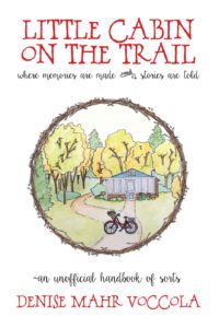
Title: Little Cabin on the Trail

Author: Denise Mahr Voccola

Designer: Denise Mahr Voccola

Genre: Memoir

Graphics: This book is about the value of family story-telling—that is, passing along accounts of the little things that happen within a family. Does the cover suggest such a theme? It’s hard to say. From looking at the first pages of the book, it isn’t clear how a cabin fits in. Perhaps it was where the author’s family often gathered and where they learned and told family stories.

The illustration itself is fine, though it’s a pity it takes up so little of the cover, being circumscribed by a circlet of branches and leaves.

It would have been better if the illustration were squared and enlarged, making it the full width of the cover. As it stands, some things in the illustration are difficult to make out, such as the bicycle and whatever is in the bicycle’s front basket. (Flowers? I can’t tell even when the cover is enlarged.)

The circlet is a nice, homey touch, but it draws too much attention to itself, and it forces the illustration to be constricted because the circlet needs to be kept away from the edges of the cover—which, come to think of it, are hard to locate, since the background is white and there is no border. At the sales page at Amazon a thin border and a drop shadow have been supplied automatically; the cover should have had at least a hairline border added to it before it was uploaded.

Back to the implications of the title, which seems to echo the title of Laura Ingalls Wilder’s best-known work, Little House on the Prairie. The illustration reinforces the idea that the centerpiece of the book is the cabin itself. There isn’t anything from which a viewer can infer story-telling. Thus the graphics miss the mark.

Typography: The font used for the title and author name suits the locale. The font’s rustic style suggests that this will be a homey read. It’s hard to tell from this borderless image, but the title is too close to the top of the cover. The two lines of the title are too close together: the C of the first line nearly hits the second T of the second line.

I don’t know whether this font has alternative characters. If so, it would have been good to use a smaller C in the author’s surname. The two large C’s draw too much attention to themselves, but that’s a quibble. One might counter by saying the double-C’s add character to the cover.

The subtitle and tagline are in a quite different—and quite difficult to read—font. Cursive fonts usually are difficult to read, especially when used for more than one or two words. What may look fine at full-monitor size often becomes a head-scratcher at thumbnail size.

In the subtitle, the conjunction “and” is set above an ornament. The two are impossible to make out at small sizes. Even when the cover is enlarged the word and ornament look odd—and inappropriate. Why are they there? They do nothing to enhance legibility. Maybe the designer thought they looked pretty. If so, this is an example of cuteness undercutting utility.

The tagline above the author name begins, oddly, with a tilde. Again, why?

The tagline is set slightly larger than the subtitle. Usually a subtitle is larger than a tagline, or the two are set at the same point size.

The subtitle could be enlarged to match the tagline’s size if its wording were modified slightly. I would omit the second use of “are” (and the ornament) so the subtitle would read: “where memories are made and stories told”. That would free up the equivalent of about five characters, allowing the text to grow—and to be brought in a little from the sides, since it’s a little wide.

Overall: This cover likely will appeal to a certain audience, just given its down-home-ness, but the poor legibility of some of the text and the hard-to-make-out illustration will cause other potential readers to look elsewhere.

It’s not possible, when designing a cover, to be as Pauline as one might wish, to be “all things to all men,” yet that aim ought to be a guiding principle during design, at least if one’s goal is to have a wide readership.

Case Study 92

Title: Access Denied

Author: David E. Gates

Designer: David E. Gates

Genre: Memoir

Graphics: The story concerns child custody. Is that suggested by the cover? Well, there is an adult hand, and cleverly arranged in it is a child’s hand. The two hands are reaching for one another, though it seems to me that the adult thumb is on the wrong side.

However that may be, there is an indication of an adult and a child, but would one infer from that a memoir regarding child custody? Not likely.

What’s that in the background? At thumbnail size it’s impossible to tell. At full size at Amazon, the background is revealed to be an apparently random sequence of four capitalized letters, A, C, G, and T. Their significance isn’t clear. Maybe the background is intended to evoke a computer program or printout. After all, “Access denied!” is a phrase one might see when inputting the wrong password. I take it that the title refers to not having access to one’s child.

The hundreds of letters in the background don’t tell us what the genre is or anything about the storyline. If a buyer has to guess at what a book is about, he’s unlikely to investigate further. Why should he, when so many other covers are vying for his attention?

Typography: Only two typographic elements appear on the cover, the title and the author name. The first is legible enough, despite the cluttered background. The second is illegible unless the cover is enlarged. The same font is used for both elements, as all caps for the title and as upper- and lowercase for the author name.

Each letter has a drop shadow. On most covers drop shadows either accomplish nothing or improve the readability of the text. Here they are counter-productive. They make the words harder to read. That’s because the drop shadows, which appear to be in gray, merge with the small background letters, which also are in gray. The resultant effect is haziness around the words.

The designer should have made alterations to the title and author name. The latter should be far larger. There would be room if the hands were rotated clockwise about thirty degrees, so the adult’s index finger would point toward the lower part of the left border and his forearm would extend not through the top border but through the upper part of the right border. This rotation would allow the title to be enlarged also. It ought to be half again as large, while the author name ought to be at least twice as large.

Once sizing is fixed, coloration needs to be fixed—and in the process the drop shadows should be removed. As for colors, the author name would work well in black, and perhaps red might work for the title since red commonly is used for warning signs, which is what “Access Denied” brings to mind.

For any of the text to be easily readable, the background (assuming the letters are kept) should be lightened by at least one-third, perhaps by half. Of course, it would be better to eliminate those hundreds of letters. Doing so would leave a simple cover, but the graphic of the hands may be enough to carry it—so long as there is an addition.

The addition would be a tagline indicating what the book is about. As it stands now, the cover doesn’t convey its genre or its storyline, the background being busy but obscure and the hands being subject to various interpretations. There needs to be a more blatant explanation of what the reader will find inside.

Overall: Author-designed covers usually fail to do what covers should do. This is a good example. The designer knows what the book is about and has used symbolism (the hands and the stream of letters) that, in his mind, explains sufficiently what the book is.

Except that the symbolism doesn’t do that for people unacquainted with the book. To them the cover lacks clarity, so they are likely to pass it by and look for something else to read.

Case Study 91

Title: I Remember the Time . . .

Author: Kim Hemphill

Designer: Cathi Stevenson

Genre: Memoir

Graphics: The author (a male, not a female: don’t be misled by the name) tells how he was run over by a train when he was three and how his disfigurement resulted in his living in an abusive home, suffering taunts throughout his school years, becoming homeless as a teenager, and falling into substance abuse—and how he overcame all of that.

The cover photo was taken by the designer not, apparently, at the site of the accident but at a more visually attractive site. Wise decision. A cover needs to attract prospective buyers. It needs enough verisimilitude to be faithful to the story, but it mostly needs to catch the eye.

This photo does that well. It’s a well-formed image, with the camera set low, for two reasons. First, the camera angle makes the rails seem to converge in the exact center of the cover. The track disappears into trees. One almost gets a sense of motion. Second, the low angle allows the child’s shoe to be well positioned.

I presume this wasn’t the author’s actual shoe but one mocked up for the purpose: it seems to have not just a thick line of dirt across the top but also a splotch of blood (perhaps ketchup). The shoe catches one’s attention, at least when the cover is viewed at a larger size. At thumbnail size, not so much, and that’s too bad. It’s a nice touch. It lends drama to the scene, which otherwise would be pretty but not dramatic.

Another thing to note is that the designer took the photo at sunset, thus resulting in ruddy clouds. That gives the photo three blocks of subdued color: red at the top, green in the middle, gray toward the bottom. That said, the cover looks dark overall. It should have been adjusted to lighter tones in an editing program. Still, it’s a fine image.

Typography: The typography isn’t as successful as the graphics. All of the text is off-white, but it should be bright white, given how dark the photo is. Even the larger letters don’t pop enough.

Imagine that the title were mentioned within a paragraph. If the title came at the end of a sentence, how many periods would you expect to follow it? (Correct answer: four.) If it came in the middle of a sentence and it was necessary to omit a few words immediately following it—that is, to have an elision represented by an ellipsis—how many periods would follow it? This time, six: three as part of the title and three as the ellipsis. That would make for awkward reading. And if the title came at the end of a question, how would it look to have a question mark follow three periods? It wouldn’t look very good.

I mention this because it’s almost always a bad idea to include punctuation in a book’s title. All kinds of confusions can arise. Imagine a book called How Are You? If you wanted to ask someone what he thought of the book, you’d have to write, “How did you like How Are You??” if you want to preserve the title. If you drop one of the question marks, a reader would think the title was simply How Are You.

In the present case, I would eliminate the ellipsis at the end of the title. It doesn’t add much to the sense; it may not add anything to the sense, depending on the reader. It will add to the confusion.

The author name should be a little larger, if this font is retained. (It’s used for everything but the blurb at the top.) The font’s thin lines tend to disappear against busy parts of the background. Other than that, the author name is fine.

Not so with the long tagline. Its major problem is legibility. It needs to be in a sans serif font that has thicker strokes than the present font. A condensed version would be preferable, so the text can be boosted a few points without having the lines come too close to the cover’s edges.

The first line ends with the indefinite article. It shouldn’t. “A” should begin the second line. “Bullying” should be brought up to the third line, to keep the thought unit together (“abuse and bullying”). “Happiness” needs to be followed by a comma, else the phrase “happiness and love” can be read as an appositive for (that is, a restating of) the word “success.”

This leaves the promotional blurb at the top. It’s the smallest text, and it suffers the most from being the wrong color: it doesn’t stand out well at all against the reddish sky.

The blurb should be in the same sans serif font as the subtitle, and it needs to be larger. I would put the first sentence on a line by itself. The other sentence I would divide this way: “A riveting read that will make you appreciate/ all that you have.”

The person quoted is identified as an “ARC reader”—that is, an “advance reader copy reader.” An ARC is a copy sent to select readers before publication, in hopes that they will supply useful promotional blurbs.

This blurb is nearly ideal, but the reader need not be identified as an ARC reader. Most buyers won’t know what that means. The designation makes her comment no more valuable that it would be if her name stood by itself.

Overall: As it stands, this is a good cover. Its legibility problems could be overcome in part simply by making all the text bright white. That would earn it a solid B. Making the other changes would bring it a much-deserved A.

Case Study 90

Title: Walking the Downs Link

Author: Holly Worton

Designer: Killion Group

Genre: Hiking

Graphics: The Downs Link is a 37-mile trail that links two other trails, the North Downs Way and the South Downs Way. The Downs Link is located south of London, and its southern terminus is near Brighton on Sussex Bay. Apparently this is the first guidebook for the little-used trail.

The sole graphic is a photograph of the trail going through a stand of trees and bushes. It may be authentic, but it’s not particularly attractive. The Downs Link route follows abandoned railway lines, and there are many places where one can see memorabilia from steam-locomotive days. A photo that included an old train car or a track switch would be more interesting than the one used on the cover.

As the route nears its southern terminus trees are more widely spread and there are said to be fine views of the South Downs. Such an image also would have been better than the one chosen.

Perhaps the author didn’t take many photos during her hike, and perhaps the other photos she took didn’t turn out well enough for use on the cover. If so, it would have been an easy matter to secure rights to a photo taken by someone else. It might have required nothing more than agreeing to give the photographer credit.

At it stands, the photo that was used lacks visual interest—there are neither people nor things other than the pathway and the greenery—and the view verges on the claustrophobic. It looks as though the viewer is going to end up swallowed by encroaching plants.

Typography: There are four typographic elements: title, subtitle, author name, and author blurb. They all use the same font, though most of the author blurb is in italics because it’s the title of another book.

On its own, the font is fine—but not for this cover. Its lines are too thin to stand out well against the greenery. If the image is to be retained, a thicker font is needed.

If this photo showed more sky, the title, as it now stands, would be acceptable since it wouldn’t overlap any trees. But it wouldn’t be more than acceptable because the first line ends awkwardly with the definite article. This is a title that needs to be set in three lines, with “the” on a line of its own and probably set smaller than the other two lines, for modesty’s sake.

The subtitle already is in three lines, which is fine, but it ought to be in all caps, to vary it from the format of the title, and it ought to be in a sans serif font. The letters should be enlarged by a few points and the line spacing reduced by half. The lines are too far apart and give the subtitle an unhelpful airy look. The lines would appear more as a unit if they were closer together. Lastly, the ampersand ought to be switched out for “and”; the subtitle will read more smoothly that way.

Of all the text on the cover, the author name looks best. That’s because it’s set atop the path and the less-busy part of the foliage. It should be set in whatever new font is chosen for the title, whereas the subtitle and author blurb should be in the same sans serif font.

Should the author blurb be here at all? It does provide credentials for the author: “Here’s someone who wrote a book about hiking one of the connecting trails, so she must know her stuff.”

Unfortunately, the author blurb is the least successful of the textual elements. At thumbnail size it’s illegible. If it’s to be retained, it has to be much larger (thus taking three lines instead of two). Otherwise, it can go on an early page inside the book and in the book’s description at Amazon. The description presently doesn’t mention the author’s previous book, a serious mistake.

Overall: As hiking book covers go, this is a dull one. There must be better-looking parts of the Downs Link, and there must be photos that allow better placement of text. Ideally one would want an image showing a good chunk of sky for the title and enough path or other non-busy area on which the other text can be placed.

Case Study 89

Title: The Time Eater

Author: N. J. Thalmayer

Designer: N. J. Thalmayer

Genre: Fantasy

Graphics: Step back from your monitor a few paces and look at this cover. What do you see? I see text that is legible (the author name), text that is barely legible (the title), two spots of red above the title, and otherwise a blob of red and blue hues.

Now come close. Seated before my monitor I now can make out the title, though still with a little difficulty, I can make out a bit of the series tagline, and I can see that the red spots are eyes that appear to be set in the sort of mask worn at a masquerade. The red in the background now resolves itself into blocks that may be buildings, and the gray-blue area behind and above the author name looks like the rear of a statue.

This is a dark cover—not dark in the sense of looking forbidding but dark in the sense of poor illumination. None of the graphical elements stand out well. The proof is that at a distance one hardly can tell what things are, and close up things aren’t much clearer. One thing that is noticeable close up is that the graphics have a pasted-on look.

The statue isn’t a statue. It’s the back side of the protagonist. She isn’t part of the red background. She wasn’t drawn as an integral part of that image. She was pasted on. You can tell by the thin, wavy line of white around her and by the fact that her features are distinct while the features of the background are slightly blurred.

The description of the book at Amazon begins this way: “Her hands were born to hold a sword.” Let’s set aside the inapt phrasing (hands aren’t “born”) and turn to the cover. It shows a sword on the woman’s back. It’s not being held in either hand. Her left hand is seen free to the left, her right hand apparently is extended in front of her.

The sword is on her back but with no visible means of support. There is no scabbard, no thong, no strap. It just floats. That suggests that just as she was pasted on the red background, the sword was pasted on her back.

Perhaps fortunately for the designer, this faux pas is hard to see, given how dark the cover is. You have to look at an enlarged version to realize that the sword belies the opening line of the description. If the cover had been drawn brightly, the pasted-on-ness of the sword and the woman would have been obvious.

What about the red eyes in the mask? I suppose it’s not supposed to be a mask, but what is the face that the eyes belong to? It’s hard to tell, and it’s hard to tell where in space we’re to understand the face to be. It isn’t an integral part of the background. It doesn’t seem to be either above the buildings or in front of them.

If it were above, you’d expect it to partly obscured by the towering structures, but it’s not. If it were in front of the buildings, you’d expect it to obscure parts of them, but it doesn’t. It seems unrelated to its setting and so seems gratuitous. The eyes are meant to be frightening, but you don’t get the sense that they frighten the woman.

Typography: Not surprisingly, the poor graphics are paired with poor typography. If the font choices (there are two fonts here) do anything well, they tell the viewer what the book is not. It’s not non-fiction, it’s not romance, it’s not a police procedural or a historical novel. It’s either fantasy (which it is) or science fiction or post-apocalyptic dystopian. Of those three, the fonts most closely fit the first category, given their runic design.

Consider first the title. Three things are wrong with the font: its color, its kerning, and the font itself.

Here we have another example of the violation of a cardinal rule: don’t use red text against a dark background. The designer must have sensed that something was amiss, because he used thin off-white lines around the letters so they would stand out against the black background. The trouble is that they don’t stand out enough. Bright white would have been better than red, as would yellow or the blue of the author name.

Most of the letters of the title abut one another, for no clear gain. When a font is peculiar in design, as here, it’s important to let each letter breathe, for maximum comprehension. Pushing letters against one another works against that.

Wider kerning would not have overcome an innate problem with this font: some of its letters are clumsily drawn. The M is the best example. The crossing middle strokes make it look like an X rather than an M. The E isn’t much better, since it can be mistaken at first glance for an F. It’s one thing to use a font that may evoke a genre; it’s something else to use one that works against legibility.

The same font is used for the subtitle, but without a surrounding rule. It works better here because the blue color pops against the near-black background and because the letters don’t touch one another. That said, the letters could be kerned better (look at the L-E combination), and the subtitle is too small.

The title and subtitle should be rearranged with both being set in a different, less cluttered font but one that still implies the genre. The title should be in a single line where its first line now is, and the subtitle should be placed in a single line under it. Assuming the title will be in upper- and lowercase, the subtitle should be in small caps, for contrast. The two elements should be distinguished further by color, perhaps white or yellow for the title and the blue of the author name for the subtitle.

The author name certainly is large enough. In fact, it’s too large, its large caps being larger than the letters of the title. It should be reset as uniform small caps (not large and small caps) and on one line. It still would be easily readable, if left in light blue. Its present font is fine for the genre, and, unlike the font used in the title and subtitle, it’s legible.

Overall: This cover fails on multiple fronts. The graphics have an amateurish, pasted-on look. Too many elements are too dark and too vague. The typography isn’t much better, aside from the author name. The title is in the wrong font and the wrong color, adding to the general murkiness of the cover, and the subtitle is misplaced and too small to read.

Case Study 88

Title: Lost Coast Rocket

Author: Joel Horn

Designer: Joel Horn

Genre: Young adult

Graphics: This cover is a lesson in bad design. Maybe something can be learned from it.

Let’s begin by noting the cover has anywhere from three to five distinct elements, starting with the background photo. The story takes place along California’s Lost Coast, an area not far below the Oregon border. The Usal Creek area in Mendocino County seems to be depicted.

On top of that landscape are plopped two to four other images. The most obvious one is of a girl, pointing northward with her right hand and scratching her head with her left. The scratching seems justified, because she too probably is wondering what she’s seeing.

She isn’t integrated into the photo. She isn’t on-site. Her image has been pasted in—and somewhat clumsily. You can see pixelated irregularities around the edges.

The remainder of the scene is formed from what seem to be three elements. It’s a little hard to say. There may be fewer, but I think the smoke, exhaust, and rocket are separate items. The multi-colored smoke might well be taken from a photo of a missile launch. The rocket certainly is a drawing; when the cover is seen at full size, there’s no doubt about that. The exhaust may be from the same drawing as the rocket, or it may be from an independent drawing.

Whatever the provenance of the several parts, the overall effect is one of hokeyness. A viewer instantly recognizes that this cover pretends to be something it isn’t and that the pretending isn’t the least bit sophisticated.

Typography: The title slants upward, perhaps to suggest a rocket launch, but then rockets are launched straight up, not at an acute angle. In partial compensation the text is placed in italics so that the words remain readable without having to cock one’s head.

Why wasn’t the same done with the subtitle? It too slants upward, but its text remains in roman and so not only is difficult to read but is out of sync with the title. The title font is unobjectionable, but the subtitle font is so ineffective that the designer seems to have added black outlines to the letters.

It would have been better to use the title font and to put the words of the subtitle in small caps, except that changing to the title’s font would have forced the subtitle to be even smaller, if it were to fit in the space provided. The only solution would be a compressed sans serif font.

All that presumes keeping the title as is, but it shouldn’t be kept as it. It should be brought down to Earth, so to speak, by removing the slant and removing the italics. Then the subtitle could be placed under it, in a single line if its new font is chosen prudently.

But what about that troublesome rocket? It’s larger than necessary. If reduced by a third, it wouldn’t intrude in the title and subtitle areas, as it does now. A smaller rocket would make more sense anyway, since the present size makes it look too close to the girl.

The author name is fine as is, except it is off-center and should be shifted leftward. The author name is in the same font as the title now is and as the subtitle should be, but, unlike the subtitle, it can remain in upper- and lowercase.

Mare Tranquillitatis translates as Sea of Tranquility. The rocket doesn’t suggest tranquility, and the beach far below doesn’t seem particularly tranquil either, so what kind of book is this? The cover would be helped by an indication of genre.

Overall: The graphics look cobbled together because in fact they were cobbled together. The designer may have delighted in producing a cover quickly, but, when later wearing his author hat, he likely wondered why he didn’t the sales he had thought he would see.

It’s almost a certainty that the cover hindered rather than helped sales. A look at other books in the genre would have alerted him to what buyers had come to expect in covers of these sorts of books.

Case Study 87

Title: Glimpses of Light

Editors: Jeanette O’Hagan and Nola L. Passmore

Designer: Jeanette O’Hagan

Genre: General fiction

Graphics: This is a collection of 26 disparate stories and poems. They don’t seem to have a common theme (the subtitle’s “imagination and hope” don’t constitute a theme), so it must have been hard to come up with a cover design that indicates what this book is about—so hard that it wasn’t done at all.

What we have instead is a cliché ocean scene. According to the book’s credits page, the photo was taken near Scawfell Island, which is off the coast of Queensland, Australia. Not that the location matters much, since the photo is indistinguishable from a thousand other photos of calm seas, distant ships, and pretty sunsets.

Perhaps the image was chosen to link to the last word in the title, “Light,” but the symbolism doesn’t work. This is a book about hope, and hope is a forward-looking thing. Hope is concerned with tomorrow, not with yesterday. You might expect a photo of a glorious sunrise, but this photo shows a sunset, which means the light soon will go out, and that’s the opposite of hope.

Whatever the motive for choosing the photo, the selection was made unimaginatively. Surely there must be other images that evoke hope without evoking instead countless similar covers.

When a designer ends up with graphics like these, stock needs to be taken. Something has gone wrong. Usually the problem is that the designer is an amateur trying to make a cover on the cheap, but sometimes professional designers let down their guard and produce something along these lines.

Even collections of unrelated items deserve covers that don’t look like they have come off an assembly line. It’s difficult to design a cover that fairly represents each of several separate contributions. That might be doable if there are only three or four items, but 26? At that point the designer has to go a different way.

Instead of trying to convey an abstract notion such as hope (which, if present in each of 26 contributions, must manifest itself in bewilderingly different ways), the designer should aim for a cover that intrigues, mystifies, or provokes—things placid waters can’t do. This may mean that the cover shouldn’t sport a nature photo at all.

Typography: The title, subtitle, and editors’ names all need revision. Let’s assume that the photo is retained. What can be done with the text?

The present title font is one of those fonts commonly thought to suggest a literary or artsy temperament. The thin lines and flourishes are thought to imply sensitivity or compassion or fineness of mind, and they may imply any or all of those things—or none of them.

Some people think that collections of short stories or poems are obligated to be titled in letters that bring to mind the Art Deco era or the Renaissance or some other time of imagined High Art, but that’s not true. Even collections ought to have titling that is clear and bold, even if also whimsical and delightful.

This cover would have been served better by a font with thicker letters and fewer curlicues. That isn’t to say that Helvetica would have been best. It wouldn’t have been; it would have failed at the other extreme. But the font used here looks weak, and it doesn’t stand out well from the uniformly-colored background. It might work as a chapter-title font on the interior of a book, but it doesn’t work well on a cover.

However the title is fixed, the fix won’t be complete until the letters’ color is changed. Even if the title were in thick letters, white letters won’t stand out well against the yellow background. They should be black.

The subtitle has two problems. Its capitalization is irregular, at least for its purpose. If it were a sentence, it would be fine, being capitalized only in the first word, but a title or subtitle needs either capitalization of every word other than articles, conjunctions, and prepositions or it needs to be set in all caps, which probably would have been the best solution here, to distinguish the subtitle from the title.

The subtitle is so long that it stretches too far across the cover, coming too close to the edges. To bring it in would require reducing the point size, but that would make the words less visible. That’s not the way to go.

One solution would be to use a new font or the same font in a condensed version. That still may not allow the letters’ size to be increased enough. The best choice might be to set the subtitle in two centered lines: “Stories and Poems/ of Imagination and Hope”. That would allow the present font to be maintained, even when made several points larger.

Like the title, the subtitle needs to be in a different color, since white doesn’t contrast sufficiently with this background. Black again would be the best choice, since the image has no other color, such as dark blue, to draw from.

The editors’ names have been placed on top of the mottled sea. This makes for difficulty in reading. The names are in yellow, which contrasts well with some parts of the water but not with other parts, since the water is reflecting a yellow sun. This is where white would have been a better choice.

Why are the editors’ names shifted to the left margin? Perhaps it was done to move the text away from the glint of the setting sun. Okay, but doing so throws the cover off balance, so there’s a negative in maintaining this placement. It’s a negative that may not be avoidable, given the choice of photo.

Using “Edited by” is necessary to indicate that these are editors, not authors, but those two words ought to be in all caps (to match the preferred revision of the subtitle), leaving only the editors’ names in upper- and lowercase.

Overall: A poor choice of photo leads to a poor choice of typography. The photo may be attractive in itself, but it has no obvious connection to the book’s contents. It seems to have been used because nothing better came to mind—a good reason to employ a professional designer.

This book includes more than twenty contributors. It would have been a tip of the hat to them to have arranged for a cover that doesn’t look so bland.

Case Study 86

Title: Leadership Is Mental

Author: Dayo Sowunmi II

Designer: Sara Garcia

Genre: Business

Graphics: This is another floating cover. When viewed here or at Amazon, the cover seems to have no border. That’s a problem with white against white. Of course, that would not be a problem for the paperback edition, when seen in real life—or when seen at Amazon, where that edition is bounded by a thin rule. It’s the ebook edition that seems to float.

What about the graphics otherwise? On this cover, the image is less important and less prominent than the text. That’s fine. What isn’t so fine is that the image doesn’t make sense without an explanation, and even the explanation, as given by the author, isn’t quite enough.

He has mentioned that the penguins are in a padded room as found in an asylum: there is a connection to the title word “Mental.” Maybe, but it seems to be an undesired connection.

The “Mental” of the title, taken on its own, implies that leadership is something one has to think about or has to keep in mind. (It’s like the Yogi Berra quotation: “Baseball is ninety percent mental, and the other half is physical.”) But “mental” as in “mental institution,” where padded rooms are found, implies a disordering of one’s reasoning faculties. I don’t think the author wants to imply that his book is for crazy people.

Thus the padded room seems inappropriate for the cover—not just irrelevant but counter-productive. It sends a message, but it’s a message that shouldn’t be sent.

And what about the penguins? Penguins aren’t noted for playing follow the leader. Some other species do that, such as cattle and sheep. In the popular imagination, penguins merely stand around on snow or swim playfully in icy water, each going his own way. It might be a fact that penguins form leadership hierarchies, but, if so, that is a fact known to a few biologists and not to the public at large.

But let’s say penguins do play follow the leader. Does this image express that? Not to me. The four penguins, though mostly facing the same way, don’t seem to be going anywhere. They couldn’t. The walls of the padded room prevent that. Thus whatever symbolism is provided by the penguins seems to fail. (Similarly with the padded room, the symbolism of which more than fails.)

Typography: One thing this cover shows is the proper way to use red text. Notice how the word “Mental” stands out. That’s because the red is atop white. Red needs a strong contrast to work. If this cover had a dark background, or a background in any shade of gray or blue, red would fail.

Keep this as a reminder: when it comes to using red, think “Civil War colors,” the colors of the Confederacy and the Union, gray and blue, and avoid red if those colors form the backdrop.

The title is fine, for a non-fiction book. Such a plain font, set so large in the third word, would be out of place on a novel’s cover, but it’s just the kind one expects to find on a book about how to improve at business.

Even if it were in black, “Mental” would stand out, given its size. “Leadership” is in the same font but not bolded, yet it’s quite legible. Even the small “Is” can be read easily, in part because the two rules at its sides seem to be pointing at it.

The title, then, has no problems, but the subtitle has one.

It’s easy enough to understand what the designer was attempting to do, trying to place emphasis on “project leader,” but that wasn’t necessary, given how short the subtitle is. The subtitle begins as many subtitles do, with “how to,” making this a how-to book. How to what? How to be a successful project leader. Anyone reading “how to” will make it to “project leader” and will know what he will learn.

There is no reason to highlight the last two words. When highlighted in red, they throw off the legibility of the subtitle, and they give the entire cover a rightward tilt. If the two words were kept in black, the black subtitle, along with the black “Leadership Is,” would bracket the red “Mental.”

Overall: This cover’s typography is strong, its graphics weak. The typography is so strong that the cover likely will do what it needs to do, though at a cost.

Some viewers may wonder what the penguins are for; a few even may wonder whether these penguins have been institutionalized. Most viewers will focus on the text. It’s too bad that the graphics weren’t done in a way as to enhance the text.

Case Study 85

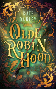
Title: Olde Robin Hood

Author: Kate Danley

Designer: Story Wrappers

Genre: Fantasy

Graphics: The “Olde” of the title refers to legends about Robin Hood that predate the story that has come down to us. The author invites the reader to “discover the man behind the myth, as you meet the Olde Robin Hood.” That doesn’t mean this is either history or historical fiction. It’s a book that reimagines stories that are older than the one commonly known. Thus the designation as fantasy.

Does the cover indicate that? Not really, thought “Olde” carries a sense different from “Old.” At least we know the book isn’t about Robin Hood on Social Security. Still, it’s not clear that this is fantasy rather than something else.

The image is very busy, partly because its elements lie on more than one level. The backmost part consists of a mottled green base and extensive filigree. The filigree may be an artistic tour de force—it truly is well drawn—but there is so much of it that it overpowers the cover. This is an instance where half as much would be twice as effective.

Placed one level higher are the author name and title. More on those below.

At still a higher level is the arrow, which is the only three-dimensional object on the cover. Unfortunately, it doesn’t stand out well. The brown of the shaft is not well distinguished from other elements of the cover.

When the cover is first viewed at small size or from a distance, the arrow hardly is seen at all. The light-colored title catches the eye. It takes the viewer a moment to realize that within this jumble of angled shapes is a straight shape, and then it takes a further moment to realize, by moving the eyes to the upper end of the shape, that this is an arrow.

That’s a pity, because the arrow is well drawn and by rights ought to get more attention. But it has a further problem.

The shaft weaves in and out of the letters of the title, passing both above and below the E, behind the B, and across the H. This means some letters must be higher off the surface than others and must be considerably higher than the letters on which the shadow of the arrow falls.

Most viewers won’t perceive that irregularity, but they might sense, subconsciously, that something isn’t quite right about the arrow. Even if they don’t, the arrow’s greatest problem remains: it isn’t sufficiently prominent.

Typography: The title hardly can be faulted. It’s a piece of art in itself. Even if the font isn’t accurate to the period in which Robin Hood supposedly flourished, it looks as though it’s from his time. The shadows behind the letters raise them from the mottled surface, and, as I said, the arrow’s path makes it seem that the letters lie on different plains.

The letters at the upper left and lower right of the title have a distressed appearance. Only the large R and N seem free of encrustations. The variety gives the letters additional character (no pun intended). All in all, the title is effective.

The author name is in a modern font and, like the title, it rises above the background due to drop shadows. Whereas the shadows behind the letters of the title go in all directions, implying a light source straight out from the cover, the shadows for the author name all go to the upper right, indicating its light source is in the lower left. This is a lack of continuity that most people won’t see, but those who see it will take off a few points from the score.

The author name is set in a light blue-green that isn’t otherwise seen on the cover. It’s close to what is found elsewhere, but it’s not a match. That’s a discrepancy rather than a problem. The text’s color does make the author name easily visible, and it sits comfortably within a frame formed by the filigree.

That leaves the third textual element, which is missing entirely. The cover needs a tagline indicating genre or even a subtitle. This could be placed, in text smaller than the author name but in the same color, in a frame at the bottom center, where the densest ornament now resides.

Overall: This cover is done well, but parts of it are overdone. One gets a sense that the designer got carried away. Well, that’s better than having a cover that omits several necessary items—though this cover omits one, a genre indicator. If the filigree were less exuberant, and if the arrow were  more prominent, the cover would warrant no complaint.

Case Study 84

Title: The Toymaker

Author: Sergio Gomez

Designer: Teddi Black

Genre: Suspense

Graphics: Charlie McCarthy not only was the most famous dummy in American entertainment (Edgar Bergen was his ventriloquist) but seems to have been the prototype for scary dummies that appeared later. Charlie himself never was scary. He always dressed in a tuxedo and sported a monocle, but he had eyes and a smile that later, horror-movie dummies emulated.

Even though Charlie always was joking, it has been frightening variants of his visage that have come down to us in movies and, as here, on book covers. The Toymaker features a spruced-up dummy—not as elegant as Charlie but still, in jacket and bow tie, a sophisticated looking guy.

Three aspects of the dummy stand out: his leering eyes, his too-red lips, and the cracks on his forehead and neck. This is a dummy that has been in some sort of fight, and he has come away victorious, at least temporarily. He’s looking for another spat.

The tilt of the dummy’s head and the deep shadows clue us that this will be an uncomfortable read, which is just what a fan of suspense fiction wants, of course.

Only at expanded size does the image reveal shelves in a toy shop. It might have been good if the background were brighter so the venue would be more obvious. If we didn’t have the title before us, we’d be hard pressed to know where the story takes place.

Despite that inconvenience, this cover’s graphics are first rate.

Typography: The same can’t be said of the typography, or at least of some of it.

The title is well done. It looks like a sign that might hang outside a toy shop. Its cracked wooden texture is doubly appropriate, suggesting that this shop sells carved wooden toys and linking to the cracks in the dummy. The curve of the title follows the curve of the dummy’s head.

If the title has a weakness, it’s that it looks subdued. The center-left portion of the cover is so bright, with the light shining on the dummy’s face, that the title could use some lightening of its own.

The author name also should be lighter, to match the title, and it needs attention. It’s the right distance from the bottom, but it overlaps the dummy’s white collar, which makes a couple of the letters less readable than they ought to be. This could be fixed by darkening the lowest portion of the dummy, bringing up the black that otherwise is behind the author name.

The problems with the title and author name are almost insignificant. Not so with the genre tagline, “A Dark Suspense Novel.” It floats awkwardly, and it’s too small to be legible at thumbnail size. Where to put it? That will be determined largely by its revised size. It needs to be large enough to read—or it needs to be gone.

Assume the tagline is doubled in size. If left where it is, it would stretch so far left that it would cover the dummy’s mouth. That wouldn’t do. What then?

One possibility would be to put the tagline in the same font as the title and to curve it to fit beneath the title, with all the tagline’s letters being of uniform size. This might require the dummy’s head to be lowered a little, but that would intrude on the author name.

The solution would be to reduce the size of the head slightly (it would be equally scary if only 90 percent of its present size). That would give extra room for the text at both the top and bottom.

If that revision weren’t made—if the tagline weren’t moved beneath the tile (where it would best, I think)—a fallback solution would be to stack the words in three right-justified lines: “A Dark/ Suspense/ Novel”. Those three lines, kept in white, could be place about where the present tagline is.

As with the text that otherwise would go beneath the title, the font should be changed to all caps, not upper and lower caps as at present (the present format actually has the upper caps bolded, which is quite unnecessary). The revised tagline not only would be more legible, but it wouldn’t approach the dummy’s face as closely as it now does.

Overall: If it weren’t for the genre tagline, this cover would rate at least an A-. If the tagline were repositioned (preferably under the title), and if the title and author name were brightened, and if the latter had all its letters set against black or near-black, then this cover would deserve full marks.

Case Study 83

Title: Tea and Madness

Author: C. Streetlights

Designer: Laura Hidalgo

Genre: Memoir

Graphics: The description at Amazon says this short book is a “memoir written in prose and poetry” that recounts the author’s multiple travails, including depression and the loss of a baby.

The indistinct image (the indistinctness seems appropriate here) shows a woman—presumably the author—with teapot in hand, walking away from a jumble of cups and saucers lying in the grass. The disarray of the tea set and the multiplicity of cups suggests a lack of self-composure or aimlessness.

You don’t normally see tea sets outdoors. You expect to find them arranged on rectangular kitchen tables or small round tables at restaurants or coffee shops. There’s something jarring about seeing such accoutrements abandoned outdoors. It looks as if the woman has had her fill and, perhaps in dejection, is walking away, not bothering to clean up after herself.

Or is she going off to find more hot water? It’s hard to say. Either way, the impression is one of unease, and that fits the “madness” part of the title well.

The only graphical element other than the photograph is a silhouette of a teapot. It is used as the container for the genre tagline, which tells us that this is “a memoir.”

Typography: That tagline is helpful—we might have little idea what the book is about otherwise—but the words are too small to be seen at thumbnail size. They should have been set in a condensed font and in two lines, with “a” centered over “memoir.” That would have allowed the letters to be taller and therefore more legible.

The title seems to have been composed in two fonts, one for “Tea and” and the other for “madness.” The fonts are similar, but close inspection shows that letters common to both parts are drawn differently. Look, for example, at the A and E.

The conjunction “and” is orange, while the other words are in white tinged with yellow. This gives “and” undue emphasis, which is doubly unfortunate in that the ascender of the D in “madness” is used to connect to the teapot, with the uppermost part of the ascender being orange tea coming out of the teapot. The orange in “and” detracts from the orange in the ascender.

Another problem is that the large swirl coming off the T in “Tea” comes too close to the cover’s edges, at both the left and right. The title thus looks cramped. This problem can be solved by reducing the size of the title. There is plenty of leeway for that, since the title is so large.

Lastly, “and” seems oddly placed. I would have put it below “Tea” and to the left of the teapot. There is room for it, though it might need to be slightly smaller. If repositioned, “and” would tend to draw the other two words together. As it is now, the title looks bifurcated, almost as if there were two titles.

The author name has several problems.

Its thin font is hard to read against the cups and saucers. Even a thicker font would have trouble being read unless it were lowered so that only grass appeared behind it, but that would require that the entire background image be raised, to show more grass at the bottom.

The color that works for the title doesn’t work for the author name because its letters are too small. White should be used instead. And the author name needs to be brought in from the left and right edges. Most of that could be accomplished by reducing the large space between the author’s initial and her surname and by shifting the period that follows the initial closer to the C.

Overall: This cover’s greatest strength is its photo. Its weakest is the sizing and coloration of its text. Fortunately, the textual problems can be remedied easily.

It is particularly important to make clearer the book’s genre. Thus “a memoir” needs to be more prominent. If adjusting the text, as suggested above, doesn’t do the trick, it may be necessary to enlarge the teapot silhouette.

Case Study 82

Title: The Book of Djinn

Author: P. K. Silverson

Designer: P. K. Silverson

Genre: Fantasy

Graphics: In Islamic mythology, a djinn is a spiritual creature that may be good or bad. Usually we see “djinn” anglicized as “genie” and think of a good genie in a lamp.

Adding a genie’s lamp might have been prudent for this cover. Doing so might have set the design on a course happier than the one taken. At least the genre would have been clear immediately. On the cover as it stands, one has to wonder. From the graphics alone, what is one to think? What genre comes to mind? Not a genie genre, in any case.

As it is, this cover’s design is wrong in every way. The title refers to “book” and to “djinn,” so you might expect to see a book or a genie or both, but the graphics don’t show—or even imply—either. The cat-like eyes don’t suggest a genie (if anything they suggest a cat), and nothing else on the cover suggests one.

Aside from the eyes and the blue background, the only other graphical element is lightning. Lightning normally isn’t associated with genies, at least not in popular imagination. When we think of a genie arising out of a lamp, he arises wreathed in smoke, not glowing in lightning.

The graphics have a pasted-on look, a sure indication that this is an amateur production. The eyes come too close to the edges, the red of the eyes clashes with the blue of the background, and the top and bottom of the cover are bounded with bars and lines that do nothing but distract.

Typography: The title has multiple faults. The smallest is that “of” should not be capitalized. As a rule, articles and prepositions should be lowercased, unless they begin a title.

A more serious fault is the color chosen for the title. The greenish cast prevents the words from standing out well against the blue. A bright yellow would have been better, yellow usually working well against blue. The designer apparently realized there was a legibility problem, for he added a black drop shadow to the letters, but that isn’t enough to rectify the poor color choice.

The author name has several problems. It too is in the wrong color. Just as bad, it is far too small. It ought to be in all caps at half again the size. Lastly, it should not be in italics, which should be reserved for emphasizing particular words. The proper way to emphasis an author name is to set it in a clean font at a large enough size. Italics not required.

Overall: This cover has graphical elements that serve no purpose, but the cover as a whole does serve a purpose. It is a reminder that most self-published authors should not try their hands at cover design. Such attempts habitually fall short. Sometimes, as here, they fail completely.

What good is a “free” cover design if it ends up being costly by driving buyers away? That is the worst kind of economy because it is counterproductive.

Case Study 81

Title: Saving Her Reputation

Author: Annie Boone

Designer: Vero Martinez

Genre: Romance

Graphics: This book is one in a series of at least ten that appear under the rubric of “A Kansas Mail Order Bride Story.” The covers are nearly identical in color palette, background scenery, and tone.

The only substantial change from one book to the next is the image of the young woman, yet even then there is commonality: a pensive look, a face in three-quarters profile, and make-up that would not have been seen on the nineteenth-century Kansas prairie.

The details of the background can be made out if one looks closely. There is enough to suggest a placid rural setting but not so much as to take attention away from the woman. The eye goes to the exquisite portraiture which itself has muted tones, though, on most of these covers, there is a dash of color—in this case, purple in the flowers in her hair, the same purple used for the title.

It is difficult to find much to fault on this cover or its companions. If anything, I would say that the heads of the women are too close to the top of the cover. The space above them should be half again as tall, for two reasons: the present spacing makes them looked cramped, and it makes the series tagline look cramped.

On some of the other books in the series, the women’s heads are so close to the top that the tagline is placed over their hair, quite unnecessarily.

Typography: Just as the illustrations are near clones from one book to the next, so the layout of the text is replicated.

At the bottom is the author name in a clear, legible font that is appropriate for the era. The letters are widely kerned—a common practice with author names, no matter what the genre—and the wide kerning helps distinguish the author name from the title. If the two were close to one another, with similar characters spacing, the eye might run the text of the title into the author name. That could happen despite an ornamental spacer, such as used here.

The series tagline is, appropriately, in the same font as the author name. Like it, it is in all caps. The letters are not as widely kerned, but one pair, the K-A, needs adjustment; the letters nearly touch.

On this cover the tagline and author name are in a brown tone. On some of the other covers they are in black. The black stands out more, but it also competes with the purple that is used throughout the series for the books’ titles. I think the brown works best.

The title is in a consistent font throughout the series, and it always is in purple, a color that stands out well against the tan backgrounds. The title words are set in two or three sizes—on this cover, three. Why is “her” so small, and why is it in italics?

Italics imply emphasis, so are we to understand that the protagonist is saving her own reputation in contradistinction to saving someone else’s? Likely not. I suspect the designer used italics just to make the word look “fancy,” but there hardly is a need for that.

And what about the small size? Like the italics, it draws undue emphasis to the least important word in the title. This miniaturization is used on other books in the series. On one cover, the article “a” is made so small that you’re likely to miss it entirely when first reading the title. It doesn’t help that the “a” is attached to the ornament, thus making it even harder to find. At least that problem isn’t on this cover, but the way “her” has been modified, in two ways, seems pointless.

Each cover includes the same large swirl between the title and author name. The ornament isn’t needed to separate the two textual elements. If the ornament weren’t there, no one would confuse the two: they are widely spaced, in different fonts, and in different colors.

The ornament is used to give the cover a further “feminine” sense. It does that, but maybe it overdoes it. The swirl is so large that it almost is intrusive. It draws too much attention to itself. A more modest swirl would have worked better.

Overall: My criticisms are few and minor because there isn’t much not to like about this cover. The design works for the individual book and for the series. Once a reader has seen any one of the books, she instantly will recognize others that belong to the series.

Case Study 80

Title: 1612

Author: Harald Johnson

Designer: Harold Johnson

Genre: Historical fiction

Graphics: This is the second book of a four-part series. Each book uses the same illustration of what Manhattan Island may have looked like in the seventeenth century. The only change, from book to book, is the color palette. This one is blue-gray. The others are brownish-tan, green, and red.

If the series tagline weren’t present, few people would know what the pictured island might be. Once a viewer sees the tagline, there is a small “Aha!” moment, but it passes quickly. The illustration is unexpected, but it tells us nothing other than that Manhattan once was wooded. Interest quickly fades.

If the illustration makes for a bland cover for one of these four books, it makes for a less than bland cover by the time one sees the other three covers. They clearly are knockoffs of one another.

Typography: Each book in the series has three textual elements: title, series tagline, and author name. For each book the title is nothing more than a four-digit year: 160916121625, and 1640. The numbers, in a rough-hewn font with a thin drop shadow, are eminently readable. The titles can be seen from across a room.

But what do the titles convey? They set the story’s period with specificity. When we move from the first book in the series to the second, we know we’re skipping three years, but what attraction is in that? The titles do make clear that the four books form a series, but the repeated illustration does that just as well. It would have been better to have for each book a “real” title, one that intrigues, sets up a problem, or mentions a character.

The series tagline, “The Manhattan Series,” is easy to read. It is a little too close to the top; it and the title should be moved down, with the title then being moved down a little more. (Not to worry: there is nothing in the illustration that will be harmed by that.)

The author name is in the same clean font as the tagline. The former is against a light color, so it properly is in black. The author name is against a dark color, so it properly is in white.

The cover verges on the monochromatic and doesn’t need to. I would put the title in maroon, not to make it stand out—its size insures that it will stand out regardless—but to give a little warmth and variation to an otherwise sterile cover.

Overall: Perhaps the author-designer felt tickled when he came up with the idea of using the same illustration on four covers and with the idea of using dates alone as titles. Sometimes what seems at one moment to be cleverness ends up not panning out.

Nothing on the cover indicates genre. This could be historical fiction, but it could be straight history too, or it could belong to some other genre. Perhaps a second tagline, indicating what sort of book this is, would have been useful.

Case Study 79

Title: Eulalie and Washerwoman

Author: Malcolm R. Campbell

Designer: Jack Stollery

Genre: Fantasy

Graphics: The illustration is set off in a box surrounded by thin rules. Below the box is a line of dingbats, and below that line is a box containing the author name. Wide borders, in aquamarine, are on the four sides. I have no idea why.

The illustration is complex and should be as large as possible, for visibility’s sake. It ought to occupy the whole of the cover. The only text outside the illustration is the author name, which could have been placed inside. That would make the multiple rules and dingbats gratuitous. Even now they serve no evident purpose.

As for the illustration, it’s hard to make out what the various objects are, even when the illustration is seen at maximum size at Amazon.

On the right is a crocodile and on the left what may be a dog. Trotting next to the woman is a cat—but is that a woman at all? She (or it) has no legs. Immediately behind her is a yellow, black, and blue object that I can’t make out. Sometimes it looks like a golf tee, at other times like a short Phillips screwdriver. No doubt it’s something else, but what?

On the pathway are the digits 41144. They apparently aren’t a zip code. The story takes place in Florida, and that zip code, in real life, is found in Kentucky. The woman (or whatever) is approaching a railroad crossing, but there is no sign of a train. The trees suggest a swamp, but do train tracks run through swamps?

The illustration is well done technically, but it’s a jumble. It gives no indication of what the story may be or even what the genre is. It could be fantasy (which is how the author describes it) or horror or thriller or something else.

Typography: A gradient seems to have been applied to the words of the title. The letters are brightest at the upper left and dimmest at the lower right. Even the brightest letters aren’t particularly bright. On the whole, the illustration is dark, so a brighter title would provide welcome contrast. It might look best in yellow.

The brightest element of the illustration is the crescent moon. To accommodate it, odd spacing has been used for the title. The space between the first two lines is greater than between the last two. It would have been better to switch “Eulalie” and the moon, putting the latter above the former but leaving space for the tagline.

The tagline should be set in all caps in a sans serif font. Its present size is about right. It should be placed at the top, above the repositioned moon. It and the author name can remain in white.

The author name, lying outside the illustration and in its own box, draws too much attention to itself. It should be set in the same font as the tagline and should be moved to where the tagline now is. This presumes that the illustration is enlarged to fill the whole of the cover.

Overall: On this cover, it’s easy to fix the text but not so easy to fix the illustration. The crocodile can be taken to indicate danger; it works as a symbol. The dog can be taken to represent loyalty; it also works symbolically. The number on the pathway means nothing to anyone who hasn’t read the book and therefore it does nothing to recommend the book to a buyer.

This may be an example of an author insisting that things that will become plain in the reading be shown on the cover. The impulse is understandable, but it needs to be sublimated. What has meaning to an author often will have no meaning to anyone who hasn’t seen the manuscript.

Case Study 78

Title: Death Is Only an Illusion

Author: J. Pelegrin

Designer: J. Pelegrin

Genre: Science fiction

Graphics: The spiral galaxy gives this away as either a science fiction novel or a non-fiction book on astronomy. The ambiguity is resolved by the text, but it shouldn’t have to rely on the text for a resolution. The ambiguity shouldn’t be present in the first place.

Most science fiction novels sport illustrations of space ships or protagonists in exotic uniforms or weird landscapes with multiple moons—all indicators of genre. This novel sports only a galaxy, plus what is seen to be a planet when the cover is viewed at its largest size.

When the cover is viewed at a small size, as here, the brownish object could be anything: the top of a skull, an oddly-colored French beret, a piece of caramel candy. There are insufficient indicators of genre.

As the bottom-most tagline indicates, this story is about “parallel worlds,” so the brown object, which is mostly obscured by the galaxy, must represent such a world. But if the galaxy obscures that world, aren’t the stars in the galaxy far smaller than the partly-hidden planet? Wouldn’t the planet be the largest thing in the universe? There is an astronomical disconnect.

Typography: This cover has four units of text—title, author name, and two taglines—set in three fonts. Each font is inappropriate to the science fiction genre, and each unit of text is hard to read.

The title is in a font that might be appropriate for a children’s book. Here it looks wildly out of place. It looks happy-go-lucky, but the reader of a novel about parallel worlds will expect a story that involves elements of suspense, technological wonder, and danger. This font suggests none of those.

Besides, its thin lines are hard to read against the speckled background of the galaxy. What is needed here is a font with thick lines and probably in a dark yellow, taking a tonal hint from the enormous planet.

The author name is far too small. It should be at least doubled in width and height, and it should be moved further from the top edge.

The tagline at the bottom needs a rewrite. It describes the book as “a fictional novel.” What other kind of novel is there—non-fiction? And then there is the idiosyncratic use of the definite article: “about the parallel worlds.”

The article should be omitted, so the entire tagline would read this way: “A Novel about Parallel Worlds.” That could fit well enough on one line; like the author name, which is in the same font, this tagline would need to be enlarged, though not as much. It and the author name can remain in white.

The other tagline in more problematic. First, it’s in yellow, the only strong color on the cover, yet it’s the least important textual element. Second, it’s in a font that doesn’t match either of the others. Third, it’s at an angle. The tilting adds nothing except difficulty in reading. Fourth, the tagline doesn’t make much sense. What does it mean to say that “fiction collides with reality”?

This tagline should be dropped entirely. It’s not worth trying to save.

Overall: This cover is unmistakably an amateur production. The implication to the prospective reader is that the text is an amateur production also. Such an implication will not boost sales.

This book hardly looks like other books in the science fiction genre. While there should not be slavish adherence to genre conventions, a designer needs to be aware of what works and what doesn’t work. He needs to understand readers’ expectations.

There is no need for science fiction novels to look like clones of one another (unfortunately, many of them do: a key fault of that genre), but any science fiction book needs to announce what it is, without reliance on help from the cover text.

Case Study 77

Title: The Inhabitants

Author: Kevin Flanders

Designer: Kevin Flanders

Genre: Horror

Graphics: This is the first book in a trio. The covers are identical, except for minor alterations. Different windows are lit, different silhouettes appear, the exterior of the house has Christmas decorations and icicles on the cover of the second volume and blood and icicles on the cover of the third. The color scheme changes slightly, but on each cover the house is seen at night, with the moon giving background light.

This is an inexpensive way to produce three covers at not much more than the cost of one. The savings must have been minimal, though, since this is an author-designed production, and the image of the house probably was obtained at little or no cost. The only real cost was the time used in manipulating the illustration.

The three stories concern a haunted house in which mass deaths occurred years ago. The house later was turned into apartments, and the stories are about how renters deal with one another and with malign forces surrounding them. Apparently not a few of the renters are malign themselves.

From one volume to the next the inhabitants change (perhaps the ghosts recur from story to story), and the three covers signify that by showing lights and silhouettes in different windows. The first volume’s cover shows two silhouettes at windows on the ground floor. The men seem to be peering out the windows The third volume shows only the upper parts of two silhouettes on the top floor. Those people seem to be trying to claw their way out. Below them, blood streams down the exterior wall.

All in all, this is a simple but effective arrangement, but it has limitations. The third volume, with the blood, clearly marks itself out as horror. This first volume doesn’t. There is nothing horrific on this cover, but there is a sense of spookiness, given the silhouettes and the darkness. This cover might belong to a thriller or a suspense story as easily as to a horror story.

Typography: There are but two textual elements, the title and the author name. They are in the same font and the same blue.

The font is not inappropriate for the genre. It has a reverse glow, with the interior of the letters being brighter than their outlines. Oddly, in the title the letter I is smaller than any of the other letters, but in the author name that letter is the same size as the others. This is especially disconcerting in that the first letter of the main word of the title is an I. If this was done purposefully by the designer, he should undo it. It serves no purpose.

That is a small problem. A bigger problem is the color used. Blue is exquisitely wrong here because it fails to stand out. The entire cover has a blue cast to it, so the text makes blue on blue. This would have been the place for a distinctive color, such as yellow for the title. (I would use white for the author name.)

The title consists of two words, the short “The” and the long “Inhabitants.” It’s not easy to put them on one line. That would be adding four units, counting the space, and “Inhabitants” already looks cramped. One could resolve this by changing to a more compressed font, but an easier solution is to change the title.

Why not simply “Inhabitants”? Dropping the definite article gives more focus, and a slightly different sense, to the chief word, and it would have the happy effect of removing the ill-fitting article. Even with that change, along with the change in color, the lone remaining word would need attention. It’s too wide and needs to be compressed slightly, so that there would be about half again as much space on either side.

The author name should be where it is (though slightly raised) but in a sans serif font. The title’s font is so distinctive that it shouldn’t be used elsewhere on the cover. Once is enough.

The cover needs one more textual element, either a subtitle or a tagline. Using the house’s address, the subtitle might read “Horror at 99 Deepwoods Drive.” That tells the genre, and it indicates that the house itself is important to the story. A tagline could be something like “A Tale of Residential Horror” or “Renters Check in But They Don’t Check Out”—something to make clear what sort of book this is.

Overall: The illustration is simple but effective, but it is more effective in the second and third volumes of the trio than in this first volume. It needs assistance in the form of a subtitle or tagline that specifies the genre, and it needs text that more readily stands out from the image.

Case Study 76

Title: The Plug Up

Author: Kevin Tait

Designer: Kevin Tait

Genre: Memoir

Graphics: The sole graphical element is a photograph of a cloudy sky. The image chiefly is in shades of gray, but there is a bluish cast toward the bottom, where the image ends at a white bar, beneath which is a black bar.

Cloud images are a dime a dozen. This one hardly rises that high. It has no character—and no color, aside from the added tint below. It is one step removed from a flat, gray background, and a flat, gray background probably would have been better. The clouds in this photo neither inspire nor intrigue.

The irruption of blue in the lower third of the cover seems gratuitous, and the white and black bars serve no obvious purpose. As poor as this image of clouds may be, it should have been granted the courtesy of extending all the way down, and the bars should have been eliminated.

Typography: The text consists of three almost illegible elements: title, subtitle, and author name.

The title is tucked into a fold in the clouds, as if the designer felt he had to put it there, thus limiting the size of the letters. The font mimics handwriting, but nothing the cover otherwise reveals why that is preferable to a regular font. In any case, the title is far too small. It should be about four times the size—and certainly in a different, tighter font and still more certainly in a color other than green.

The green text of the subtitle almost is legible when the cover is viewed at a small size, bur green is still the wrong color. The subtitle has multiple faults, aside from its color. Let’s start with punctuation.

A title or subtitle should not have terminal punctuation: no period, as here. There is a floating comma, unmoored to any word and in the wrong place anyway. No comma is needed in this sentence, the two prepositional phrases being tied by the conjunction “and.” The third punctuational error is a missing hyphen; one is needed between “self” and “transformation.”

There are problems with the layout of the text and with word choice.

The poorly chosen word in the first one, “A.” Instead of “A story of a spiritual thinker,” the line should read “The story of a spiritual thinker.” The definite article implies that the author is telling his entire story, while the indefinite article implies that he is telling one of several stories.

The text could be in three lines, but the words should break differently: “The story of a spiritual thinker/ and a quest/ for self-transformation.”

The preposition “for” shouldn’t be separated from the rest of the prepositional phrase, if possible, so “for” and “self-transformation” should appear on the same line.

Similarly, the first line includes a prepositional phrase: “of a spiritual thinker.” When combined with “The story,” that makes for a long line, but that’s not necessarily bad. The very short line that follows, “and a quest,” draws attention to itself from its very shortness. Of all the words in the subtitle, only “quest” gives a sense of change or motion, so it’s good to give it emphasis.

The author name is invisible at thumbnail size. Like the title, it ought to be much larger, though not as large as the revised title. Like the rest of the text, its green color is exquisitely wrong.

If the cloudy background were retained (and continued to the bottom edge), the author name could be put in white letters at the bottom, where the background is darkest, the title could be moved up about a fourth of the way toward to top, and the subtitle could begin at the cover’s midpoint. Like the author name, the subtitle should be in white, while the title could be in a bright color, such as yellow or gold.

Overall: The proposed changes would succeed only in making a bad cover a little less bad. The cover needs a thorough remake. As it stands, it sends a message. The message is that the author-designer should seek the services of a professional. That he let a cover such as this be published is confirmation of that.

Case Study 75

Title: The Buckeye

Author: Troy Allen

Designer: Mariah Sinclair

Genre: Historical fiction

Graphics: The graphics are particularly well done. There are three focal points: the title, the B-24 bomber, and the curled, dried buckeye leaf. (I gather that the bomber in the story is nicknamed The Buckeye.)

After those, two other things catch the eye.

First is the buckeye seed that is above the title. It looks much like an acorn. The real-life seed, when separated from its cap, has the look of a male deer’s eye: thus the eye of a buck.

I admit I’m of two minds regarding this particular rendition.

The seed occupies what otherwise would be empty space, and that’s good. It brings burnt orange coloration to the left side of the cover, and that also is good. To the knowing, it indicates that the leaf comes from a buckeye tree, and that is yet another good thing.

But the seed is not easy to make out at thumbnail. It might have been better to show the seed next to its upturned cap or to show it enlarged. Or both.

The next thing to catch the eye is the pale journal paper. When the cover is shown small, it’s hard to make out that this is paper. It simply looks like a mottled surface. But when the cover is enlarged, faded handwriting can be made out—plus a water stain at the lower right.

If the handwriting were about twice its current strength, it still would look faded, but it would be able to be discerned no matter how small the cover might be viewed. Any enlargement, though, should not be at the expense of the legibility of the subtitle or author name, each of which should be fine if revised as suggested below.

Typography: What immediately catches the eye is the elegant presentation of the title. The font is Corvinus, which was released in 1934, making it perfect for this World War II story. It not only hearkens back to the period, but it actually was from the period.

If anything, I would like to see the title a little brighter. The font is a tricky one, with dark and light elements abutting one another, with the light elements appearing wider than the dark even though they’re not. The words have a subdued feel, and the light elements are a little difficult to make out against the beige journal page.

One way around this would be to leave the text as it is and lighten up the page, bringing it a third of the way from what it is to the white that it presumably once was. Another way would be to remove some of the gray in the light green elements of the letters, making them greener.

The subtitle, “A World War II Novel,” tells us two things: this is a novel, and it’s a novel based in a particular historical period. Of course, we likely would surmise that already, having seen the bomber even before taking in the title. The only fault of the subtitle is its size. If the font came in a condensed variant, I would use it instead; that would allow the text to be boosted by a few points.

The same font is used for the author name as for the subtitle. Note that the letters are kerned widely, a common technique that works especially well on period pieces, as here. But here the wide kerning ends up counterproductive because the added width prevents the author name from being as large as it should be.

If the letters were kerned normally, and if the text were allowed to extend slightly further to the right than it now does (but not to the very edge of the journal paper), the author name could be considerably larger. It would give the author more credit, and it would balance out the title somewhat. As it stands, the author name and subtitle seem scrunched by the title.

Overall: This is a fine, professional-looking cover. Not only is each element appropriate to the story and period, but each, clearly, has been crafted with care.

The changes I propose are minor. They would change this from a cover that pleases any viewer to one to which viewers would say “Ahh!” If the average self-published book had a cover this nicely done, self-publishing as a whole would have its reputation raised considerably.

Case Study 74

Title: Shanghaied

Author: Carey Fessler

Designer: Carey Fessler

Genre: Children’s fiction

Graphics: The story is about two twelve-year-olds trapped on a submarine the crew members of which were turned into mutants through a “radioactive incident.” Do the cover graphics suggest that? Only in part, I’d say.

The main image, in the central box, shows the boy and girl. She is looking through the periscope. He seems to be startled by something he learned from the instrumentation. Thus tension is shown, but there is no hint of anyone else being aboard the submarine, let alone mutants, and there is no indication that the kids have been shanghaied.

Nevertheless, the illustration is well done: her face is larger, being closer to the viewer, but his face is more brightly lit; they end up with equal prominence. The scene is highly detailed, down to the radar screen and the other monitors. By comparison, the image of the exterior of the submarine suffers.

First of all, is this the submarine they’re on, or is it an enemy’s submarine? Its contours are strangely bulbous, and what’s that coming out of it? No doubt it’s a torpedo, but, when the cover is seen at small size, it looks like a green pencil with a dark brown eraser. Even when enlarged, it hardly seems shaped like a regular torpedo.

The images compete against one another—and not successfully. The better image shows the protagonists. It should have been the sole image, though redrawn to occupy all of the cover. If that were done, there would be room to insert a menacing presence in a shadowy area toward the rear of where the kids are standing: a mere hint of a mutant would do.

Imagine if the boxed illustration were removed and all that remained were the torpedo-shooting submarine on a background of blue. That would make for a dull cover and not one likely to catch a child’s eye. Then imagine the boxed illustration taking up the whole space. What ten-year-old could resist?

As it stands, the cover indicates the genre well enough. This isn’t a history of World War II submarine warfare. It’s a pre-teen thriller. The boxed illustration looks the part; the submarine, not so much.

Typography: The title is fine. The same word has been used as the title of lots of books. Its presentation here is at once easy to read yet not dull. The characters in this font sit at different positions relative to the base line, and that works well for the kind of book this is.

If the graphics were reconfigured as proposed, with a revision of the boxed illustration taking up all the cover, the illustrator would need to include an un-busy area at the top where the title could reside without conflicting with fine detail.

That same area should hold the subtitle. Now, the subtitle is placed indiscriminately atop the illustration and in letters that are partially transparent. The words “from the” are far too small. Perhaps the designer thought that making them the size of the other words would make the subtitle too long for the interior of the box. Maybe so, but that should have been a clue that something was amiss with the original placement.

Even in the current scheme the subtitle should be moved to beneath the title. The submarine could be shrunk (it doesn’t have to be as large as it is), and the title could be compressed vertically. Those adjustment would provide uncramped room for the subtitle, which should be set in one line with all characters the same height, except that the font shouldn’t be the one used for the title. It should be the one used for the author name. That way, the subtitle would be maximally distinct from the title.

As for the author name, it’s fine as it is, though it should be in white, like the rest of the text. If the boxed illustration is enlarged to cover the whole cover, it may be necessary to change the color of the author name—and perhaps the color of the title and subtitle. That would be determined mainly by the new background color.

If several alternate colors would seem to work, the designer should choose one that picks up a color in the illustration, such as yellow or gold from the girl’s hair—but not pink from the back side of the boy’s pants. (And why are his pants that color anyway?)

Overall: I suspect this cover’s main weakness, the attempt to use two illustrations at once, arose from the designer’s desire to convey as much of the story as possible. That is a temptation that usually must be resisted.

Designers often acquiesce to authors’ request for covers to include multiple items that represent multiple parts of the story. Often, those things have meaning only to the authors; they can’t mean anything to the readers until the readers have read the books.

At other times, such as here, designers want to include things that will make sense to prospective readers (in this case, the submarine), but those things aren’t necessary to convey the sense of the book. They just end up cluttering the cover.

Case Study 73

Title: Storm Coming

Author: Jack W. Lewis

Designer: Jack W. Lewis

Genre: Historical fiction

Graphics: The story takes place during the Civil War in the part of Virginia that would become the new state of West Virginia. Is it clear, at first glance, that this is a Civil War book? Not really.

The illustration is indistinct. Its provenance isn’t given in the credits. It appears to be a watercolor and may look fine when seen full size, but at cover size (even a large cover size) its lines are blurry and its colors are muddy. The lack of distinction is enough that this could be a Union soldier, or he could be a soldier in the Franco-Prussian War of 1870. It’s hard to tell.

The rider and horse are at rest. There is no motion in the image and nothing to suggest it is wartime. The same posture of rider and mount could be from a time of peace. Nothing in the background suggests battle either, but then the background is so blurred that it really suggests nothing much at all.

One might expect that the image would relate to the book’s title, Storm Coming, but, if anything, the sky appears calm. There are no roiling clouds or anything else to give a sense of impending troubles.

All in all, it’s a pretty image, but it’s not a successful image for this cover—or perhaps for any cover, given how difficult it is to make out details of the picture.

Typography: However ineffective the imagery, the typography is more so.

The title and author name are set in blue boxes, top and bottom. The top box is solid, the bottom box partly transparent. Such boxes, whether solid or not, almost invariably are signs of an amateur production. It takes considerable skill for a designer to use text boxes and get away with it. On this cover the boxes don’t work well.

The boxes pick up a light blue color that appears in the image, but they take up so much real estate that the light blue becomes the predominant color of the whole cover and draws too much attention to itself. If the boxes were to be retained, it would be better to select a dark color from the image; that would have the effect of making the sky pop better. Better yet would be not to have the boxes at all.

That the boxes were felt necessary is a sign that there is something wrong with the image. For fiction, normally the image should occupy the whole of the cover, and the image should be so made that it easily accommodates text. This image isn’t conducive to text: thus the unfortunate boxes.

The title font is weak: thin strokes and italics. For a book about war, the title needs to be strong, even masculine. This font seems feminine. It just isn’t appropriate.

The font used for the author name would have been better for the title. If that switch were made, the author name should be set in small caps, possibly in the same font (if it includes a small caps version), otherwise in a sans serif font. Assuming the bottom box is omitted, probably a sans serif font would be preferred, since serifs could be lost against a busy background.

As for color, and assuming both boxes are dropped, black would suffice for the title and maybe for the author name. The former would be set against the white and gold background, so it would be readable easily, while the latter would be against a darker, busier part of the image.

Would black work there? It’s hard to tell, since the blue box now obscures that part of the image. It might be necessary to lighten that portion if black text is used, or it might make sense to darken it and set the author name in white.

The subtitle is set in a reddish band that lies across the lower part of the image. The band is translucent, so the image partly shows through. The subtitle reads “A Novel of the Civil War in western Virginia.” It is in white italics (why italics?) and can be read only with difficulty. It sits atop an important part of the image, the horse’s legs, and ought to be either lower or higher. It probably would look best immediately under the title.

Like the title, it should be changed from white to black, and it certainly should not be in italics. I would put the subtitle in the same sans serif font as the author name and in all caps, thus allowing only the title to be in a serif font and in upper- and lowercase.

Overall: This cover unmistakably is home grown. No doubt the author-designer was happy with how it turned out. It seemed good enough to him, but most self-published authors are not good judges of cover treatments. Their artistic standards often don’t keep pace with their literary standards.

They may realize, while writing their text, that they need the services of professional editors (most writers do), but they fail to realize that their covers also need professional attention. A do-it-yourself cover may save money or even time, but almost always it will lose customers.

Case Study 72

Title: Garden of Fiends

Editor: Mark Matthews

Designer: Zach McCain

Genre: Horror

Graphics: This is a collection of eight fictional stories about addiction to drugs and drink. The book’s purpose is to warn of the dangers of addiction and to show hope for recovery.

The genre is horror. How well does the cover suggest the genre? Pretty well, I’d say, since it sports an image not unlike those painted by Hieronymus Bosch. We see a disembodied head that has mouth agape and eyes aflame (in the worst sense of eyes being aflame).

When seen at small size, portions of the image are hard to make out. Are those swords piercing the neck? On closer inspection, they’re seen to be hypodermic needles. And what’s in the mouth—or coming out of the mouth? Some items are hard to identify. It turns out that some are medicinal capsules.

The background to the image is a sickly green, an appropriate color under the circumstances. The background is lighter at the top, darker at the bottom, and it’s splotchy. That gives it interest—far better than having just one, solid color—but it means that small items at the bottom, which are dark themselves, don’t stand out well.

One of the hallmarks of Bosch’s paintings was their precision and clarity. That fifteenth-century artist succeeded in making even the smallest objects in his paintings comprehensible in their appearance, if not in their meaning. This image doesn’t pull that off, the small objects at the bottom looking like an undifferentiated jumble.

Still, the overall effect works. This is a “horrible” image (particularly the eyes) because the book’s subject is horrible: the horror of mind and body being destroyed by addiction.

Typography: There are three typographical components: title, subtitle, and list of authors. Given the prominence of the head, the title seems too small by comparison. It doesn’t stand out enough. A more compressed font, with thicker lines, would have been better.

The distressed effect given to the present font (and to all the text) is a good one, but it does make each letter harder to read than it otherwise would be. How to compensate?

The title is in green. While the font for the title ought to be changed, a font change alone may not be enough to make the title stand out sufficiently from the background. We now see green on yellow-green. To give the title the attention it deserves, it may be necessary to change the revised text to black. The distressed effect could be kept, its negatives being canceled out by the black of the lettering.

The names of the eight contributors are in deep red. Despite being so much smaller than the title, the names stand out better, but they do suffer from a busy background.

The names appear on four lines, with the spacing between the lines being irregular: there is less space between the second and third lines than between the other pairs. The spacings should be made equal, and they should be made smaller, about half the size they now are.

That would move the names a little further from the busiest part of the image, but they still would be competing against the background. It might be prudent to return to the image and lighten its upper half, making a more pronounced gradient beginning just above the skull. This would have the happy effect of helping the title too.

Lastly, the ornament that separates the top line of names from the subtitle should be removed. It serves no purpose. Blank space works just as well.

The subtitle is the least legible text. It is in red, like the author names, but, unlike them, it’s not bolded, perhaps to distinguish it from them. That could be achieved as well, and the subtitle could be made easier to read, if it, like the title, were put in black.

Note that all the text has been squared up, left and right, except for the subtitle, which is indented on both sides. This helps mark off the subtitle from the names beneath it. Also helping is the wide kerning of the subtitle. (Speaking of kerning, some of the names have problems with letter pairs.)

Overall: The cover’s feel is one of off-putting-ness, and that’s appropriate. It’s an ugly cover, in a good sense: the stories deal with ugly realities expressed fictionally, and the cover indicates what the reader will find inside.

The lower part of the image is indistinct; it could use Boschian attention. The text can be made more prominent and easier to read. The changes needed would be minimal.

Case Study 71

Title: The Best of Funds for Writers

Author: C. Hope Clark

Designer: My House of Design

Genre: Self-publishing

Graphics: You could squint and still tell that this is a non-fiction book and, likely, a self-help book. The graphical treatment is that obvious. Covers of fiction books almost never feature large, rectangular blocks of background color, as here. When they do, it’s almost always a design error, but with self-help books it’s almost always a design plus.

The central image, of a hand writing in a journal and of books stacked nearby, suggests writing or, at least, journaling. What it fails to suggest is that this is a collection of essays about how to earn money as a writer. The cover graphic includes no pecuniary element.

Given the style of the illustration, I could imagine a pecuniary element being represented by something like an overflowing piggy bank, a stack of gold coins or banded hundred-dollar bills, or an open checkbook. As it is now, the illustration could represent the act of writing and nothing more, and to me it suggests casual writing than writing for a livelihood.

Since it shows writing by hand rather than writing at a keyboard, the illustration is a step removed from the way people who write for money actually do their writing. Most of the book’s essays are about freelancing. Does any freelancer today get by with writing with a pencil? Not likely, so I think hands at a keyboard would have been more effective than a hand holding a pencil.

Thus the illustration has two weaknesses, attractive as it otherwise it. The action it shows implies informality rather than professionalism, and there is no indication of acquiring money being the object of the essays.

Typography: Just as the graphics fit a self-help book, so does the typography. There appear to be two sans serif fonts, one for the author name, volume indication, and the first three words of the title, the other for the remainder of the title.

All the words stand out well from the background, though the author name ought to have been in bold, the better to pop. It’s legible as it is, but the bottom of the cover could use more textual weight. The cover seems word-top-heavy.

Besides, the author name is a key element of a cover, and the author deserves proper credit. Many self-published writers, being otherwise little known, shy away from making their names big and bold. “No one will know my name anyway,” they think.

Humility is a virtue, but there is no good reason to downplay the author name when the object of the cover is to sell the book. If the author name is in sufficiently large and eye-catching letters, its very prominence will suggest to the buyer that this must be a writer of note, one he ought to have heard of already.

I have seen covers where all the text is well presented except for the author name, which is hidden in small text in a corner, as though the author were ashamed of having written the book. That hardly is the impression an author should want to give. That isn’t the impression given by this cover, but the author name nevertheless could use more oomph.

Each time I read the second half of the title, “Funds for Writers,” I get thrown off by the final S being in white. I read the words as “Funds for Writer,” and then I catch myself. I see no good reason for that letter and the swirl leading to the nib to be anything but black. After all, who writes in white ink?

Perhaps the S was put in white to balance the white of “for,” but is there a good reason to have that preposition in white rather than black? Not that I can see. Stand back from the screen and look at the title again.

The two words that stand out most are “Funds” and “Writer” (not “Writers”), precisely because they’re black. The “for” almost drops out of the picture, leaving the main part of the title to be seen as “Funds Writer,” which doesn’t make much sense.

Overall: This is a cover appropriate to the genre. Its weaknesses are not major. The deficiencies with the typography can be rectified easily. The deficiencies with the illustration would require more work to overcome, the main problem being that the cover doesn’t imply earning money. That’s not a killer, since the title itself supplies that information, but it would have been better had the title and illustration worked in closer harmony.

Case Study 70

Title: Harps Upon the Willows

Author: M. B. Gibson

Designer: Panagiotis Lampridis

Genre: Historical fiction

Graphics: This story takes place in County Tipperary in 1766. The Irish venue isn’t clear from the cover image, which could be taken for many other places.

The building may be the seat of the town’s government, given its bell tower. While the first thing to catch the eye is the building, what then catches the eye are the scaffolds. Without them the image would just be an image of an old building, but with them the image begins to tell a story.

The cover is in black and white, with brown tones for the scaffolds and the building off to the right of the main building. This implies that the original photo was in color with the color then drained from most of it. The overall effect is one of dreariness. There is no bright, uplifting element in the image, and that may be precisely the sense of the book.

I mention what catches the eye first, but in that regard I refer only to the image. What actually catches the eye is the lone area of color, the seal in the lower left.

The small text indicates that this book was the winner in the literary fiction division of the Kindle Book Awards. That may sound like an official, Amazon-sponsored contest, but it’s not. It’s one of those contests where authors pay a submission fee and hope to be awarded a seal like this one.

The seal itself looks impressive, but it mars the cover. The seal would look fine on the back of the paperback version and in advertising, but it throws the cover off. It obscures part of the building and, worse, completely overshadows the building—and that scaffolds too. It largely destroys the aura the image otherwise would convey.

Besides, the seal is just too small to read. At thumbnail size one barely can make out the award year, 2018. Everything else is in microscopic text. Even at the Amazon sales page for the book the seal is illegible, until one clicks on the cover and sees the largest cover image.

What this means in practice is that the seal, as seen here, tells the viewer nothing other than that the book received some sort of award. That isn’t enough consolation for throwing off the cover.

Typography: The five lines of text come in four distinct fonts. The author name and series tagline are in one font, with the latter in a bolded version. Each of those lines is set against a background that has light-colored areas, and in those areas the thin-stroked font is difficult to read. The designer may have thought that this font evoked the era of the story, and that may be so, but timeline verisimilitude should take back seat to legibility. A font with thicker strokes should have been selected.

The title comes in three lines, each with its own font, with each font wildly distinct from the others. The main word, “Harps,” is read easily even though it is in white against a whitish background. What saves it—and the two following lines—is a drop shadow. The font itself looks like it might have used in the credits for a 1940s motion picture produced by Darryl F. Zanuck.

The final word of the title, “Willows,” is in a markedly different font. Whereas the font used for “Harps” has interior spaces, the one used for “Willows” is solid, and it’s solid gray. It’s as though the two words are unrelated.

Between them are sandwiched “Upon the,” rendered in italics, with the descender of the P falling behind the first L in “Willows.” That small three-dimensional effect is well done, but, when seen at a distance, “Upon the” seem cramped between the other two lines. These words, like “Harps,” are in white, which makes one wonder all the more why “Willows” isn’t.

All four words of the title should have been given a muted color, something more pronounced than the vague brown of the scaffold. These words need to stand out more than they do, and they need to do that without relying on the artificial respiration of drop shadows. The cover could use a little color—nothing garish, such as the seal (which should be removed) but enough to draw attention to the title.

Overall: In many ways this is an attractive cover, or at least it would have to be called that if not for the intrusive seal. It’s understandable that an author would want to tout the winning of an award, even if it’s a pay-for-hire award, but touting usually is best proclaimed elsewhere than on the front cover, particularly if the touting ends up distracting from an otherwise carefully composed image.

Case Study 69

Title: The Etruscan Mysteries

Author: Darren Foulk

Designer: Alexandra Brandt

Genre: Adventure, fantasy

Graphics: This appears to be the first book of an intended series. It takes place in the eighteenth century and, according to the book description at Amazon, is  partly a travelogue, partly a historical novel, and includes elements of  fantasy and even horror. The author seems to have combined multiple genres. The cover illustration suggests at least some of them.

The upper half of the cover is in deep red tones. It shows the silhouette of a man in a cape, presumably the protagonist. He is standing partway up steps that lead to an Indiana Jones-style gaping mouth carved into what might be the entrance to a cave. The mouth is aglow, and above the entrance are flaring nostrils and equally glowing eyes.

The spookiness factor is clear, but the image itself is muddy. Of the three partitions of the cover—image, series frame, and title and author frame—the image is the part that stands out least, even though it is largest. That’s because it’s too dark.

One understands the designer’s desire to maximize tension, but it has come at the expense of giving the image its proper due. The cave is so dark that the silhouette doesn’t stand out sufficiently, even the part of it in front of the glowing mouth.

I would lighten all the elements of the image, other than the silhouette, which of course should remain black. The image would retain an impression of darkness without actually being dark. By being lighter, it would show off its details better, particularly encrustations on the rocky face that give the rock the appearance of a face. At the current small size it’s hard to tell, but the rock actually shows cheeks. They would show up better if the image were lighter.

Typography: The title and author name are in the same font, with the exception of “The.” The text is easily read, but the letters are not well kerned. This is more obvious in the title than in the author name, which has wide kerning.

There are few pairs of letters in the title with equal spacing, or so it seems. Look at the final E and S: they actually touch one another. There is more space between the I and the E than between the R and the I. On the top line, the E-T combination is tighter than the T-R combination. Similarly for the C-A and A-N combinations.

The author name doesn’t line up squarely under the title. It’s a little too wide. It’s also a little too close to the bottom. On the other hand, the first word of the title, “The,” appears in the font used for the series information. That’s fine, but it seems cramped, lying too close to the blue partition.

These problems could be resolved if the title were reduced in height by about a third. It’s larger than it needs to be for legibility, and a reduction in its size would help focus attention on the image. Once the title is made smaller, its letters would have more room to stretch out and breathe, and the author name and “The” could be spaced further from their respective edges.

The series information, which appears in the blue area, is illegible at thumbnail size. The font looks as though it belongs to the eighteenth century, which is good, but it is hard to read, which is not good. Perhaps it could be compressed horizontally so that its size could be boosted a few points.

To achieve that happily, it might be necessary to enlarge the blue area, which could be done at the expense of the area below if the title were made more compact.

Overall: This cover is not far from being first-rate. Each element is fine in substance, but each needs work. This is true especially of the image, which ought to be the focal point of the cover but isn’t, partly because of its dull tones but partly because of the too-large title, which draws attention away from the image.

Case Study 68

Title: Letters from a Young Poet

Author: Michael Molyneux

Designer: Shanti arts Design

Genre: Travel, memoir

Graphics: I mistook this book’s genre immediately—and twice. At first I presumed this to be a book of poems, given its graphical style. (More on that below.) Then I realized that the title promises letters rather than poems, so I thought it was about a young man’s struggles to become a successful poet: a poetic coming-of-age story.

It is neither of these. It consists of more than seventy short recountings of things and people the author experienced as he traveled solo through Latin America. I never would have gathered that, had I not looked at the first few pages of text.

The indistinct painting shows a doorway into a garden. On the wall is a guitar, on the walls some paintings, and at the sides two chairs. The style is Impressionistic, and that’s not conducive to clarity at small sizes. At thumbnail size, most elements of the painting are indecipherable. The chairs and guitar can be made out but not much more.

The scene does have a Latin American look to it, so in that degree it’s appropriate for a travel memoir that takes place far south of the border, but the scene doesn’t necessarily suggest travel in and through Latin America. It doesn’t suggest interacting with people met on the journey—something, from the table of contents, that seems to be a big part of the retelling.

I mentioned that I at first thought this to be a book of poetry. That’s because many such books—not just those produced by indie authors but also those produced by smaller traditional publishers—are laid out as this one is: a boxed, artsy image, chosen seemingly because it’s pretty, not because it relates to any particular poem, with the box taking up less than half the real estate of the cover, the remainder being the title and author name in a nondescript font, with everything on a background of a single, solid color.

Perhaps people and firms that produce poetry books have tended to use a common template. If so, they would do well to discard it. Other genres have template-like covers. Many science fiction books or police procedurals look like close cousins of one another, but those templates at least speak to the respective genres. The imagined poetry template doesn’t.

The artwork seems like an afterthought, something to take up space so the cover isn’t reduced to two lines of type, as this cover would be if the image were deleted.

As I say, that’s for poetry books, but this isn’t a poetry book. It just looks like one. I suspect others who have come across the kind of poetry books I have seen will have the same reaction. They will think they will find poetry and so either will pass up the book (because they aren’t looking for poetry) or will purchase it and become disappointed (because they are looking for poetry).

Typography: It’s hard to say what should be done about the uninspiring font used for the title and author name. As a start, there should be two fonts, a serif font for the title and a sans serif for the author name. The latter should be in all caps, not upper and lower caps, as the title presently is.

The title should be in a font with some hint of movement or even place, and it should be set in upper- and lowercase letters. The book is about traveling in Latin America, so a font with a few flourishes might be appropriate for the title, which could use a little verve.

The author name is too small, and the title is far too small. If the image is kept boxed, it could be raised to provide space at the bottom (but not too near the bottom!) for the author name. The author name and box should be centered, there being no particular reason to have them off to the right.

Moving the author name would leave room at the top for the title, which should be centered in two lines: “Letters from/ a Young Poet”. The font should be about twice the present height.

These adjustments would help, but the predominant element of the cover would remain what it is: not the text and not even the image but the mass of color in the background. The way around this is to get rid of the background by making the image extend over the whole of the cover. If that were done, the text would have to be arranged other than as proposed above.

In that revision, I would place the title in two lines at the bottom, across the flagstones, and would put it in a thick-lined font and in black. The author name I would put atop the lintel at the top. It also would be in black.

Overall: I mention alternate reworkings of the cover because I see no completely satisfactory solution, at least so long as the image is retained. It doesn’t work in its present small size, and it will remain with deficiencies even if made full size.

Having the image take up the whole of the cover may be the better way to go; at least it gets rid of the overpowering dark-red background, and it also might prevent people from jumping to the wrong conclusions that I jumped to.

Case Study 67

Title: Uncover

Author: Amanda Linehan

Designer: Amanda Lineham

Genre: Young adult, suspense

Graphics: The background image is a forest scene, obtained from a stock photo company. What we see represents less than half of the original photo which, when seen as a whole, has a brighter feel. The portion used on the cover is darker. It shows a few rays of sunlight coming in from the left, but otherwise there is what some might consider a sense of gloom.

The story is written for teenagers. After her best friend is killed in a car accident, the heroine, according to the book’s description, finds “herself trapped in the dark, making all the wrong moves. In order to reclaim her freedom, she must find a way out of the darkness.”

Well, the cover has plenty of darkness, even though the photo was taken in the daytime, but does it convey a sense of being trapped or of having lost one’s freedom? Not really. It’s a lovely forest scene, but it could represent many things—or nothing much at all. To some it might have a sense of foreboding, to others a sense of delight at a new day.

If one already knows that the story involves a protagonist who feels trapped and unfree, then the image works, to a degree. But it should work without otherwise knowing what the plot is. The image should point to the plot, not the plot to the image.

Beyond that, the forest scene gives no indication of genre. Yes, this might be a place through which someone runs in fear. It equally might be a place where a thru-hiker spent the night, as explained in his how-I-hiked-the-Appalachian Trail memoir. It might be any of a number of things, since it doesn’t specify genre.

When self-published authors design their own covers—and this is especially true for works of fiction—they often, as here, select photos or illustrations that remind them of scenes in their books. To them, the images fit, but the fit won’t be obvious to prospective readers who otherwise don’t know what the books are about.

The lack of genre-sense in graphics can be overcome, in part, by using a tagline that makes the genre clear, but such a tagline should be supplementary to genre-explicit graphics, not in substitution for them.

Typography: The title, “Uncover,” covers too much space. It comes too near the left and right edges, thus running the risk of having its right end snipped off if the paperback version is trimmed too closely—something that happens with distressing frequency at printers. The letters of the title have been too widely kerned and should be moved closer together, with the spaces between them being reduced by one-third.

The letters seem to have a light glow or haze added to them, perhaps to give an ethereal sense. Whatever the intention, the glow or haze makes the letters stand out less from the background, not more, and so should be eliminated on that ground alone.

There is another reason they should go: they conflict with the rays of sunlight coming in from the left and with the gentle lightening in the background. The foreground is darker than the background, and it should be kept that way. The glow or haze brings unneeded light to the text and thus to the foreground.

Like the title, the author name is spread too widely and should be brought in. It is in the same font as the title but should be in a plainer, sans serif font, so the title will stand out more. The new font should have thicker strokes, since the current font struggles against the busy, if dark, forest duff.

The most problematic text is the tagline at the top. It is too near the top, is set on too many lines, is in the wrong font, is too small, and includes unnecessary punctuation.

I would set the text in two lines: “What She Went Looking for/ Isn’t What She Found”. This makes the reading easier and keeps the two parts of the sentence together, each on a separate line. Notice that I have omitted the ellipsis, which adds nothing. I even have omitted a period at the end of what normally would be considered a sentence that requires one. Here, the sentence acts more like a headline and so should not have concluding punctuation.

By resetting the tagline this way—reducing it from four lines to two—half the space is freed up. The tagline can be moved away from the top by putting its new first line where the present third line is. In the process, it should be put in the same sans serif font as the author name, and it should be doubled in height. This would leave it a little smaller than the author name, which is appropriate.

Being smaller and being set against a busier part of the image than is the author name, the subtitle may need to be bolded to stand out sufficiently. At its present size, and with its present font, it is illegible at thumbnail size.

Overall: This cover is pretty, but its graphics fail to explain what the book is about. The book even could be mistaken for non-fiction. The solution lies in using an image that indicates genre. This is all the more important when a book’s title is ambiguous, as here. “Uncover” could suggest many things to many readers. Their thoughts need to be focused, instantly, by graphics that point the way.

Case Study 66

Title: What’s Really Eating You?

Author: Renée Jones

Designer: Cathi Stevenson

Genre: Self-help

Graphics: To say this cover’s graphics are minimalistic is almost to understate the case. We can spot just three elements: a broken spoon, an easy-to-miss butterfly, and the background itself.

If the spoon were whole, it wouldn’t so much imply restraint from eating as digging in. A little thing like a break changes the symbolism entirely. It sends the exactly opposite message. Since spoons don’t break spontaneously (it’s not easy to break a spoon, even if you try), we know that the break was deliberate: the breaking of the spoon stands for the breaking of a bad habit.

Oddly, this spoon is deeply tarnished. It’s not obvious why. Tarnish suggests that the spoon hasn’t been used much; it’s what we expect to find on authentically silver silverware that has lain in a drawer for a long time.

Granted, the tarnish does add “character” to the spoon, and it tells us that this is (or once was) a piece of a handsome place setting. Still, I’d have opted for a well-polished spoon, an image that implied constant use (or overuse).

The spoon is set too far right. This book was published not just as an ebook but as a hardback and a paperback. I wouldn’t be surprised if, at least in the case of the paperback, errant trimming made the break in the spoon touch the edge of the cover—or even extend beyond it.

This potential problem could have been avoided by rotating the two parts of the spoon inward, so the break is aimed not at the edge of the cover but toward the bottom of the G in “Eating,” though perhaps it would be necessary for the bowl of the spoon to be placed vertically while the handle was placed at more of an angle.

So much for the spoon. What about the butterfly?

“What butterfly?” you might ask. Fair enough. I missed it the first couple of times I looked at the cover. I mean the butterfly silhouette at the top right. I suppose the designer meant the butterfly to symbolism liberation from the habit of overeating. The placement perhaps was meant to imply that the butterfly somehow freed itself from the bowl of the spoon, but that’s a conceit that’s a little too precious.

If a butterfly were to be used, I think it would be better if it were especially colorful. (The “question mark butterfly”—yes, that’s its common name—would be appropriate: its wings are orange, brown, and black, and it would “pop” from this cover’s background well.) That would heighten the liberation symbolism. The vague, monochrome silhouette presently on the cover can be taken to be a shadow, implying something that was but no longer is rather than a new birth, thus sending a confused message.

The third element of the cover is the aquamarine background pattern. It isn’t entirely flat; it has a slight texture. The color is subdued enough that the spoon and text aren’t lost in it. I might have considered a background that looks more like a wooden table on which the broken spoon could rest, but such a table would have to have subtle grain so as not to interfere with the imagery or text.

Typography: This cover has three textual elements: title, subtitle, and author name. The first and last are in a serif font, the subtitle in a sans serif font. I would have reserved the serif font for the title alone, since it’s the most important part of the wording.

The present font is adequate, but the kerning needs work. There is too much space between the apostrophe and the S and too much between two A-T pairs, but most people won’t notice those small deficiencies.

The chief problem with the title is its coloration. It’s in navy blue, sitting atop aquamarine. There is insufficient contrast between the two colors, resulting in a title that doesn’t catch the eye as it should. Odd as it may seem, the title would stand out better if it were in black. I say that may seem odd, because many people assume black to be the least prepossessing color, but actually black and white are the colors that usually are most noticeable when place against colored backgrounds, as here.

As an alternative to black, a yellow or gold tone could be considered. Whereas black text would be more noticeable than navy blue text, it wouldn’t be so noticeable as to draw attention away from the spoon, which is where the eye tends to go first. If the title were in yellow or gold, it likely would take precedence over the spoon—not necessarily a bad thing, but one a designer would want to weigh.

The subtitle is too subtle. It needs to be in bolded text. The font itself is fine, but its lines are thin, and so the words don’t stand out sufficiently from the background. This is an easy fix.

Similarly for the author name, which, as I said, should be in the same sans serif font as the subtitle. If set several points larger than the subtitle, the author name could remain unbolded. That would provide a nice contrast with the subtitle. The contrast would be more marked if the letters of the author name were kerned widely, a common technique nowadays for author names.

Overall: This simple cover has much going for it, but it could stand a little perkiness.

The spoon, on its own, isn’t enough to make the cover look upbeat, and that presumably is what the author would want. She is providing what she believes is a solution to a widespread problem, so the cover of her book should emit a can-do attitude. A colorful butterfly and more prominent lettering could achieve that.

Case Study 65

Title: Babylon’s Downfall

Author: M. J. Logue

Designer: Rosemary Tree Press

Genre: Historical fiction

Graphics: This novel is based on a military campaign that occurred during England’s Civil War (1642-1651). Can you tell that from the cover? I can’t either.

The bottom of the cover shows a rider in silhouette. He’s brandishing a torn flag. Perhaps he’s escaping from a lost battle, one of the few survivors. Behind him is a lowering sky. Above him is—what? The clouds behind him are gray, and above them are clouds that are blue, but above those clouds? I enlarged the image to try to make out the rest of the cover, and still I failed.

At the top center and top right are sprigs from bushes. They seem to be taken from photographs. Below them the cover appears to be painted in, down to the level of the blue clouds. This is an odd procedure, having photographic realism at top and bottom separated by an un-photographic and painted-on middle.

Running from the upper left to the center are the hilt and part of the blade of a sword, but they end in something that I can’t make out. Whatever it is doesn’t seem to be a scabbard or a gloved hand or a helmet, but it looks metallic. If a viewer has to squint at part of an image and still can’t make it out, the problem likely is with the image rather than with the viewer.

Nothing graphical suggests either ancient Babylon or a modern (even seventeenth-century) variant of it. When the downfall of a city or empire is mentioned, you expect to see ruins or buildings in flames or falling towers—at least some evidence of destruction—but all we have here is a lone, distant rider, a few hints at foliage, and a cartoonish sword.

Nothing about the cover’s look hints at the book’s genre. The sword and rider might imply historical fiction, but they equally might imply true history or a fantasy novel or even a thriller.

Typography: The absence of a genre indication in the graphics means that one ought to be supplied by way of the text. What’s needed is a tagline that accomplishes that, but there is no tagline. All we have are title and author name. A tagline as bland as “A Historical Novel” would help, though something more explicit, such as “A Story Set in England’s Civil War” or “A 1644 Military Tale” would be better.

The same mushy font is used for the title and author name, the main distinction being that in the title the letters are outlined in black, a silent acknowledgment that the letters otherwise wouldn’t be legible against the muddled background. The letters aren’t particularly legible even with the outlining.

All the text is white, but parts of the background are white too. This makes some letters nearly disappear. Notice how the G in the author name becomes indistinct. The L and O in “Babylon” would have been lost entirely without the black lines around them. For clarity’s sake the title should have been in a different color, perhaps  yellow-brown, though that tone appears nowhere else in the image.

The two words of the title are not quite centered above one another, and they are shifted too far to the right. The “air” on the left is more than twice that on the right.

Worse, the title letters are in three sizes. The B in “Babylon” is so large that it draws undue attention to itself. The remaining letters of that word are so relatively small that they receive too little attention. Despite the oversized B, it’s the second word of the title that capture’s one eye. There is no obvious reason why it should, and so it would have been better if all the title letters had been the same size.

The author name is legible enough, but there is no space between the initials. The author is British, and omitting the space between initials in a person’s name is a British typographic custom, but it’s not a custom in American typography, and to Americans the absence of a space looks like an oversight.

For the sake of American readers, the space should have been included; after all, it’s likely that there will be more purchasers in the U.S. than in Britain, not just because the U.S. is more populous but because, in absolute numbers, there probably are more Americans than Britons who are interested in seventeenth-century British history.

Overall: This may be enticing historical fiction, but few potential readers will find out. They won’t get past the cover to the opening text. They won’t discover whether this is a story they are attracted to, if they find the cover off-putting.

Case Study 64

Title: The Dirtbag Handbook

Author: Vanessa Runs

Designer: Y42K Publishing

Genre: Travel

Graphics: The author, her husband, and their pets live in a 22-foot long RV and have traveled the country spending less than $20,000 annually, all expenses included. This is the story of how they were able to do that and how others can follow their example.

Not surprisingly, the RV is the center of focus for the cover. Here we see the rear of the vehicle. At full size the photo shows clearly that the RV is pasted with innumerable stickers. Some are of places visited, such as Zion National Park, while many seem to have little to do with travel per se.

Even at full size, it’s hard to make out most of the stickers. At smaller sizes, as here, it’s impossible, and the rear of the RV could be mistaken for a vehicle that was damaged in a severe sandstorm.

It’s a pity the stickers aren’t fewer and larger. The designer could have airbrushed out most of the actual stickers and overlain a few easily-read substitutes, such “Nomads on Board” (to mimic the actual “Baby on Board” sticker at the top of the RV’s rear). As it is, the stickers are so plentiful that they make it hard to make out the lines of the mountain bike that hangs off the rear of the rear.

Sometimes, particularly for non-fiction books, it’s desirable to use photos of the author or the author’s possessions. Sometimes not. This is one of the not times. The RV is just too cluttered for clarity. It’s also too static. The book is about travel, a term that suggests motion, but there is no sense of motion here.

The RV is shown in a bubble of landscape. Bushes and dirt can be made out, but not much more. The color of the dirt is continued onto the rest of the cover, forming its background. I can’t tell whether this background is a true photo of the dirt or merely a stock texture that imitates dirt. Either way, it makes for easy contrast for the text. It also makes for a background that overpowers the image of the RV, which takes up only about a third of the total area of the cover.

Typography: Like Caesar’s Gaul, the text here is divided into three parts: title, subtitle, and author name. All three parts are in the same font, and it’s a dull one. It might be adequate for the subtitle and author name, but, for variety, a different font should have been chosen for the title, preferably one with mild serifs, a font that hints at motion.

The font used here not only lacks interest but it lacks good kerning. Notice how the T and B in “Dirtbag” nearly touch one another, while the I in that word is separated by four times as much space from the D and R. This appears to be a problem arising with the B, which elsewhere also plays unhappily with its neighbors. Some fonts are like that, their designers having drawn one or more letters imprecisely.

All of the text seems to be slapped atop the background. None of it seems part of the imagery. Ideally, cover text should seem integral with the graphics, but that hasn’t happened here. It’s as though the graphics were completed and then the cover was run through an inkjet printer to apply the words.

Overall: The image of the RV has weaknesses, but it has a countervailing sense of verisimilitude. This is the author’s actual vehicle, and the reader supposes the book will be WYSIWYG in terms of storyline: what you see is what you get.

Since the design firm specializes in books about running, I presume the author is using a pseudonym, at least for her surname. If her name amounts to “that Vanessa who runs,” then it’s unfortunate that this cover doesn’t express as much motion as her name does.

Case Study 63

Title: Twelve Feet Down

Author: John Penteros

Designer: Christian Fuenfhausen

Genre: Young adult

Graphics: I admit I’m not sure of this book’s genre. Its protagonist is a thirteen-year-old who lost his leg and his father in a car accident. The author’s niece wrote a review of the book and said she liked the story, so perhaps young adult is the correct categorization.

However that may be, the illustration shows key elements of the story.

Even though it isn’t the most prominent thing on the cover, the prosthetic leg is what captures one’s attention first. The backhoe’s bucket is full of dirt. It pulled up a scraggly root. Did it just unearth this prosthesis too? Does the leg remain attached to a body hidden in the dirt, thus implying that this is a murder mystery or a thriller? Or was the replacement leg somehow lost or buried by the protagonist, who now has it dug up?

There is a scary look to the image—but also a humorous look. Which gives the right sense to the story? It’s hard to say. We can’t tell from the image alone what the book’s genre is, and that’s a failing. Even after reading the book’s description I can’t tell for sure.

That said, the image nevertheless is arresting. We see only the business end of the backhoe, which has been painted in camouflage. The descending root and crumbling dirt slightly obscure parts of the title. There is a sense of motion. The backhoe is rendered almost photographically; its shadow raises it out from the surface of the cover.

These are effective if subtle elements. Even though the graphics fail to identify genre, they do proclaim cleverness and even whimsy.

Typography: The text forms a square that occupies slightly less than half the cover. Well, not quite a square. While the three lines of the title are the same length, the author name is slightly wider. I would have moved its end inward a little, to line up with the text above. Then I would have moved the whole block of text a little leftward. As it stands, it’s off center, the left-hand margin being one-and-a-third times as wide as the right-hand margin.

The author name seems too close to the bottom. How to fix that?

If the whole block of text were raised, “Twelve” would be largely hidden by the backhoe’s bucket. If the backhoe were raised to accommodate the text block, part of the backhoe’s arm would be lost. One solution would be to compress the three title lines vertically by about a tenth. The words would remain as legible as they are now, but the author name would be given as much space below it as it would have to its sides.

The distressed look of the words works well with the backhoe. To me the white text looks like old, worn lettering on an asphalt street. The dirt-brown of the author name, though, seems less prominent than it ought to be. I’d have chosen a greenish hue from the arm of the backhoe, thus putting that tone toward the top and at the bottom of the cover, for balance. But one couldn’t say the present coloration is wrong.

Perhaps the designer left off a genre indicator because there isn’t any obvious place to put it. It can’t go at the top without overlaying the backhoe. One wants to see it beneath the title, but that would make three textual elements—title, tagline, author name—stacked atop one another, and that would look heavy, and it might be difficult to move from one to the next smoothly.

I can propose no good solution for the placement of such a tagline (tiny text in one of the upper corners would look terrible), so perhaps all one can do is hope the intriguing image induces people to go to the book’s description page to learn what it’s about.

Overall: This is a good cover, despite a few limitations. The more I look at it, the more I think that, even though the illustration is eye-catching, what catches my eye yet more insistently is the bold title. Those three words balance off the mechanical top half of the cover and make a prospective buyer wonder what might be found in a hole a dozen feet deep.

Case Study 62

Title: Basically Good People

Author: Will Martin

Designer: Paper and Sage

Genre: Humor

Graphics: This is an anthology of seven stories involving a uniform cast of characters. The setting is a fictitious small town in Missouri. The author says these “linked stories [are] reminiscent of the unforgettable characters and sense of place portrayed in stories by Fannie Flagg and Garrison Keillor.” Does the illustration indicate that?

Hard to say. It does show what must be a small town—the street appears to be dirt rather than asphalt—with a blue Ford pickup that seems to be parked within an intersection. Maybe that’s to suggest the humorous angle.

The only reason I know this book belongs in the humor genre is that I consulted the book description at Amazon. I otherwise couldn’t tell. The illustration doesn’t clearly indicate the genre. There is no action (there are no people), nothing threatening (such as a looming storm), nothing particularly odd. One might dismiss some genres, such as thriller and horror, but then one is at something of a loss.

Typography: The author name, in a black sans serif font set against the light-brown street, is read easily, no matter how small the cover image, but it looks almost too stark for the scene. I would have looked for a sans serif font that had a little curvature to the letters.

The title clearly is hand drawn—but why? The word “Good” is bolded, or at least its last three letters seem to be, even the lazy D, but again—why? All the letters are capitalized, except for the I, but (once more)—why?

I can’t avoid the impression that considerable care was taken with this cover, but then the time ran out, and the designer used a marker pen that happened to be handy. I’m sure that’s not how the title was produced, but to me it looks like a rush job, even though I suppose the designer took pains to effect this look.

Certainly the title is readable, even though it’s blue on blue, but I would have tried another color, one taken perhaps from part of one of the buildings—but not the lighter shades of red.

There already is plenty of blue in the illustration: not just the sky, which takes up more than half the space, but the pickup, which is the most prominent element, and the cornice of the yellow building. Perhaps a burnt orange, as seen at the lower corner of the yellow building, would work.

Since this is not just a book of humor but an anthology, some reference to those facts should have been included, particularly since the illustration doesn’t indicate the genre clearly. A tagline could be set beneath the title, something like “A Lighthearted Rural Anthology.”

Overall: Despite the several problems mentioned above, this is an attractive cover. Its artistic style is uncommon, having an almost Impressionistic sense. At a time when many cover illustrations seem to have been done by the same hand, even when they haven’t been, it’s refreshing to come across a pleasant design, even one that could use further attention.

Case Study 61

Title: The Stationmaster’s Cottage

Author: Phillipa Nefri Clark

Designer: Steam Power Studios

Genre: Romance

Graphics: It is not often one comes across a book cover that actually looks three-dimensional. Oh, there are plenty of fantasy or thriller covers that have three-dimensional aspects, but this cover has the three-dimensionality of a photograph. That’s a rare thing.

The image lies in three layers too. The furthest back appears to be a table or a something that looks more rocky than wooden. The middle layer is the parchment, rolled at the top and bottom and burned on the edges. The parchment’s shadow suggests that it floats an inch off the surface.

Then there are the modern additions: photograph, key, rings, ribbon. The ribbon ties the rings together and itself is sandwiched between the photo and the key. Somehow, it is implied, these things are connected with one another. The building in the photo must be the cottage in the title. The key? It doesn’t look like a house key, so it might belong to another building—perhaps the station itself.

In terms of symbolism and place, this cover excels. The keys make it clear it’s a romance. The old-timey look to the parchment, key, and cottage suggest that, even if the action takes place chiefly in the present, an earlier era is part of the story. The graphics alone make this a book that even a non-reader of romance novels likely would open.

Typography: The cover has only two textual elements, the title and the author name. The first thing that might pop into a viewer’s mind is that the title couldn’t have been set in a standard font. Given its flowing swirls, it had to be hand drawn—or was it? Look at the letters carefully. Each E is exactly the same. Likewise each T, O, and A. Real handwriting can’t produce such uniformity.

However the title was made, one has to say it looks almost perfect—not quite, but almost. The grand swirl at the top crosses the final S in “Stationmaster’s,” somewhat obscuring that letter. Despite that, the word is legible. The whole title is legible, even at thumbnail size.

The same can’t be said of the author name. Parts of several letters are hidden behind the photo and ribbon, for no obvious purpose.

The ribbon ought to have been moved up and to the right a smidgen to give air to the A and the K, and the photo should have been rotated slightly to reveal the L and I. When the image is at full size, all those letters are clear, but when it’s at a small size they aren’t.

Overall: This is close to being an errorless cover.

If the rings weren’t present, the genre wouldn’t be clear, and a tagline would have been necessary. I suppose someone might wish for a more explicit indication of the genre, but I wouldn’t call the cover’s subtle way to be a problem.

Really, the only weakness—and it is a small one—is the obscuring of a few letters.

Intermezzo 6

This Intermezzo might use as its title a variant of the advertising slogan for Visine eye drops: “Gets the red out!” Here it would be: “Get the red text out!”

Amateur cover designers seem to have a penchant for using red text against blue and gray backgrounds. Almost always this is a mistake.

The problem most often is seen in two genres, horror and thrillers, but it appears elsewhere too, though seldom on the covers of non-fiction books or romance novels.

The reason isn’t hard to fathom. Red is the color of blood and of fear. Scary things come in red, not in sweet pastels. A horror story is likely to have gallons of blood spilled within its pages. A thriller will have blood-curdling scenes, even if no blood seeps from wounds. Science fiction books will have scary aliens, while suspense stories will have scary malefactors.

“Why not suggest the blood on the cover, using red type?” wonder these designers. It’s a fair question but one that usually ought to be answered this way: “Please don’t.”

The problem is that red, when used even for large type such as titles, stands out poorly against the background colors often used for most horror stories, thrillers, and other genres. Those colors are dark blue and shades of gray. There are two problems.

First, red on blue or red on gray usually means dark color on dark color, with the result that nothing pops. Second, and worse, is that red and blue clash (see the accompanying spiral for proof), and even red and gray don’t play well together.

Red type can look great on a cover, provided the red is set against a light color such as white, beige, or pale yellow. When that is done, a red title will catch the eye more deliberately than will a blue or green or brown title. The only competition, oddly enough, will be black.

I say “oddly enough” because many people think black is an unobtrusive color, one that sits at a table while the vibrant colors dance in the middle of the room. Not so, actually. Black, when put on a light-colored background, pops at least as well as red. (Conversely, on a dark background, white stands out well, often even better than the next-best color for that situation, yellow.)

As effective as red can be on a light background, it can be that ineffective on a dark background. It even can be ineffective on a background halfway between, such as sky blue (against which gold often is a better choice). Still, many amateur designers default to red on blue or red on gray. They focus too much on symbolism (blood, fear) and too little on visuals.

They think they “need” to show the typographical equivalent of blood if their book is to be seen as being in its true genre. They overlook that many of the most successful covers in categories such as horror, thrillers, suspense, and science fiction—all genres where red is widely misused—have no red on them at all.

Each designer—particularly each do-it-yourself designer—should have by the computer monitor a sticky note that says, “Get the red text out!” Following that injunction can prevent a good cover from being tagged with the kiss-of-death label “amateur.”

Case Study 60

Title: What Happened to Me

Author: Richard White

Designer: Richard White

Genre: Memoir

Graphics: This is the author’s account of dealing with post-traumatic stress disorder, anxiety, and depression. The book is so short—just 29 pages—that many would consider it a long pamphlet, but even pamphlets deserve good covers.

The black-and-white image doesn’t seem to be of the author. His author page at Amazon shows a middle-aged man, but the fellow on the cover is notably younger. Maybe it’s an old photograph of the author, but I suspect it’s a piece of stock photography.

Whatever its provenance, the image is effective, particularly the eyes, which are looking worriedly to one side. You almost can hear the man rephrasing the title as a question: “What is happening to me?”

There are two incongruous elements to the cover design.

The first is the in-your-face award seal. It’s grand for a book to receive an award, but these seals always seem to interfere with covers’ graphics. That certainly is the case here, with the seal, which has a bit of color and shine, being superimposed on a matte image. If the seal is to be used at all, it should be relegated to the back cover.

But honestly, I wouldn’t use this seal at all. It says “Amazon.com Bestselling Author,” but that really doesn’t mean much.

All it means is that a book reached the No. 1 spot in one of the hundreds of minute subcategories at Amazon, and it usually means nothing more than that the book held that spot for a few days or even just a few hours. Every day, hundreds of books become fresh (and short-lived) “bestsellers” at Amazon.

Maybe this book became No. 1 briefly in the “Anxiety & Phobias” category, where it presently has its highest rank, but that’s a fourth-level category, meaning their are hundreds of categories at higher levels.

The other incongruity is the pastel banner at the bottom. Nowhere else does that light color appear. It falsely draws attention to itself. If anything good can be said about it, it’s that at least it isn’t a bright color, which would be immeasurably worse.

Typography: Let’s go from top to bottom.

The puffery tagline (“International Best Selling Author”) either needs a hyphen (“Best-Selling”) or it needs the words joined (“Bestselling”). What it needs more than either is size. It’s too small.

The letters seem widely kerned. They should be returned to standard kerning, and, if there is one, should be put in a condensed version of the font. Even just closer kerning would allow these words to be boosted in size: there is room for them to go left and right.

Next comes the author name, which looks small in proportion to the title. It ought to be set larger—ideally large enough to stretch as widely as the line above it, and it should be set in bold. It still would be less prominent than the title, but the discrepancy no longer would be a problem.

Then the title itself. The font has a slightly distressed look, which seems appropriate when the theme is PTSD, but its distress doesn’t seem quite enough. I would select a more irregularly-drawn font, or I would go the other direction and select one without any hint of distress. The current font falls in between and so seems slightly off.

The first word of the title, “What,” is smaller and more widely kerned, for no evident reason. If it isn’t the most important word in the title, it’s at least the second most important word and should be given equal status with the others.

Then comes the genre tagline, “A Story of Defeating PTSD.” The words clearly inform the viewer what kind of book this is. Without the tagline, someone might presume the book to be a thriller or mystery.

But what about that pastel background? It should be replaced either with the lower part of the photo or, if that part is unavailable or inappropriate as a backdrop, with solid black that transitions, on the left, into the man’s chin and beard.

That done, the tagline’s text should be reversed out into white (the same tone as the author name), and the italics should be removed. They serve no purpose.

Overall: The photo is arresting and rightly is presented in black and white. There are problems with sizing of the textual elements, but those problems can be resolved in minutes by the designer. This cover is only a short way from being an excellent cover for a book—or even a pamphlet.

Case Study 59

Title: 14 Steps to Self-Publishing a Book

Author: Mike Kowis

Designer: Octagon Lab

Genre: Self-publishing

Graphics: I tried to count and came up with about three times fourteen steps in the illustration, each step being a book. It would have been nice if the designer had been able to match the number of steps to the number in the title.

Perhaps he used a stock illustration and felt constrained, though it seems he easily enough could have trimmed the illustration at the man standing furthest to the right. That man happens to be standing on the fourteenth step (or book). A snip of the graphical scissors would have made for a perfect numerical match.

Even without numerical accuracy, the illustration is on point. This book is about publishing your own book, and the author tells you how to do that in fourteen steps—thus an illustration that shows books as steps is just right.

If the illustration were modified as I propose, it could be moved up slightly from the bottom and in slightly from the right. As presently positioned it is cut off without obvious purpose. Despite that, the illustration works well.

It does have two minor drawbacks. One is the wall behind the steps. The transition to the upper part of the cover is too abrupt. I would feather the wall, making it a gradient that fades out at the level of the top step. The other drawback is the overall subdued colors of the illustration. Perhaps the designer could brighten up the people or even some of the books.

Typography: The title font is clean, as one expects for a how-to book, and all the words are legible, even at thumbnail size, but why are the words in three colors (red, gray, black) and five sizes? To my eye, the most grating thing is the size differential between “Steps” and “Book.” They appear to be in the same font and ought to be at the same size, particularly since both are black and bold, but “Book” is notably bigger.

It may be harder to tell, but “to” and “a” also are in different sizes. That makes four mismatched words. I would make “Steps,” “Book,” “to,” and “a” all the same size and in the same font. I would remove the bolding because those words otherwise overpower the key title words, “Self-Publishing.”

If the four lesser words are made uniform, the lines will be of unequal length, given the differing number of characters. I would kern the bottom line wider, to match the length of the two lines above it.

Those key words, “Self-Publishing,” are fine as they stand. So is the oversized top line, but I would put “14” and “Self-Publishing” in a brighter red. This cover looks faded compared to most how-to books, which commonly have bold colors. There should be hints of boldness here.

The final bit of text is the author name, which has two problems: it’s too small, and “Esq.” should be jettisoned.

What does being an attorney have to do with teaching self-publishing? Nothing. (I can affirm that because, long ago, I practiced law.) If “Esq.” were removed, there would be plenty of room to enlarge the author name, which should be set in all caps to match the rest of the lettering.

Overall: As it stands, this is a good cover, but it easily could be refashioned into being a top-rate cover. I would give it a B in its present condition. It wouldn’t take much for it to earn an A.

Case Study 58

Title: Pens Plows & Gunpowder

Author: J. P. Irvine

Designer: Cara Willenbrock

Genre: Poetry

Graphics: The editor describes J. P. Irvine (1835-1892) as “the most forgotten Midwestern poet of the nineteenth century.” These are Irvine’s collected works. The editor hopes to salvage him and his poems from obscurity. Does the cover help do this?

There is but one element to the graphics, set off to the left of the cover. At first I took it to be an old map but on closer inspection saw that it is page from a patent application. What is the significance of this? There’s no indication. The drawing looks nineteenth-century-ish, so that fits, but is it supposed to tell us something about the poet, about the overarching theme of his poems, or what?

What made me think, at first glance, that this was a map was the burned edge. It brought to mind the opening credits of the old television show Bonanza, where a map of the Ponderosa ranch is set aflame. I wonder whether other viewers “of a certain age” might have the same reminiscence.

The larger part of the cover has no particular artwork. It consists of a tinted background that is lightly speckled, giving the impression of old-timey paper: thus map against paper. I suppose the speckles are better than nothing, but the vast open space makes one think less of the Old West (or the Old Midwest) than of a lack of creativity in filling the void.

Typography: The title is in a font that evokes the nineteenth century. Curiously, the title as shown on the cover isn’t quite as it appears at Amazon. On the cover the serial commas are missing. At Amazon the cover is given as Pens, Plows, & Gunpowder, which is proper and preferable. Why the commas are missing isn’t explained.

While the title font is appropriate, the letters are far too small. That may be because the image was placed first and the remaining space was considered by the designer to be unable to hold larger text. That should have led to the reconfiguration of the image.

I would reshape the image to fit in the lower half of the cover so the title has space to spread across nearly the whole width in two lines: “Pens, Plows/ & Gunpowder,” with the possibility of the ampersand being centered on a line by itself. Then I would choose a hue a red for the title, making it the one non-sepia element.

If the title needs work, the subtitle need more. It is the only line that explains what the book is about. If we had only the title to go by, we might think this to be a work of history, perhaps about the 1605 Gunpowder Plot in London. We almost certainly wouldn’t think it to be a collection of poems.

In fact, even with the subtitle as is, we wouldn’t necessarily guess that the “collected works” are poems. That suggests that the line should be rephrased to read “The Collected Poems of J. P. Irvine.”

In any case, the subtitle should be set in two lines: “The Collected Works [Poems]/ of J. P. Irvine.” To keep to the period feel, a serif font can be used, but not one with pronounced serifs. The font for the subtitle shouldn’t compete for attention with the font for the title.

That subtitle font also should be used for the author name, which in this case actually is the editor name and which should be set in all caps in a single line near the bottom of the cover.

Overall: This cover’s chief fault is lack of genre specificity. Even if we can read the small text, we can’t be sure what is behind the cover. It could be poems, but it also could be non-fiction essays or short stories.

The title font tells us more or less the era, and the image does the same, if confusedly. The elements of a good cover for poems are here, but they need reworking. Until they get it, I’d rate this cover no higher than a C.

Case Study 57

Title: Sparks

Authors: Matthew Cash and E. M. Dehaney

Designer: Matt Hill

Genre: Horror

Graphics: This is an anthology of fifteen stories, each having something to do with electricity and most of them being in the horror genre, though others qualify as science fiction or fantasy.

The illustration makes it doubly clear that this book involves things electrical. Not only are there high-tension electrical transmission towers, but the towers are being stuck by bolts of lightning. It’s a double whammy.

On closer inspection it becomes evident that, while the towers may have been taken from an actual photograph, the lightning bolts have been drawn in—not, one suspects, because the designer couldn’t find images of towers being struck by lightning (those are easily found) but because he wanted the lightning to illuminate not just the towers but the title.

This works effectively: we see a shaft of lightning sizzling down the right side of the A, and the only true sparks on the cover fall not so much from a struck tower as from the struck letter.

The cover image is well balanced, with bright lightning in the upper-left quadrant and a near-black tower in the upper- and lower-right quadrants. There is enough dark landscape at the bottom for the author names and a tagline, though there isn’t as useful a spot for the subtitle. Despite that inconvenience, the visuals are effective.

Typography: The textual treatment is quite fine. The lone title word, “Sparks,” stands out well, even though its color isn’t bright. The letters have been given a mottled appearance that makes them more interesting than they would have been if shown plain. It’s as though they have been pitted by repeated lightning strikes. The most concentrated mottling is on the right arm of the A, now under electrical attack.

The subtitle is not as legible as the title. It picks up its color from the background sky, and in some spots it is hard to read against the clouds. Perhaps the words’ color could have been more saturated.

However that may be, the subtitle gives a sense of what the book is about, and such a sense needs to be given because the one-word title, standing on its own, could work on a multiplicity of genres. A book titled Sparks could be, as here, a horror story, or it could be a romance, or the story of a dog named Sparks, or a biography of Alessandro Volta.

But does “An Electric Anthology” say enough? The one thing it says clearly is that this book is an anthology. The ambiguous “Electric” leads one to suspect that the anthology consists of works of fiction rather than non-fiction, as in “I Sing the Body Electric” (title of a short story collection by Ray Bradbury and, before that, of a poem by Walt Whitman).

But “Electric” isn’t enough to convey to us the book’s genre. That could be done by adding a tagline at the top of the cover or, in the same place, a short blurb from a well-known writer of horror stories. Imagine something like “‘Shocking horror stories.’ —Stephen King” (though probably a lesser-known author would have to suffice).

The names of the co-authors and co-editors stand out sufficiently from the dark backdrop. The line above their names, “Compiled and Edited by,” may be necessary to head off the mistaken idea that this is an anthology of works written only by them. If so, this becomes an exception to the rule of not using “by” when referring to an author.

In almost all cases it’s obvious that a name on a cover is the name of the author. Prefixing “by” does nothing but tell the reader that the author is an amateur (the designer likewise). On this cover, though, the use of “by” is justified and even helpful, as part of a phrase that explains who’s who.

Overall: This cover has many strengths and almost no weaknesses. I would give it an A-.

Cast Study 56

Title: Move or Improve?

Author: Debbie C. Miller

Designer: Steve Fata

Genre: Self-help

Graphics: The sole graphic clearly is a stock business image, the kind that looked innovative in the 1990s. Here we see a maze that fades into the distance. A youngish man and woman, in business attire, view a shortcut across the maze, the shortcut being cut by the eraser of a gigantic pencil.

The image is muddy blue, and the telltale yellow of the pencil is hardly discernible. Nothing about the image pops, and nothing about it relates to the book’s theme, which is housing options for those nearing or at retirement age.

The intended audience is baby boomers, yet the two people in the image clearly aren’t in that generational cohort. The length of the woman’s skirt is enough to tell us that. And what does a maze have to do with downsizing a home? Granted, the process can be confusing and frustrating, just as mazes can be confusing and frustrating (they are designed to be so), but that’s a tenuous connection.

Why not an image of a shrinking house, to suggest empty-nester-ism? Or a moving truck? Or houses of various sizes? Such images actually would relate to the argument of the book. The present image doesn’t.

Worse, it’s just an unattractive image regardless. I presume that it didn’t start out so muddily blue but that the designer muted the colors in order to form a backdrop for the text. Perhaps that helped legibility, but it injured attractiveness.

The image adds nothing, so it should have been omitted, replaced either with a relevant image or with nothing at all, since this cover could have gotten by just with a clever placement of text against a solid background—something that often works with covers of how-to books.

Typography: As ineffective as the image is, the text is more so. Let’s work our way up.

The author name is clear enough, though I would set it in sans serif rather than in the serif font that, at present, is used for all the text. That same san serif I would use for everything except the title. Even with that change the author name would require help. It is too near the bottom edge and is threatened with having its feet sliced off on the paperback version of the book. (One has to leave room for errant trimming.)

As a practical matter, there likely won’t be many instances of that, since few people ever will see the paperback version. Its price ($24.95) and the book’s length (just 50 pages) will see to that. Nevertheless, even for the benefit of the ebook cover, the author name should be shifted up—and it should not be isolated in a box that serves little purpose.

Moving up the cover, next we come to the second half of the long subtitle, “How to Choose What’s Right for You.” This is the second-most prominent part of the titling area, after the main title itself. It so overpowers the first half of the subtitle, “The Baby Boomers’ Guide to Housing Options,” that at first I read it immediately after the main title, “Move or Improve?”

When read that way, the second half of the subtitle makes little sense. What is the “What” in “How to Choose What’s Right for You”? There seems to be no referent. You have to backtrack to take in the first half of the subtitle, and only then do you realize that the book is about housing choices.

This problem arises from the subtitle being bifurcated in two ways. The fist half is reversed out in a white box, and it’s set in considerably smaller type. It’s meant to go with the second half, as shown by the colon, but the two parts feel disjointed. I would have reversed out the reversal, making the first half look like the second, giving both halves the same size and the same coloration.

Even with that clean-up, the subtitle would be less than optimal because it’s so wordy. If all fourteen words are retained, they could be set in four lines, like this: “The Baby Boomers’ Guide/ to Housing Options:/ How to Choose/ What’s Right for You.” Notice that each line includes one phrase or thought.

Now to the title, the largest yet weakest part of the textual treatment. The font is not particularly attractive, in part because the letters are not kerned well. Notice that the V and E nearly touch, while the O and V seem too far apart. Since the title includes an action word, “Move,” I would have chosen a serif font with more character—but not one that might be mistaken for a font suitable for a romance novel.

What about the title’s middle word, “or”? Look how much emphasis it has, partly from being reversed out (black instead of white) but mostly from being set in a large white box. The box is the largest segment of white on the cover, yet it does nothing. It serves no purpose. The word “or” doesn’t need emphasis; after all, it’s the least important word of the title. It would have been fine to leave “or” in white, just like the other two words.

Perhaps the designer felt that such a small word, on a line of its own, looked orphaned. That could have been fixed by putting “or” in italics or in a separate, cursive-like font (thus adding a little variety to the text). It also could have been fixed by putting “or” at the end of the first line, thus making the title two lines rather than three.

Normally it’s a mistake to put a conjunction or similar small words, such as prepositions and articles, at the end of a title line, but here it could be made to work if “or” were in a notably different font. One advantage of such an arrangement is that it would allow “Move” to be made the same size as “Improve,” removing the false impression (given by the present cover) that “Move” is more important than “Improve.”

Overall: As it now stands, there is little to commend this cover. It looks amateurish and, worse, ineffective.

Its words ought to flow, but they do not, and the odd textual treatment leads the viewer into misunderstanding what the book is about. Even the graphic sends wrong signals about the book’s theme and its target audience.

Case Study 55

Title: New York Orphan

Author: Rosemary J. Kind

Designer: Magic Owl Design

Genre: Historical fiction

Graphics: This book is about an Irish immigrant boy whose parents die while fleeing the potato famine. In pre-Civil War America he is put on a train, relocated westward, and shuffled off to a status little better than slavery. How much of this does the cover convey?

The graphics consist of three photographic images. The most arresting is the lower one, which takes up about half the cover.

A dirty-faced boy peers through a hole in a gunny sack, the quintessential repository of grain or potatoes on nineteenth-century farms. The fingers of his right hand enlarge the opening, and his eyes seem filled with inquisitiveness and apprehension. This image works well with the book’s theme because it shows the orphan of the title, his dirtiness suggesting a difficult and unhappy childhood.

What about the other photos?

The locomotive sets the time frame. Clearly this isn’t a twentieth-century story. It takes place much earlier. But if we don’t know the gist of the story—that children were transported long distances by train, to get them away from overcrowded orphanages in New York and other port cities—would it have meaning for us? I don’t think so, unless there were a subtitle that made reference to the train. I would have left this photo off.

Similarly for the third photo. It takes a moment to realize that this building (which is a grain repository, according to a sign that can be read only when the cover is enlarged) must be at a pier because immediately behind it we see the rigging of a sailing ship. The building on its own doesn’t tell us the story’s era—such buildings existed well into the last century—but the partial image of the ship would, if we could make it out easily.

I suppose the third photo is meant to suggest immigrants’ voyages, but, as with the photo of the locomotive, it doesn’t do that unless one already knows something of the story. Thus I would omit this photo also.

That would leave only the photo of the boy, but that is how it should be. It far and away is the focal point, and the eye shouldn’t be drawn away to other images.

A viewer can’t tell whether the boy’s image, before being cropped, included other material above or below what we see. If it did, there may be room for the text atop additional portions of the gunny-sack. If not, a good designer could make graphical transitions above and below what we now see.

Typography: The cover has but two textual elements, the title and the author name. They are in the same spare font, which works well for the historical period. Assuming the reconfiguration of the images as mentioned above, so that the gunny sack is extended above and below the current image, the text would overlay the gunny sack.

That likely would require that the author name be set in bold because the sack alternates light and dark areas and thus the present thinner letters might not stand out well enough against parts of the new image. The title probably can be kept as it is, since its size is much larger, but its letters may need to be bolded also.

Two things are missing from the cover, an indication of genre and a tagline suggesting elements of the story.

The former can be handled by adding something as simple as “A Historical Novel.” Without such an indication, one could take the book to be social history, since it otherwise looks like books of that sort.

(In fact, even as the cover now stands, it reminds me of the cover of James Agee’s Let Us Now Praise Famous Men, the Ballantine edition of which featured a pensive and impoverished Appalachian child on the cover.)

A genre indicator is needed, but this cover needs something more. It needs a tagline that hints at the flight from famine, the forced train ride, and the immigrant boy’s struggles while living in near-servitude. Such a tagline should be put at the top of the cover, while the genre indicator should be put below the title.

Overall: The upper two photos try to convey elements of the storyline, but they don’t succeed because their significance can’t be known until the viewer is told something the cover remains silent about. That silence could be overcome through a judicious tagline, but the image of the boy is so powerful that I would focus the entire cover on him, leaving off the other, distracting photos.

The storyline still would need a bit of explication, and the genre would need to be made clear, but the result would be a cover that would fascinate anyone who looked at it.

Case Study 54

Title: The Lover’s Portrait

Author: Jennifer S. Alderson

Designer: GoOnWrite

Genre: Mystery

Graphics: Let’s start with the background, which appears to be wallpaper with off-white elements set against black. The lower part of the wallpaper has been darkened to accommodate the author name.

What sort of wall would use such wallpaper? Not likely a museum, where walls usually are in neutral tones so as not to draw attention away from the artwork that is hung on or placed before them. Not likely a home either, since the overall weight of the wallpaper is dark, even uninviting. And not likely an office, for similar reasons.

Thus I fail to grasp which venue is intended by the background. The only time I have seen wallpaper remotely similar has been in the restrooms of hotels with lobbies decorated in Nouveau Garish. I’m quite sure that is not what the designer intended to bring to our minds.

Let’s move outward, to the picture frame. This is the key element of the cover.

Even though the frame is filled, it isn’t filled with a painting. Words are within the frame, but we realize the frame actually is empty and signifies lost or stolen art. Unfortunately, the edges of the frame are hard to distinguish from the dark and busy background. That reduces the three-dimensional effect of the frame.

The frame sits so close to the left and right borders that it doesn’t pop enough from the background. Perhaps the designer wanted to maximize the frame’s interior real estate—a worthy goal, but I would reduce the size of the frame by about a fifth. That would put some air around it, and it still would leave plenty of room for interior text.

It would have been better if the background had been simpler. For interest’s sake, it still could feature a gradient: lighter to darker, working downward. A less fussy background would give even more emphasis to the frame and its emptiness.

Typography: Four colors are used for the text: white, black, red, and gold. That is about two colors too many. With so many colors, no one color stands out. Let’s start at the top.

The book’s first tagline is “One painting. Two claimants. Three murders.” Ah, a murder mystery—at least that and maybe something more. Except you hardly can read these words, which are very small and are set against that busy background.

If the frame were made smaller, as suggested above, it could be lowered, allowing room for three centered lines of text at the top, with each line of text about twice as tall as what we see here. Probably the text would need to be bolded, to stand out better against the background (assuming the background stays as it is).

The title is set in a stencil font—but why? If the missing artwork were packed in a wooden crate, one might expect lettering on the crate to be stenciled, but there is no crate here. What we see are a wall and a picture frame. The stenciling seems gratuitous. Given the title, which suggests romance, I would propose a font with notable serifs and perhaps a flowing initial L.

The book’s genre tagline, “An Art Mystery,” lets us know what to expect. It’s helpful for the prospective buyer, but the use of red draws too much attention to it. Of all the text on the cover, it’s the least important. The other tagline, not this one, provides a hint of action; this one provides categorization. That’s important, but it’s not as important, so I would have put this line in black.

To my eye, the most prominent textual element isn’t the title, large and unusual though it is, but the author name, which is just as large and, with its gold lettering placed against black, incapable of being overlooked.

The author name would look better and more professional if it were on one line, in a sans serif font (leave the serifs to the title: all the other text should be sans serif), in all caps, and in a condensed version set bold. Aim for a height equal to the lowercase letters presently used. Lastly, I would change the author name to white, leaving gold for just the frame.

Overall: In terms of what this cover says, it’s fine. It has an intriguing title, the obligatory author name, and two taglines which, in combination, make clear what sort of book this is. The coloration and arrangement of the text need work, and further work needs to be done on the background image.

All that said, the concept is good: an empty frame implies missing art, and that’s what the story hinges on.

Case Study 53

Title: Book of Failures

Author: Amy Binegar-Kimmes-Lyle

Designer: Andrea Ferenchik

Genre: Memoir

Graphics: The cover features a photo of the author. We know that because her name appears in small white letters on the base of the red chair. And that’s it, image-wise. There is no background image and no background texture. That poses a problem.

The white background makes the image float when viewed at thumbnail size. The cover appears to have no borders. Some such covers, when viewed at their sales pages at Amazon, have thin rules or drop shadows around them, but this cover doesn’t. It just floats.

This is a widely seen problem, and I don’t understand why designers don’t compensate for it. You’d think they’d look at how their covers look at Amazon and other sales venues, but perhaps they don’t bother.

This book is characterized as “a funny memoir,” so it’s appropriate that the author looks, if not pensive, maybe puzzled. She’s eyeing something off to her left. Her lips are pursed slightly, but that’s noticeable only when the cover is enlarged. It might have been good if she had exaggerated the pursing, to make it more obvious.

If there is anything bothersome about the image it’s that her feet have been cut off. That wouldn’t have happened if the image had been reduced slightly. As it is, the feet leave the impression that the cover was designed with insufficient care.

Typography: The title is curved, perhaps to follow the lines of the chair, but the curves don’t match. Better to leave the text straight.

The title font is cartoonish. That may be appropriate given this memoir’s emphasis on humor, but the font doesn’t make for legibility. I wouldn’t recommend Comic Sans here (or anywhere else, for that matter), but there are many lighthearted yet legible cartoonish fonts to choose from.

Another choice of font should have been made—and another choice of color. I would have put the title in the same red as the chair, leaving all the rest of the text black.

In everyday life the author seems to go by “Amy Lyle,” the name that appears on the chair, but the book partly is about her two marriages, so her name is given as “Amy Binegar-Kimmes-Lyle,” a mouthful that includes her maiden name. Unfortunately, the hyphenated name is so long that it’s difficult to give it the prominence it should have. (Adding “The” before it doesn’t help.)

The author’s name thus appears two ways, short and long, with the long way used for a reason a reader won’t “get” until the book is read. It would have been better simply to use “Amy Lyle” at the top, in larger letters, and to omit her name from the chair, where the name could be mistaken for a manufacturer’s logo.

The subtitle is “A Funny Memoir of Missteps, Inadequacies, and Faux Pas.” That clearly explains what the book is, but the subtitle is crammed into a small space and itself becomes too small. It would be better to put it, in two lines, at the bottom of the cover (after the author’s feet have been salvaged, of course) in considerably larger type.

Overall: The image is simple but has strength to it. Aside from the problem with the cut-off feet, it has no real fault. The same can’t be said for the typography. All the text needs adjustment.

It would not take much work to earn this cover a higher grade. As it stands, I would give it no more than a C.

Case Study 52

Title: Tilting

Author: Nicole Harkin

Designer: Nada Visual

Genre: Memoir

Graphics: This is the author’s account of her family, particularly problems involving her father. Although the credits page doesn’t say so, I presume the cover photo shows members of her family and was taken several decades ago. The photo has been put through a filter, the figures, deck, and fencing now appearing indistinct. The central third of the image is lightened, or is it that the outer two thirds are darkened?

Either way, it isn’t easy to make out details. Perhaps this is deliberate, there being nothing of note to note. Family photos often are that way. Perhaps this scene is mentioned somewhere in the book and is considered by the author to be a “significant moment.” If so, it holds no meaning for the reader who hasn’t yet read the book.

The cover looks artsy, but does the image tell us anything about what’s inside? If the words “A Memoir” were omitted, would a reader realize this book’s genre? I wouldn’t. I’d guess it to be a novel. The artsy-ness suggests that to me, since the image reminds me of images that appear on novels published by traditional publishing houses.

The most prominent thing on the cover isn’t the photo and isn’t the text. It’s the seal of approval, which reads: “The Wishing Shelf Book Awards 2017 Gold Winner.” Unfamiliar with that award, I looked it up.

It was set up in 2014 by a British fellow who didn’t care for the way other book awards operated. It’s one of those ubiquitous awards where author submit their books, pay a fee, and receive in return—if chosen as winners—a handsome certificate and the inclusion of their names on a list that no one other than applicants is likely to see.

In other words, this is no Newberry Award or Booker Mann Prize. If a book received an internationally-known award, it would make sense to feature notice of that on the book’s cover, but what does a seal from the Wishing Shelf Book Awards tell us? Very little, really, and that has to be weighed against the seal’s intrusion onto the cover’s artwork.

Here the intrusion is notable. The seal is the most eye-catching part of the cover, but I can’t imagine any prospective buyer saying, “I’ve got to get this book—it won the Wishing Shelf Book Award!” The marketing value of the seal will be low, but its interference with the moody cover will be great.

It would have been better to put the seal on the back cover of the paperback edition and to make mention of the award somewhere in the opening pages of the book.

Typography: The text is minimalistic, both in quantity and style. There are but five words, one for the title, two for the author name, and two for the tagline. The fonts are spare, one for the title and another for the other words. Fonts with prominent serifs would be inappropriate here. These fonts work well with the horizontal lines of the image, particularly the fencing.

It’s proper that the title word, “Tilting,” tilts. I wonder whether making it tilt the other, “wrong” direction might have been good, suggesting thereby that something was amiss. After all, the memoir is about a family in which, apparently, much was amiss. You might say that’s inconsequential.

What’s not inconsequential is that the title doesn’t stand out well. Its letters could be kerned more tightly and enlarged. Like the photo, they appear screened. It would be good to see how they would look if they were at full strength, thus becoming the only part of the cover (other than the seal of approval) that pops.

The author name is far too small, and the series designator (“A Memoir”) is smaller still. Each is kerned widely—but not equally. They should be the same size in height and in spacing, and they certainly should be taller, to make them decipherable at thumbnail size.

Overall: This cover deserves a high score for its artistic feel but a low score for its marketing effectiveness. It’s a pretty cover, but it’s also pretty hard to make out parts of it, and that seal grates.

Case Study 51

Title: The Moonstone

Author: Evelyne Contant

Designer: Boudesign

Genre: Fantasy

Graphics: Remove the text and filigree from the cover—then what do you have? A pendant suspended in space, against a hazy background. What genre does this imply? Probably none. It could imply fantasy, the genre this novel actually belongs to, but it could imply several other genres of fiction and might even imply a non-fiction genre, such as gemstone making. In other words, the cover doesn’t succeed in announcing what kind of book this is.

The most prominent part of the image isn’t the moonstone and isn’t its case or its chain. It’s the glow in the background, which draws attention to itself without setting off the pendant adequately.

And what about the chain? It disappears under the design that separates the image from the title. It would have been more effective if the chain had disappeared off the top of the cover, perhaps becoming progressively attenuated as it did so.

The moonstone itself fails to stand out against the background or even from its case. The background “haze” should have been a different color, less bright and less quick to fade into the black that occupies too much of the cover.

The strongest graphical elements are the four filigrees. Usually such devices act as partial frames, focusing attention on an object at their center, but here the three large filigrees seem to float aimlessly, while the fourth one, under the title, has no clear purpose except to indicate that the title isn’t the chain—a mistake few people are likely to make.

All four filigrees should be removed. By doing so, more space would be available for enlarging the pendant image and enlarging and rearranging the text.

Typography: Almost always the title is the largest text on a cover. The most common exception occurs where the author is famous and his name is enough to effect sales. Look at novels displayed at airport book stores. You’ll see that the ones in the eye-level racks sport tremendously large author names, with titles given secondary status.

But those are exceptions. On most covers, the largest text is found in the title.

Nt here. It may seem that “Enchantment” is the title, but actually it’s the series title. There are three books in the series, and this is the first. Its title isn’t “Enchantment” but “The Moonstone,” something that doesn’t become apparent until you look at the book’s sales page.

It would have been better to make “The Moonstone” large and “Enchantment” smaller and better yet to make it clear that “Enchantment” is the title of the series, using a line such as this: “Book 1 in the Enchantment Series.”

The author name is illegible at thumbnail size. Even at the sales page at Amazon it can’t be deciphered. You have to click on the cover to bring up a still larger image.

The author name ought to be as large as the present title. Since the title font is artistic, the font for the author name should be simple, preferably sans serif, and the text should be set in all caps, perhaps with the letters widely kerned. The new font should not have thick lines because the title font itself has lines that are not thick.

Overall: This cover may have taken the designer a fair amount of time to put together, but it gives the unfortunate impression of being slapdash. The four filigree elements, in particular, look as though they were pasted on quickly, with little thought about their purpose and how they might draw undue attention to themselves.

The cover’s greatest failing is not making clear the genre. To some it will say fantasy, but to others it will say romance or science fiction or something else. Someone might even mistake it for Wilkie Collins’ The Moonstone, the first widely-read detective novel.

This kind of oversight—not making genre clear—can be deadly for sales. If someone is looking for a fantasy novel but thinks this book falls into a different category, a sale will be lost.

Intermezzo 5


The earliest book covers weren’t covers as we know them. They were tubes in which scrolls were kept. Jesus went to the synagogue at Nazareth and there read from the scroll of the book of Isaiah. The scroll would have been fetched for him by an attendant who removed it from a shelf where it likely was kept in a protective tube.

Centuries later, handwritten books featured not only elaborately illustrated pages but finely wrought covers. The largest books, such as Bibles, often had covers made of wood, from which we get the term “boards” for the front and back covers of a hardback book.

The book trade flourished in the seventeenth century. By that time printing had become far advanced, and books were affordable by people of means. Covers were tooled leather, which persisted into the twentieth century.

At home I have an elegant forty-volume set of the works of John Henry Newman. The books were printed in the late 1870s. The covers are stiff leather, with prominent ribs on the spines. The books look handsome on their shelves, but only the golden lettering on the spines reveal what the books contain.

Dust jackets with flaps began to be used in the 1850s, and by the 1890s most books sported them. Of course, back then nearly all books were hardbacks, paperbacks being a rarity. Early dust jackets made up for simplified bindings, which no longer were visible. It was cheaper to make dust jackets than fancy bindings. This was true even after cloth covers replaced leather covers. Cloth covers—then as now—consisted of stiffened cardboard (still “boards”) over which cloth was glued.

Once cloth began to predominate for covers, it was possible to add artwork inexpensively directly to the cover. Adding artwork to leather covers could be done, but it required time-consuming tooling. Eventually dust jackets took over the artistic task entirely, and we ended up with the sort of cloth covers seen today: usually monochromatic, with black and deep blue being the two most common colors.

The covers themselves are blank, but the spine include the title, author name, and perhaps the publisher’s logo. Artwork is to be found on the dust jacket, as in the pictured cover of Ernest Hemingway’s The Sun Also Rises (1926).

Soon the artwork was more than just artwork. It became a marketing device for the book. Publishers came to realize that it wasn’t enough to have an artsy cover, as with the Hemingway book. What was needed was an attractive cover that made clear the genre of the book and said enough about the book to induce the prospective buyer to take the book off the book store shelf. Unless the buyer hefted the book and turned its pages, it was unlikely a sale would be made. A cover that intrigued, rather than just looked pretty, often was enough to get past that crucial first step.

Paperback books were issued as early as the nineteenth century, but they didn’t come into prominence until after World War II. In 1935 Penguin began issuing paperbacks with the now-famous penguin logo. It was a cheap way to distribute books that likely wouldn’t have mass appeal, such as Classical works or works in niches other than fiction. The Pelican paperback on The Pyramids of Egypt (1947) is an example.

After the war, other publishers followed suit, and mass-market paperbacks became ubiquitous in the 1950s. For the first time, at least in a concerted way, book covers began to have a distinctly marketing function. They no longer were merely protective or merely artistic. The still were both of those, of course, but now they also were sales tools. By today’s standards they were primitive sales tools, and often garish, but there was a deliberate attempt to make covers analogous to display advertisements, the purpose of which was to generate sales.

Fast forward a few decades, to the era of digital books. By the time the first ebooks began to appear, paperback covers and hardback dust jackets had matured considerably. Competition had forced publishers to pay attention not just to marketing angles but to overall attractiveness of their covers. Still, many printed books had pedestrian covers.

After all, there were ways other than the covers themselves that the books came to the attention of the public, such as catalogues and display ads. In such venues more than the book cover was shown. Commonly there would be a few lines about the book’s contents and perhaps even a few celebrity endorsements, “celebrity” varying from niche to niche, of course. The cover didn’t carry all the marketing weight—or even most of it.

For the most part, ebooks weren’t listed in printed catalogues or given ad space in newspapers and magazines. They didn’t have auxiliary means of promotion. They had to promote themselves, which meant their covers took on a more crucial role for them than covers did for hardbacks and paperbacks.

In the “old days,” an author or publisher could get by with a ho-hum cover. If the cover didn’t indicate the niche of the book, well, that could be made up by the text in the catalogue or ad. Now there was no catalogue or ad. The cover had to do all the work, and it had to do it right, else the book wouldn’t sell.

A detective thriller that looked like the hardback cover of The Sun Also Rises wouldn’t get thrilling sales. A plain-text cover, such as The Pyramids of Egypt, might get by, if the text said what needed to be said, but was getting by enough, given the competition.

Over the last decade ebook covers have become increasingly sophisticated. They often surpass covers of hardbacks issued by the Big 5 publishers, some of whom produce beautiful, artsy covers that fail as marketing tools, with microscopic or skewed text or images that relate neither to the genre nor the book’s storyline.

Today’s indie author probably isn’t today’s indie cover designer. When ebooks first appeared, simple, home-grown covers often were enough, so long as they weren’t outright dreadful, but that phase didn’t last long. Competition saw to that. Few authors have the skills needed to produce top-rate or even just respectable covers, but many try their hands at it anyway. The results usually are less than adequate.

There seem to be two things at work here.

Many writers are on such tight budgets that they shrink from spending several hundred dollars on a professionally-made cover. Will their books sell enough to make up even for that cost?

Other writers don’t yet understand the purpose of ebook covers. “A cover’s a cover,” they think, as though only their books’ words are important. They don’t appreciate that if people don’t get past their books’ covers, they won’t get to their books’ words.

Most of these people likely are doomed to few sales. For some it will be well deserved, since their prose won’t deserve good sales anyway, but for others, who objectively are good writers, the disappointment will be keen. They will complain that, despite what some say, there isn’t any real market for ebooks or that the ebook tide has crested and print books are the wave of the future. Such people will disappear from ebook publishing.

That will leave those who have varying levels of savvy. They will know that their books’ covers are crucial to their books’ hoped-for success. The ones who experience wide sales will know to give not a small part of the credit to their cover designers. They will acknowledge that, in the minds of readers, “what you see is what you get.”

Case Study 50

Title: Fiction in a Weekend

Authors: Michael Ashley and Alicia Dunams

Designer: Book Cover World

Genre: Self-publishing

Graphics: This book is a lead magnet. It’s designed to get you to a website through which you can sign up for a course on novel writing. The authors have a similar course for non-fiction writing. They hold themselves out to be experts in getting books written. Does the cover convey such expertise?

The graphics are minimalistic. The background is a lightly patterned pastel blue. The pattern is so light that it’s visible only when the cover is seen at expanded size. Otherwise the art consists of a clip-art style illustration: laptop, coffee mug, phone, pen and paper, disembodied arms.

Again, the cover must be seen at its maximum online size, such as when clicked on at the book’s sales page at Amazon, for another element to be seen: the laptop screen shows a two-page spread the righthand page of which is labeled with the name of the book, Fiction in a Weekend.

This would have been a cute technique had it been visible at thumbnail size, which is the size at which people first will see the cover. They won’t visit the book’s sales page unless the cover already has done its job, at which point the words on the laptop will be superfluous.

Typography: All the text on the cover, even the smallest, seems backed by a light glow, an analogue of a drop shadow. The glow has the same purpose as a drop shadow: to make text distinguishable from its background. If, as here, all the text needs help to pop from the background, that means there is a problem either with the background or with the text. If the background had been lighter, such as pale yellow, the glow wouldn’t be needed.

The lines of text alternate between red and black, with the red standing out more because it clashes with the blue background. Since the red stands out more, the lines of text in red catch the eye better. That’s fine for the first word of the title, and it’s fine for the third line of the subtitle since “and market yourself” is a key promise by the authors, but it’s not fine for the first two words of the subtitle, “How to.” Why emphasize them? And why emphasize the authors’ website address, which is given on the bottom-most line of the cover?

There are two extraneous bits of text. The website address is one of them. It ought to be on the back cover of the paperback edition and on a “Contact Us” page in both the electronic and paperback editions. It doesn’t belong on the cover—and, for years now, website addresses have not needed the prefix “www,” which ought to be dropped.

The other bit of extraneous text is the trademark symbol attached to the last word of the title. It serves no legitimate purpose, either graphical or legal. The symbol used is for unregistered trademarks. As a rule, titles of single books can’t be trademarked, though series titles can be.

This is a stand-alone book (the authors don’t have a companion volume for non-fiction), so it would seem that its title wouldn’t be eligible for trademark protection even if that protection were applied for formally. Conclusion: omit the trademark symbol.

I see a problem with the subtitle that likely eluded the authors. The last six words can be read as “[how to] market yourself as a debut author.” Why would anyone want to market himself as that? Why would he want to emphasize that this is his first book? That isn’t something first-time authors shout from the housetops, at least not toward prospective buyers.

They indeed may shout the happy news of first publication to their family and friends, but they don’t advertise their freshman status to the public at large because that would do nothing to help sales.

I know, I know. What the authors of this book meant was something like this: “As a debut author, here is how you can market your book” or “Book marketing tips for the debut author.” But that’s now how the subtitle reads to me and probably not how it reads to others.

On the whole, all the cover text looks small, aside from “Fiction.” The line spacing in the subtitle is wide, so there is plenty of room for taller text, though that would necessitate a more condensed font. Similarly, the author names ought to be nearly doubled in height. There will be room for that when the website address is removed and the names are put on two lines.

I would put the author names in red and would make all four lines of the subtitle black. The title should be all in red, thus making a color balance between it and the author names.

Overall: This book promotes book writing, not cover design, but it needs high-quality graphics to suggest the authors’ expertise as authors. It doesn’t have such graphics. What it has, even if done bespoke, looks like the clip art that is bundled with hundreds of programs. There is no sense of graphic originality. Much the same can be said of the typography.

When a book touts its authors as experts, it needs an expert look, something this cover lacks.

Case Study 49

Title: From Ocean to Ocean

Author: Jerome J. Murif

Designer: Sylvain Eliade

Genre: Travel, memoir

Graphics: In 1897 Jerome J. Murif bicycled across Australia, from south to north, from Adelaide to Port Darwin, in 74 days, without sponsorship or support and without benefit of paved roads or even many dirt roads. This is his account of his trip. It’s just, therefore, that the cover include a photo of him and his bicycle.

Inasmuch as Murif disappeared from history the year after his ride, it’s not surprising that there must be few photos of him. He was a loner who wanted to do something big, did it, and then was forgotten. Fortunately the editor, who also is the cover designer, found a photo that, nearly a century-and-a-quarter later, catches the eye because to us it seems a period piece. Murif stands stiffly by his steed, looking not at the camera but seemingly into the distance. His bicycle, a little surprisingly, looks like many hardtails we see today.

Murif’s right arm is cut off by the left edge of the cover, and the bicycle’s front tire nearly touches the right edge. Perhaps the designer was trying to make the image as tall as possible and so sacrificed airiness, but the photo gives the impression of having been carelessly cropped. Had the photo been reduced slightly, with the complete arm visible and the tire further from the edge, that impression would have been obviated.

The photo takes up something less than half the cover and is cut off diagonally. Above it is a line drawing, not a direct taking from the photo (the rider’s hand is positioned differently, for example) but clearly a representation of a similar scene. The drawing occupies space but otherwise adds little; it might have been better had it been a depiction of Murif riding. The main problem is that the drawing draws the eye away from the photo and away from the text.

The original photo must have been in black and white, given the era, but on the cover it and everything else is in sepia tones. This gives an old-timey feel but also makes for a bland cover. It might have been interesting to try a few color highlights on the bicycle, thereby drawing additional attention to it, or perhaps it would have been enough to add color to some of the text.

I am unable to discern what the opening in the wall, above the bicycle, might be. I would have airbrushed it out. The hole does nothing but distract. At thumbnail size it looks like a rectangular splotch, and at the cover’s maximum size online it still is a puzzle. Perhaps the text explains what it is, but a viewer shouldn’t have to read a book to understand elements of the cover.

Typography: Everything on the cover is pushed to the left: the rider, the title, the subtitle, and author name. The only exception is the date of original publication, which ought not to be on the cover at all. The text should be centered, to contrast with the leftward emphasis of the photo.

At least the title should be in a color aside from its present brown. Deep red would do. The title is in a font that suggests handwriting, and that’s fine, but the subtitle is in italics, which is not fine. It should be in roman, and it could stand shortening.

Australia is known to be a continent, so there is little purpose in labeling it as such, and the opening words of the subtitle, “An account of,” are unnecessary. The subtitle could be reduced to this: “The First Ride Across Australia, from Adelaide to Port Darwin.”

Although the wordcount would be reduced this way, the text size should be increased; there will be room for that, even if the subtitle is refashioned into two lines rather than three.

Notice my addition of a comma. With the comma, the subtitle implies that this was the first ride across any part of Australia and that it happened to be from Adelaide to Port Darwin. Without the comma, the subtitle implies that this was the first ride from Adelaide to Port Darwin but that there may have been earlier rides across Australia between two other cities.

In the title, the preposition “To” should be changed to lowercase. Small words, such as prepositions and articles, should be lowercased unless they begin a title or sentence.

The author name is far too small. One almost has to hunt for it. It should be in all caps (not large and small caps), enlarged to at least twice its present height. It might look good if the letters were widely kerned, a common attribute given to author names. As mentioned above, the publication date, 1897, should be deleted.

Overall: This cover’s biggest problem is the gratuitous line drawing in the background. It provides no information not already provided by the photo of the bicycle, and it obscures the text.

The text itself needs reworking; it needs concision. This is as true for the cover of a book as for its interior text. An author always should be asking himself whether something can be stricken out. Usually, less is more.

Case Study 48

Title: James and the Rainy Day

Author: Philip Blows

Designer: Gareth Lucas

Genre: Children’s fiction

Graphics: It’s hard to find fault with this delightful image. Although one might expect rain to suggest disappointment or sadness, it’s clear that the weather is unable to ruin this boy’s bright spirits—or even those of the two birds, who seem to be smiling also.

Of course, the boy is wildly out of proportion to his ship. In real life he hardly would stand above its railing, and the sail would be above his head. No matter. This is a children’s book, and verisimilitude isn’t expected. What is expected is an attractive image that invokes wonder, and that’s what this image does.

If there is an incongruity that might be caught by a young reader, it might be that on this rainy day the rain seems far in the background. None of it is hitting the boy or the ship. Perhaps that’s part of the storyline, but I wonder if the “Rainy” part of the title might be more effective if splatters covered the whole scene.

Typography: The title and author name seem to be hand drawn. If so, this is a cover on which hand-drawn lettering works. The title is on a billowing sail. I wish the letters had been shaped more to indicate the billowing, being worked more into the bulging shape of the sail.

The only problematic part of the title is the coloration. The lettering, here and on the author name, is the only dull thing on the cover. Perhaps red, taken from the boy’s bandana, might have worked for the title. It certainly would stand out better. Even solid black would be an improvement. The gray just seems too subdued.

A similar comment can be made regarding the coloration of the author name. Instead of red, perhaps it could be in a blue taken from the boy’s pants.

The “O” in “Blows” is filled in. There is no doughnut hole. This parallels the treatment of “A” in the title, but the solid “O,” being hand-drawn, might be taken to be an error in drawing, as though the artist’s pen leaked.

What about “by” before the author name? Almost always this is a mistake and a mark of an amateur effort. (You never see “by” in books from the Big 5 publishers.) In this case, though, I’d give “by” a pass because the young reader might misread the author name otherwise.

He might read “Philip Blows” not as a first name and surname but as part of a sentence, as in “Philip blows up the balloon.” If he takes the surname as a verb, even momentarily, that is an indication that the cover needs adjustment, and the usually improper “by” may be just the trick.

Overall: If this cover were made before the plot of the book even were thought out, on its own it could inspire a storyline. It’s that attractive. The suggested changes are minor. The cover works as it is, even if it could work a little better with a tweak here and a tweak there.

Case Study 47

Title: The 1-Hour College Admissions Essay

Author: Craig Machen

Designer: Ebook Launch

Genre: Self-help

Graphics: It takes but one glance to recognize that this is a non-fiction book. The graphics follow a standard pattern: solid or slightly shaded background, a centered photo or illustration, and type that is clean and simple.

The background is a gradient from left to right. I would have had the gradient—if I included one at all—go from top to bottom, from lighter to darker. Why? To suggest an off-the-cover light source that could account for the stopwatch’s shadow, which is below the stopwatch, not to its right, as the present gradient might imply.

What about the stopwatch itself? Its hand is at about the eleven-minute mark. I wish there were a way to have it indicate either a full hour or an hour that has just begun, but that would interfere with the graduation cap, so what we see is fine. The cap is a nice touch, even though caps are worn at graduation, not at matriculation. No matter. The cap immediately brings to mind higher education, and that’s the point.

My only reservation with the graphical treatment is that I’d like to see the stopwatch and cap occupy a little more room, though I admit I’m at a loss to see how that could happen without impinging on the text.

Typography: There is just one font here, and it’s a good one. Its lines are spare, yet it has a little distinctiveness: notice the slight movement on the foot of the R.

The key term in the title is “1-Hour,” an appeal to high school students who want to handle this part of the onerous college admissions process expeditiously. It’s proper that “1-Hour” be in particularly large letters, but those letters would stand out better if they weren’t set in dark blue against a blue background that, on its right, comes close to being dark blue. The letters should take the yellow from the cap’s tassel. That would help the cover from over-relying on one color. The remainder of the title looks fine.

The same can’t be said for the subtitle, which is illegible at thumbnail size. The subtitle needs to be larger. There is room, left and right, for it to expand by about a quarter in width and height. That still might not be enough to make it legible, so I would change it to yellow also. That would leave two colors for the text, white and yellow, rather than three, as would be the case if only “1-Hour” were put in yellow. The more I look at this cover, the more I think that blue on blue doesn’t quite work—thus the swap to yellow.

Overall: There is little to fault here—not surprisingly since the design comes from a professional firm. A change in color, an the enlargement of the subtitle, and a reconfiguring of the gradient wouldn’t take ten minutes but would be enough to bring this cover from a solid B to an A. Even in its present form the cover does its job.

Case Study 46

Title: Tale of the Music-Thief

Author: Earl T. Roske

Designer: Aubrey Watt

Genre: Fantasy

Graphics: I admit a bias. What attracted me to this cover was the lute. I play a similar-looking instrument, the baroque mandolino, and I pay attention when I see such instruments portrayed in art. Here the lute draws the eye even more than does the young woman, but both are nearly overpowered by the red glow of the forest.

The chief source of light is in the distance, but the lute doesn’t appear in shadow, as one might expect, but clearly has a separate light source highlighting it. And then there is a third light source, the glow around the crystal at the bottom. What does that represent?

I would leave out the crystal, even if that item appears in the story and plays a significant role. None of that can be known by a prospective purchaser, so for him the crystal and its glow add nothing. Likewise with the green framing at the top and bottom. The framing serves no obvious purpose, and it clashes in color with the red of the forest.

With those items removed, the title can be lowered, revealing more of the main part of the image. Similarly, the author name can be raised slightly, giving a little air between it and the woman’s head.

Typography: There seem to be two distinct fonts here, one used for the author name and the words “of the,” the other used for the remainder of the title, but even that remainder shows up in two variations. Notice how the letters in “Thief” differ in their strokes from those in “Tale” and “Music.” Each letter in “Thief” has an elongated serif—but why? That variant adds nothing to legibility.

It isn’t obvious why “of the” appears in a font slightly different from the rest of the title. Those little words are in off-white rather than the gold of the other three title words, and they aren’t centered vertically between “Tale” and “Music.” 

A final mystery is why the title includes a hyphen. You don’t see a hyphen in such terms as “car thief” or “jewel thief,” so why here? The hyphen is another gratuitous element.

The entire title should be in one font and in just one variant of that font (the one with fewer filigrees), while the author name shouldn’t be in its present font, which is too similar to the other one, but in a sans serif font and in a lighter tone, closer to white, in order to make the author name stand out more from the background.

Beyond all that, the three main title words should be reduced in size. They don’t need to be this large to be read, and in square inches they occupy more space than do the main elements of the graphics, the woman and the lute. While that size change is being made, “of the” should be boosted a couple of points.

Overall: The illustration is good, but it is surrounded by extraneous objects (the crystal and the framing) and cramped by text that is too close and too large. Despite these problems, the cover conveys the genre well enough.

Case Study 45

Title: The Face of a Monster

Author: Patricia Earnest Suter

Designer: Manos Design

Genres: Biography, literature

Graphics: This is an account of a German immigrant who became Philadelphia’s first mass-murderer. The author draws parallels between Anton Probst’s life and that of Mary Shelley, author of Frankenstein, a book that was published nearly half a century before Probst’s 1863 arrival in America. Thus it makes sense to have on the cover not just an image of Probst but one of Dr. Frankenstein’s monster.

But which predominates? The book chiefly is about the real-life criminal, but what catches the eye is Boris Karloff’s famous interpretation of the monster, which occupies about four times the acreage as does the man, who is shunted off to one corner. The Karloff image is screened but not nearly enough for it to be unobtrusive. Its lines and coloration remain so strong that it not only overpowers Probst’s image but makes the overlain text difficult to read.

Since the book chiefly is about Probst and only secondarily about Shelley and the monster she contrived, Probst’s image should predominate. The monster could be suggested by being positioned as a “shadow” of Probst, either a shadow that is just a silhouette (the bolts in the neck would be enough for identification) or one that is much like the current monster image but more screened.

On the current cover, the title refers to a face, but the face that stands out is on Shelley’s creation, not on the true biographical subject. Thus there is an inadvertent misdirection.

Typography: If the graphics were rearranged as I propose, the present title treatment would be adequate, but the words would need to be drawn in slightly from the margins. They come too close to the edges of the cover. If the graphics are left largely as they appear, then I suggest that the title be changed from black to white.

Even though “Monster” is by far the largest word on the cover, the small subtitle stands out nearly as well because it is white. The subtitle could stand three changes. Its color should be changed to black, it should be moved closer to the title, and it should be kerned more widely so it extends the same width as “Monster.” (I also would reduce the spacing between the two lines of the title, to make them seem more of a unit.)

The author name is hard to read at thumbnail size. It ought to appear in a single line, in larger type (perhaps bold), and in white, to stand out against the mostly dark colors of the bottom of the cover. It too could be set to be the width of “Monster.”

Overall: This story has two foci: on the one hand, Probst; on the other, Shelley and her monster. The designer seems to have given emphasis to the wrong one, since the book (as I understand it) mainly is about the real-life murderer.

If I saw this book on the shelf of a book store, I would presume it concerned mainly the fictional character rather than the real man. The cover would throw me off—which means it needs further work.

Case Study 44

Title: Transitions and Beyond

Author: Inderjit Kaur

Designer: Inderjit Kaur

Genre: Self-help

Graphics: I have read this book’s jargon-heavy preface more than once and admit I can’t figure out what the book is about or whom it’s for. It seems to be a step-by-step guide toward regaining psychological balance when faced with adversity, but I’m not sure.

Assuming that’s an approximation of the book’s intent, do the graphics help us understand that? Not that I can see.

Here we have three entirely unrelated images: a puzzle, an image that might be taken from a PowerPoint demonstration, and a photo of a tree trunk with sprouting leaves.

Only the middle image could be taken to suggest a transition or going beyond (to use the words of the title). It implies leaping over an obstacle and continuing on one’s way. Neither of the other images says even that much. The puzzle consists of isolated pieces that are floating away. I suppose that might imply “beyond,” but where is the transition part? And the tree trunk? It’s pretty, but that’s about all that can be said for it.

Each of these images, taken in itself, fails to indicate the genre of the book, except perhaps to indicate that this is a non-fiction work. Taken together, the three images are a muddle. The muddle exemplifies what happens when a designer tries to cram too much into a small space.

Self-help books almost always limit themselves to one bold image that recapitulates the thrust of the title. How to Sell Your Car will have an image of a for-sale car. Mastering French will sport the Eiffel Tower or something equivalent. Planning Your Wedding will feature a multitiered wedding cake. Each cover will have just one image. With three images you don’t get three times the oomph. You get three times the chances to confuse readers, as here.

As I said, I’m not sure what this book is about, but it certainly isn’t about puzzle pieces, red arrows, and foliage. If the author-designer has no choice but to select from these images, I’d recommend using either the first (since the floating-away puzzle pieces might be construed as representing a transition) or the second (since the leaping arrow implies going beyond).

Typography: This book sorely needs a tagline to let us know what it’s about. The title is too opaque. There are countless sorts of transitions in life, and we need to have some sense of what the writer is writing about. Of course, the ideal would be a change to a more explanatory title. In the absence of that, a tagline would help.

The title and author name are in a odd font, one with cartoonish elements. Notice how some of the letters are off-kilter and how the large, blocky serifs run into one another. This font might be suitable for a children’s book but is out of place on a book intended for an adult readership.

The title would look better if it occupied the whole of the top third of the cover and were set in two lines rather than three—and in a different font. As it stands, the text is far too small. It needs to be at least twice the size to have an impact, and it ought to be centered rather than huddle against the left margin. These changes won’t work against the present image; it wouldn’t do to have the text superimposed on the puzzle pieces.

The author name can stay more or less where it is, in the lower left-hand corner, but it needs to be considerably larger, at least twice the current size. This would require a change of font. The new font’s characters would need thick verticals to stand out sufficiently against the tree trunk, which has light-gray sections. If the new text doesn’t stand out sufficiently in white, it might look fine in yellow.

Overall: Amateur designers often see, in the graphics they choose, implications or symbolisms that their hoped-for audience doesn’t see. What might seem meaningful to the designer is meaningless to the reader, and thus a sale is lost.

If it is bad to use one image that fails to convey a book’s theme, it’s worse to use three. If the author had shown a mock-up of this cover to complete strangers and asked them what they thought, she likely would have learned enough to turn to a professional designer.

Case Study 43

Title: A Whitewashed Tomb

Author: Rebecca Loomis

Designer: Rebecca Loomis

Genre: Dystopian fiction

Graphics: The background graphic seems to be a photo taken at Antelope Canyon in Arizona. In itself it’s a lovely image, but what does it have to do with a dystopian theme? The opening pages of the book refer to gray, sterile surroundings. This photo suggests something quite different.

Much the same can be said of the white silhouette. It’s clear enough that the protagonist is a woman, so the silhouette serves at least that purpose, but the title leads us to imagine that the cover would show a white tomb rather than a white silhouette. And what does the overlay imply, the silhouette placed over particolored rocks? How do the two images go together? They clash more than they cooperate.

Each of the graphical elements, the three-dimensional rocks and the two-dimensional silhouette, is fine in itself, but they don’t work together, and they don’t work to tell us what this book is about or what its genre is. Most dystopian novels signify their genre by having covers in which grays and deep blues predominate. Such colors are absent here. Such covers usually feature architectural elements that suggest post-disaster ruins or a partial recovery from disaster. Again, this cover has nothing of the sort.

I suspect this is a case of a do-it-yourself author-designer juxtaposing images she likes even though they do little to advance an understanding of what the book is about. This is a common fallback position for authors on a budget, but it’s an example of false economy.

There are countless pre-made covers available in the dystopian genre, many of them with images of young women. Such covers can be purchased for as little as $100. Assume the author of this book bought such a cover.

She has set her ebook price so that her royalty from Amazon will be nearly $5. A more genre-obvious cover certainly would yield additional sales. She would need to sell only 20 additional copies to recover her investment in a more appropriate design. It’s likely that a cover that fairly screams the genre would result in far more additional sales than that.

This book has received favorable reviews, but it hasn’t sold widely. I suggest that the author redo the cover and relaunch the book. Almost certainly she will recoup enough to pay for a cover that clearly signals the genre, and she might luck out and see far more sales than she has seen so far.

Typography: Given the graphical problems, and assuming the author doesn’t seek out a professional designer, this cover could use a tagline that indicates its genre, such as “A Dystopian Novel.” If such a tagline were added, I’d put it where the author name now is and would move the author name to the top. But that’s a workaround and only a partial one. There’s only so much that text can do if the image is off.

The author name is far too small. It ought to be doubled in size, with the color changed to a brighter white so the name will stand out better against a rocky background that itself has light tones.

First-time authors (the author identifies herself as such) often are over-modest, putting their names in letters as small as their (soon-to-develop) reputations. That’s a mistake. Their names should be as large as those of well-known writers, even if not as large as those of truly famous writers whose books sell precisely because of their names and not because of their titles.

On this cover, the title is more troublesome than the author name. The font is uniform, but the coloration is not. There actually are three colors, with “A” being darker than “Whitewashed.” The only word that stands out well is “Tomb” because it is black against white, but its letters are decidedly smaller than those of the other title words, for no obvious reason. I would make “Tomb” the largest word of all, even over-sized, perhaps stretching it to be as wide as “Whitewashed.”

But what to do about “Whitewashed”? The word itself suggests that it should appear in white or white’s opposite, black. As it is, the word is in a reddish color that is too much like portions of the image: precisely the wrong choice.

If the silhouette is to be preserved, I would make it smaller and move it lower so that it’s beneath the title, and I would put all three title words in white, moving them up a little. As mentioned above, I would make “Tomb” much larger, but I would keep the other words at their present size. This would not be a complete fix for the cover, but at least it would make the textual elements legible and more prominent.

Overall: A few decades ago, an author could get by with a cover that didn’t clearly identify the genre and that had graphical elements that gave little hint about the storyline. That no longer is the case, the competition having become so great.

There must be tens of thousands of books within just the dystopian genre. A designer need not be slavish in preparing a cover that prospective buyers immediately will recognize as belonging to that segment, but certain conventions need to be kept in mind if a book is to have prospects of decent sales.

Case Study 42

Title: Stories Aren’t Just for Kids

Author: Christine Dillon

Designer: Lankshear Design

Genre: Religion

Graphics: The author’s premise is that adults, as well as children, can learn the elements of the Christian faith through biblical storytelling. How to convey storytelling graphically? Where does storytelling occur in everyday life outside a specifically religious venue? Around a campfire. Thus the image.

It’s a natural, but it has drawbacks: it’s small proportionate to the whole, and it’s hard to see details.

The image takes up too little of the cover. The part of the cover that is supposed to convey the genre or what the book is about is minimized unnecessarily. That’s the first problem: the smallness of the round-the-campfire portion of the image.

The other problem is that one almost has to squint to figure out what is being portrayed. Even at the largest available size (when the cover is clicked on at the Amazon sales page for the book), it’s still hard to tell what is being portrayed.

The segment of the image to the right of the fire’s glow looks as though that portion of the photo had been taken while the camera was moving; it’s all a blur.

The silhouette directly blocking the fire can be interpreted more than one way. Is it the back side of a person under a blanket, or is it the back side of a large dog?

The people off to the left seem to be talking among themselves and not interacting with the others.

I would look for a more intimate campfire photo, one with fewer people, a photo where the fire has died down to embers so the fire’s glow doesn’t overpower the scene. I would prefer a close-up shot, perhaps with everyone in shadow. The intimacy of such a photo would add to the sense of storytelling. The photo used on the cover seems to be not of people listening to a single storyteller but just chatting with one another in several small groups.

Typography: The off-white color of the title and author name works well. It suggests evening, and the text is easily visible against the solid background.

To give an alternate photo more room and thus more prominence, the author name could be lowered a little (about half the height of the characters), and the title could be compressed vertically by about one-fourth. That would open up space for a new image that would be where the eye first goes.

The subtitle looks fine with the two rules extending from the first line. They keep the text in the top half of the cover in a rectangle. The color of the subtitle is a little subdued; a lighter shade would help. Other than that, there are no problems with the text.

Overall: This cover would earn an A if the photo were more intimate and more suggestive of the theme. That should be an easy fix. Until the fix is made, and because of the importance of the photo, I’d give the cover, as it stands, no more than a B-.

Case Study 41

Title: How I Became My Father . . . a Drunk

Author: William G. Borchert

Designer: Indie Designz

Genre: Memoir

Graphics: The author wrote the screenplay for the television movie My Name Is Bill W, a story about the founder of Alcoholics Anonymous. Here he writes about his father’s alcoholism and his own. It’s appropriate, then, that the cover should feature shot glasses.

They are the second-most prominent element on the cover, after the words A Drunk. Showing two shot glasses is better than showing one, since this suggests a progression of drinks rather than a single drink after which the drinker stops. A more telling image might have been of an empty bottle lying on its side—or perhaps two empty bottles.

The cover is framed by a thin rule, for no obvious reason. In the bottom corners are similarly-colored leaves, representing—what? To me they look like wheat, which doesn’t have much to do with drinking. Drawings of hops might have been more appropriate, but more appropriate still would be leaving off these images entirely, since they add nothing to the cover’s message. Similarly, I’d leave off the bounding rule.

I have the impression that these elements were added because the designer felt the cover otherwise was “empty.” If so, that intuition should have been a clue to alter the imagery, such as switching out the shot glasses for empty bottles or a photo of a down-on-his-luck man slouching on the sidewalk against the wall of a building.

Typography: The title stands out well. White almost always is a good choice when lettering has a solid, dark background, and the red-orange for the chief words of the title plays off well against the yellow-orange of the drinks. This is a title that will be legible when the paperback is seen across a room.

The author name ought to be larger and wider, its width matching that of the title, and the letters should be set in bold. These changes are needed because the text is in a subdued hue.

What about the tagline above the author name, “An Inspirational True Story by”? At least the “by” should be omitted, since it’s clear that “William G. Borchert” is the author. I would move the tagline to the top, replacing the long and entirely unreadable quotation. I understand why the quotation is there: it’s by the well-known actor James Woods.

Such a long blurb should be relegated to the back cover, where it could be set in larger type, and perhaps to a few pages of blurbs at the beginning of the ebook version. Here it is ineffective because no one can read it. And not just here. At the Amazon sales page for the book the quotation is too small even for those with excellent vision, and thus nothing is gained by using Woods’ name.

Instead of the tagline going at the top, the final few words of Woods’ encomium could be put there: “Bravo, my friend.—James Woods, Actor.” In that case, I would shift the title upward and place the tagline immediately under the title and above the image of the shot glasses (or empty bottles). That would give good balance to the page.

Overall: Despite a few problems, this cover catches the eye because of the bold title. A well-done title can compensate for much, but this cover easily enough could have been stronger. Its weakest points are the two areas of hard-to-read text. The next weakest are the rule and leaves, which seem to be little more than visual filler.

Intermezzo 4


In American political history, there have been two times when opposite sides have been represented by distinctive colors.

During the Civil War the colors were blue and gray, used respectively for the uniforms of the Union and Confederate armies. In our own time the colors red and blue have come to symbolize the Republican and Democratic parties.

It happens that these three colors—red, blue, and gray—can be problems not just in politics but in the design of book covers, particularly where red text is put atop a blue or gray background.

There is a persistent tendency among designers, particularly amateurs, to select red for text when red simply doesn’t go with the graphics. The designers seem to think red is obligatory for their genres. This tendency is seen especially on covers of murder mysteries, thrillers, and horror stories.

The thinking is easy enough to grasp: red is the color of blood and, secondarily, of fear. Mysteries, thrillers, and horror stores involve blood—sometimes a lot of it—and so the blood “needs” to be represented on the cover, if not in the image then at least in the type.

But that isn’t so. Look at covers of successful books in those genres. Few make use of red type, even those that show no blood in the image. White, off-white, and yellow-orange seem to predominate as colors in the typography, and they succeed not just in conveying the genre but in being legible. Red may succeed in the first, but it often fails in the second.

Consider the four covers shown here.

Red must have seemed the ideal color for the main title word of The Blood Cries Out. The choice may have seemed inevitable, but the designer should have found a way to make the inevitable avoidable. “Blood” ends up being the least standout-ish word on the cover because it rests against dark (black) or similar (brown) hues.

Bucharest may be a beautiful city, but the title of The Beauty of Bucharest isn’t beautiful because it’s hard to read. The main word nearly disappears in the gloom.

This book is labeled a thriller, but the maroon of “Bucharest” wasn’t mandatory. The cover might have worked adequately if that word were fire-engine red (or any of several colors other than red). As it is, the words that stand out are “the beauty of.”

Given how large “Bucharest” is by comparison, those three words apparently were understood by the designer to be less important than the name of the city, yet they ended up being the words that first catch the eye because they are in white and “Bucharest” is in red. They pop from the background, while “Bucharest” fades into the background.

A similar problem shows up in Castle Danger, where the whole of the title is in dull red set against a mottled gray background. Here again a bright red might have worked, without yet being quite right. I would have chosen a yellow or orange, as a link to the fire burning in the building.

On this cover, as it now stands, only the specks of fire stand out. The red title doesn’t stand out even as well as the author name, which itself isn’t bright enough.

Night of the Hidden Fang has two textual elements in red, the author name and the series tagline. The tagline would be difficult to read even if it were in white; the red makes it almost entirely unreadable. The author name, being so much larger, can be made out, but it unfortunately takes attention away from what should be the only red on the cover, the eyes of the wolf.

In each of these cases, it’s easy enough to imagine the designer’s thinking, but first instincts often led us astray. It may “make sense” to employ red on a cover of a book promising thrills and chills, but that abstract notion often fails in practice.

The covers on which red text “works” against blue or gray are few in number. There’s a reason for that, one that designers and authors should learn.

Case Study 40

Title: The Zero Hour

Author: Ryan Schow

Designer: Deranged Doctor Design

Genre: Thriller, young adult

Graphics: This is one of seven books in a post-apocalypse series. The covers follow a pattern: somber colors (brown and gray predominate) with a few highlights, a usually distant shot of a damaged cityscape, an industrial look to the featured parts of the illustration, and carefully drawn architectural details, such as the girders on the bridge in this cover.

The author name always appears at the top, the title and series tagline always low, and the bottom of the cover always features a V-shaped area of metallic parts with a globe in the center.

These elements, or ones much like them, are common to the genre. At a glance a reader knows this is neither a cozy romance nor a self-help guide to carpentry. What isn’t clear is the niche audience to which these books are marketed, in this case older teenagers and early twenty-somethings.

That becomes evident from reading the opening pages, where the heroine is said to be eighteen and her thoughts and language echo those of her real-life cohort. This isn’t to say all the characters are of her age, but the book’s intended audience seems fairly clear.

An older fan of post-apocalyptic novels might set the book aside on discovering the ages of the main characters, but that won’t happen until the cover is gotten past and some of the text is read, which is to say that the cover will have succeeded in its chief task: getting people past it. In terms of marketing, the covers in this series likely are effective.

A persnickety observer might see a few incongruous notes in this cover and some of the others. For example, here the main element is a bridge. Its underpinnings and distant towers already appear rickety, yet its lights remain on. One might expect that electrical connections to the bridge would be the first to go in a disaster, but by leaving the lights on the designer has provided dozens of small highlights that make the shadows all the more effective.

Typography: I have mentioned the regularity of text placement among the seven books. Let’s consider the three elements of each of the covers: title, subtitle, author name.

The title is in a quasi-steampunk font that evokes the 1920s. Notice the high bar on the E, a common sight in lettering of that era. Here the letters are heavily textured, yet that doesn’t make them hard to read. It isn’t so much that they are three-dimensional, though the edges are lightly rounded, but that they look distressed or damaged by fire or projectiles. They imply war. That implication fits perfectly with the subtitle, The Last War Series: Book 2.

The subtitle’s letters are barely a fourth as tall as the letters of the title, yet they are legible. The designer has placed them against a lightly-textured but dark background. They stand out easily, and they are in the same font as the title.

Only with the author name do I have a quibble. Its font has prominent serifs—notice particularly the foot of the R—and doesn’t evoke either the 1920s or disaster.

The letters are legible, being set in a light gray against an almost black sky, but if the author name alone were seen on a cover-in-progress, one might expect the book to be revealed as a romance or literary fiction rather than as a thriller. I wouldn’t call this a poor choice of font, but I would have looked for something else.

Overall: That is a small quibble indeed. I suspect few people will see the slight disconnect between the font for the author name and the remainder of the cover, which, taken overall, has to be considered a success.

The thing that almost compels success in such a cover is the designer’s insistence on keeping to genre. True, there are hundreds of thriller covers that look like this one. There may be thousands. But each makes clear, at first glance, the genre.

In this series of seven, the author has been served well by his designer.

Case Study 39

Title: The 3D Printing Handbook

Authors: Ben Redwood, Filemon Schöffer, Brian Garret

Designer: Multitude

Genre: Business

Graphics: The first thing to note about this cover is that the words and images float, anchorless, because the background is white and the cover has no border. At Amazon a light rule and drop shadow have been added, but here the elements seem unbounded. Imagine what a difference changing the background to, say, yellow would make in visualizing the cover’s boundaries.

The graphics consist of twelve basic engineering shapes. Each has a highlighted red part and a caption. The second item in the second row, for example, is captioned “pin diameter,” and the part in red is the pin.

To convey that bit of information to you I had to go to Amazon, click on the cover, expand it to its greatest size, and squint, because even then the captions are hardly legible. Some of them I still can’t make out. Perhaps they can be read on the paperback version of the book, but on the ebook cover the words are hopelessly small.

Even the engineering shapes are difficult to make out. Their lines are thin, and the red parts don’t pop. Instead of using twelve such shapes, it would have been better to use as few as three, each being several time larger than what we see and perhaps each without red and without text. Better yet would have been an actual photo of something produced by 3-D printing.

The graphic that most catches the eye isn’t any of the twelve shapes but a thirteenth shape in the lower righthand corner: the logo for the publisher. That should be relegated to the spine of the paperback and to the title page or credits page of the ebook and paperback.

Typography: The title could be in a sprightlier font. The article, “The,” doesn’t add information, and it sits awkwardly above the other words.

The subtitle, “Technologies, design and application,” is fine in terms of information but weak in terms of layout. Each word of the title is capitalized; each word of the subtitle, other than “and,” also should be capitalized.

Missing is an Oxford comma, which should follow “Design.” With the Oxford comma, it appears that three independent things are listed. Without it, it appears that the second and third things recapitulate the first—that is, that “design” and “applications” are subsumed under “technologies.”

Many people don’t appreciate the utility of the Oxford comma. As a reminder to themselves, they may want to memorize these sentences: “Let’s eat Grandma. Let’s eat, Grandma.” Something as small as a comma can change the whole sense of an expression.

The only text appearing in color is the notice of the foreword. Its writer may be well known to the people for whom this book was written, but the use of red draws the eye to a secondary element. I would have placed the foreword notice in black at the bottom of the cover, where there would be plenty of space for it in a larger size, so long as the logo were removed and the author names moved to the top.

As for the author names, here they are the smallest text of all, outside of the graphic. The names should be moved to the top and put on one line, in a condensed and bolded version of the font. That would make them legible. Usually the author name is the second-largest text on a cover, and that convention should be kept here. Granted, these three authors may not be widely known, even to people in the industry, but they ought to be given proper credit.

Overall: Technical books by their nature are written for small audiences. No matter how fine its cover or how winsome its writing, a book such as this never will appear on a bestsellers list. Its purpose isn’t to delight but to instruct—and to instruct a few rather than many. Such books commonly end up with uninspiring covers, perhaps on the rationale that those who might be interested in the topic will purchase the book no matter how it looks.

For some that no doubt is true, but other buyers may take a pass on a book the cover of which appears slapdash, thinking that the content also will be slapdash. Such buyers will hunt around for an alternative book or, if none exists, for compensating information online.

There is no good reason not to make even a technical book—or any book for which the anticipated audience is expected to be small—look nice. Often it takes little effort to transform a cover such as this one into a cover that pleases even if it doesn’t delight.

Self-publishers and small publishers can make use of pre-made covers that have attractive graphics and placeholding text. While perhaps not as good as bespoke covers, where every element can work toward a desired effect, these pre-made covers provide books an aura of professionalism that covers such as the one critiqued here just don’t have.

Case Study 38

Title: Cruising the Mediterranean

Authors: Al & Sunny Lockwood

Designer: Wallman Design

Genre: Travel, memoir

Graphics: In the opening pages one of the co-authors notes her fascination with Venice, which becomes the focus of a journey she and her husband make. It is fitting, then, that the cover features Venice. The silhouette of the city’s skyline is not architecturally accurate, but it’s enough, when coupled with the water, to suggest La Serenissima.

If this view of Venice is understood to be from the island of San Giorgio Maggiore, there is a mild falsification: gondolas restrict themselves to the narrow canals of Venice; they don’t venture into the open water as do the vaporettos. But little matter. The prospective reader gets the message.

The only colors on this cover are shades of blue, black, and white. The skyline is in a blue so dark that it almost is black. The gondola and gondolier are in solid black. It would have been good to have a more marked contrast. When graphic elements are so close in color the variance may be taken as an oversight by the designer.

I would have made the skyline lighter and its reflection lighter still (and somewhat rippled), and I would have added hints of other colors, such as a few spots of yellow to imply illuminated windows in several of the buildings.

The tagline—it isn’t phrased as a subtitle—is in a light blue area near the bottom of the cover. There seems no good reason to segregate this area, other than to provide a light background for the text. It would have been better to extend the water.

The author names are in a dark-blue band at the bottom. As with the area immediately above it, the band serves no purpose except to provide a background, in this case dark, for the text. The cover would look more uniform is this band also were removed and replaced with an extension of the water.

Typography: The title itself is slightly misleading, since four of the eighteen chapters (not counting those about trip preparation) are concerned with touring Amsterdam, which, of course, is not in the Mediterranean. Had I been asked about titling, I might have suggested the simpler Cruising or Cruising North and South—something like that.

As far as the title’s text goes, the serif font is a little hard to read when viewed at thumbnail size, and the words stretch too far across the cover. I would place the title in three lines and change the font to one that subtly suggests motion (as in cruising). There is so much water in the lower part of the cover that the skyline can be lowered considerably, giving plenty of space for much-larger title words.

I would skip all caps and gone with upper- and lowercase, to give more legibility and variety to the two long words, and I would use a color other than white for the title—perhaps the same yellow as used in the windows.

At the bottom, as a contrast, I would place the author names in all caps (small caps, really) and perhaps kern them widely, to give that text airiness. I would put the names in bright white.

What to do about the long tagline?

It reads like a sales blurb (“this travel memoir takes readers on the trip of a lifetime”), so I would relegate it to the back cover of the paperback version and maybe to the interior of the ebook version, or I might leave it out of the ebook version entirely and use it just for the book description at Amazon.

In place of the long tagline it might be sufficient to highlight, in a teasing fashion, the locales, thus having something like this: “Amsterdam—Venice—Athens—Santorini—Ephesus—Istanbul.” Letting buyers know where the authors traveled is enough for the cover.

Overall: This cover needs fixes, but they are easy to implement. The mistakes are ones common to indie books, and by correcting them this book can appear to be more than an indie project.

Case Study 37

Title: Digitize or Die

Author: Nicolas Windpassinger

Designer: Maxime Zoffoli

Genre: Business

Graphics: This book is about the Internet of Things and aims to help businesses deal with the “digital evolution [sic]” before they get left behind by the competition. Is that what the graphics on this cover suggest? Not that I can see.

There is a slight sense of motion in the five upper red bars as they transform into separated squares, but what are we to understand that to mean? If the title were omitted, would the graphic elements in any way convey the genre of the book, other than that it is a work of non-fiction? To me the red elements seem little more than clutter, conveying almost nothing.

One might expect that the graphics would play off the first word of the title, in some way invoking numbers or a change from doing things in an analogue way to doing them in a digital way, but there is no hint of that. I wonder if the cover would be more effective if these graphics were removed entirely.

Typography: If the failure to digitize results in death, whose death will it be—that of a business or that of the reader? If read the second way, the title is off-putting, if not actually threatening. In part this is a consequence of the lack of a visual connection between the title and the graphics.

Logically, which is the more important word of the title, “Digitize” or “Die”? Certainly the first, but the word that stands out, because it stands up, is “Die.” It is the only three-dimensional text on the cover, and its face is in the darkest color, so it attracts the eye, but in the wrong way. The title is a little hard to read since the final word is set at an angle from the others. It’s almost as if “Digitize or” doesn’t go with “Die.”

As for the author name, it takes a little hunting to find it, and at thumbnail size it is illegible, in part because its thin letters, which seem to be not quite black, are placed over a gray bar.

The tagline that identifies the genre, “Internet of Things,” stands out more because its letters are bold and black and set against white. (I call this a tagline, though at the Amazon sales page for the book it seems to be the actual title, given as Internet of Things: Digitize or Die. I presume that’s a mistake in layout.)

What might be taken as the subtitle consists of three hard-to-read lines (they aren’t readable until one maximizes the size of the cover at Amazon): “Transform your organization. Embrace the digital evolution. Rise above the competition.” What good do these words do if they can’t be read?

Lastly, there is the note about the foreword, which begins with unnecessary punctuation: the colon after “by” should be eliminated. Is the writer of the foreword someone widely known to the prospective audience? Maybe, since he heads a foreign multinational, but then maybe not, since the target audience seems to be American businessmen.

Overall: This cover fails at all levels, sad to say. The graphics fail to suggest the genre and hardly look professional. Most of the text is illegible, and the title arrangement puts the emphasis on the wrong word.

Case Study 36

Title: Camouflaged Sisters

Author: Lila Holley

Designer: Purposely Created Publishing

Genre: Memoir

Graphics: This book consists of short memoirs by fourteen black women who served in the United States military. Unsurprisingly, given the book’s theme, the cover features the face of a female soldier. She seems to be wearing orange-colored camouflage, but that actually is a portion of an overlaid image of a military vehicle. Her helmet can be made out—or at least inferred—at thumbnail size, but that’s about all that can be made out, other than her face.

If this cover had no text, it might be hard to guess what the other elements of the image were. At arm’s length, they seem a mish-mash of somber colors, with a few points of brightness. Only when the cover is enlarged can one make out the military vehicle and what appears to be a mountain ridge on the right and smoke at the bottom. Despite these flaws, the cover has an attraction, perhaps because the woman’s eyes are the clearest and most contrasting element.

Typography: Let’s start at the bottom. The author is one of the contributors to this book, and she wanted to give the other contributors acknowledgment not just in the introductory pages but on the cover itself—thus the line beneath her name: “& 13 Courageous Sisters in Arms.” The problem is that those extra words are difficult to read, being so small. Even the author name, in thin letters set against a variously-shaded background, is hard to read.

The author name should be kept in the same font and even at the same size but should be in bold and in a brighter white. Then the letters should be kerned widely, to stretch the author name most of the way across the cover, so that it fills about two-thirds of the open space on either side of the present arrangement.

That would allow the next line to be set in a larger point size, one large enough to stretch the words exactly as widely as the author name. That would boost the height of the letters by nearly half, making them more legible. (In the process the preposition “In” should be lowercased, following the convention that prepositions and other “small” words aren’t capitalized unless they begin a sentence, headline, or title.)

Now to the title. It looks fine as it is. The color tone is just about right: slightly subdued, to go along with the tone of the illustration. The text is large enough to read at all sizes, and the stylized S gives the curve-less words a little distinctiveness and perhaps a feminine touch.

The weakest text treatment is found in the subtitle, which, like the credit to the other contributors, is set in too small a font. As positioned here, there isn’t much leeway for increasing the font size. Too much increase and the second line of the subtitle will butt into the right margin. It’s almost there as it is.

What I would do is reconfigure the subtitle into three lines: “Revealing Struggles/of the Black Woman’s/Military Experience.” Then I would increase the size of the text until the rightmost letter of the longest line was flush with the right edge of the final letter of the title. This would make the subtitle larger than the line under the author name. There should be no interfering with the image, since there is plenty of room atop the helmet for the rearranged text.

Overall: One imagines the process of cover design, with the designer sitting before a large monitor, carefully adjusting his creation until every small element meets his satisfaction.

The large monitor allows him to position images and text with precision, but it also might lull him into not taking into account that buyers’ first views of the cover will be not full-screen on a large monitor but at thumbnail size, perhaps even on a screen as small as a phone’s.

The chief problem with this cover is the legibility of the text other than the title. Fortunately, there are relatively simple fixes—or, at least, relatively simple lessons to learn for the designer (for when he works on a similar project) and, perhaps more importantly, for an author who is thinking about what sort of cover an upcoming book should have.

Case Study 35

Title: Double Edged Blade

Author: Blake Banner

Designer: Ebook Launch

Genre: Thriller

Graphics: As the tagline at the bottom indicates, this book is part of a series—at least seven titles so far. Each cover is in the same style, with the same layout of textual elements.

The graphics here hardly can be faulted. In the background is a scarred, textured surface that suggests confusion or disarray. The chief image is of a man, presumably the protagonist, holding a gun. I have two quibbles about him.

First, his left shoulder precisely meets the right margin of the cover. It’s the precision that bothers me. I’d have preferred either that the shoulder were made to extend beyond the cover or that it were given a little space from the cover, at least as much as the barrel of the gun is in from the left margin.

But even the gun is too close to the margin, I think. I suppose the designer wanted to maximize space for the smaller, interior image. I understand that, but the larger image seems cramped because it abuts the two margins.

That’s quibble No. 1. Quibble No. 2 concerns the man’s face. When I first saw the image, at thumbnail size, I thought the man was facing away from the viewer. It took me a moment to see the reflection on his right cheek and forehead. I would have asked the designer to lighten the man’s face somewhat (and perhaps the gun also), while keeping the remainder of his body as nearly a silhouette.

From the main image alone we understand that this is a thriller. It’s the interior image that provides us further information, and it makes this a double-message cover.

Half a dozen men are shown, holding weapons in what perhaps is the Arizona desert (clue: the saguaro cactus, which the man next to it imitates by holding up his arms). These men are the bad guys. They are heavily armed, while the hero has only a handgun. Thus the cover tells us that the hero is up against long odds.

Typography: In each book in the series, the positioning of text is as in this cover. Here the author name is in black, and the letters are kerned outward. I would have left a little more space between the author name and the man’s head and a little more above the author name. That could have been accomplished by moving the main image down slightly.

The title is in two lines. In each book of the series the word in the bottom line is much larger than the word or words in the upper line. The bottom line always is a noun, the upper line a descriptor. This puts emphasis on the most important word in the title.

Note how the designer flipped color tones, almost producing a photographic-negative effect, where text goes from being over the man’s body to being over the background. This gives a sense of motion or tension without making the text difficult to read. This technique has to be used with care. I have seen other covers where the flipping of tones made the text nearly indecipherable.

At the bottom is the series tagline. Usually series taglines include sequence numbering: “Book 1,” “Book 2,” and so on. Here only the name of the series is given. This may be smart marketing. Looking at a single cover, you can’t tell whether the book is the first or last in the series.

I presume the volumes don’t build on one another, so there isn’t a reason to read the books in any particular order. The author will be happy for a new reader to take up any of the books—whichever cover appeals to him most—and hopes that the purchase of one title will lead to the purchase of others in the series, in any order.

Overall: This is an effective color, from its gold/brown palette to its clever use of exterior and interior images. Few prospective purchasers will notice the imperfections I point out.

Once a cover treatment reaches the ninetieth percentile, so to speak, an author rightly can be satisfied. Small improvements can be made, but few people will notice them, and their absence likely will result in almost no diminution of sales. At this level of artistry imperfections are noted more for art’s sake than for sales’ sake.

Case Study 34

Title: His Perfect Love

Author: Sharon K. Connell

Designer: Sharon K. Connell

Genre: Religious fiction

Graphics: From the description at Amazon, this book seems to be part mystery, part thriller, part religious reflection. Having uncovered a troubling secret, the protagonist is on the run, both from her pursuer and from God. Will she elude the one and return to the other?

If that is a fair precís of the book, one might ask why none of it suggested by the cover photo. The photo itself is nice—but perhaps for a book about wildlife. Nothing in the image leads a prospective buyer to think a woman is running scared and that problems external and internal need to be resolved if the story is to have a happy ending.

Another failure of the image is that it tells us nothing about the book’s genre. The snowy egret and its watery background don’t imply “thriller” or “religion.” They don’t even imply “fiction.” They imply little more than “pretty.”

A common mistake among indie authors who design their own covers is that they take images that appeal to them, for whatever reasons, and think the images must appeal to others and that that will be enough. It won’t be. The images indeed may appeal to others, as mere images, but they fail to do what cover images are supposed to do, which is to let readers know what the books are about.

Typography: This cover seems to use but a single font, in two variants: roman for the author name and italics for the title. In both forms it is a thin font that doesn’t play well with background images. The designer realized this and added black drop shadows. If drop shadows are needed, that usually is a sign that the wrong font has been chosen. Drop shadows are used to compensate, at least in part, for typographic design flaws.

This cover offers adequate room for placing the title over the greenish water. The words don’t need to obscure a visual element. This allows leeway in choosing text color. In this case, I would not have used white for the title because the bird should be kept as the chief draw of the eye. To put white text next to the white bird makes the bird stand out less. Given the background color, perhaps a bright yellow would have worked.

As for the title text itself, it should not be in italics, which normally should be reserved for emphasis. The font should be changed to a serif font that has thicker strokes. Two variants could be considered: the normal and the condensed.

If a condensed font were used (but one with thicker strokes), the entire title could be placed on one line, so long as the words didn’t come too close to the left and right margins. (Always keep in mind how paperbacks are trimmed: usually a little more than you’d like.)

If the condensed variant doesn’t seem to work, the normal variant of the font could be used if the three words of the title were stacked and made flush left.

The author name is more of a problem since it rests atop a variegated background.

First of all, the name should be centered, not shunted off to the right. Second, it might have to remain in white to contrast with a relatively busy backdrop. It’s far enough from the bird that white lettering here won’t detract from the avian image.

If the title is put in upper- and lowercase letters, the author name would look best in small caps, assuming the font has a small caps variant. Many fonts don’t. Their regular caps aren’t intended to be used except as the first letters of words. Small caps and regular caps are shaped and kerned differently, though the differences may be subtle, such as slightly shorter legs or serifs for small caps.

Overall: This cover fails to let readers know what the book is about, and thus it fails the most important test. Not only doesn’t it suggest genre, it doesn’t even suggest fiction rather than non-fiction. This could be a novel with religious components (which it is) or a series of straight religious reflections (which it isn’t), but it’s hard to tell from the cover alone.

Case Study 33

Title: The Abominable Mr. Darcy

Author: J. Dawn King

Designer: JD Smith Design

Genre: Romance

Graphics: The Mr. Darcy who is abominable is, of course, the character from Pride and Prejudice. As in the original, here he is the love interest of Elizabeth Bennet. She is joined by others from the 1813 novel. This book takes Janes Austen’s characters in its own directions.

Thus this book is a period-piece romance (and fan fiction). How to convey that graphically? What better than a partial image of Mr. Darcy? That’s what we have: just enough of his clothing to suggest the period and his relative wealth, though some might say that they have seen footmen as well attired.

However that may be, this cover’s image works, though it isn’t clear what the jumble behind Mr. Darcy’s shoulder might be. To me the jumble looks like boulders. To someone else it may look like ruins of a fine house or church. I think I would have preferred a distant aspect of a building, the further to suggest the era, but that’s a quibble.

Typography: The author has written nine novels based on the Pride and Prejudice characters. Four of them include “Mr. Darcy” in the title, so they seem to be variants on a theme. All of them have as their largest text the name of the author, not the title of the book. This is contrary to the usual convention for books, but it’s common for series, particularly when the author is well known.

So far as I can gather from the rankings at Amazon, the author isn’t widely known to the general public, but she may be well known to a niche. That may be why her designer chose to highlight her name rather than the titles of the several books. Another reason may be that romance novels don’t tend toward novelty, especially those in a series. They often are close variants on one another, and readers buy them not so much for deep and well-delineated plot lines but for leisure reading.

To these readers the important thing is to get that next book by a favorite author, the story itself being of secondary concern. We see this with Stephen King and John Grisham, for example. The most prominent text on their covers always is their names. Titles take second place. Fans of King or Grisham buy their books regardless of storyline. So it is with some romance writers.

We find the title, The Abominable Mr. Darcy, in small letters at the bottom of the cover—small but legible enough since the thin white letters are laid atop solid black. The author name is in a light blue that would be too faint if the name were in letters as small as the title, but the name is so large that nearly any color would stand out sufficiently.

The only other text on the cover is the series tagline, “A Pride and Prejudice Variation.” On each book in the series this text is placed at the top between two thin rules. On this cover the tagline is legible and obscures nothing. On some of the others it doesn’t stand out well against a busy or light background, or it obscures a character’s face.

Overall: Romance is one of those genres that has distinct sub-genres, one being Regency romance, which is what this book and the others in the series fall into. The partial image of the man immediately suggests such a time frame, and a reader’s guess as to the era is reinforced by the tagline.

Anyone familiar with Pride and Prejudice will see elements of the cover come together immediately. A stranger to Jane Austen might be unsure of this book’s genre, but little matter: someone unfamiliar with Austen wouldn’t be attracted to this book regardless.

Case Study 32

Title: The Blood of Princes

Author: Derek Birks

Designer: Katie Birks

Genre: Historical novel

Graphics: This story centers around the disappearance of Edward V and his brother Richard, Duke of York. In 1483, at the death of their father, Edward IV, the boys were lodged in London Tower and disappeared from history. Their uncle, Richard, Duke of Gloucester, became king. It commonly is assumed that Richard had the boys, ages 12 and 9, murdered. This justifies the bloody crown on this book’s cover, though one might argue that two crowns should be depicted.

The crown isn’t the only thing bloodied here. Below the crown is a large splotch of blood, and several letters of the title drip with blood. The last word of the title, Princes, is the same color as the blood, but it’s not clear whether this implies that each letter of that word has been dipped in blood or simply that the letters were colored red from the start, even though the other words of the title are black.

If the graphic has a problem, it’s that the blood, which seems to be flowing at least over the letters, is rust colored rather than blood red. The crown looks rusted rather than bloodied. However that may be, there is so much blood that it seems to be overkill (no pun intended). I think the effect would have been more striking had there been less and redder blood, confined to the crown and a few drops falling off it.

At the margins of the cover are metallic-looking vines. It’s not clear what their purpose is. The cover would lose nothing by losing them.

Typography: The chief words of the cover, Blood and Princes, are partly obscured by copious blood. I would have reduced or eliminated blood on the letters. At least I would have kept all four words of the title black. With Princes in dark red, the word competes with the crown for attention. The auxiliary words, The and of, are a little small. Each should be centered over the other words. Having The off-centered serves no obvious purpose.

As with the title, I would have kept the author name in black. As it stands, it’s kerned too widely. The paperback version risks having the author name too near the edges, if the trimming is too generous.

This is the second volume in a series. Why no mention of that? Instead of the big splotch of blood at the bottom, a tagline could have been added: “Book 2 of the Craft of Kings Series.”

Even if all these changes were made, the cover still would look a little bland. Perhaps the title needs to be in royal gold rather than black. That would make the title stand out more, and it would add a dash of color that would contrast nicely with the somber tone of the rest of the cover (even if the blood were recolored to look more like blood than rust).

Overall: The basic elements are appropriate for the story. They just need to be tweaked. To attract those who are attracted to historical novels, perhaps the designer could add, just beneath the title, a phrase such as “A Historical Novel.” That would help readers understand the precise genre. Even without that addition, the cover works, but it could work more effectively with a few changes.

Case Study 31

Title: Prove Them Wrong

Author: Nancy Shugart

Designer: Kathi Dunn

Genre: Self-help

Graphics: Most self-help books have bright covers. There’s a reason. The books want to inculcate a sense of optimism: “You can do this!” But this cover is exclusively in dull tones: light gray for the background, darker gray for the area behind the author name and the arrow, near-black for the maze and the title. The overall sense is not so much inspiring as dispiriting.

I called the lone image a maze. I think that’s what it’s supposed to be, but it isn’t constructed like a maze. Neither the light nor dark parts go anywhere. The red arrow points to the goal, represented by a red flag, and presumably implies a shortcut, but the maze itself provides no way to reach the goal from the near side.

This may be intentional, since the tiny-print blurb refers to accomplishing seemingly impossible things, so perhaps the designer deliberately drew a maze that has no solution. I think it would be better if there were a solution, even if complex, so that the arrow could point to a shortcut, the notion being that one might become discouraged by a path that appears insurmountably difficult but, with persistence, a straightforward way can be found.

The maze is free-floating. It doesn’t suggest a landscape, yet three clouds float above it. Why? They add nothing. If anything, they make the viewer suspect he’s looking up a skyscraper and seeing clouds above it, and in that case the maze ceases to be a maze.

Typography: The title and author name are legible, though each should be in a brighter color, perhaps yellow for the title (to contrast with the relentless gray) and bright white for the author name. Only the subtitle is in a bright color—and for no obvious reason, since it isn’t the key textual element here. (As a call to action, it’s less than inspiring.)

Why is the subtitle in all lowercase? It reads as a sentence, so one would expect at least the first letter to be uppercase. In fact, the whole of the subtitle should be uppercase, tying it more closely to the title. The subtitle should be kerned more tightly: it would look better if its length matched that of the bottom word of the title.

The chief textual problem is the long blurb. It is a mere blur at thumbnail size and still unreadable at the next larger size. The only way to make it out is to go to the book’s page at Amazon and click on the cover to enlarge it. Even on the paperback version of the book the blurb would be hard to read. If the blurb were to be kept at all, it should be moved to the back cover of the paperback, along with other endorsements. On the front cover it accomplishes nothing.

At the bottom is a line giving the name and identity of the writer of the foreword. It might make sense to advertise that the foreword has been written by someone well known for writing self-help books along the lines of this one, but I’m unable to locate any book written by Mark J. Doyle. He may not be known to prospective purchasers of this book, in which case giving his name would have little marketing purpose. Again, it might have been better to include mention of him on the back cover of the paperback version.

Overall: There are countless self-help books. A diligent search might turn up more than a hundred that promise to help the reader accomplish something otherwise considered impossible. When there is that much competition, a book such as this needs a top-flight cover. It doesn’t have one. The cover is bland in color and textual treatment. Nothing on it suggests expertise on the part of the author, except perhaps the far-too-tiny blurb.

The title itself is engaging. It’s a challenge to the reader. It suggests “Do what I propose, and you’ll see success,” but the cover otherwise doesn’t live up to that promise.

Intermezzo 3


These four covers were chosen by AIGA as among the 50 best covers in their respective publication years. AIGA is the American Institute of Graphic Arts, which calls itself “the profession’s oldest and largest professional membership organization for design.” It has 70 chapters and 25,000 members.

AIGA runs an annual competition called 50 Books/50 Covers, the purpose of which is to showcase “the best work in book and cover design.” The competition began in 1923. From what I can gather, it features covers (and books as a whole, but here I’ll consider these four books only as covers) published by traditional publishers, not by indie publishers.

You might think that with nearly a century of experience, this competition would feature covers that would put those found on self-published books to shame, but not so, at least in my estimation. Here I have selected for comment four representative covers, and I think each one is a failure, though in different ways. Let’s look at them sequentially.

A Man Lies Dreaming, which originally was published by Hodder & Stoughton and appears here in reprint from Melville House, has an intriguing title. It can be taken two ways. It might refer to a man who is lying down and dreaming in his sleep, or it might refer to a man who commits a lie while he dreams. The double entendre is attractive. That’s more than can be said for the cover.

This is a novel, but “A Novel” is almost illegible. The author name is in a red box, but the box is small, and so the name is small. The title is sharply angled. The angling may grab attention, but it makes the words hard to read. There is a promotional blurb from The Guardian, but the blurb is even harder to read than “A Novel.” Textually, the cover is a failure all around.

What about the graphic? The title is A Man Lies Dreaming, but the only thing we see lying down is the lower half of a woman. There is blood behind her knee, so apparently a murder has occurred. However that may be, there is a disconnect between the title and the image.

The graphic treatment has one other element, the background. It’s made to look like a torn and faded paper cover. There is a slight three-dimensionality to it, which is effective and is, to my mind, the most attractive part of the cover. On the left the cover appears to have been torn. Despite the well-done background, I also would call the graphic treatment less than a success.

Let’s look at the second book, Your Face in Mine, which is published by Riverhead Books, an imprint of Penguin Random House.

We know this is a novel because the cover tells us so, provided we can read upside-down text. What is gained by putting “A Novel” upside down, other than brownie points from other designers? It isn’t all that clever a technique, and it certainly doesn’t make the words easier to read for prospective buyers. Perhaps the words are meant to clue buyers that this book is High Art.

The title might suggest that the cover would include, somewhere, a face, whether “yours” or “mine,” but there is nothing facial here, not even in an abstract, Picasso-esque sense. The graphics consist of triangles, parallelograms, and trapezoids, each in a different earth tone, plus a few lines and circles. Those take up about half the acreage, the rest being a flat black background.

Nothing on the cover indicates genre. Is this a murder mystery, a science-fiction fantasy, historical fiction? There is no way to tell, and so the cover fails to provide important information. You likely wouldn’t guess that this is “a daring, ambitious novel about identity and race in the age of globalization,” as described at Amazon. That’s because this cover has been designed for art’s sake, not for marketing’s sake.

The third cover belongs to Accidence Will Happen, a book about English-language style, published by Pegasus Books. It is the simplest of the four covers and the only one, I think, that “works” at all.

It has two chief problems. One is the small text for the blurb: “Distinguished. A unique and indispensable guide to usage.” Those words are just about legible at thumbnail size, but the words themselves are cotton candy, having no substance. They are useful only because they are the words of a well-known writer, but his name is in text that is smaller still. If you can’t read his name, it isn’t there.

The other problem this cover has is graphical dullness. As with A Man Lies Dreaming, the background is made to look like slightly crumpled paper, but the effect isn’t nearly so obvious here. It needs to be either more pronounced or not used at all.

If this cover hadn’t come out of a prominent publisher, one might think it was cobbled together by a first-time writer whose budget was too small to hire a professional designer. There is nothing about it to suggest that indeed it was the product of someone who makes a living in design. Beyond that, its dullness will make a potential reader think the text must be equally dull.

The fourth book is The Wall, a novel published by Random House. We know it’s a novel because the microscopic print tell us so. But what kind of novel is it? The description at Amazon says The Wall “tells the story of Arthur Landau, survivor of a wartime atrocity, a man struggling with his nightmares and his memories of the past as he strives to forge a new life for himself. . . . The Wall is a magnificent epic of survival and redemption, powerfully told through stream of consciousness and suffused with daydream, fantasy, memory, nightmare, and pure imagination.”

Let’s grant all that, but is any of it suggested by the cover? The photo is of the interior of Liverpool Street Station in London, taken seemingly a lifetime ago. The most prominent architectural element isn’t a wall—something you might expect—but an array of columns. It’s a fine, evocative photo but not one that explains what the story is about. If I hadn’t quoted from the description, you likely would have no idea what the storyline might be.

These covers were winners in design competitions. The judges considered them among the top 50 covers in their respective years, but the judges seem to have looked at the contestants with spectacles quite different from my own. They seem to have awarded points based on techniques thought clever by other designers. (The upside-down “A Novel” is an example.) They seem not to have based their judgments on seeing book covers as marketing tools.

I’m all for loveliness and cleverness in book covers, but nowadays covers need to serve a purpose beyond the merely artistic, important as that may be. Writers want their writings to be read. For that to happen, their books need to be sold, and that’s where covers come into play as marketing tools.

Imagine an entirely blank cover. No words, no graphics—and thus, assuredly, almost no sales. I remember the small buzz that surrounded the publication of The Wit and Wisdom of Spiro Agnew in 1970. It was a book of blank pages. I remember handling the book at a book store. I also remember not bothering to purchase it. I suspect most people who saw it made the same decision.

People don’t buy books that have nothing on the inside (except for journals, I suppose), and they don’t buy books that have nothing on the outside, even if those books have wonderful material on the inside. They never see that wonderful inside material because the covers of those (imaginary) books don’t lure them to the text within.

It isn’t a far step from that to what we see with these four books. They are artsy. They show certain kinds of creativity. One even might find elements of the covers to be interesting or even pretty. But they fail to do what covers need to do, particularly with today’s vast competition among books, and so they fail as covers.
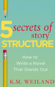
Case Study 30

Title: Catalyst

Author: Kristin Smith

Designer: Marya Heidel

Genre: Young adult, dystopian fiction

Graphics: The finely done illustration tells us several things at once. The protagonist is a teenaged girl. The book has something to do with her coming of age or maturing (the butterfly), and there is a scientific or genetic element to the story (the DNA strands).

The girl looks weary and wary. As it happens, she is one of only two students at her school who aren’t genetically modified. Everyone else is “perfect,” and that discrepancy is what the story hinges on. She is “odd girl out,” so to speak.

If the illustration has a weakness it is the disparity between the precision of the girl’s face and the haziness of the DNA strands and, less so, the butterfly. At thumbnail size the DNA looks like a blur, and the wings of the butterfly could be mistaken for two spheres or planets. It’s important for designers to keep in mind that, except on shelves of bookstores, book covers nowadays are seen first at thumbnail size, so each element has to be discernible even when small.

Typography: The title font is an unusual one. There is nothing particularly objectionable about it—it is legible enough—but it doesn’t suggest the genre. It might be just right for a book set in the Medieval era, given the font’s rough-hewn look, but it doesn’t seem to add anything here. Nevertheless, it has no real drawback (except see below).

The author name is in letters that are too thin, and they shouldn’t be in large and small caps. The same font could be used if it were in bold and all the letters the same height.

The series tagline, “The Deception Game, Book One,” is where one would expect a subtitle to be. It is so small as to be illegible even when the cover is seen at larger than thumbnail size. I would have put this tagline at the top in letters at least twice as tall. Again, there is the problem of using large and small caps.

There is a second tagline, “Perfection is Everything.” Where to put this? Before putting it anywhere, its size also should be increased substantially, and the period should be dropped, even though the tagline forms a complete sentence. Perhaps this tagline could be considered the subtitle and be placed immediately under the title, but that would bring back a spacing problem: to fit there, the text would have to be kept small.

The problem is with the descender to the Y. If the title were in all caps, there would be no descender, and the tagline/subtitle could stretch the full length of the title, allowing it to appear much larger.

As another alternative, the tagline/subtitle might be placed beneath the series tagline at the top, with its letters widely kerned to help distinguish the two lines from one another. Such a placement might necessitate lowering the girl’s face so the two lines of text don’t cover too much of her forehead.

Overall: This cover’s strength is the girl’s face, its weakness the size and placement of the text. At least the genre is plain enough. The cover makes it clear that this book is aimed at a young-adult audience and that it has something to do with the unexpected or the bizarre. Even as it stands, the cover deserves a solid B.

Case Study 29

Title: Lost and Forgotten

Author: Maurice Barkley

Designer: Ivan Zanchetta

Genre: Thriller

Graphics: This is an especially well done cover. Let me begin by pointing out something that makes it “work”: the dark area at the bottom. The designer prudently didn’t try to fill the whole space with a complex image. He left room at the bottom for the title, which stands out nicely. Imagine if the whole cover were as complex in detail as the locomotive. How could text be placed atop the image without obscuring a key part of it or without the text becoming hard to read?

The story takes place chiefly in the present, but showing a Nazi train and plane, even if only referring to the backstory, immediately suggests to the reader a tie to the past. I do have one question and one quibble.

Did locomotives of the 1940s have bells at the front, to warn of the train’s approach? Maybe they did, but, given the size and presumed loudness of this locomotive, it seems that a bell hardly could be heard above the clatter of the wheels and the roar of the engine.

The quibble concerns the lightning bolt that seems to be striking the bell. Perhaps the lightning is intended to be in the distant background, as at the upper left, and perhaps the bell just happens to be obscuring lightning that is far behind it, but it almost looks as if the illustrator is trying to convey a message by having lightning hit the bell. (If so, it would be a remarkably small bolt.)

Typography: A single font is used on this cover. It reminds me of James Hilton’s Lost Horizon, a story that takes place in the 1930s (even though I can’t locate a cover of that book that uses this font). In other words, this font evokes a period, and the period it evokes is the 1930s through the end of World War II, so it is quite appropriate here.

As I said, the designer prudently left lots of dark room at the bottom for the title to pop. Unfortunately, the same can’t be said about the top of the image and the author name, which is in thinner letters and against a less-contrasting background.

I would have put the author name in bold but kept it at the same size. The bottom of the text rests against the plane’s propeller and the locomotive’s smoke, so I would have pulled the image down slightly. I wouldn’t have done the simpler thing of raising the author name because that would have placed it too close to the top.

What about the tagline, “Book One—Discovery”? It isn’t clear how to interpret this. Is Lost and Forgotten the first book in a series called Discovery, or is Discovery the first book in a series called Lost and Forgotten?

I presume the former, since it would be strange to have the real title, Discovery, in such small text and the series title, Lost and Forgotten, looking like a title. If my presumption is correct, then I would have reworded the tagline to read “Book One in the Discovery Series,” or something like that.

The one element I would drop from the cover is the rule separating the title from the tagline. It’s unnecessary, since no one will read the tagline as part of the title, and it also conflicts graphically with the rest of the image. It’s the kind of rule one might find on a science fiction cover: galaxy-like, it’s more prominent in the center and fades at the two sides. Even in color tone it doesn’t match anything else on the cover.

Overall: Despite a few reservations, this cover must be counted a success. I suspect few aficionados of the thriller genre would pass this book by if they saw it on a bookstore shelf. The well-done illustration is enough to attract even people whose preferences lie with other genres.

Case Study 28

Title: Wasted

Author: John Byrne Barry

Designer: John Byrne Barry

Genre: Mystery

Graphics: The description at Amazon describes this book as “part mystery, part love triangle, part midlife crisis, and part political satire,” but that’s not what the cover says, at least not if you look at the graphics and don’t bother to read the smaller words.

If you do read the smaller words, you see “mystery” once and “murder” twice. That should be enough to tell you the book is a murder mystery, but what if you don’t read the words (which are not particularly large) but just notice the graphics? You likely will think this is a work of non-fiction, something about recycling, because what does catch your eye implies that.

The largest graphic element is the recycling symbol. It’s ubiquitous in our society. Whenever we see it, we think of garbage, sanitation, and the like. That will be the first impression here, unless other cover elements immediately counter that impression—but they don’t. They reinforce it.

The next most prominent element is the black circle in which the recycling symbol is positioned, and the other most prominent element is the green background. Taken together, these three elements suggest not a murder mystery but an environmental handbook.

That suggestion is all the stronger with the one-word title, which many may read simply as Waste rather than as Wasted. Drop out all the smaller text, but leave the author name, and you’d think this book might be a complaint about pollution or over-consumption, and that’s a problem, at least for the author.

Some prospective readers will take one glance and move on, misunderstanding the book’s genre. Thus, instead of helping sales, the cover may hinder sales.

Typography: There appear to be two fonts here, one for the three words within the circle, another for everything else. In its plain form, in the bottom-most text, the font appears weak because its lines are thin. In its bold form, as in the title and author name, the font is legible. I’d have kept this font only for the title and author name and would have used a sans serif font for the remaining text, including the words in the circle.

As for those words, why do they have periods after them? They aren’t sentences and wouldn’t make sense as sentences. Given the stark nature of the recycle symbol, the three words probably would look better in all caps. With upper- and lowercase they don’t stand out enough.

The subtitle is far too small. It disappears at thumbnail size, as does the series tagline at the top (“a ‘green noir’ mystery”). If this text were in a condensed sans serif font—that is, the condensed version of the sans serif font that should be used everywhere but for the title and author name—it could be twice as tall. As it stands, there is too much discrepancy between it and the title, and one may wonder whether it really is a subtitle or something else.

I mentioned the last line of text, which is the title of another book by the author. Is that book well known? Will someone looking at this cover say, “Oh, sure. I remember Bones in the Wash!” I suspect not.

This line and the line above it (“author of”) should go on the back cover of the paperback version and on the inside of the digital version. Unless this prior book is likely to be known, mentioning it here is little better than saying “this author has written another book,” which isn’t much of a selling point for the present book.

Overall: In part this book is a satire, so it is proper for the cover to include satirical elements. The three words in the circle (“murder, betrayal, aluminum”) are satirical because no one expects the third word. There is a tongue-in-cheek quality here, but it largely is lost because the graphics suggest a non-fiction genre.

This cover is a good example of cleverness getting in the way of the message.

Case Study 27

Title: Old Habits

Author: Ben Trebilcook

Designer: Ant Gardner

Genre: Mystery

Graphics: It is probably fair to say that this cover’s graphics did not require much time to produce. All we have are a stylized hand grenade and a blue background overlaid with a few white and black speckles. If the image tells us anything, it tells us this is a war story—except that it’s not. It’s a crime story, a mystery, even if it has wartime segments.

The graphics are so simple that they look simplistic rather than subtle or clever. They looked hurried rather than carefully prepared, and that likely will lead prospective buyers to suspect that the inside text also will seem hurried rather than carefully prepared.

To some people, particularly authors, this may seem an unfair inference, but buyers really do prejudge a book’s words by its cover. If a cover looks slapdash or amateurish, buyers will suppose that the words likewise will be slapdash or amateurish, so many of them won’t investigate further and will move on to some other prospective purchase. If this happens with every second viewer of the cover, then the author has seen his income from the book halved.

Typography: At first glance the title and author name seem to be in the same font, but they aren’t. The curves of the letters in the author name aren’t true curves but a series of angled strokes. The font used for the author name isn’t objectionable in itself, but it should be the same font as in the title or a font clearly distinct from it.

The chief problem with the title font is dullness. Here was a chance to choose a font that suggests motion or tension, at least something to contrast with the uninteresting background. On the other hand, if the text’s background were more interesting than a silhouetted hand grenade, this title font would have been fine.

Perhaps the largest textual problem is that this cover needs a tagline to indicate the genre, since the image fails to do that adequately—perhaps something using the protagonist’s name, such as “A Joe Brady Mystery.”

Overall: At Amazon this book has four reviews, all five stars. If the book had a better cover—one that intrigued while indicating the genre—it might have received several times as many laudatory reviews, not to mention several times as many sales.

However fine a book’s writing, the writing won’t be seen unless readers are attracted to the cover and then get past the cover to the text. A cover can be a door one wants to open or a door one wants to pass by.

Case Study 26

Title: Wind in the Fire

Author: Bobbi Gibb

Designer: Y42K Publishing Services

Genre: Sports, Memoir

Graphics: This story is about the author’s training to run the Boston Marathon. She was the first woman to complete the race, in 1966. You might expect a contemporary photo of her, taken during the months of preparation or during the race itself. She would have been in her early twenties then, but the photo shows a woman of retirement age. This means there is a disconnect between the woman of the story and the woman of the cover.

There is another kind of disconnect. Her image clearly has been pasted onto a beach scene. She floats above the sand—so far above that she leaves no footprints. Even the background image may be untrustworthy: can we be sure those pillars in the background are real, or has the surf been superimposed on them?

However that may be, this graphic presentation doesn’t deserve even a gentleman’s D. The author used a small help-you-publish company that promises full-service publication for just $275, plus another $100 for cover design. As far as the cover goes, the author got less than she paid for. It would have been better just to have her floating image or, better yet, an easily-obtained aerial shot of the Boston Marathon in its early years.

Typography: It seems that a single font was used for the title, author name, and tagline. The title and author name are in all caps, and they ought not to be, at least not with this font. In this version it isn’t meant to be used as all caps.

The proof is in the capital R, which has a long, serifed leg. The leg forces the following E either to be kerned too close, so that it almost touches the R, or, if properly separated from the leg, to be kerned too widely, putting too much space between the upper parts of the R and E.

Given the busy background, a thicker, sans serif font would have worked better for the title, which is in the wrong color: white. There isn’t enough contrast between the title and the light image behind it. The designer could have used black, taken from the runner’s leggings, or a dark shade taken from her sweater.

The author name is in a color similar to those found in the sweater—but not similar enough. The runner’s sweater has hints of green, while the author name has a gray tint. So close yet so far, and that just doesn’t work. I would have placed the author name in black in one line at the top.

The tagline is illegible at thumbnail size. The sand is sufficiently uniform to serve as the background to text, but this font is drawn too thinly to stand out at such small sizes. Besides, it would have been better in black.

In summary, I would have used black for the tagline and author name, moving the latter to the top, and a dark shade drawn from the runner’s sweater for the title, provided the title were in a thicker, sans serif font. Or, for the title, I might have chosen a color not otherwise in the image, such as gold.

Overall: This cover fails in almost every respect: the pasted-on image of the runner, the ludicrous absence of footprints, the irrelevant background when an image of a race could have been used, the inappropriate font, and the weak colors for the text.

Case Study 25

Title: Islandia: The Lost Colony

Author: C. J. Klinger

Designer: James Wintel

Genre: Science Fiction

Graphics: The cover features an eighteenth-century-style ship sailing beneath a mountainous island atop which is a futuristic city. A close view of the cover shows fine detail, particularly on the ship. Sailors on deck can be distinguished from one another, the rigging and sails are well executed, and even the crow’s nest is finely delineated.

The remainder of the scene sports less detail. Neighboring islands are in shadow, and the city seems drawn in a different artistic style; its lines are more suggestive than definitive.

On the whole, the illustration must be labeled as first rate, but it has one deficiency. At thumbnail size the city is indistinguishable as such. The viewer can make out the island and the glow around it, but it isn’t clear what sits on the island. It very well could be trees.

If that is what the viewer thinks he sees, then the cover no longer indicates science fiction. It fails to indicate the genre and may suggest a different genre, such as historical fiction.

I would have suggested that the designer rework the cityscape, removing most of the buildings and leaving just a few isolated structures that could be recognized immediately as buildings.

The finer the illustration, the more professional a cover looks, but the illustration also has another task: to indicate to the prospective buyer the book’s genre. Sometimes designers put so much effort into producing a lovely cover, as this one, that they overlook marketing considerations—or think that the professionalism of their work somehow can render the marketing part nugatory.

Typography: This is the first volume in a series. It could have used a tagline to that effect. If the tagline included an indication of the genre, the problem with the illustration might have been overcome—perhaps something along the lines of “Book 1 of the Distant Stars Trilogy.”

As for the text, it’s clear and says what needs to be said, though the subtitle is so much smaller than the title that one almost wonders whether it’s a subtitle or something else. I would have reduced the height of the title a little and doubled the height of the subtitle, which, at the current size, is hard to make out in the thumbnail.

Overall: Although this cover could stand a few tweaks, there is no mistaking that it’s been designed professionally. The professionalism suggests to the prospective buyer that the story is written professionally.

At least the prospective buyer is likely to click on the thumbnail and read the opening words of the book. If he does that, the cover has accomplished its chief purpose: it is a door that has been opened. At that point, the author’s words have to do the selling.

Case Study 24

Title: Movement

Author: Matthew S. Miller

Designer: Matthew S. Miller

Genre: Religion

Graphics: When I first saw this cover, I knew at once what the book was: an account of a long-distance hike during which the author “discovered himself.” But I was wrong. The text seems to have nothing to do with hiking. It’s a devotional book, designed to “equip you to rediscover discipleship as you find your own personal revolution.”

Why did I make this mistake in genre? Because the cover led me astray. Even the subtitle—A 40 Day Spiritual Journey—wasn’t enough to make me think this was a book about religion because many “self-discovery” hiking books use similar language.

In short, this cover failed to explain (at least to me) what the book’s genre is. This is a fundamental mistake. It is one thing for a cover not to make clear what a book’s genre is. It’s a bigger problem for it to imply an entirely incorrect genre.

There is another problem: the image contradicts the title. The title is Movement, which suggests action, but the image shows a hiker who is stationary. It would have been better to select an image that showed a hiker taking large strides along a trail.

Typography: The author name and title are in a serif font, while the subtitle seems to be in two sans serif fonts. At the least, the subtitle should be in just one font.

Let’s start with the title. Its font, with long serifs, has a chiseled look that might be appropriate on the pediment of an ancient Roman building. The font suggests a static condition, which is contrary to a sense of movement. It would be better to select a sans serif font that, through fluidity of lines, gives a sense of action rather than repose.

Another problem: the title’s letter spacing is too wide, bringing the word too close to the edges of the book. Similarly, the author name is set too close to the top edge, and it is far too small. It might be an interesting effect to enlarge the author name to the point where its length matches that of the adjusted title, though it should be in whatever font is used for the subtitle, leaving the title to have its own font.

As for the subtitle, here it is encased in a box that adds nothing—in fact, the box detracts since it draws the eye unnecessarily. It would have been better to make the two lines of the subtitle the same height and to boost the font several points above the current size of the second line. As it is, the first line of the subtitle is easy to miss.

The letter spacing of the second line of the subtitle seems to have been tightened, for no clear reason. Even with the box there is plenty of room for normal letter spacing.

Overall: This is a good example of how a cover can throw prospective readers off. If only half of them made the mistake I did, thinking this was a book about hiking, that could mean a substantial reduction in sales.

How many fewer copies of Charlotte’s Web might have been sold if that children’s book’s cover had featured scary-looking spider webs á la an Indiana Jones adventure or, worse, spider webs as seen on horror-story covers?

Case Study 23

Title: Gentleman with a Loaded Gun

Author: Emmanuel Obi, Jr.

Designer: Emmanuel Obi, Jr.

Genre: Thriller

Graphics: The first problem is that this is a floating cover, the fault of using a white background. At thumbnail size the illustration and text seem unanchored. Fortunately, at the Amazon sales page a thin rule and slight drop shadow have been added, giving the cover boundaries.

The only graphic is a silhouette of a man in a trench coat. Is he walking toward us or away from us? It’s impossible to say. His feet are in a line, making him look like he has but one leg, and we can’t tell which way his feet are pointing.

The title tells us that he has a loaded gun, but there is no hint of a gun in the silhouette. Perhaps he has a concealed carry permit, but it would have been better to show him holding a gun in a slightly extended arm.

Typography: When I first saw the cover, I presumed the author was Bruce Howard and wondered why the double-volume notice was placed directly under his name. Then I realized that Bruce Howard is the protagonist and that the author name is at the top in small letters.

Let’s begin with the font. It’s the kind one might have found on theatre marquees decades ago, but here it does little but make for difficult reading. If it’s meant to evoke a certain era, it fails. Only the man’s hat suggests that the stories take place no later than the 1950s. It would have been better to use a more legible font.

The protagonist’s name is much larger than the title. If the protagonist were famous—say, Sam Spade or Philip Marlowe—that might make sense, but few readers ever have heard of Bruce Howard. With rare exceptions, the title should be the largest text on a cover, with the author name next largest. Here the author name is the smallest, which is why I thought the protagonist’s name was the author name.

Instead of “Vol 1 & 2” (notice the lack of a period), I would have used “Books 1 & 2,” which is the more common formulation and gets around the problem of using an abbreviation. I would have put the series information at the bottom, something like this: “Books 1 & 2 of the Bruce Howard Series.”

Back to the author’s name. It has an underline, which serves no purpose, and “Jr” should be followed by a period. The font needs to be boosted several points, but first there needs to be a new font, one for the author name and series information, another for the title.

Overall: No prospective buyer will suspect that this cover was designed by a professional, and surely others will have the confusion I had with the protagonist’s name being taken for the author name.

The few reviews the book has garnered praise it for its prose, but how many will see the prose if they can’t get past a cover that looks amateurish to them? A cover should be like a door that invites one to open it, not a door from which people shy away.

Case Study 22

Title: Simply Faulkner

Author: Philip Weinstein

Designers: José Ramos (illustration) and Scarlett Rugers (text)

Genre: Biography

Graphics: This short book (118 pages) is part of the Simply series: Simply BeethovenSimply EdisonSimply Hitchcock, and so forth. Most of the covers are like this one, with a caricature of the subject and text placed in a uniform pattern.

Anyone the least familiar with William Faulkner will recognize him immediately here. The illustration is well done. On a signpost behind Faulkner is the name of his fictional locale, Yoknapatawpha County, but that clue isn’t needed: the author’s visage is enough.

By their nature, caricatures exaggerate features, but there is an oddity here: Faulkner’s pinkie isn’t his littlest finger but his largest and is shaped like a thumb—and he otherwise doesn’t seem to have a thumb.

The illustration reaches to the very edges of the cover. For the paperback version of the book this could be a problem, since the outside edge might be trimmed off and the inside edge might bend around onto the spine. The illustration should have been reduced slightly, giving it air on all sides. Note that Faulkner’s typewriter butts against the head of the man in the series logo at the bottom of the cover.

Typography: At the top are the title and author name. The first word of the title, Simply, is on a line of its own and is set not quite flush left. It doesn’t square up above Faulkner, and its underscore runs a little too far past the Y in Simply. It isn’t clear why there is an underscore at all. It seems to give false emphasis to the less-important word, Simply. I would have left out the underscore.

The main word, Faulkner, is kerned poorly. Compare the fairly wide space between the F and A with the lack of space between two other pairs, the K and N and the N and E.

This appears to be one of those fonts not intended to be used in all caps because the serifs are so large that the letters can’t be placed close to one another without some serifs overlapping. Perhaps the font had a separate small-caps variation. If so, that variation should have been used. If not, another font should have been chosen.

I suspect the designer chose this particular font because of its rustic appearance, Faulkner’s novels being set in a rural part of Mississippi. It often is a good thing to try to match fonts to themes or locales, but the font here might not be suitable for use in all caps. There likely would have been no problem with kerning had Faulkner been set in upper- and lowercase.

Notice that the remaining word of the title, Simply, and the author name are in different fonts. Why aren’t they in the same font? Given the strong serifs and fractured look of the word Faulkner, I would have chosen a single sans serif font for the other words. That would make Faulkner stand out more. As with the illustration, I would have brought in the text a bit from the sides, keeping in mind paperback trimming.

Overall: The strong point of this cover is its illustration, the weak point its typography. There could be some adjustment to the hand, and there really ought to be some adjustment to the text. It is the former that earns this cover a solid B and that latter that prevents it from earning a higher grade.

Case Study 21

Title: The Dark Sacrifice

Author: Jay Bower

Designer: MibleArt Design

Genre: Horror

Graphics: There is an element of spookiness in the photo, a function of the camera angle, the distortion of the trees, and the black-and-white palette. But does the photo suggest “horror”? Apparently not in the mind of the author, who added a tagline that says “A Horror Novel.” Such a tagline wouldn’t be needed if the cover image clearly indicated the genre.

The book opens with this line: “Ten-year-old Todd lay motionless on the bloodstained sacred altar.” Immediately the reader connects the title to the story. Why wasn’t the cover image chosen to match? An image of a bloody altar—say, a rustic one made of massive rocks—not only would have matched the title but would have made clear the genre. There would have been no need for the tagline, as least not as written.

Typography: Step back from the monitor and look at this cover. Which text stands out the most? Right: the author name. It’s white against dark gray, and so the contrast is strong. It can be seen from a distance.

Now look at the title and subtitle. The chief reason they don’t stand out as much isn’t the choice of font or even the text size. It’s the color. This is another example of red text against a dark background. Usually the offending background is dark blue, but gray can be as poor a choice, as here. I presume the designer chose red for the title and subtitle because this is a horror story, and horror implies blood, right? But symbolism shouldn’t outweigh legibility.

Now consider the title. How many words does it have? At first glance it appears to have two: Dark Sacrifice. But look carefully to find the tiny The that is only as tall as the strokes of the other letters are thick. Why this great disparity in size? It would have been better to make The the same size as the other letters. There is plenty of room for it on the first line.

Better yet, though, would be dropping The entirely. It isn’t needed. It adds nothing. When titling a book, as when writing its text, one should strive to eliminate words that aren’t doing productive work, and in this title the article adds nothing.

Now let’s look at how the title lettering is used. The letters are maneuvered behind and in front of the trees’ branches and trunks. Any particular branch passes behind some letters and in front of others, almost suggesting an attempt to mimic an M. C. Escher illustration. The result is that the letters look blotchy and so are somewhat difficult to read at thumbnail size.

Overall: It would not have taken much to make this a strong cover: a different color for the title and subtitle text, the elimination of a word, and the use of an image that doesn’t settle for “spooky” but says “horror.”

Intermezzo 2

I belong to a writers club in my town. Its monthly meeting attracts as many as 60 members, depending on the subject of the main talk and the notoriety of the speaker. Prior to the main meeting there is a meeting of the marketing group. It meets for an hour and attracts about half as many people.

The marketing group has its regular participants and its occasional participants. All of them are anxious to learn how to let more prospective customers know about their books. Most participants have a single book to their names. A few have half a dozen or more, and others are still working on their first books.

Clubs such as this one attract writers of varying skills and experience. Some actually are good writers. Some have had modest success in marketing their books. Most are in no danger of winning literary prizes and are surprised when their monthly unit sales reach double digits. Occasionally a writer will report on a book signing event at a book store. Some around the table will perk up at the mention of five or ten copies being sold. For them, that would be a windfall.

I confess I remain surprised at how few attendees appreciate the role of their books’ covers. They don’t seem to understand that the book cover has taken on a new function in the age of digital books: the cover now is a book’s chief marketing tool, eclipsing all else. Even people who prefer to make their purchases at brick-and-mortar book stores commonly discover the books they want online, and all those who no longer frequent book stores (the majority of purchasers) find what they want at Amazon or similar sites.

At a book store, a buyer might pick up a book with a ho-hum cover simply because he’s standing in front of the shelf where that book resides. He may not be impressed by the front cover, but he might find something on the back cover to keep his attention. He can flip through the pages. He can heft the book. He can look at the cover from several angles, and he just might buy the book, even if its cover otherwise displeases him.

That same buyer, sitting before his computer at home, operates differently. In a few minutes dozens or even hundreds of book covers pass before his eyes, once he visits an online seller. Each cover will be the same small size. The books may be grouped for him by genre or author, but otherwise he is on his own.

His eyes pass from one cover to the next, lingering only a second or two, until a cover captures his attention. He clicks on it and is taken to a page touting the book’s virtues, the author’s skills, and the low price, as least as compared to the print version. He sees a long or short description of the book. He is unable to flip through the pages in a tactile way, and he may have to click on the print edition to see the back-cover blurbs, but he gleans enough information about the book to make a decision.

What is it about a book’s cover that captures the buyer’s attention? An interesting graphic treatment, an intriguing title, text that is legible, an overall style that indicates the book’s genre—those are things the buyer reacts to even if not quite consciously. He “likes” the cover, even if he wouldn’t be able to explain just why.

If a cover doesn’t attract him, he doesn’t click through to that book, perhaps to his loss. It might have been precisely the book he was hoping to find, but he won’t know because he won’t get to the first page. He won’t see the author’s words because he won’t get past the cover.

In the early days of printing, from Gutenberg onward, a cover’s chief role was to protect the pages from the elements. Not until the twentieth century, with the advent of dust jackets, was there much room for artistry on covers. Before then, covers were noted for their leatherwork or binding, but they did little to attract purchasers who otherwise hadn’t been looking for those particular volumes.

(I have a forty-volume set of the collected works of John Henry Newman, published by multiple publishing houses over a several-year span in the 1870s and 1880s. The leather covers are wonderfully designed, with raised ribs and gilt lettering. They are among the handsomest books I’ve ever seen, but those covers were not marketing devices per se.)

Paperbacks didn’t come into wide use until after World War II. In parallel with the general expansion of advertising, their covers became tools to foster sales, though few early paperbacks sported covers that could be called first-rate designs. Over the succeeding decades paperback covers improved only slowly, perhaps understandably so, since nearly all books were purchased in book stores, where they could be held in the hand and considered at leisure.

Then came online book stores and self-publishing. Competition for eyeballs became intense—and remains so. Throughout the era of paperback domination and, before that, of hardbacks, advertising for books largely was independent of the books themselves. There were ads in newspapers, magazines, and, of course, catalogues, but all that largely has disappeared. Display ads once turned a profit for publishers. They long have ceased to do so. Today the dynamics are different, which means the purpose of covers is different.

I hope over time to find ways to impress upon members of my writers club that they need to become as serious about their books’ covers as they are about their books’ words. Not just that: I want to impress upon them that, while they might occasionally use other means of promotion, such as book signings, their sales chiefly will come—if they come at all—as a consequence of buyers seeing their covers and delighting in them.

Two and a half centuries ago Samuel Johnson quipped that “No man but a blockhead ever wrote, except for money.” In his case—at least until he received a pension from the King—that literally was true. If Johnson didn’t write, he didn’t eat. But not everyone then or now writes for money. Some people just want to see their words enshrined in print, and they don’t much care whether anyone else ever reads what they wrote.

But most writers, even the most inexperienced, hope to have a wide readership. That requires wide sales, and nowadays wide sales require fine covers. That’s just the way it is.

Case Study 20

Title: End of the Wild

Author: Jason Taylor

Designer: Cakamura Studios

Genre: Fantasy

Graphics: This is a story about a young couple that finds itself shipwrecked on an island off the British Columbia coast. The island is populated by “legendary creatures” from native mythology. Does the cover convey that?

Not really. There is no indication, in the image, of shipwreck or island or strange creatures. (The tree-studded background could be part of a long, continental coast rather than an island.)

When I first saw the cover, I thought the book was a non-fiction account of a sailing adventure. In fact, the sailboat at rest in calm water is deceptive, because there is no such scene in the book. The very first paragraph has the boat’s hull breached by rocks, and within a few paragraph the boat sinks and the man and woman find themselves on the shore.

I suspect this was a case of the designer finding a pretty photo and settling for it. It’s easy to imagine how an illustrator might have worked up those initial paragraphs into a compelling cover, but perhaps the author was on a tight budget and couldn’t afford an illustrator.

Typography: Not a few outdoor-adventure books use thin fonts, such as Helvetica, with widely-spaced letters, as here. Nothing wrong with that, though nothing innovative either.

The title is legible enough, but the author’s first name gets lost in the mist on the hillside. It’s hard to say how to fix that problem while keeping the image.

Perhaps the first name could have been stacked atop the surname, thus making almost all the text flush right. (If the title lines were closer together, even the first word could have its own line, without forcing the last word of the title onto the light-colored water.)

Overall: The biggest problem with this cover is that it doesn’t suggest the genre. For that matter, it doesn’t even suggest that this is a novel.

Case Study 19

Title: Method Acting for Writers

Author: Lisa Hall-Wilson

Designer: Lisa Hall-Wilson

Genre: Writing

Graphics: Perhaps the first thing you notice about this cover is that it doesn’t look like a cover. It looks like floating text-plus-image. The problem is the white background.

On this page, and at the book’s product page at Amazon, the text and image seem unanchored. If a cover uses a white background, the thumbnail will look odd unless there is a thin rule around the four sides. Of course, that rule wouldn’t be used in the print version; for print, a white cover is fine. But for an ebook cover or for the product page image of a paperback? No.

The stock image doesn’t suggest acting and doesn’t suggest writing, and it doesn’t quite suggest layering either. It looks like stacked fruit, not layered fruit. I suppose a sliced onion (which everyone recognizes as having layers) would have sent undesired signals, so this kind of image might be the best that was easily available.

Typography: As a rule, one should avoid ending a title line with a preposition, but in this case it might be okay. If “for” were put on the third line, that line would be the widest of the three, and some may think that having the middle line be widest—as here—is more aesthetically pleasing, so let it pass.

The subtitle needs help. The text is too small. If “Using” were moved to the second line, the two lines would be of nearly equal length. The adjusted lines would allow the subtitle to be enlarged to something approximating half the height of the title. As it stands, the title and subtitle are too far apart in height.

Aiming for a ratio of 2:1 usually seems pleasing, especially when the title is all caps and the subtitle is mainly lowercase.

Overall: This cover is functional. There is nothing greatly wrong about it—but nothing greatly right either.

Case Study 18

Title: The Power of Creativity

Author: Bryan Collins

Designer: Bryan Collins

Genre: Self-help

Graphics: The stock image isn’t bad, although it might suggest ingenuity rather than creativity. The animals are trying to reach the ivy, but why does the ivy dangle from the word “success”? Is this a not-so-subtle hint by the author? If so, it doesn’t quite work. It would have been better to leave plenty of space between the ivy and the words.

Typography: Non-fiction books usually feature fairly plain fonts, whereas many fiction genres feature fonts that somehow suggest their genres, such as curlicued fonts for romance novels. We see two fonts, a sans serif for the title and a serif for the author name and subtitle. Given how many words there are in the subtitle, I would have switched the fonts, using the serif for the title and the sans serif for the remaining words.

Placement of the text is the chief problem here. The author name is too small and is too close to the top of the cover. If the book were to be printed as a paperback, trimming might result in the author name ending up right against the top, and that would look awful.

A bigger problem is the size and placement of the subtitle. The first phrase, “how to conquer procrastination,” is so long that it hardly can be increased in height without the words butting against the sides of the cover. It would have been cleaner to drop the “how to” and just get right to it: “conquer procrastination . . .”

Notice that the second line of the subtitle ends with a conjunction, a construction that one should try to avoid. And notice the lack of an Oxford comma—that is, a comma at the end of the second of the three items. The subtitle ought to read this way: “conquer procrastination, finish your work, and find success”.

The subtitle should be stacked in three lines, as here, but with the shortening of the first line and the moving of “and” to the third line. The shortening would allow for larger text: about twice as large should do.

What about “find success” being in bold? Perhaps the author wanted to give the cover a little more oomph (“Everyone is looking for success!”), but bold, on its own, rarely does that. Better to have been consistent with the font weight, using regular instead of bold all the way through.

One last problem: red text against a blue background. It isn’t so bothersome here as in some other covers because the blue is solid and light, but, nevertheless, red and blue clash. They don’t sit well with the eye. I would have drawn some color from the giraffe’s back instead.

Overall: If you wish to put yourself forward as an authority on developing creativity, your book cover needs to be creative. It needs to tell the prospective buyer, visually, that you are creative. This cover doesn’t do that. It clearly consists of a stock image overlaid by uninspiring text. It doesn’t have that “wow” factor one would expect on the cover of a book touting the secret path to creativity.

An adventure story cover should look adventuresome, a romance story cover should look romantic, and a self-help book about creativity should look creative. This one falls short.

Case Study 17

Title: Sealing Death

Author: Basil E. Bacorn

Designer: Basil E. Bacorn

Genre: Fantasy, young adult

Graphics: The graphic treatment here is, shall we say, minimalistic: a green, corrugated background on top of which lies a blue, textured splotch. The best I can do is to guess that the green represents grass and the blue a pond, though the green doesn’t look like grass, and the blue doesn’t look like water.

Whatever these items are supposed to be, in no way do they indicate death or even the book’s genre. At best they confuse or mislead the reader. It would have been better to use a cover without graphics at all, one with just a solid color. That would not have made for a good cover, but at least it would not have induced the wrong kinds of questions.

Typography: The title font seems to have been designed by someone who was having a bad day. It’s hard to imagine any situation in which the font would be appropriate. It certainly adds nothing here. The font’s odd serifs don’t say “fantasy” or “young adult” or even “death.” Even Helvetica would have been a better choice.

The author name appears in too small a size and too close to the bottom of the cover. It is preceded by “by,” a major gaffe. It likely is impossible to locate a book published by one of the Big 5 publishers that sticks “by” before an author’s name. There’s a reason for that: “by” adds nothing. The prospective reader already knows, from experience, that if a cover sports a person’s name—especially if that name is in sufficiently large letters—that person must be the author.

Overall: I should note that, at Amazon, the author identifies himself as a high school student. If a middle-aged writer had produced such a cover, I would have little hope of reformation, but most teenagers are capable of acquiring new skills. The author is to be commended just for being an author at his age, but he needs to learn that his words are unlikely to find an audience unless they are packaged reasonably well.

Case Study 16

Title: Forest Child

Author: Heather Day Gilbert

Designer: Seedlings Design Studio

Genre: Historical Fiction

Graphics: This is the second book in a series built around Viking explorations. The protagonist, Freydis, is the illegitimate daughter (“forest child”) of Erik the Red and half-sister to Leif Erikson—all three actual historical figures. In a legendary account Freydis is pictured as braver than many of the men she explored with, and the book is written on that premise.

In the cover image we see Freydis depicted as a young woman, her face showing quiet determination. Her hair, appropriately, is red (her father got his moniker from the color of his hair and beard). We see arrows poking out from a quiver, thus a hunting or military connection, and in the background, partly obscured in mist, are trees—an implication of “forest child.”

The image thus presents several elements of the historical character and the fictional character, something not commonly done well on book covers. As in most such covers, the protagonist looks twenty-first century (Vikings didn’t sport sculpted eyebrows, and is that a hint of lip gloss one sees?), but that concession to commercialism doesn’t detract from the overall effect.

Typography: Two fonts are used, one for the title and author name, the other for the tagline. The author name is set in a bar at the bottom of the cover. Often such bars conflict with the associated image, but here, because of the multiple horizontal lines and the gray and brown colors, the bar seems to work. The kerning doesn’t quite work. Notice that the T and H in “Heather” are touching.

The font used for the title and author name has an embossed, three-dimensional look. That’s not necessarily bad, but it isn’t necessary, given the effective three-dimensionality of the image. Such fonts aren’t uniform in coloration; slight alterations in tone are needed to suggest the third dimension. That sometimes is problematic, since a secondary tone might be lost in the background, thus making the font look slightly broken. I would have used a simpler, flat font here.

The bigger problem is with the tagline. It is illegible at thumbnail size and almost illegible even at Amazon’s sale page for the book. I’d have reworded the tagline slightly: “Vikings of the New World Saga Book 2″—which actually is how it is at Amazon. That would have saved nine characters and spaces, allowing the font size to be boosted by a couple of points.

As it is, the tagline is too close to the protagonist’s head. Since a larger font would make the tagline closer still, I’d add more free space above her head, making that area about twice as tall as it now is. This could be done by shrinking her image slightly and by moving it a bit lower.

Overall: This cover has to be rated a success, despite minor flaws with the typography. Even at thumbnail size it says “professional,” which is precisely what any author should want.

Case Study 15

Title: Fate

Author: Maya Mirza-Gill

Designer: Maya Mirza-Gill

Genre: Young adult

Graphics: This is the third book in a trilogy. The others have similar covers: a silhouetted figure and lightning. Perhaps the author/designer felt obligated to keep the style uniform, once the first volume was published. That’s understandable, but it would have been better to have turned to a professional for the later volumes. As it is, this one has the least intelligible image, which, unfortunately, is cut off at the top and bottom by large black swaths.

Typography: The title has a drop shadow to make it stand out, an indication that the wrong font was chosen—but at least the color is correct. There seems to be a single font used on the cover. It would be better for the title to be in one font—say, a serif font, as here—and the rest of the text to be in a sans serif font.

The biggest problem with the text is that it isn’t big enough. At thumbnail size everything except the title is illegible, and even that is too small.

The tagline, which hugs the bottom and is oddly divided, actually has nothing to do with this book. It’s praise of the first volume in the series. That kind of thing “works” only if the one giving the praise is famous, but that isn’t the case here.

Overall: Stand back from the monitor a bit and look at this cover. It’s hard to distinguish anything, other than the title word.

A cover is a book’s most important marketing tool, and this is truer for ebooks than for print books. An ebook cover needs to catch a buyer’s eye in seconds, or it won’t catch it at all. There is nothing catchy here, and, for Fate, that may have proved fatal.

Case Study 14

Title: Sacred River

Author: Debu Majumdar

Designer: Evolution Design

Genre: General fiction

Graphics: This novel tells the story of a journey along the Ganges, so it is natural that a photo of the river would be the main graphical element, but this photo fails. If you remove the text from the cover, it’s not clear whether the water is a river, part of the ocean, or perhaps even a lake. In any case, nothing about it says “Ganges.” It would have been better to use no river image than this one.

Typography: Except for “A Novel,” all of the white text has a drop shadow behind it—and with reason. White text against white or light blue is difficult to read, and the drop shadows don’t resolve the problem. Solid black would have been better, assuming this photo was retained.

There seem to be three different fonts: one for the title, one for “A Novel” (why does the least important text get a font of its own?), and one for the subtitle, tagline, and author name. As a rule, a cover should use one or two fonts, and there is no clear need to break that rule with this cover.

The tagline wastes an opportunity. It ought to say something about the hero’s adventure, but it tries to speak to the reader directly: “An adventure through India that will touch your soul.” Then it adds, “Compelling and powerful”—which adds nothing. Such fog words don’t clarify; they obscure, and they ought to be omitted.

The tagline is the place where a book—particularly a novel—should demonstrate intrigue. It should make the prospective buyer wonder what the book is about while inducing him to lay down money for it. It should say something about the protagonist, but this tagline only hints that there is a protagonist.

Overall: The opening paragraphs of the book give the reader a murder, the quick, accidental death of the murderer, and an unbroken numerical code. That’s a promising opening, but you never would suspect this book to have such action at the get-go, at least not from the cover.

The designer seems to be someone whose work chiefly is with designing websites. This would have been a good instance to be strict with oneself and to have used a designer experienced in designing book covers.

Case Study 13

Title: Through the Barricades

Author: Denise Deegan

Designer: Lawston Design

Genre: Children’s fiction

Graphics: The story is set during World War I, so the background of the image is appropriate, though it’s difficult to make out at thumbnail size or even at the size used here. Only at full size can one tell that the young woman stands in front of a front-line trench and that soldiers are at the top of it. Apparently she is a nurse: she wears an apron with a red cross on it, but the haziness of that part of the image and the overlay of text make it a bit hard to see that she in fact is wearing an apron.

I understand why authors like to put “seals of approval” on their covers, but often, like here, it’s hard to make those work with the rest of the graphics. Certainly I’d include a seal testifying that a book won the Newberry Medal or even one of that award’s three honorable mentions, but most seals, as with the Spark Award, don’t have remotely the same cachet, and I wonder whether using them compensates enough for the intrusion they make on the cover.

Typography: Start with the author name. Here is a good use of red text. As I have said in earlier case studies, and as I no doubt will say in future ones, red text demands a light background, from white through beige to tones of yellow, as here. Too many author-designers, and even some professional designers, place red text against a dark background (often blue), but in such a case the red doesn’t pop. Here it does.

The title font is less interesting than the author-name font. Its greatest problem is that its thin lines don’t stand out enough against parts of the image, particularly the dark area with the pendant. The author name works fine with thin letters because there is nothing behind it. Here thicker letters were needed.

The blurb from author Hazel Gaynor is weak tea: “a thoroughly compelling book.” Those words carry almost no meaning. Surely they could have come up with something that either gives a sense of what the book is about or somehow singles it out from the author’s other books. Since this blurb adds nothing, it should have been left out.

Overall: The strength of this cover is in the young woman’s face: determined, perhaps already knowing too much, perhaps soon to find the war too much for herself. It’s the face that carries the day, but the rest of the cover is fairly good too.

Case Study 12

Title: M.I.A.

Author: A. L. Davroe

Designer: Cover Quill

Genre: Thriller

Graphics: The strongest part of this cover is the image: dead arm on dead leaves, all in blue-gray tones. The arm seems totally relaxed, without weight, and, in its paleness, without blood, as cold as the carpet of leaves.

Typography: There are three typographical elements here: one good, one questionable, and one bad. Let’s start with the bad. The ornaments in the upper corners serve no useful purpose; worse, they undermine the somberness of the cover. The image is of death, but the ornaments are light, swirly, even exuberant, and instead of highlighting the title they compete with it. They should be omitted entirely, allowing the title to be larger.

What about the title? It’s in a peculiar font for no apparent reason. The wide serifs don’t contrast well with the bed of leaves. It would have been better to use a chunkier font, whether sans serif or one with modest serifs. As for the font used elsewhere, it’s fine, at least for the author name. For the tagline it should have been semi-bold, to stand out better against the background.

And what about the tagline? It could have been tightened up to read: “Only the dead know where the missing go.” That would eliminate the question mark and the ellipsis.

Overall: A good cover, on the whole. The strong image partly makes up for typographical weaknesses. The author used a professional designer but may have deferred too readily to the designer’s judgment. It’s usually good, and often necessary, for an author to second guess a designer. That would have helped here.

Case Study 11

Title: A Sidekick’s Tale

Author: Elisabeth Grace Foley

Designer: Seedlings Design Studio

Genre: Historical fiction

Graphics: In Death Valley, at the intersection of two far-from-civilization dirt roads, is Teakettle Junction. The wooden directional sign there is adorned with dozens of battered teakettles placed by passersby. The teakettles and the sign give the site a Wild West flair. Similarly with this book’s cover.

Here the sign has four direction arrows. Instead of naming destinations they give the title and author. Hung on the sign are three items symbolic of the story’s era and plot: a rifle, a cowboy hat, and a wedding ring. The latter is a bit hard to make out, even though its size is grossly exaggerated. Th silver and white of the ring are too similar to the pale blue of the sky and the white of the clouds.

In the background are galloping horses pulling a wagon, a windmill, barbed-wire fencing, and five inappropriate birds. I call the birds inappropriate not because they’re there but because they seem to be seagulls, not the hawks or vultures one would expect to find in an end-of-the-nineteenth-century story set on the plains.

But that’s a minor point. All in all, the illustration is clever and conveys what it needs to convey. Aside from changing the birds, I would have saturated the colors more—particularly the sky—and would have made the rifle larger, to match the hat in relative size. (The ring would have to remain large; if it were reduced to its true size, relative to the hat and rifle, it would be invisible.)

Typography: There is but one font, used for both the title and the author name. It works well and suggests the locale and era. Many fonts that try to do the same overdo themselves. They end up looking like caricatures rather than authentic representations of a certain time and place. Not so with this font.

The author name is long. That could make placement difficult, but here there is no problem. Her name is legible (and it even sounds like a name from the era in which the story takes place).

The only thing missing, in terms of words, is a tagline. One easily could be placed at the top, if the sign were lowered slightly and if the two birds at the top were removed. The book description at Amazon says A Sidekick’s Tale is “a hilarious tangle involving an emerald ring, a fearsome aunt, a scheming suitor, and a team of runaway mules.” A compressed version of that would work well as a tagline, and it would confirm that this Wild West story is humorous and fun.

Overall: This is an effective cover. I read the first few pages of the book to see whether the cover gives a true sense of the story, and it does. Many covers fail that simple test, leaving some buyers regretful. They think We’re Having Grandma for Dinner is about happy multigenerational relationships only to discover it’s a culinary horror story. No danger of that with A Sidekick’s Tale.

Intermezzo 1

There is the critique of a cover, and then there is the critique of the critic. Let me share an account of how not to handle criticism that is negative, even if only mildly.

Joel Friedlander runs a site popular with indie authors, The Book Designer. He has written several books useful to self-publishers, offers training programs, and sells a wide array of book-design templates for use in Microsoft Word, Apple Pages, and Adobe InDesign.

For seven years Friedlander has run a monthly cover design contest. Authors of published books submit their covers for consideration and comment. An average month might feature one hundred covers, three quarters of them fiction, the rest non-fiction. Friedlander chooses a winner from each category and gives gold stars to also-rans. To most books he gives one or two sentences of comment. About some—including most of the worst-designed covers—he politely says nothing.

Usually the winning covers are by professional designers. A few names rise to the top repeatedly. On occasion a winning cover will have been designed by the author, but this is rare. Usually author-designed covers are easy to spot because of their artistic and typographical limitations.

The cover of The Kitty was submitted for the June 2017 competition. The designer was the author, Shawn P. Flynn. Friedlander gave two sentences as comment: “Ah, who doesn’t love cats? This amateur cover makes it clear what you will find inside.”

I suppose that could be taken two ways, regarding “what you will find inside.” It could be taken to mean that inside you will find stuff about this particular kitty, or it might be taken to mean that inside you will find writing as amateurish as the cover design. The author took it the second way, but I think most people would take Friedlander’s comment the first way. After all, the book is about a cat “Who Rescued Me After I Rescued Him.” The subtitle pretty much explains “what you will find inside.”

The author was dissatisfied with Friedlander’s short remark and wrote a comment at The Book Designer:

“Thanks for your comments about The Kitty Who Rescued Me After I Rescued Him. We actually field tested several cover concepts, and this was the one that was preferred by the overwhelming majority of participants across all testing platforms (mostly cat lovers). It was designed to have a similar look and feel to James Bowen’s bestseller A Street Cat Named Bob, published by St. Martin’s Press.

“As for the interior, we designed it after reviewing your templates. So, one could argue that even you helped to design the book. Amy Collins [author of a book on self-publishing] also provided feedback on both the cover design and the interior. Judging from the reviews on Amazon (currently 4.9 out of 5 stars) and the other favorable reviews received, target readers have been delighted with the book! But, what do I know, right, heck, you’re The Book Designer.

“Thanks again for your comments, Joel, and I hope you are having a great day!”

Friedlander replied more diplomatically than I might have been inclined to:

“Shawn, I’m glad you ‘field tested’ your cover and that your book is well reviewed. It’s not uncommon to find books that are selling well despite bad or ineffective covers. (Although one wonders how much better they would be selling with great covers!) As long as your target market has no objection to an obviously amateur book production, what’s to worry?”

Friedlander didn’t back down. He was firm yet polite: “Your cover seems to be working? Great! But it’s still a bad cover.”

Flynn, not knowing when to stop, wrote another comment:

“Joel, it doesn’t take a rocket scientist to recognize that you can’t make the comment ‘amateur book production’ without having evaluated any other part of the book including the spine, back cover, copyright page, rest of the interior, or even reading the story (although I expect now you’ll say that you did). You remind me of a cliché and lose all credibility as a result.

“I see, however, that you typically select one person each month to be an opinion to. And judging from the language at the top of this page about ‘constructive criticism’ and then not providing any constructive suggestions, you clearly are attempting to simply create controversy with your comments. You obviously don’t understand how constructive criticism is defined. It is unfortunate that you feel the need to be such an opinion to visitors of your website. I hope you feel better about yourself now.

“But, I get it, because I didn’t pay you to create my cover or participate in the process, it must be an amateur production. I find it particularly revealing that you did not address my comment that the interior is based on one of your templates. As such, my ‘amateur book production’ must make use of an amateur book template. Therefore, your readers should note that you are selling book templates that are of amateur quality.

“You know what they say about opinions, Joel, and apparently you are just one big opinion!”

Let’s take this paragraph by paragraph.

The monthly cover design contest is a contest about cover design, not about a book’s interior layout. (If it were about interior layout, it’s hard to see how evaluating the copyright page would be an important part of that.) Nor does one need to read the story to judge the cover.

I will say this, having looked through part of the book: the copyright page is handsomely designed. It looks quite professional, as does the table of contents. But the actual contents do not. Amazon lists this paperback as having 102 pages, but the pages are double-spaced, giving them an odd look. Flynn claims that the layout was “based on one of [Friedlander’s] templates,” but apparently no template by Friedlander was purchased or used (none of them feature double-spacing).

As for Flynn’s second paragraph, he accuses Friedlander of “attempting to simply create controversy” with his comments, but it seems evident that Friedlander tried to do precisely the opposite by saying little about a cover he considered to be poorly-executed.

In his third paragraph, Flynn accuses Friedlander of panning his cover because there was no backsheesh. Friedlander must have called the cover amateur only because he saw no money coming his way. “[M]y ‘amateur book production’ must make use of an amateur book template,” pouted Flynn—a template that may have inspired him though he didn’t purchase it.

In this exchange Flynn did everything wrong. His remarks—and his attitude—should be a lesson for authors who design their own covers. The odds are that such covers will have problems that the author-designers will be unconscious of. They might be taken aback by a reviewer’s comments, even when those comments are phrased kindly, as were Friedlander’s in this case.

When that happens, it usually is good to remember the admonition “mum’s the word!”

Case Study 10

Title: The Legacy: Dax

Author: G. G. Atcheson

Designer: Yanik Dallaire

Genre: Science fiction

Graphics: This cover was designed by the author’s son, as were the covers of the three other books in the series. Of the four covers, this is the least satisfactory in terms of graphics.

The entire page is surrounded by what at first seems to be a black border but on inspection turns out to be an image of a star field. If a cover is chiefly white or a very light pastel, it may be necessary to use a thin black border so the cover won’t appear to be floating when viewed at thumbnail size at Amazon. But when a cover’s background is as vividly colored as this one, a border is superfluous; if it does anything, it draws attention away from the main image, which is not desirable.

As for the main image, consisting of planets and moons, one can say that it fits the genre well, but the spacecraft appears to be plastered atop an otherwise complete picture. The water, the sky, and the celestial bodies all have a slight indistinctness to them, a little haziness, but the spacecraft is sharp in its outline and details. Perhaps it was part of the original image; perhaps it was overlaid later. Whichever the case, it looks like an afterthought.

Typography: Let’s start with the title. This is the prequel in a series of four books. Each is titled The Legacy. In the author’s use, after a colon comes the distinguishing part of the title: FateDestinyDoom, and, here, Dax. Thus we have The Legacy:Dax. (I can’t tell what Dax means, but it’s not in parallel with the three other terms.)

On each of the covers the distinguishing word is small, while the common part, The Legacy, is large. When the covers are set next to one another, as at the author page at Amazon, it seems that the books have the same title or that one book was given several different covers.

It would be better to name the books something like Fate: Book 1 of The LegacyDestiny: Book 2 of The LegacyDoom: Book 3 of The Legacy, and Dax: Prequel to The Legacy. That kind of thing. The single word before the colon should be larger than the rest of the title and should be on its own line, and, of course, the colon itself wouldn’t appear. This arrangement would indicate that the books are part of a series while emphasizing the chief word.

So much for the words themselves. Now let’s look at their presentation.

There are four fonts, three for the three words of the title and another for the author name. There seldom is a need for more than two fonts on a cover, and this cover certainly doesn’t need four. Even the article (The) gets it own font, for no evident reason. At least it appears undisturbed. The biggest word in the title, Legacy, is in a distressed style, with a white drop shadow added, to give a sense of three-dimensionality. Even this isn’t done well, since the white appears at the left of some letters and at the right of others.

The distinguishing word of the title, Dax, is in an entirely unrelated font. It has a rock-like pattern the color of which is similar to the shadow cast by the spacecraft. Legibility is diminished further by having the bottom parts of the letters hidden in the water.

The font used for the author’s name is unremarkable, but her name also has a white drop shadow. In this case, the light comes from neither side but from the top, so there is an inconsistency with the main title word (which has an internal inconsistency, as mentioned above).

The reason for the drop shadow for the author’s name is that the name hardly would be legible against the multi-colored background. This suggests a wrong choice of font. A thicker but compressed font, with verticals about three times as thick, would be legible without the help of a drop shadow.

Overall: This cover has the hallmarks of an amateur production: poor typography, awkward wording, inconsistent graphics. If the black border were eliminated, the wording altered as suggested above, and the fonts fixed, the cover could rate a grade of B, despite shortcomings in the graphics.

Case Study 9

Title: Gods Themselves

Author: Catherine Griffin

Designer: Deranged Doctor Design

Genres: Fantasy

Graphics: Each time I return to this cover, I have a sense that the top has been sliced away. It’s not so much that only half the compass appears. I think it’s that the filigree at the corners seems cut off. If the outer borders of those decorations were visible, then having part of the compass outside the frame wouldn’t be a problem. As it stands, the cover looks as though it’s the victim of someone who was inexpert in using the cropping tool.

That’s the only complaint I can levy against the graphics, which otherwise are quite fine. I mentioned in Case Study 5 that silhouettes are problematic because they usually fail to display action. Here they work, even though there is only a hint of action, with the man looking taut as though caught unawares, and the woman’s hair blowing in the breeze. They’re watching the pterosaur. The man’s hand is clenched. From his top hat we can take it that this story is set before 1870 or so, which means The Wizard of Oz hadn’t yet been written. If it had been, no doubt the man would be saying to the woman, “I don’t think we’re in Kansas anymore.”

The top hat, the compass, and the etching that lightly overlays the sky tells us that this is a steampunk novel. The pterosaur tells us that it has something to do with time travel. The silhouette suggests mystery or the unknown. All in all, a good use of symbolism.

Typography: The author’s name is set in a bar that lies atop the image and obscures the maze-like elements at the lower corners. The design of the bar doesn’t match the design of the rest of the cover, nor does its color come from the same palette. It would have been easy to work in a rectangle where her name would have seemed part of the whole rather than in conflict with the whole.

As for the font used for the author’s name, it has fairly strong serifs, and, while a sans serif font may not have been called for, given the era in which the story is set (Helvetica, for example, was released in 1957), I would have chosen a font with smaller serifs.

The font for the main title is unobjectionable, and the nesting of the two words works well. It’s difficult to know just how to place the words of a title when one is short and the other long, but the designer pulled it off here. But she and the author neglected one or two things: a subtitle and/or a tagline—probably the latter. As descriptive as the illustration is, it would have been helpful to have a few words that give a sense of what the reader might expect to find.

Overall: Despite a few weaknesses in design, this is a book I would have picked up had I come across it in a book store—even though it’s not a genre I otherwise have interest in. That makes me suspect that those who do like steampunk or fantasy stories would be inclined to do more than just pick up the book.

Case Study 8

Title: Italy Travels & Adventures

Author: Steven J. Craig

Designer: JD Smith

Genres: Travel

Graphics: The cover photograph is lovely—it reminds me of many side streets I’ve ventured down in Italy—but I can’t fathom why the upper center was faded out to such a bright white. Perhaps the designer thought that was necessary to make the red title stand out. But maybe not, since “travel & adventures” has a bit of the background still visible.

Typography: The subtitle sits too close to the bottom. The three lines should be raised about half the height of the characters. The subtitle is legible enough, but I would have insisted on using the Oxford comma (after “Terre”) to eliminate possible confusion. Making the font bold would make the text more easily read at thumbnail size.

The author’s name cramps the title. It should be raised slightly and, like the subtitle, could stand to be in bold, chiefly because it rests on a busy background. There doesn’t seem to be much choice but to use black here: red would confuse the author name with the title, and white would make it disappear into the background.

“Italy” is sized well, but the remainder of the title, “travel & adventures,” is too small. There is plenty of room to increase those words. They should be enlarged until “adventures” is the same width as “Italy.” That would make this part of the title look more like a title than a subtitle.

Overall: There is little to fault in this cover. It is the sort of professional design that is within the grasp of some amateurs. Everything is determined by the photo. If that were in hand, not a few amateurs could do as well with the text—and some of them even would remember to use the Oxford comma!

Case Study 7

Title: The Space Between

Author: Rachel Sanderson

Designer: Zoella Rose Designs

Genre: Young adult

Graphics: At first it’s hard to tell what the image is, at least at thumbnail size. At full size it’s clear that we’re looking across a plain at a distant ridge, with roiling clouds above and ground fog below.

If the image is supposed to evoke “space between,” it doesn’t quite work since the fog obscures the space between the woman and the ridge. It would have been better to choose an image that shows a large, flat, unobscured plain with hills and clouds in the distance.

Suggestion: a wintertime shot of Death Valley’s famous Racetrack playa, looking south to north at the Grandstand outcropping of rocks at the far end. In such a photo there would be no fog, yet in winter there often are roiling clouds over Death Valley.

As on far too many covers, here the protagonist (I presume that’s who it is) has her back to us. This might be a case where it makes sense, since she’s looking across a void. Nevertheless, rear views (and views of rears) have become cliché. There no longer is anything catchy about them.

On close inspection it looks like the image of the woman was pasted onto the background. Yes, there is a hint of shadow behind her, and it goes in the right direction, given that the light is coming from in front of her. But she doesn’t look like part of the scene. Perhaps she would have, had there been footprints behind her on the wet grass.

Typography: The tagline at the top (virtually invisible in this image) says this book was “shortlisted for the 2016 Ampersand Prize.” That’s nice, but it’s not really a selling point. It would have been better to include a subtitle or a tagline that explains what the story is about.

In fact, is it a story? From the title alone, one might imagine something to do with physics or geography. There isn’t even the customary notice that this book is “a novel.”

The font for the author name is fine, and the letters are well spaced, but they shouldn’t be black. Perhaps a light blue, taken from the lightest tone of the woman’s denims, or perhaps just plain ol’ white. The black is just too hard to read against the darkness of the ground.

The title text is bad in two ways. The font is too thin for the image, and its colors (three of them) are poor: light blue for “space,” medium blue for “the,” and dark blue for “between,” all of them partly transparent, for no obvious reason—and why is the article tucked into “space”?

This cover needs a font with short serifs or no serifs and with thick verticals, and all three words should be a uniform color with no transparency. But which color?

White would seem to be contraindicated since the clouds have much white in them. So maybe black. As it is, “between” stands out reasonably well, and it would stand out even better if it were solid black. If the first two words were put on one line, and if all three title words were in uppercase, they could rest not far above the ridge, thereby giving more emphasis to the notion of distance.

Overall: To do this novel justice, it probably would have been necessary to fight the impulse to use a long-distance background image. Such images make it too easy for a designer to take shortcuts, and they’re overused. However that may be, there really was no excuse for the title treatment. The intent may have been to make the words look mysterious, but the result was to make them look hard to read.

Case Study 6

Title: The Uber Fights

Author: Connor J. McGee

Designer: Ebook Launch

Genre: Politics

Graphics: It isn’t often that a book about current events has a cover that immediately tells the story—or at least a good part of it. Here we have ten Yellow Cabs surrounding a dull-gray SUV. They aren’t going to let it go anywhere, and that’s the theme of the book: attempts by established cab companies to undercut, through regulation, the new competition.

Yellow necessarily is the predominant color here, so that implies a contrasting and unpretentious background. The circular gradient is fine; it draws attention to the SUV, and it allows the upper and lower text to be set against a background that might have been too dark for the vehicles.

Typography: Let’s start at the top: the subtitle is weak. The first problem is the size of the text. It’s illegible at thumbnail size, which is a pity, since its words offer more of a sense of conflict than does the title.

Why are the words “inside story” italicized? Italics make those words look like the title of a book. If they’re meant for contrast, what would be their opposite—the “outside story”? Then there’s the small problem of “vs” not having a period. There’s no reason not to provide it one.

I’d recommend shortening the subtitle to something like “regulators battle rogue apps.” This uses an action verb, and the lesser word count would allow for larger text.

The title isn’t particularly engaging, and it could stand to stand out: I’d make it a brighter white. I’d use the same white for the shortened subtitle and for the author name. Putting the latter in yellow draws attention away from the cabs and makes the author name look like it might be intended as a base for the circled vehicles. (Squint at the cover and you might see a yellow flower sprouting from the yellow ground.)

Overall: No one would call this an exciting cover, but it’s clear at a glance what the story line is, even if the subtitle is unreadable. If you have to choose between being understood and being pretty, being understood is preferable, at least if your goal is to sell books.

Case Study 5

Title: Deadfall

Author: Thurston Bassett

Designer: Pulp Studio

Genres: Post-apocalyptic, thriller

Graphics: The red background doesn’t much look like a sky, but that clearly is what it is, and no one will be confused by it. Red is better than blue here because it gives a sense of anxiety rather than calm.

What about the silhouette? Usually silhouettes work poorly because they don’t convey action well. Here the action is clear enough: a body is falling. Given its size relative to the cityscape, we assume the body is much closer to us than are the buildings, and we are left to imagine the origin of the fall: from a nearby building just out of sight or from a plane or helicopter? It could be any of those. At least there is no mistaking the idea that the woman will be dead in a few seconds.

What the illustration lacks is any connection to the tagline. Nothing in the image says “post-humans.”

Typography: Let’s start with the author name: white against black. You can’t ask for anything more legible. Nothing to criticize here, but the title and tagline could use a little help.

Usually inverted letters cause more trouble than they’re worth (trying to be cute usually does), but here the inverted A works well because it looks like an arrow or funnel pointing downward, the same direction the body is falling. If there is a failing with the title, it’s that it’s pushing too close to the edges of the cover. It should be about twice as far in on the left and right. Given that the author name is the brightest text and so attracts the eye more than it should, as compared to the title, I’d recommend a brighter yellowish tone for the title.

The tagline is a little hard to read. It should be the same height as the author name, and there should be more space between it and the title, which should be moved down about a third of the way to the present position of the falling body, which in turn should be moved down a little. That in turn probably would necessitate the cityscape being moved down too, but there’s plenty of room for that without altering the position of the author name.

Overall: This is a competently done cover. There is nothing remarkable about it: nothing remarkably good but nothing remarkably bad either. The thing that stands out most is the inverted letter, a fairly common technique in thrillers and similar genres. The cover could have worked as well (maybe even better) if the genre were detective story (“who threw the woman off the balcony?”) or something else.

Case Study 4

Title: Rome’s Female Saints

Author: Nicol Nixon Augusté

Designer: André Augusté

Genre: Religion

Graphics: The cover seems to have been designed by the author’s husband. The photo he took is quite good, with the focal point being the saint’s crossed arms, which give a sense of humility and supplication, just what you’d expect from a saint.

The secondary focal point is the pillar, which is darker in tone than the statue and thus is a nice contrast. Perhaps it would have been better to restrict the camera’s focus to the statue, allowing the inlaid floor to become blurred. That would have made the saint’s face stand out better, but otherwise the photo is fine, though it was cropped too close to the head.

Typography: The typography is far less than fine. Let’s start at the top.

The author’s name is nearly invisible at thumbnail size. It’s hard to read even at larger sizes. It ought to be at least three times as tall and wide. Her three-part name (which should be in all caps) has a lot of characters, so a condensed font would be in order, one that has thick verticals that stand out against the visually complex background. There is no need for “Ph.D.” This is a book chiefly of poetry; the author’s academic credentials aren’t relevant.

The revised author name shouldn’t go at the top; there would be no way for it not to overlap the saint’s head. It and all the text should go in the lower third of the cover.

The subtitle is even less legible than the author name, even though it’s larger. Actually, it’s larger in two different sizes, with “Eternal City” being larger than the first part. The script font would be hard to read regardless, but here, in white against a background that has light elements, it’s painful.

The main title not only is in two fonts but is in three sizes, and “Female” has a reddish drop shadow. The three words of the title are in a pale blue-green. Perhaps the designer thought that would say “feminine,” but it’s enough that the middle word of the title is “Female.” All three words should have been in one font. Depending on the color chosen for the author name and subtitle, the title could be in black or a strong color picked up from the image, though black seems the best bet.

Overall: Using oneself or one’s spouse to do the artwork saves time and money, but usually it is an unwise savings. To echo a biblical question, what does it profit an author if she saves a few dollar but loses sales? No book will sell well if its title is hard to read.

Case Study 3

Title: The Last Homecoming

Author: Dan Chabot

Designer: The Book Design House

Genre: General fiction

Graphics: In the prologue the author says, “This is Norman Rockwell’s America, the America of everyday lives and all of their joys and sorrows.” The novel is about one-time residents of a doomed house who return to say good-bye to it on Christmas Eve. The illustration thus is quite appropriate: a house that looks tired, even with a covering of snow; the snow itself, blanketing the whole scene; Christmas lights.

I don’t know why the designer made certain elements, such as the lights, fuzzy, and perhaps what look to me like camera lens artifacts in the foreground are meant to be out-of-focus snowflakes. Hard to tell. The Norman Rockwell effect would have been stronger had the illustration been more in his style, with sharper lines—more a sense of Vermeer than Renoir. Still, it’s a good picture.

Typography: This cover’s problems are mainly with the text. The entire illustration has a bluish tint, and that causes trouble with the subtitle, which is red, thus violating a cardinal (no pun intended) rule that red shouldn’t overlay blue because (1) the red won’t stand out well and (2) the text might look as though it’s buzzing, which doesn’t help legibility.

The designer could have chosen a yellow tone from the windows (or even a brighter yellow), though that color probably would have been used best on the title. In that case, the subtitle and author name could have been in black. As it is, the title and author name are in two tones of gray, which makes them stand out insufficiently. Whatever text ends up in black should be at 100 percent, like the shutters on the windows.

Then there are the fonts. The subtitle and title are in one font, the author name in another. The first two are in all uppercase, the third in all lowercase. I would have put all three elements in the same font, with the subtitle and author name in all caps but the title in upper- and lowercase. The first two words of the title should go on one line. “Homecoming” should be kerned more tightly so that its length matches the combined length of the other two. The present title font’s lines are too thin to stand out well against the corrugated landscape. A different font should be used, one with thicker lines and shorter serifs.

Last, I’d get rid of the two ornamented rules (lines). They serve no purpose. If done in the right fonts and in the right colors, the title, subtitle, and author name will distinguish themselves from one another. Rarely are rules needed. If they seem to be, usually that’s an indication that there is something wrong with the typography.

Overall: The top half of this cover earns at least a solid B, while the bottom half struggles to earn a C–. It wouldn’t have taken much to make this an outstanding cover: some tweaking of the illustration and easy reconfiguring of the text.

Case Study 2

Title: The Little Blue Book for Authors

Author: Gisela Hausmann

Designer: Gisela Hausmann

Genre: Self-publishing

Graphics: The background is solid blue overlaid with the pound sign—for no obvious reason. Non-fiction books often do well with solid backgrounds, provided the backgrounds remain uncluttered. The old-fashioned typewriter, which incongruously features an emoji, is just a two-dimensional illustration and not a very well done one at that. A photo of a dusty Remington would have worked better and would have relieved the cover’s flatness.

Typography: The subtitle, 53 Do’s and Don’ts Nobody is Telling You, stands out more than the title, which is set in a childish font atop the number “53” (why does that number appear twice?). The title should have been twice as large as it is, with the lines more closely spaced. The title and author name are in a yellowish, but not strong yellow, hue that isn’t sufficiently distinct from the off-white of the subtitle and tagline.

The author is touted as an “Amazon Top Reviewer,” which doesn’t seem a particularly high or relevant credential. Better to have said nothing—and definitely better to have left off “by,” which is never necessary. It’s one of the telltale marks of an amateur designer. Authors are identified sufficiently just by having their names at the top or bottom. (If a name appears on a book cover, everyone will presume it’s the name of the author. What else would it be?)

Overall: Self-publishing is a popular topic. Authors of self-publishing books hold themselves out to be experts: “I know how to do this right, so follow my advice.” This means these authors need to prove their bona fides immediately, with the cover. It’s more important for them than for authors of most other non-fiction books. This cover fails to do that.

Case Study 1

Title: Valley of the Kings

Author: Terrance Coffey

Designer: Damonza

Genre: Historical fiction

Graphics: The illustration is very fine and looks particularly good at full size. Note how the eye is drawn to the gold medallion, on which a shaft of light plays. The background is an inscribed wall. It has some three-dimensionality, but the medallion seems to rise out of the surface.

The illustration, particularly the medallion, immediately identifies the era: there is almost no need for the subtitle. The gold works well against the aquamarine behind it. A lesser designer might have chosen gray or—gag—a reddish hue. Neither would have allowed the gold to stand out as it does here.

Typography: At thumbnail size the author name and subtitle look wispy. The font works well for the title but not so well at the smaller sizes. A narrow and bolded version might have worked better there. The tagline “a novel” is almost invisible. Even in the full-size image at Amazon those words are too small. They should have been the size of the subtitle, which does a good job of telling the reader that this is a historical novel without directly saying so, although I must admit the possibility of confusion: I have on my shelf another book titled Valley of the Kings. It’s about a famous Egyptian burial ground with that name.

Overall: This cover, though it has imperfections, clearly is the work of a professional. You just don’t see this quality coming from amateurs, but it would have been helpful if an amateur (such as the author) had commented that the smaller text wasn’t as legible as it could have been. Sometimes professional designers overlook such things, perhaps because they’re too involved with the project.

Addendum: The medallion shows a seated Nefertiti, wife of pharaoh Akhenaten. She died around 1330 B.C., at age 40, outliving her husband by a few months. She may have ruled in her own right and was succeeded by Tuthankamun, the famous boy-pharaoh, who died at age 18 after reigning nine years.

Why This Site?

Cover design can determine whether a book flies or flops. As an author, I prefer to see my books fly. I suspect other authors feel the same. I hope my critiques will help authors get (and keep) their books in the air.