 Title: Double Edged Blade
Author: Blake Banner
Designer: Ebook Launch
Genre: Thriller
Graphics: As the tagline at the bottom indicates, this book is part of a series—at least seven titles so far. Each cover is in the same style, with the same layout of textual elements.
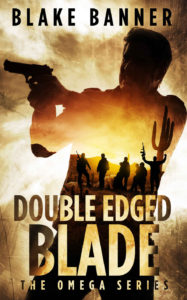
The graphics here hardly can be faulted. In the background is a scarred, textured surface that suggests confusion or disarray. The chief image is of a man, presumably the protagonist, holding a gun. I have two quibbles about him.
First, his left shoulder precisely meets the right margin of the cover. It’s the precision that bothers me. I’d have preferred either that the shoulder were made to extend beyond the cover or that it were given a little space from the cover, at least as much as the barrel of the gun is in from the left margin.
But even the gun is too close to the margin, I think. I suppose the designer wanted to maximize space for the smaller, interior image. I understand that, but the larger image seems cramped because it abuts the two margins.
That’s quibble No. 1. Quibble No. 2 concerns the man’s face. When I first saw the image, at thumbnail size, I thought the man was facing away from the viewer. It took me a moment to see the reflection on his right cheek and forehead. I would have asked the designer to lighten the man’s face somewhat (and perhaps the gun also), while keeping the remainder of his body as nearly a silhouette.
From the main image alone we understand that this is a thriller. It’s the interior image that provides us further information, and it makes this a double-message cover.
Half a dozen men are shown, holding weapons in what perhaps is the Arizona desert (clue: the saguaro cactus, which the man next to it imitates by holding up his arms). These men are the bad guys. They are heavily armed, while the hero has only a handgun. Thus the cover tells us that the hero is up against long odds.
Typography: In each book in the series, the positioning of text is as in this cover. Here the author name is in black, and the letters are kerned outward. I would have left a little more space between the author name and the man’s head and a little more above the author name. That could have been accomplished by moving the main image down slightly.
The title is in two lines. In each book of the series the word in the bottom line is much larger than the word or words in the upper line. The bottom line always is a noun, the upper line a descriptor. This puts emphasis on the most important word in the title.
Note how the designer flipped color tones, almost producing a photographic-negative effect, where text goes from being over the man’s body to being over the background. This gives a sense of motion or tension without making the text difficult to read. This technique has to be used with care. I have seen other covers where the flipping of tones made the text nearly indecipherable.
At the bottom is the series tagline. Usually series taglines include sequence numbering: “Book 1,” “Book 2,” and so on. Here only the name of the series is given. This may be smart marketing. Looking at a single cover, you can’t tell whether the book is the first or last in the series.
I presume the volumes don’t build on one another, so there isn’t a reason to read the books in any particular order. The author will be happy for a new reader to take up any of the books—whichever cover appeals to him most—and hopes that the purchase of one title will lead to the purchase of others in the series, in any order.
Overall: This is an effective color, from its gold/brown palette to its clever use of exterior and interior images. Few prospective purchasers will notice the imperfections I point out.
Once a cover treatment reaches the ninetieth percentile, so to speak, an author rightly can be satisfied. Small improvements can be made, but few people will notice them, and their absence likely will result in almost no diminution of sales. At this level of artistry imperfections are noted more for art’s sake than for sales’ sake.
