

 Title: Prove Them Wrong
Author: Nancy Shugart
Designer: Kathi Dunn
Genre: Self-help
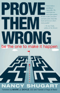
Graphics: Most self-help books have bright covers. There’s a reason. The books want to inculcate a sense of optimism: “You can do this!” But this cover is exclusively in dull tones: light gray for the background, darker gray for the area behind the author name and the arrow, near-black for the maze and the title. The overall sense is not so much inspiring as dispiriting.
I called the lone image a maze. I think that’s what it’s supposed to be, but it isn’t constructed like a maze. Neither the light nor dark parts go anywhere. The red arrow points to the goal, represented by a red flag, and presumably implies a shortcut, but the maze itself provides no way to reach the goal from the near side.
This may be intentional, since the tiny-print blurb refers to accomplishing seemingly impossible things, so perhaps the designer deliberately drew a maze that has no solution. I think it would be better if there were a solution, even if complex, so that the arrow could point to a shortcut, the notion being that one might become discouraged by a path that appears insurmountably difficult but, with persistence, a straightforward way can be found.
The maze is free-floating. It doesn’t suggest a landscape, yet three clouds float above it. Why? They add nothing. If anything, they make the viewer suspect he’s looking up a skyscraper and seeing clouds above it, and in that case the maze ceases to be a maze.
Typography: The title and author name are legible, though each should be in a brighter color, perhaps yellow for the title (to contrast with the relentless gray) and bright white for the author name. Only the subtitle is in a bright color—and for no obvious reason, since it isn’t the key textual element here. (As a call to action, it’s less than inspiring.)
Why is the subtitle in all lowercase? It reads as a sentence, so one would expect at least the first letter to be uppercase. In fact, the whole of the subtitle should be uppercase, tying it more closely to the title. The subtitle should be kerned more tightly: it would look better if its length matched that of the bottom word of the title.
The chief textual problem is the long blurb. It is a mere blur at thumbnail size and still unreadable at the next larger size. The only way to make it out is to go to the book’s page at Amazon and click on the cover to enlarge it. Even on the paperback version of the book the blurb would be hard to read. If the blurb were to be kept at all, it should be moved to the back cover of the paperback, along with other endorsements. On the front cover it accomplishes nothing.
At the bottom is a line giving the name and identity of the writer of the foreword. It might make sense to advertise that the foreword has been written by someone well known for writing self-help books along the lines of this one, but I’m unable to locate any book written by Mark J. Doyle. He may not be known to prospective purchasers of this book, in which case giving his name would have little marketing purpose. Again, it might have been better to include mention of him on the back cover of the paperback version.
Overall: There are countless self-help books. A diligent search might turn up more than a hundred that promise to help the reader accomplish something otherwise considered impossible. When there is that much competition, a book such as this needs a top-flight cover. It doesn’t have one. The cover is bland in color and textual treatment. Nothing on it suggests expertise on the part of the author, except perhaps the far-too-tiny blurb.
The title itself is engaging. It’s a challenge to the reader. It suggests “Do what I propose, and you’ll see success,” but the cover otherwise doesn’t live up to that promise.