 Title: Through the Barricades
Author: Denise Deegan
Designer: Lawston Design
Genre: Children’s fiction
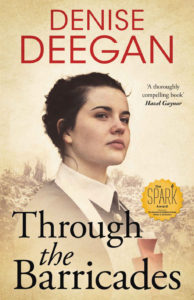
Graphics: The story is set during World War I, so the background of the image is appropriate, though it’s difficult to make out at thumbnail size or even at the size used here. Only at full size can one tell that the young woman stands in front of a front-line trench and that soldiers are at the top of it. Apparently she is a nurse: she wears an apron with a red cross on it, but the haziness of that part of the image and the overlay of text make it a bit hard to see that she in fact is wearing an apron.
I understand why authors like to put “seals of approval” on their covers, but often, like here, it’s hard to make those work with the rest of the graphics. Certainly I’d include a seal testifying that a book won the Newberry Medal or even one of that award’s three honorable mentions, but most seals, as with the Spark Award, don’t have remotely the same cachet, and I wonder whether using them compensates enough for the intrusion they make on the cover.
Typography: Start with the author name. Here is a good use of red text. As I have said in earlier case studies, and as I no doubt will say in future ones, red text demands a light background, from white through beige to tones of yellow, as here. Too many author-designers, and even some professional designers, place red text against a dark background (often blue), but in such a case the red doesn’t pop. Here it does.
The title font is less interesting than the author-name font. Its greatest problem is that its thin lines don’t stand out enough against parts of the image, particularly the dark area with the pendant. The author name works fine with thin letters because there is nothing behind it. Here thicker letters were needed.
The blurb from author Hazel Gaynor is weak tea: “a thoroughly compelling book.” Those words carry almost no meaning. Surely they could have come up with something that either gives a sense of what the book is about or somehow singles it out from the author’s other books. Since this blurb adds nothing, it should have been left out.
Overall: The strength of this cover is in the young woman’s face: determined, perhaps already knowing too much, perhaps soon to find the war too much for herself. It’s the face that carries the day, but the rest of the cover is fairly good too.
