Case Study 102

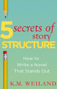
Title: 5 Secrets of Story Structure

Author: K. M. Weiland

Designer: K. M. Weiland

Genre: Self-publishing

Graphics: The graphics are minimalistic: a background with a slight color gradient and parts of two pencils. That’s it.

Only the pencils can carry meaning (the background could have been any of a number of colors). What meaning do the pencils convey? Writing, certainly, but they don’t necessarily imply writing a novel, which is what this book is about.

Nowadays, few book writers write with pencils. Nearly all of their words are composed at keyboards. If the designer wanted a graphical element that indicated book writing, something other than pencils might have been more appropriate as leading viewers toward the theme of the book.

Beyond that, the book is about writing novels, so a generic image of a novel—at least an image that implies fiction rather than non-fiction—would have been a step up, yet even that wouldn’t quite do it.

The book focuses on how to structure a story, so an image that indicates structuring, organizing, or building might have been better still.

Typography: Each of the three typographical elements—title, subtitle, and author name—needs adjustment. Let’s start with the title, which is a mishmash: two colors, two fonts, and four sizes for just five words.

Each color is a poor choice. Neither pops well against this background, the red for the usual reason and the yellow because it’s too close in tone to the greenish background.

The oversized “5” is fine, and the large “Structure” is fine enough in terms of size, but it crowds the edges of the cover, and its letters are crammed together. Some of the letters actually touch one another. “Structure” should be in a more condensed font that could be set as tall but with adequate space between letters and away from the edges.

“Secrets of Story” comes in two sizes and two styles, roman and italics. If the italics were chosen for emphasis, it’s not clear why the preposition would be emphasized. It’s the least important word. Similarly, there is no obvious reason why “Story” should be smaller than the other words in the phrase: it’s no less important.

The italics should be removed entirely and the words put into a sans serif font, even if not the same sans serif font used for “5” and “Structure.”

As for using red in the title, that actually reduces clarity. It’s easy for the eye to go to the red first, resulting in “Secrets of Story 5 Structure.” Or the yellow text could be read by itself, since it’s much larger than the red text, making the title seem to be “5 Structure.” These problems could have been avoided by using a single color, such as black, for the title.

The subtitle needs a thicker font. If white is to be used against a light-colored background, the letters need weight, and fatter strokes will provide that.

The author name should not be in red but in black, like the revised title. Its font (which may or may not be the same one used for “Secrets of Story”: it’s hard to tell) is too thin-stroked and ought to be sans serif.

After those fixes, the author name needs to be moved in from the right edge of the cover. Although this book appears only as an ebook and not as a paperback, it should adhere to paperback conventions: keep in mind what might happen if the paperback is trimmed too tightly, with the right edge of the cover going the way of the blade. If graphics or text are too close to the edge for a paperback, they’re too close for an ebook too.

Overall: This short book’s cover likely was thrown together quickly by the author-designer. It’s understandable that she may not have thought it worthwhile to invest time or money in producing a more professional cover, but a few alterations (particularly to the text) could help the cover substantially.

Case Study 101

Title: From Pit to Park

Author: Janet Roberts

Designer: Ebook Design

Genre: History

Graphics: This is an account of how an abandoned English pit mine was turned into a park. The designer wanted to show the “before” and “after” and chose to do so partly by using a free-standing image and partly by making the text itself into images.

The free-standing image is in two parts. The left side is half of an illustration of a spoked wheel, the whole illustration being used as the letter O in the title. 

What does this wheel represent, other than the pit mine in general? Was it part of a pulley system by which ore was hauled to the surface? Was it something else? There’s no indication.

The wheel isn’t solid black. It actually uses a black-and-white photo for its fill. The photo seems to be an old one of a mine worker. The same man appears more clearly in the second T of the title. You have to look close to see him there and closer still to see him in the wheel. At thumbnail size you can’t see him at all. 

The right side of the free-standing image is a circle, with lines mimicking the left side, but this circle isn’t a spoked wheel. It’s a recent photo of the park that has replaced the mine. It’s the only part of the graphics that doesn’t require the viewer to pause to figure out what he’s seeing.

Typography: The title comes in three segments. The initial word, “From,” is easily overlooked since it is so much smaller than the other words. It would be better to make all four words the same size and to put them in two lines: “From Pit/ to Park”. That would require a more condensed font, but it would prevent readers from seeing the title as having only three words.

It would have another advantage. It would remove the preposition “to” from the end of a line. Prepositions should be kept, whenever possible, with the remainder of their phrases.

The biggest problem with the title is the transformation of the letters into images. It doesn’t work well. When the cover is seen at thumbnail size, the words “Pit to” seem to be mottled gray, and “Park” seems to be green and dark green. It’s only when the cover is seen at a larger size that one perceives that the upper line has that black-and-white photo as its fill while the lower line uses the same recent photo as is used in the free-standing image.

Since the spoked wheel is used below, as part of the free-standing image, there is no good reason to shoehorn it into the title as the letter O. It confuses the reader, who will be confused enough trying to read text that really consists of photos. 

The subtitle doesn’t stand out well because it is dark green letters against a light green background. It would have been better to make the subtitle black. If it were to remain green, the lone word now in black, “to,” also should be green. It presently draws too much attention to itself. 

The best text is the author name, but it ought to be at least twice as large. At least it’s legible, even at a small size. 

Overall: This seems to be a case of the designer trying too hard, adding symbolism in too many places. If the type were kept to straight type, with the proposed modifications, and if the free-standing image were the only image in sight, this cover would be far better.

Case Study 100

Title: The Perpetual Paycheck

Author: Lori B. Rassas

Designer: Littera Designs

Genre: Business

Graphics: The symbolism of the hundred-dollar bills needs no explanation, but it has to be said that this is a dull graphical treatment.

It’s not so much that we’re seeing currency rather than paychecks (which would go better with the title). It’s that the bills aren’t interesting in themselves, individually or as a group.

An online search for “stack of falling currency” yields many images that not only look more motion-filled than the one used here but that would occupy the upper portion of the cover more fully.

These seven bills show the motion of falling leaves, not the motion of a heap of money falling into a worker’s hands. The bills are too spread apart to give the sense of a continual, strong income, which is what the author seems to be holding out to readers as a live possibility.

Typography: This is one of those rare covers on which red text works. The key is that the red letters are set against a light background, in this case yellow. None of that red-on-blue stuff that one can find too many examples of in certain genres, at least in fiction. The misuse of red is rare on non-fiction covers.

The title is easy on the eyes: a simple sans serif font for text enlarged as far as it will go without intruding on the cover’s edges.

The author name is in the same font as the title and is even easier to read, since it’s black. The letters have been kerned widely, to stretch the name to match the length of the longest word in the title, “Perpetual.” This works well. Fortunately, the author name is kept sufficiently far from the lower edge, keeping it from looking cramped.

The text that has a problem is the lengthy subtitle. If something seems awry, it’s because something is. The second and third lines have letters that are kerned more widely than those of the first line. Was this done so those lines wouldn’t look short in comparison to the first line? If so, then it was a needless worry.

When the lines are set with varying letter-spacing, the eye stumbles as it reads along. It’s important to keep each unit of the cover—title, author name, and subtitle—internally consistent.

Step back from the monitor and look at the cover. The three blocks of text look bottom-heavy. They seem pushed together. It would have been better to leave more space between each element, adding about the height of each subtitle line both above and below the subtitle. That would push the title up to about the top of the lower-left hundred-dollar bill, but that would be fine. The graphic easily enough can be adjusted to accommodate the text—which shouldn’t overlay any of the bills because that only makes the red letters harder to read.

Overall: The cover leaves no doubt about the book’s genre or its promises. The subtitle in particular includes key words that people looking for new jobs likely would use in search engines. All that is to the good.

The text needs adjustment, though not much; the graphic needs replacement. Fortunately, there is much similar stock art to choose from.

Case Study 99

Title: Orange Berets

Author: James “Doc” Crabtree

Designer: Heidi Crabtree

Genre: Memoir

Graphics: This is an account of an Army major’s time spent with the peace-keeping force assigned to the Sinai. The personnel wear orange berets to mark them out as members of a multinational force.

The photo presumably is of the author, although the opening pages of the book don’t specify that. Immediately you know that the photo has something to do with the military (the man clearly isn’t a civilian) and that the locale must be where camels are found, and that suggests the Arabian peninsula.

So far so good. The photo has narrowed the genres and geography. It’s focused on the camel’s snout, which, unfortunately, extends beyond the photo’s top. The man is not in focus and thus becomes a secondary figure.

In a photo editing program this otherwise black-and-white image was given two bits of color, the beret and a shoulder patch. Making the beret orange makes sense, but why is the patch also orange? Given the book’s title, it would have been better to restrict the added color to the beret.

The larger problem with the cover photo is that is isn’t larger. The photo takes up less than half the cover. If it had been taken in portrait format, there presumably were parts that were snipped out, particularly below what we see here but perhaps also above. The ideal would have been for the photo to occupy all or nearly all of the cover acreage.

If its proportions wouldn’t quite fit, or if it had inappropriate or irrelevant elements that couldn’t be omitted or obscured through photo editing, then it would have been fine to have it occupy all but the bottom-most area of the cover. That area would be where certain textual items could be placed.

Even if the photo couldn’t be expanded beyond what we see here, in terms of what it showed, it could be expanded to fill the awkward blocks above it and to its left. The top block actually detracts from the photo, since its coloration overpowers the orange of the beret.

Below the subtitle is a smaller image. Even when that image is expanded to its largest size at Amazon, it isn’t clear what is being shown, other than that it is a flag. Is it the flag of the multinational force? Even if so, how does it coordinate with the title and the larger image, and what does it add to the cover, other than occupying what otherwise might have been blank space?

Lastly, the background, that large swath of orange. This seems to be an example of a designer getting carried away with making connections. If “orange” is in the title, why not make the cover mainly orange? The chief response is that the orange of the background overpowers the orange of the beret. Had the background been nearly any other color, the hint of orange in the photo would have caught the viewer’s attention, but now the color of the beret looks like an afterthought.

Typography: The title font is unobjectionable. It’s read easily, and it has a little more character than would a font such as Helvetica. It is the other font, the one used for the subtitle and author name, that needs attention. It’s a typewriter font. Was the designer wanting to suggest that the memoir includes accounts of clerical work in the Sinai? It’s hard to say.

One thing that can be said is that the typewriter font looks weak against the title font. Perhaps that mostly is a consequence of size. If the subtitle and author name were enlarged, they might not seem so overshadowed by the title. If the image of the flag were removed, there would be plenty of room for the subtitle to be set in three lines, even if the main photo were enlarged enough to get rid of the orange areas on the left and top.

The subtitle then could be in much larger letters arranged this way: “Adventures/ and Misadventures/ in the Sinai”. Notice that I change the ampersand to “and”; that reads more easily when more than just two words are used.

Is it necessary to mention the author’s nickname? Could it be brought up in the early pages of the text instead? If the nickname were omitted from the cover, the author name could be made larger than the subtitle yet smaller than the title. If the nickname has to be preserved, still the author name could be enlarged, but not nearly so much. It might go up by about a quarter, there being insufficient space for it to expand much horizontally.

Overall: This cover is unmistakably an amateur production. It’s mainly little things that are off kilter: the unneeded orange areas at the side and top, the camel’s nose being snipped off, the author name not being centered, and particularly a second image that serves no clear purpose. It would not take much to make this a presentable, even if still not a good, cover.

Case Study 98

Title: Looking Forward

Editor: Jamie Arpin-Ricci

Designer: Jamie Arpin-Ricci

Genre: Religion

Graphics: The editor has collected eleven essays about how to become an effective leader in Christian ministry. You might expect the cover of this book to have a distinctively Christian element to it, but it doesn’t. It has one of those ubiquitous down-the-middle-of-the-desert-highway photos that became clichéd even before indie publishing became popular.

The photo itself is lovely, if you like desert travel, which I do, but it seems to have no relationship to the theme of the book. Why was it chosen? I suspect it was because of the title’s second word, “Forward.” I easily enough can imagine a designer asking “What sort of image suggests forward movement?” and coming up with something in everyone’s experience: driving (forward) down a long expanse of road.

But the road itself is static. It’s not the road that advances but whoever is driving on it, and in this photo there is no hint of a driver. (If there were a driver, he shouldn’t be straddling the center lines.) The temptation to plump for this sort of image is a strong one, which is why so many covers feature open roads, but in this case it was a temptation that should have been resisted.

Yes, the image is attractive in itself, but it does nothing to indicate genre or the purpose of the book, and those are important things for the graphics to do on non-fiction covers. Fictional works have more leeway. Non-fiction covers need to attend to their books’ purposes.

Typography: Let’s start at the bottom. The editor’s name, like all the text above it, is hard to read against the yellow-orange lines of the highway. It’s difficult to find a font and to select a color that will pop against both yellow-orange and the dark gray of the asphalt. It may be impossible. If a road “had” to be used on this cover, one with worn or missing lines would have been better—or the designer could have faded the lines by using a photo-editing program.

Assuming the photo of the road is retained, about all one could do is choose a bolder font for the author name and, really, for all of the text. I would recommend sans serif fonts throughout, because serifs are what are lost to the eye first in situations such as this. The sans serif fonts should be used in their bold variants.

Two other modifications of the editor’s name: the initial letter, J, should be made the same height as the other letters (it’s the only over-sized letter on the cover), and “edited by” should be put in all caps. Normally “edited by” would work well as it is, all lowercased, but, given the problematic background, it needs more oomph.

As I said, all of the text should be sans serif, but it would be good to use two fonts (not one as here), a font for the title and a font for the rest. The title could stand to be in a font with a sense of motion that might be suggested by the shape of the letters, while the rest of the words could be in something akin to Helvetica.

Why is “Forward” in gray rather than white, and why is the word larger than “Looking”? Gray makes the second word of the title harder, not easier, to read against the dark gray road. By making “Forward” gray and larger, the two words of the title become detached from one another—precisely what one should avoid.

Overall: The photo verges on the commonplace. There is nothing distinctive about it and, worse, nothing in it to suggest the book’s theme or genre. That can be deadly for a non-fiction book’s sales.

When designing a cover, it’s important to ask, about each element of text, “Is this legible, even at small sizes?” On this cover, the answer must be, “Not very, and not even at large sizes.” Most of the illegibility arises from the photo—another reason to find another image.

Case Study 97

Title: Homeschool Made EAsy

Author: Lea Ann Garfias

Designer: Lea Ann Garfias

Genre: Self-help

Graphics: Homeschooling is becoming ever more popular, so there must be an increasing need for books about how to get started in it. This one promises an easy introduction. To what extent is any of that indicated by the graphics?

On the right side of the cover is a stack of books. Some of them are thick and look formidable. These likely aren’t books to be used when instructing children of elementary-school years. Someone looking at the books might think, “If those are the sorts of books I need to master to teach my children, maybe homeschooling is beyond me.”

If a stack of books were to remain the chief graphical element, then thinner books, more along the heft of those actually used with children, would seem more appropriate. But is a stack of books the best way to go anyway? There isn’t much inviting about many pages piled atop one another. This might have been a good cover for a bespoke illustration or, if the budget didn’t allow that, for a low-royalty illustration that better exemplifies the materials used by most homeschooling families.

The books on this cover bleed beyond the right edge and half of the top and bottom edges, thus marking where the cover stops, but what about the left edge and the other half of the top and bottom edges? It’s as though they aren’t there because the cover uses an almost-pure-white background. This problem persists at the Amazon sales page for the ebook edition. Before uploading the cover to Amazon, the author-designer should have added a thin black rule all around the cover.

Next let’s look at the disk. It provides a good contrast to the books. They are rectilinear; the disk is round. It isn’t a mere circle, which would have been a little dull. Near its perimeter are two concentric cutouts, providing sneak peeks of the books, and the edges of the disk are jagged and might suggest a pinwheel.

Typography: There appear to be three fonts, one for “Homeschool,” one for “Easy,” and one for the rest of the text.

The title word that stands out best is “Easy,” not just because it is the largest text but because it’s the only text in color, in this case red. (This is an example of the proper use of red text: against a light background.)

The most important word of the title is “Homeschool,” but it hasn’t been given the prominence it deserves. Its size has been constricted by an attempt to keep it within the disk, and the choice of font isn’t optimum. The designer should have selected a more compressed yet still thick-stroked font so that its point size could be boosted. “Homeschool” ought to be half again as tall. Compression will take care of part of that, and the word can occupy some of the empty space to its left.

Yes, under the current arrangement, that would force the word beyond the border of the disk, but there is a solution to that: enlarge the disk. It need not remain wholly within the bounds of the cover. If the diameter of the disk were increased by a third, the right side could extend over the right edge, just as the books do, while the left side could come close to the left edge of the cover.

Enlarging the disk would provide several benefits. It would give space for a larger “Homeschool,” it would become the focus of graphical attention (that honor now is held by the books, not the disk), and the text within the disk would have room not to extend across the two cutouts. Notice how the tails of the L in “Homeschool” and the Y in “Easy” become obscured when they are placed over the books in the background.

The remaining words of the title and subtitle, “Made” and “Homeschool Your Way,” are adequate as they are, but they would look better if they were bolded. The other words—especially once the initial title word is enlarged—vary too much from these words in strength.

The final text to consider is the author name. It’s too small. Its placement is fine, but it ought to be in a font that is at once compressed and bolded. That would allow the letters to be boosted by a few points.

However that works out, it’s necessary to omit “by,” which signals not that this book was written by the person whose name follows but that this book was written by an amateur. If a name stands by itself on a cover, viewers immediately will think it’s the name of the author. There is no reason to add a verbal arrow.

Overall: This cover has good things going for it, particularly the attractive disk and the font and color choice for “Easy,” but the cover also needs work, chiefly in terms of sizing and placement.

If the disk and text were adjusted as proposed, the cover would earn a solid B. If a more enticing illustration could be found, the grade would be higher still.

Case Study 96

Title: Bound to Love

Author: Skye Blaine

Designer: Berkana Publications

Genre: Memoir

Graphics: This book tells a forty-year-old story of a young woman whose only child was born with serious health problems and the troubles they both had as he fought to live and grew to adulthood.

The cover photo is of the author’s son as a young child—a perfectly appropriate picture for this sort of memoir. Clearly this photo wasn’t taken in a studio. It’s cropped from a larger photo, and it’s slightly out of focus. No harm in that. Authenticity makes allowances.

I presume there was more to the photo above the boy’s head. It’s too bad that portion wasn’t retained, because it would provide a place for the title and genre tagline. Those now appear in a box, part of which flows down the left side.

It would have been better for the photo to occupy the whole of the cover. It’s easy enough to imagine how the image could be enlarged to take over the vertical strip of red. Cropping it differently could have taken care of that plus the large red area at the top.

At the lower left is a medallion issued by a group called IndieBRAG. You pay a fee, submit your book, and, if your book is reasonably well written, you end up with a medallion for the cover. (The author has a second book that has the same medallion.)

Such medallions aren’t true literary awards, and most book buyers are savvy enough to know that. Besides, which reader, looking for a new purchase, ever has heard of the issuing group? Probably not a single one.

Medallions such as this one accomplish little in terms of sales, but they do accomplish something else: they detract from the integrity of the covers they appear on. They don’t mesh with any of the artwork or text, and they appear to be slapped-on stickers.

It’s best to omit all such things, unless the award isn’t pay-for-hire and is nationally known, such as the Caldecott Medal or the Pulitzer Prize. Anything else looks like puffery.

Typography: A single font is used throughout. As a rule, it’s good to use two or, rarely, three fonts, each signaling a different purpose. This font is serviceable but doesn’t have much character.

Given that this book is written by the boy’s mother, it would be appropriate for the font to be of the sort that might appeal to women—perhaps something that has initial letters that sport flourishes.

The tagline should be, like the author name, in a different font, particularly if the new font used for the title includes such things as flourishes on some of the letters. If the title font has strong serifs, the tagline could get by with a font with mild serifs or without any serifs. The tagline should be set in all caps, while the author name could be either in all caps (but larger than the tagline) or in upper- and lowercase.

If the medallion is removed, the author name can be placed where it ought to be: in the center. It should be larger than the present author name, and the new font should have sufficiently thick strokes that the letters will stand out well against the red of the boy’s jacket. White would be the preferred color, both for the author name and the tagline.

The title ought to have a distinctive color, perhaps matching the yellowish bead near the boy’s chin. That color likely would stand out well against whatever the original photo showed above his head.

If that area was cropped out because it seemed too busy to lay text over, well, there are ways around that. An experienced designer can blur whatever might appear behind the text, though that may not be necessary for the title, if its letters are sufficiently large and thick. As for the tagline, it would be legitimate to place it beneath the title in a banner, one not dissimilar from the color of the background on which it is overlaid.

Overall: Family memoirs often have a paucity of visual materials to draw from. Fortunately, the author had a long-ago photo that serves the cover well. The problems don’t relate to the photo so much as to its placement and to the uninspired textual treatment.

Case Study 95

Title: Deranged Justice

Author: Jeffrey A. Nix

Designers: Jeffrey A. Nix and Daniel Wills

Genre: Biography

Graphics: This is the story of the author’s great uncle, who was hanged 1919 for having committed a double murder and who had committed other murders before those.

The relevant scenes of the story took place in and near Columbus, Georgia, which I presume is the city we see in the background. The photograph, circa World War I, is unobjectionable in itself. It lends an old-time feel to the cover, but it doesn’t lend much more. The scene would be meaningless to anyone not intimately familiar with how Columbus looked a century ago. It’s not as though this is a photo of 1919 New York with the iconic Flatiron Building in the background.

The chief problem with the background image lies with the foreground image. The noose (which doesn’t have a rope attached to it) is the most three-dimensional element on the cover, but even the two-dimensional newspaper seems to float above the background. The newspaper has been scissored above the author name. It might have been better to continue the newspaper to the bottom of the cover, laying the author name over it.

It would have been better yet, in that case, to eliminate the background photo entirely. The noose could be rotated clockwise and moved slightly right, so that it bleeds off the page. This would hide the absence of a rope. With the background now clear, there would be no problem arranging for the title and subtitle to be in attractive letters that stand out well.

Typography: The biggest problem with the text is that it’s hardly visible. The headline in the newspaper is far more legible than the title, subtitle, or author name. Why? Because the headline is in black, which contrasts well with the faded newsprint.

The text placed by the designers is in white and is surrounded by light-blue ghosting. The ghosting is an acknowledgement that the white of the letters wasn’t enough. The designers recognized that something was wrong, but they applied the wrong fix. They should have backtracked and changed the color of the text.

Before that, they should have done something else with the text. They should have chosen different fonts.

A stencil font is used for the title and author name. This particular stenciling isn’t easy to read under any circumstances, and here, when set against a varying background, if fares poorly. And it doesn’t seem to serve a purpose. The story is about crime and justice, but this font doesn’t evoke thoughts of police and courtrooms. It’s a font you expect to find on the outside of wooden crates piled high in a warehouse.

Given how busy the central part of the image is, with the noose and newspaper, what was needed was a strong but simple font, one in a strong color, such as maroon, which would play off well against the brown tones of the central part of the image.

The subtitle is set in italics in a serif font. If the new title and author name font has serifs (and it probably should, but modest ones), the subtitle should be set in a sans serif font and definitely not in italics. For greater contrast, the subtitle should be in all caps, assuming the title and author name are in upper- and lowercase, which would be preferable for them.

Placement of the title and subtitle will be tricky.  A larger, appropriately-fonted title will take up all the space where the title and subtitle now are. Where to put the revised subtitle? It might look fine if placed to the left of the noose’s windings. That would place it over the black, gray, and white of the cityscape, so it would need to be in a contrasting color but one that would pair well with the color of the title.

Overall:

Case Study 94

Title: The Circle of Fifths

Author: Philip Jackson

Designer: Philip Jackson

Genre: Self-help

Graphics: Online I found half a dozen books written to teach musicians the meaning and use of the circle of fifths. Not one of those books has an attractive cover, so this book fits right in.

In fact, its poor graphics are better than those of several of the other books, which may demonstrate that expertise in one area (playing music) doesn’t necessarily correlate to expertise in another area (designing book covers).

Here we have an especially simple drawing of the circle of fifths. Most of the other books make the circle look like a pie, with slices in various colors, or they try to give the circle a three-dimensional air, trying to raise it off the page a little. Each of those attempts makes for clutter. Often simplicity is best, but this drawing is so simple that it’s dull.

It’s also missing some of the notes because the title and subtitle have been laid over the circle. This makes it appear as though the circle consists of only eight notes, three at the top of the circle and five at the bottom, when in fact is consists of twelve, at least in its simplest form. Someone unfamiliar with musical terminology might imagine that the circle of fifths is a circle with two separate areas, with three notes gathered in one and five in the other.

The circle and its labels (indicating natural notes and flats) are in dark blue and are set against a gradient that goes from a fairly dark blue at the top of the cover to light blue above the author name, where the gradient inexplicably changes from blue to gray.

Thus the circle is blue on blue, which the eye interprets as moving the circle into the background. What is left in the foreground? Nothing at all, since the circle is the whole of the illustration.

Typography: As ineffective as the drawing is, the typography is even worse.

The only bright spot is, well, the only bright spot: the title is legible because it’s yellow and stands out well against the blue. Alas, the title’s font lacks all charm, and the title is set with the nouns in all caps and the other words in upper- and lowercase (and with the article set several points smaller than everything else).

The author name is set in gray against gray, precisely what shouldn’t be done. In that it mimics the circle, which is set in blue against blue. At least the author name is legible. That’s more than can be said for the rest of the text.

The subtitle almost contains a joke. It reads “visual tools for musicians,” but its red letters make it almost the opposite of visual. When two colors clash, as red and blue do, it’s nearly impossible for the eye to focus on the two at once. One is in focus only if the other is kept out of focus.

Things are even worse with the tagline at the bottom. There, the red against light gray isn’t as bad as the red against medium blue above, but the letters are so small that they can be discerned only if the cover is expanded to its maximum size at Amazon.

The tagline has three errors. Its first word ought to be capitalized because the tagline reads not like a headline or title but like a long sentence. The ampersand should be swapped out for “and”; there is plenty of room for the additional two characters. There should be a comma after “modes.”

Better yet, the sentence should end with “modes”—which then would need “and” in front of it—and the phrase “and much more” should be dropped, since it tells the reader nothing. If the “much more” included anything important, that thing should be listed along with the other items.

Overall: For some reason, a few things in life never get the artistic attention they deserve. The circle of fifths is one of them. Someday a designer will come along to give the circle its just desserts. In the meantime, there are ineffectual covers such as this one.

For most musicians, mastering the circle of fifths is no easy task. It isn’t made any easier by books with covers that imply that the labor will be dull and unrewarding.

Case Study 93

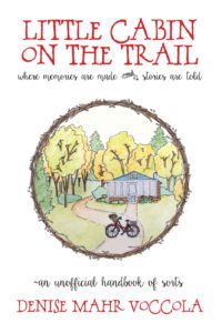
Title: Little Cabin on the Trail

Author: Denise Mahr Voccola

Designer: Denise Mahr Voccola

Genre: Memoir

Graphics: This book is about the value of family story-telling—that is, passing along accounts of the little things that happen within a family. Does the cover suggest such a theme? It’s hard to say. From looking at the first pages of the book, it isn’t clear how a cabin fits in. Perhaps it was where the author’s family often gathered and where they learned and told family stories.

The illustration itself is fine, though it’s a pity it takes up so little of the cover, being circumscribed by a circlet of branches and leaves.

It would have been better if the illustration were squared and enlarged, making it the full width of the cover. As it stands, some things in the illustration are difficult to make out, such as the bicycle and whatever is in the bicycle’s front basket. (Flowers? I can’t tell even when the cover is enlarged.)

The circlet is a nice, homey touch, but it draws too much attention to itself, and it forces the illustration to be constricted because the circlet needs to be kept away from the edges of the cover—which, come to think of it, are hard to locate, since the background is white and there is no border. At the sales page at Amazon a thin border and a drop shadow have been supplied automatically; the cover should have had at least a hairline border added to it before it was uploaded.

Back to the implications of the title, which seems to echo the title of Laura Ingalls Wilder’s best-known work, Little House on the Prairie. The illustration reinforces the idea that the centerpiece of the book is the cabin itself. There isn’t anything from which a viewer can infer story-telling. Thus the graphics miss the mark.

Typography: The font used for the title and author name suits the locale. The font’s rustic style suggests that this will be a homey read. It’s hard to tell from this borderless image, but the title is too close to the top of the cover. The two lines of the title are too close together: the C of the first line nearly hits the second T of the second line.

I don’t know whether this font has alternative characters. If so, it would have been good to use a smaller C in the author’s surname. The two large C’s draw too much attention to themselves, but that’s a quibble. One might counter by saying the double-C’s add character to the cover.

The subtitle and tagline are in a quite different—and quite difficult to read—font. Cursive fonts usually are difficult to read, especially when used for more than one or two words. What may look fine at full-monitor size often becomes a head-scratcher at thumbnail size.

In the subtitle, the conjunction “and” is set above an ornament. The two are impossible to make out at small sizes. Even when the cover is enlarged the word and ornament look odd—and inappropriate. Why are they there? They do nothing to enhance legibility. Maybe the designer thought they looked pretty. If so, this is an example of cuteness undercutting utility.

The tagline above the author name begins, oddly, with a tilde. Again, why?

The tagline is set slightly larger than the subtitle. Usually a subtitle is larger than a tagline, or the two are set at the same point size.

The subtitle could be enlarged to match the tagline’s size if its wording were modified slightly. I would omit the second use of “are” (and the ornament) so the subtitle would read: “where memories are made and stories told”. That would free up the equivalent of about five characters, allowing the text to grow—and to be brought in a little from the sides, since it’s a little wide.

Overall: This cover likely will appeal to a certain audience, just given its down-home-ness, but the poor legibility of some of the text and the hard-to-make-out illustration will cause other potential readers to look elsewhere.

It’s not possible, when designing a cover, to be as Pauline as one might wish, to be “all things to all men,” yet that aim ought to be a guiding principle during design, at least if one’s goal is to have a wide readership.

Case Study 92

Title: Access Denied

Author: David E. Gates

Designer: David E. Gates

Genre: Memoir

Graphics: The story concerns child custody. Is that suggested by the cover? Well, there is an adult hand, and cleverly arranged in it is a child’s hand. The two hands are reaching for one another, though it seems to me that the adult thumb is on the wrong side.

However that may be, there is an indication of an adult and a child, but would one infer from that a memoir regarding child custody? Not likely.

What’s that in the background? At thumbnail size it’s impossible to tell. At full size at Amazon, the background is revealed to be an apparently random sequence of four capitalized letters, A, C, G, and T. Their significance isn’t clear. Maybe the background is intended to evoke a computer program or printout. After all, “Access denied!” is a phrase one might see when inputting the wrong password. I take it that the title refers to not having access to one’s child.

The hundreds of letters in the background don’t tell us what the genre is or anything about the storyline. If a buyer has to guess at what a book is about, he’s unlikely to investigate further. Why should he, when so many other covers are vying for his attention?

Typography: Only two typographic elements appear on the cover, the title and the author name. The first is legible enough, despite the cluttered background. The second is illegible unless the cover is enlarged. The same font is used for both elements, as all caps for the title and as upper- and lowercase for the author name.

Each letter has a drop shadow. On most covers drop shadows either accomplish nothing or improve the readability of the text. Here they are counter-productive. They make the words harder to read. That’s because the drop shadows, which appear to be in gray, merge with the small background letters, which also are in gray. The resultant effect is haziness around the words.

The designer should have made alterations to the title and author name. The latter should be far larger. There would be room if the hands were rotated clockwise about thirty degrees, so the adult’s index finger would point toward the lower part of the left border and his forearm would extend not through the top border but through the upper part of the right border. This rotation would allow the title to be enlarged also. It ought to be half again as large, while the author name ought to be at least twice as large.

Once sizing is fixed, coloration needs to be fixed—and in the process the drop shadows should be removed. As for colors, the author name would work well in black, and perhaps red might work for the title since red commonly is used for warning signs, which is what “Access Denied” brings to mind.

For any of the text to be easily readable, the background (assuming the letters are kept) should be lightened by at least one-third, perhaps by half. Of course, it would be better to eliminate those hundreds of letters. Doing so would leave a simple cover, but the graphic of the hands may be enough to carry it—so long as there is an addition.

The addition would be a tagline indicating what the book is about. As it stands now, the cover doesn’t convey its genre or its storyline, the background being busy but obscure and the hands being subject to various interpretations. There needs to be a more blatant explanation of what the reader will find inside.

Overall: Author-designed covers usually fail to do what covers should do. This is a good example. The designer knows what the book is about and has used symbolism (the hands and the stream of letters) that, in his mind, explains sufficiently what the book is.

Except that the symbolism doesn’t do that for people unacquainted with the book. To them the cover lacks clarity, so they are likely to pass it by and look for something else to read.

Case Study 91

Title: I Remember the Time . . .

Author: Kim Hemphill

Designer: Cathi Stevenson

Genre: Memoir

Graphics: The author (a male, not a female: don’t be misled by the name) tells how he was run over by a train when he was three and how his disfigurement resulted in his living in an abusive home, suffering taunts throughout his school years, becoming homeless as a teenager, and falling into substance abuse—and how he overcame all of that.

The cover photo was taken by the designer not, apparently, at the site of the accident but at a more visually attractive site. Wise decision. A cover needs to attract prospective buyers. It needs enough verisimilitude to be faithful to the story, but it mostly needs to catch the eye.

This photo does that well. It’s a well-formed image, with the camera set low, for two reasons. First, the camera angle makes the rails seem to converge in the exact center of the cover. The track disappears into trees. One almost gets a sense of motion. Second, the low angle allows the child’s shoe to be well positioned.

I presume this wasn’t the author’s actual shoe but one mocked up for the purpose: it seems to have not just a thick line of dirt across the top but also a splotch of blood (perhaps ketchup). The shoe catches one’s attention, at least when the cover is viewed at a larger size. At thumbnail size, not so much, and that’s too bad. It’s a nice touch. It lends drama to the scene, which otherwise would be pretty but not dramatic.

Another thing to note is that the designer took the photo at sunset, thus resulting in ruddy clouds. That gives the photo three blocks of subdued color: red at the top, green in the middle, gray toward the bottom. That said, the cover looks dark overall. It should have been adjusted to lighter tones in an editing program. Still, it’s a fine image.

Typography: The typography isn’t as successful as the graphics. All of the text is off-white, but it should be bright white, given how dark the photo is. Even the larger letters don’t pop enough.

Imagine that the title were mentioned within a paragraph. If the title came at the end of a sentence, how many periods would you expect to follow it? (Correct answer: four.) If it came in the middle of a sentence and it was necessary to omit a few words immediately following it—that is, to have an elision represented by an ellipsis—how many periods would follow it? This time, six: three as part of the title and three as the ellipsis. That would make for awkward reading. And if the title came at the end of a question, how would it look to have a question mark follow three periods? It wouldn’t look very good.

I mention this because it’s almost always a bad idea to include punctuation in a book’s title. All kinds of confusions can arise. Imagine a book called How Are You? If you wanted to ask someone what he thought of the book, you’d have to write, “How did you like How Are You??” if you want to preserve the title. If you drop one of the question marks, a reader would think the title was simply How Are You.

In the present case, I would eliminate the ellipsis at the end of the title. It doesn’t add much to the sense; it may not add anything to the sense, depending on the reader. It will add to the confusion.

The author name should be a little larger, if this font is retained. (It’s used for everything but the blurb at the top.) The font’s thin lines tend to disappear against busy parts of the background. Other than that, the author name is fine.

Not so with the long tagline. Its major problem is legibility. It needs to be in a sans serif font that has thicker strokes than the present font. A condensed version would be preferable, so the text can be boosted a few points without having the lines come too close to the cover’s edges.

The first line ends with the indefinite article. It shouldn’t. “A” should begin the second line. “Bullying” should be brought up to the third line, to keep the thought unit together (“abuse and bullying”). “Happiness” needs to be followed by a comma, else the phrase “happiness and love” can be read as an appositive for (that is, a restating of) the word “success.”

This leaves the promotional blurb at the top. It’s the smallest text, and it suffers the most from being the wrong color: it doesn’t stand out well at all against the reddish sky.

The blurb should be in the same sans serif font as the subtitle, and it needs to be larger. I would put the first sentence on a line by itself. The other sentence I would divide this way: “A riveting read that will make you appreciate/ all that you have.”

The person quoted is identified as an “ARC reader”—that is, an “advance reader copy reader.” An ARC is a copy sent to select readers before publication, in hopes that they will supply useful promotional blurbs.

This blurb is nearly ideal, but the reader need not be identified as an ARC reader. Most buyers won’t know what that means. The designation makes her comment no more valuable that it would be if her name stood by itself.

Overall: As it stands, this is a good cover. Its legibility problems could be overcome in part simply by making all the text bright white. That would earn it a solid B. Making the other changes would bring it a much-deserved A.

Case Study 90

Title: Walking the Downs Link

Author: Holly Worton

Designer: Killion Group

Genre: Hiking

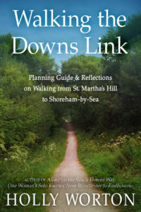
Graphics: The Downs Link is a 37-mile trail that links two other trails, the North Downs Way and the South Downs Way. The Downs Link is located south of London, and its southern terminus is near Brighton on Sussex Bay. Apparently this is the first guidebook for the little-used trail.

The sole graphic is a photograph of the trail going through a stand of trees and bushes. It may be authentic, but it’s not particularly attractive. The Downs Link route follows abandoned railway lines, and there are many places where one can see memorabilia from steam-locomotive days. A photo that included an old train car or a track switch would be more interesting than the one used on the cover.

As the route nears its southern terminus trees are more widely spread and there are said to be fine views of the South Downs. Such an image also would have been better than the one chosen.

Perhaps the author didn’t take many photos during her hike, and perhaps the other photos she took didn’t turn out well enough for use on the cover. If so, it would have been an easy matter to secure rights to a photo taken by someone else. It might have required nothing more than agreeing to give the photographer credit.

At it stands, the photo that was used lacks visual interest—there are neither people nor things other than the pathway and the greenery—and the view verges on the claustrophobic. It looks as though the viewer is going to end up swallowed by encroaching plants.

Typography: There are four typographic elements: title, subtitle, author name, and author blurb. They all use the same font, though most of the author blurb is in italics because it’s the title of another book.

On its own, the font is fine—but not for this cover. Its lines are too thin to stand out well against the greenery. If the image is to be retained, a thicker font is needed.

If this photo showed more sky, the title, as it now stands, would be acceptable since it wouldn’t overlap any trees. But it wouldn’t be more than acceptable because the first line ends awkwardly with the definite article. This is a title that needs to be set in three lines, with “the” on a line of its own and probably set smaller than the other two lines, for modesty’s sake.

The subtitle already is in three lines, which is fine, but it ought to be in all caps, to vary it from the format of the title, and it ought to be in a sans serif font. The letters should be enlarged by a few points and the line spacing reduced by half. The lines are too far apart and give the subtitle an unhelpful airy look. The lines would appear more as a unit if they were closer together. Lastly, the ampersand ought to be switched out for “and”; the subtitle will read more smoothly that way.

Of all the text on the cover, the author name looks best. That’s because it’s set atop the path and the less-busy part of the foliage. It should be set in whatever new font is chosen for the title, whereas the subtitle and author blurb should be in the same sans serif font.

Should the author blurb be here at all? It does provide credentials for the author: “Here’s someone who wrote a book about hiking one of the connecting trails, so she must know her stuff.”

Unfortunately, the author blurb is the least successful of the textual elements. At thumbnail size it’s illegible. If it’s to be retained, it has to be much larger (thus taking three lines instead of two). Otherwise, it can go on an early page inside the book and in the book’s description at Amazon. The description presently doesn’t mention the author’s previous book, a serious mistake.

Overall: As hiking book covers go, this is a dull one. There must be better-looking parts of the Downs Link, and there must be photos that allow better placement of text. Ideally one would want an image showing a good chunk of sky for the title and enough path or other non-busy area on which the other text can be placed.

Case Study 86

Title: Leadership Is Mental

Author: Dayo Sowunmi II

Designer: Sara Garcia

Genre: Business

Graphics: This is another floating cover. When viewed here or at Amazon, the cover seems to have no border. That’s a problem with white against white. Of course, that would not be a problem for the paperback edition, when seen in real life—or when seen at Amazon, where that edition is bounded by a thin rule. It’s the ebook edition that seems to float.

What about the graphics otherwise? On this cover, the image is less important and less prominent than the text. That’s fine. What isn’t so fine is that the image doesn’t make sense without an explanation, and even the explanation, as given by the author, isn’t quite enough.

He has mentioned that the penguins are in a padded room as found in an asylum: there is a connection to the title word “Mental.” Maybe, but it seems to be an undesired connection.

The “Mental” of the title, taken on its own, implies that leadership is something one has to think about or has to keep in mind. (It’s like the Yogi Berra quotation: “Baseball is ninety percent mental, and the other half is physical.”) But “mental” as in “mental institution,” where padded rooms are found, implies a disordering of one’s reasoning faculties. I don’t think the author wants to imply that his book is for crazy people.

Thus the padded room seems inappropriate for the cover—not just irrelevant but counter-productive. It sends a message, but it’s a message that shouldn’t be sent.

And what about the penguins? Penguins aren’t noted for playing follow the leader. Some other species do that, such as cattle and sheep. In the popular imagination, penguins merely stand around on snow or swim playfully in icy water, each going his own way. It might be a fact that penguins form leadership hierarchies, but, if so, that is a fact known to a few biologists and not to the public at large.

But let’s say penguins do play follow the leader. Does this image express that? Not to me. The four penguins, though mostly facing the same way, don’t seem to be going anywhere. They couldn’t. The walls of the padded room prevent that. Thus whatever symbolism is provided by the penguins seems to fail. (Similarly with the padded room, the symbolism of which more than fails.)

Typography: One thing this cover shows is the proper way to use red text. Notice how the word “Mental” stands out. That’s because the red is atop white. Red needs a strong contrast to work. If this cover had a dark background, or a background in any shade of gray or blue, red would fail.

Keep this as a reminder: when it comes to using red, think “Civil War colors,” the colors of the Confederacy and the Union, gray and blue, and avoid red if those colors form the backdrop.

The title is fine, for a non-fiction book. Such a plain font, set so large in the third word, would be out of place on a novel’s cover, but it’s just the kind one expects to find on a book about how to improve at business.

Even if it were in black, “Mental” would stand out, given its size. “Leadership” is in the same font but not bolded, yet it’s quite legible. Even the small “Is” can be read easily, in part because the two rules at its sides seem to be pointing at it.

The title, then, has no problems, but the subtitle has one.

It’s easy enough to understand what the designer was attempting to do, trying to place emphasis on “project leader,” but that wasn’t necessary, given how short the subtitle is. The subtitle begins as many subtitles do, with “how to,” making this a how-to book. How to what? How to be a successful project leader. Anyone reading “how to” will make it to “project leader” and will know what he will learn.

There is no reason to highlight the last two words. When highlighted in red, they throw off the legibility of the subtitle, and they give the entire cover a rightward tilt. If the two words were kept in black, the black subtitle, along with the black “Leadership Is,” would bracket the red “Mental.”

Overall: This cover’s typography is strong, its graphics weak. The typography is so strong that the cover likely will do what it needs to do, though at a cost.

Some viewers may wonder what the penguins are for; a few even may wonder whether these penguins have been institutionalized. Most viewers will focus on the text. It’s too bad that the graphics weren’t done in a way as to enhance the text.

Case Study 83

Title: Tea and Madness

Author: C. Streetlights

Designer: Laura Hidalgo

Genre: Memoir

Graphics: The description at Amazon says this short book is a “memoir written in prose and poetry” that recounts the author’s multiple travails, including depression and the loss of a baby.

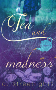
The indistinct image (the indistinctness seems appropriate here) shows a woman—presumably the author—with teapot in hand, walking away from a jumble of cups and saucers lying in the grass. The disarray of the tea set and the multiplicity of cups suggests a lack of self-composure or aimlessness.

You don’t normally see tea sets outdoors. You expect to find them arranged on rectangular kitchen tables or small round tables at restaurants or coffee shops. There’s something jarring about seeing such accoutrements abandoned outdoors. It looks as if the woman has had her fill and, perhaps in dejection, is walking away, not bothering to clean up after herself.

Or is she going off to find more hot water? It’s hard to say. Either way, the impression is one of unease, and that fits the “madness” part of the title well.

The only graphical element other than the photograph is a silhouette of a teapot. It is used as the container for the genre tagline, which tells us that this is “a memoir.”

Typography: That tagline is helpful—we might have little idea what the book is about otherwise—but the words are too small to be seen at thumbnail size. They should have been set in a condensed font and in two lines, with “a” centered over “memoir.” That would have allowed the letters to be taller and therefore more legible.

The title seems to have been composed in two fonts, one for “Tea and” and the other for “madness.” The fonts are similar, but close inspection shows that letters common to both parts are drawn differently. Look, for example, at the A and E.

The conjunction “and” is orange, while the other words are in white tinged with yellow. This gives “and” undue emphasis, which is doubly unfortunate in that the ascender of the D in “madness” is used to connect to the teapot, with the uppermost part of the ascender being orange tea coming out of the teapot. The orange in “and” detracts from the orange in the ascender.

Another problem is that the large swirl coming off the T in “Tea” comes too close to the cover’s edges, at both the left and right. The title thus looks cramped. This problem can be solved by reducing the size of the title. There is plenty of leeway for that, since the title is so large.

Lastly, “and” seems oddly placed. I would have put it below “Tea” and to the left of the teapot. There is room for it, though it might need to be slightly smaller. If repositioned, “and” would tend to draw the other two words together. As it is now, the title looks bifurcated, almost as if there were two titles.

The author name has several problems.

Its thin font is hard to read against the cups and saucers. Even a thicker font would have trouble being read unless it were lowered so that only grass appeared behind it, but that would require that the entire background image be raised, to show more grass at the bottom.

The color that works for the title doesn’t work for the author name because its letters are too small. White should be used instead. And the author name needs to be brought in from the left and right edges. Most of that could be accomplished by reducing the large space between the author’s initial and her surname and by shifting the period that follows the initial closer to the C.

Overall: This cover’s greatest strength is its photo. Its weakest is the sizing and coloration of its text. Fortunately, the textual problems can be remedied easily.

It is particularly important to make clearer the book’s genre. Thus “a memoir” needs to be more prominent. If adjusting the text, as suggested above, doesn’t do the trick, it may be necessary to enlarge the teapot silhouette.

Case Study 76

Title: The Plug Up

Author: Kevin Tait

Designer: Kevin Tait

Genre: Memoir

Graphics: The sole graphical element is a photograph of a cloudy sky. The image chiefly is in shades of gray, but there is a bluish cast toward the bottom, where the image ends at a white bar, beneath which is a black bar.

Cloud images are a dime a dozen. This one hardly rises that high. It has no character—and no color, aside from the added tint below. It is one step removed from a flat, gray background, and a flat, gray background probably would have been better. The clouds in this photo neither inspire nor intrigue.

The irruption of blue in the lower third of the cover seems gratuitous, and the white and black bars serve no obvious purpose. As poor as this image of clouds may be, it should have been granted the courtesy of extending all the way down, and the bars should have been eliminated.

Typography: The text consists of three almost illegible elements: title, subtitle, and author name.

The title is tucked into a fold in the clouds, as if the designer felt he had to put it there, thus limiting the size of the letters. The font mimics handwriting, but nothing the cover otherwise reveals why that is preferable to a regular font. In any case, the title is far too small. It should be about four times the size—and certainly in a different, tighter font and still more certainly in a color other than green.

The green text of the subtitle almost is legible when the cover is viewed at a small size, bur green is still the wrong color. The subtitle has multiple faults, aside from its color. Let’s start with punctuation.

A title or subtitle should not have terminal punctuation: no period, as here. There is a floating comma, unmoored to any word and in the wrong place anyway. No comma is needed in this sentence, the two prepositional phrases being tied by the conjunction “and.” The third punctuational error is a missing hyphen; one is needed between “self” and “transformation.”

There are problems with the layout of the text and with word choice.

The poorly chosen word in the first one, “A.” Instead of “A story of a spiritual thinker,” the line should read “The story of a spiritual thinker.” The definite article implies that the author is telling his entire story, while the indefinite article implies that he is telling one of several stories.

The text could be in three lines, but the words should break differently: “The story of a spiritual thinker/ and a quest/ for self-transformation.”

The preposition “for” shouldn’t be separated from the rest of the prepositional phrase, if possible, so “for” and “self-transformation” should appear on the same line.

Similarly, the first line includes a prepositional phrase: “of a spiritual thinker.” When combined with “The story,” that makes for a long line, but that’s not necessarily bad. The very short line that follows, “and a quest,” draws attention to itself from its very shortness. Of all the words in the subtitle, only “quest” gives a sense of change or motion, so it’s good to give it emphasis.

The author name is invisible at thumbnail size. Like the title, it ought to be much larger, though not as large as the revised title. Like the rest of the text, its green color is exquisitely wrong.

If the cloudy background were retained (and continued to the bottom edge), the author name could be put in white letters at the bottom, where the background is darkest, the title could be moved up about a fourth of the way toward to top, and the subtitle could begin at the cover’s midpoint. Like the author name, the subtitle should be in white, while the title could be in a bright color, such as yellow or gold.

Overall: The proposed changes would succeed only in making a bad cover a little less bad. The cover needs a thorough remake. As it stands, it sends a message. The message is that the author-designer should seek the services of a professional. That he let a cover such as this be published is confirmation of that.

Case Study 71

Title: The Best of Funds for Writers

Author: C. Hope Clark

Designer: My House of Design

Genre: Self-publishing

Graphics: You could squint and still tell that this is a non-fiction book and, likely, a self-help book. The graphical treatment is that obvious. Covers of fiction books almost never feature large, rectangular blocks of background color, as here. When they do, it’s almost always a design error, but with self-help books it’s almost always a design plus.

The central image, of a hand writing in a journal and of books stacked nearby, suggests writing or, at least, journaling. What it fails to suggest is that this is a collection of essays about how to earn money as a writer. The cover graphic includes no pecuniary element.

Given the style of the illustration, I could imagine a pecuniary element being represented by something like an overflowing piggy bank, a stack of gold coins or banded hundred-dollar bills, or an open checkbook. As it is now, the illustration could represent the act of writing and nothing more, and to me it suggests casual writing than writing for a livelihood.

Since it shows writing by hand rather than writing at a keyboard, the illustration is a step removed from the way people who write for money actually do their writing. Most of the book’s essays are about freelancing. Does any freelancer today get by with writing with a pencil? Not likely, so I think hands at a keyboard would have been more effective than a hand holding a pencil.

Thus the illustration has two weaknesses, attractive as it otherwise it. The action it shows implies informality rather than professionalism, and there is no indication of acquiring money being the object of the essays.

Typography: Just as the graphics fit a self-help book, so does the typography. There appear to be two sans serif fonts, one for the author name, volume indication, and the first three words of the title, the other for the remainder of the title.

All the words stand out well from the background, though the author name ought to have been in bold, the better to pop. It’s legible as it is, but the bottom of the cover could use more textual weight. The cover seems word-top-heavy.

Besides, the author name is a key element of a cover, and the author deserves proper credit. Many self-published writers, being otherwise little known, shy away from making their names big and bold. “No one will know my name anyway,” they think.

Humility is a virtue, but there is no good reason to downplay the author name when the object of the cover is to sell the book. If the author name is in sufficiently large and eye-catching letters, its very prominence will suggest to the buyer that this must be a writer of note, one he ought to have heard of already.

I have seen covers where all the text is well presented except for the author name, which is hidden in small text in a corner, as though the author were ashamed of having written the book. That hardly is the impression an author should want to give. That isn’t the impression given by this cover, but the author name nevertheless could use more oomph.

Each time I read the second half of the title, “Funds for Writers,” I get thrown off by the final S being in white. I read the words as “Funds for Writer,” and then I catch myself. I see no good reason for that letter and the swirl leading to the nib to be anything but black. After all, who writes in white ink?

Perhaps the S was put in white to balance the white of “for,” but is there a good reason to have that preposition in white rather than black? Not that I can see. Stand back from the screen and look at the title again.

The two words that stand out most are “Funds” and “Writer” (not “Writers”), precisely because they’re black. The “for” almost drops out of the picture, leaving the main part of the title to be seen as “Funds Writer,” which doesn’t make much sense.

Overall: This is a cover appropriate to the genre. Its weaknesses are not major. The deficiencies with the typography can be rectified easily. The deficiencies with the illustration would require more work to overcome, the main problem being that the cover doesn’t imply earning money. That’s not a killer, since the title itself supplies that information, but it would have been better had the title and illustration worked in closer harmony.

Case Study 68

Title: Letters from a Young Poet

Author: Michael Molyneux

Designer: Shanti arts Design

Genre: Travel, memoir

Graphics: I mistook this book’s genre immediately—and twice. At first I presumed this to be a book of poems, given its graphical style. (More on that below.) Then I realized that the title promises letters rather than poems, so I thought it was about a young man’s struggles to become a successful poet: a poetic coming-of-age story.

It is neither of these. It consists of more than seventy short recountings of things and people the author experienced as he traveled solo through Latin America. I never would have gathered that, had I not looked at the first few pages of text.

The indistinct painting shows a doorway into a garden. On the wall is a guitar, on the walls some paintings, and at the sides two chairs. The style is Impressionistic, and that’s not conducive to clarity at small sizes. At thumbnail size, most elements of the painting are indecipherable. The chairs and guitar can be made out but not much more.

The scene does have a Latin American look to it, so in that degree it’s appropriate for a travel memoir that takes place far south of the border, but the scene doesn’t necessarily suggest travel in and through Latin America. It doesn’t suggest interacting with people met on the journey—something, from the table of contents, that seems to be a big part of the retelling.

I mentioned that I at first thought this to be a book of poetry. That’s because many such books—not just those produced by indie authors but also those produced by smaller traditional publishers—are laid out as this one is: a boxed, artsy image, chosen seemingly because it’s pretty, not because it relates to any particular poem, with the box taking up less than half the real estate of the cover, the remainder being the title and author name in a nondescript font, with everything on a background of a single, solid color.

Perhaps people and firms that produce poetry books have tended to use a common template. If so, they would do well to discard it. Other genres have template-like covers. Many science fiction books or police procedurals look like close cousins of one another, but those templates at least speak to the respective genres. The imagined poetry template doesn’t.

The artwork seems like an afterthought, something to take up space so the cover isn’t reduced to two lines of type, as this cover would be if the image were deleted.

As I say, that’s for poetry books, but this isn’t a poetry book. It just looks like one. I suspect others who have come across the kind of poetry books I have seen will have the same reaction. They will think they will find poetry and so either will pass up the book (because they aren’t looking for poetry) or will purchase it and become disappointed (because they are looking for poetry).

Typography: It’s hard to say what should be done about the uninspiring font used for the title and author name. As a start, there should be two fonts, a serif font for the title and a sans serif for the author name. The latter should be in all caps, not upper and lower caps, as the title presently is.

The title should be in a font with some hint of movement or even place, and it should be set in upper- and lowercase letters. The book is about traveling in Latin America, so a font with a few flourishes might be appropriate for the title, which could use a little verve.

The author name is too small, and the title is far too small. If the image is kept boxed, it could be raised to provide space at the bottom (but not too near the bottom!) for the author name. The author name and box should be centered, there being no particular reason to have them off to the right.

Moving the author name would leave room at the top for the title, which should be centered in two lines: “Letters from/ a Young Poet”. The font should be about twice the present height.

These adjustments would help, but the predominant element of the cover would remain what it is: not the text and not even the image but the mass of color in the background. The way around this is to get rid of the background by making the image extend over the whole of the cover. If that were done, the text would have to be arranged other than as proposed above.

In that revision, I would place the title in two lines at the bottom, across the flagstones, and would put it in a thick-lined font and in black. The author name I would put atop the lintel at the top. It also would be in black.

Overall: I mention alternate reworkings of the cover because I see no completely satisfactory solution, at least so long as the image is retained. It doesn’t work in its present small size, and it will remain with deficiencies even if made full size.

Having the image take up the whole of the cover may be the better way to go; at least it gets rid of the overpowering dark-red background, and it also might prevent people from jumping to the wrong conclusions that I jumped to.

Case Study 66

Title: What’s Really Eating You?

Author: Renée Jones

Designer: Cathi Stevenson

Genre: Self-help

Graphics: To say this cover’s graphics are minimalistic is almost to understate the case. We can spot just three elements: a broken spoon, an easy-to-miss butterfly, and the background itself.

If the spoon were whole, it wouldn’t so much imply restraint from eating as digging in. A little thing like a break changes the symbolism entirely. It sends the exactly opposite message. Since spoons don’t break spontaneously (it’s not easy to break a spoon, even if you try), we know that the break was deliberate: the breaking of the spoon stands for the breaking of a bad habit.

Oddly, this spoon is deeply tarnished. It’s not obvious why. Tarnish suggests that the spoon hasn’t been used much; it’s what we expect to find on authentically silver silverware that has lain in a drawer for a long time.

Granted, the tarnish does add “character” to the spoon, and it tells us that this is (or once was) a piece of a handsome place setting. Still, I’d have opted for a well-polished spoon, an image that implied constant use (or overuse).

The spoon is set too far right. This book was published not just as an ebook but as a hardback and a paperback. I wouldn’t be surprised if, at least in the case of the paperback, errant trimming made the break in the spoon touch the edge of the cover—or even extend beyond it.

This potential problem could have been avoided by rotating the two parts of the spoon inward, so the break is aimed not at the edge of the cover but toward the bottom of the G in “Eating,” though perhaps it would be necessary for the bowl of the spoon to be placed vertically while the handle was placed at more of an angle.

So much for the spoon. What about the butterfly?

“What butterfly?” you might ask. Fair enough. I missed it the first couple of times I looked at the cover. I mean the butterfly silhouette at the top right. I suppose the designer meant the butterfly to symbolism liberation from the habit of overeating. The placement perhaps was meant to imply that the butterfly somehow freed itself from the bowl of the spoon, but that’s a conceit that’s a little too precious.

If a butterfly were to be used, I think it would be better if it were especially colorful. (The “question mark butterfly”—yes, that’s its common name—would be appropriate: its wings are orange, brown, and black, and it would “pop” from this cover’s background well.) That would heighten the liberation symbolism. The vague, monochrome silhouette presently on the cover can be taken to be a shadow, implying something that was but no longer is rather than a new birth, thus sending a confused message.

The third element of the cover is the aquamarine background pattern. It isn’t entirely flat; it has a slight texture. The color is subdued enough that the spoon and text aren’t lost in it. I might have considered a background that looks more like a wooden table on which the broken spoon could rest, but such a table would have to have subtle grain so as not to interfere with the imagery or text.

Typography: This cover has three textual elements: title, subtitle, and author name. The first and last are in a serif font, the subtitle in a sans serif font. I would have reserved the serif font for the title alone, since it’s the most important part of the wording.

The present font is adequate, but the kerning needs work. There is too much space between the apostrophe and the S and too much between two A-T pairs, but most people won’t notice those small deficiencies.

The chief problem with the title is its coloration. It’s in navy blue, sitting atop aquamarine. There is insufficient contrast between the two colors, resulting in a title that doesn’t catch the eye as it should. Odd as it may seem, the title would stand out better if it were in black. I say that may seem odd, because many people assume black to be the least prepossessing color, but actually black and white are the colors that usually are most noticeable when place against colored backgrounds, as here.

As an alternative to black, a yellow or gold tone could be considered. Whereas black text would be more noticeable than navy blue text, it wouldn’t be so noticeable as to draw attention away from the spoon, which is where the eye tends to go first. If the title were in yellow or gold, it likely would take precedence over the spoon—not necessarily a bad thing, but one a designer would want to weigh.

The subtitle is too subtle. It needs to be in bolded text. The font itself is fine, but its lines are thin, and so the words don’t stand out sufficiently from the background. This is an easy fix.

Similarly for the author name, which, as I said, should be in the same sans serif font as the subtitle. If set several points larger than the subtitle, the author name could remain unbolded. That would provide a nice contrast with the subtitle. The contrast would be more marked if the letters of the author name were kerned widely, a common technique nowadays for author names.

Overall: This simple cover has much going for it, but it could stand a little perkiness.

The spoon, on its own, isn’t enough to make the cover look upbeat, and that presumably is what the author would want. She is providing what she believes is a solution to a widespread problem, so the cover of her book should emit a can-do attitude. A colorful butterfly and more prominent lettering could achieve that.

Case Study 64

Title: The Dirtbag Handbook

Author: Vanessa Runs

Designer: Y42K Publishing

Genre: Travel

Graphics: The author, her husband, and their pets live in a 22-foot long RV and have traveled the country spending less than $20,000 annually, all expenses included. This is the story of how they were able to do that and how others can follow their example.

Not surprisingly, the RV is the center of focus for the cover. Here we see the rear of the vehicle. At full size the photo shows clearly that the RV is pasted with innumerable stickers. Some are of places visited, such as Zion National Park, while many seem to have little to do with travel per se.

Even at full size, it’s hard to make out most of the stickers. At smaller sizes, as here, it’s impossible, and the rear of the RV could be mistaken for a vehicle that was damaged in a severe sandstorm.

It’s a pity the stickers aren’t fewer and larger. The designer could have airbrushed out most of the actual stickers and overlain a few easily-read substitutes, such “Nomads on Board” (to mimic the actual “Baby on Board” sticker at the top of the RV’s rear). As it is, the stickers are so plentiful that they make it hard to make out the lines of the mountain bike that hangs off the rear of the rear.

Sometimes, particularly for non-fiction books, it’s desirable to use photos of the author or the author’s possessions. Sometimes not. This is one of the not times. The RV is just too cluttered for clarity. It’s also too static. The book is about travel, a term that suggests motion, but there is no sense of motion here.

The RV is shown in a bubble of landscape. Bushes and dirt can be made out, but not much more. The color of the dirt is continued onto the rest of the cover, forming its background. I can’t tell whether this background is a true photo of the dirt or merely a stock texture that imitates dirt. Either way, it makes for easy contrast for the text. It also makes for a background that overpowers the image of the RV, which takes up only about a third of the total area of the cover.

Typography: Like Caesar’s Gaul, the text here is divided into three parts: title, subtitle, and author name. All three parts are in the same font, and it’s a dull one. It might be adequate for the subtitle and author name, but, for variety, a different font should have been chosen for the title, preferably one with mild serifs, a font that hints at motion.

The font used here not only lacks interest but it lacks good kerning. Notice how the T and B in “Dirtbag” nearly touch one another, while the I in that word is separated by four times as much space from the D and R. This appears to be a problem arising with the B, which elsewhere also plays unhappily with its neighbors. Some fonts are like that, their designers having drawn one or more letters imprecisely.

All of the text seems to be slapped atop the background. None of it seems part of the imagery. Ideally, cover text should seem integral with the graphics, but that hasn’t happened here. It’s as though the graphics were completed and then the cover was run through an inkjet printer to apply the words.

Overall: The image of the RV has weaknesses, but it has a countervailing sense of verisimilitude. This is the author’s actual vehicle, and the reader supposes the book will be WYSIWYG in terms of storyline: what you see is what you get.

Since the design firm specializes in books about running, I presume the author is using a pseudonym, at least for her surname. If her name amounts to “that Vanessa who runs,” then it’s unfortunate that this cover doesn’t express as much motion as her name does.

Case Study 60

Title: What Happened to Me

Author: Richard White

Designer: Richard White

Genre: Memoir

Graphics: This is the author’s account of dealing with post-traumatic stress disorder, anxiety, and depression. The book is so short—just 29 pages—that many would consider it a long pamphlet, but even pamphlets deserve good covers.

The black-and-white image doesn’t seem to be of the author. His author page at Amazon shows a middle-aged man, but the fellow on the cover is notably younger. Maybe it’s an old photograph of the author, but I suspect it’s a piece of stock photography.

Whatever its provenance, the image is effective, particularly the eyes, which are looking worriedly to one side. You almost can hear the man rephrasing the title as a question: “What is happening to me?”

There are two incongruous elements to the cover design.

The first is the in-your-face award seal. It’s grand for a book to receive an award, but these seals always seem to interfere with covers’ graphics. That certainly is the case here, with the seal, which has a bit of color and shine, being superimposed on a matte image. If the seal is to be used at all, it should be relegated to the back cover.

But honestly, I wouldn’t use this seal at all. It says “Amazon.com Bestselling Author,” but that really doesn’t mean much.

All it means is that a book reached the No. 1 spot in one of the hundreds of minute subcategories at Amazon, and it usually means nothing more than that the book held that spot for a few days or even just a few hours. Every day, hundreds of books become fresh (and short-lived) “bestsellers” at Amazon.

Maybe this book became No. 1 briefly in the “Anxiety & Phobias” category, where it presently has its highest rank, but that’s a fourth-level category, meaning their are hundreds of categories at higher levels.

The other incongruity is the pastel banner at the bottom. Nowhere else does that light color appear. It falsely draws attention to itself. If anything good can be said about it, it’s that at least it isn’t a bright color, which would be immeasurably worse.

Typography: Let’s go from top to bottom.

The puffery tagline (“International Best Selling Author”) either needs a hyphen (“Best-Selling”) or it needs the words joined (“Bestselling”). What it needs more than either is size. It’s too small.

The letters seem widely kerned. They should be returned to standard kerning, and, if there is one, should be put in a condensed version of the font. Even just closer kerning would allow these words to be boosted in size: there is room for them to go left and right.

Next comes the author name, which looks small in proportion to the title. It ought to be set larger—ideally large enough to stretch as widely as the line above it, and it should be set in bold. It still would be less prominent than the title, but the discrepancy no longer would be a problem.

Then the title itself. The font has a slightly distressed look, which seems appropriate when the theme is PTSD, but its distress doesn’t seem quite enough. I would select a more irregularly-drawn font, or I would go the other direction and select one without any hint of distress. The current font falls in between and so seems slightly off.

The first word of the title, “What,” is smaller and more widely kerned, for no evident reason. If it isn’t the most important word in the title, it’s at least the second most important word and should be given equal status with the others.

Then comes the genre tagline, “A Story of Defeating PTSD.” The words clearly inform the viewer what kind of book this is. Without the tagline, someone might presume the book to be a thriller or mystery.

But what about that pastel background? It should be replaced either with the lower part of the photo or, if that part is unavailable or inappropriate as a backdrop, with solid black that transitions, on the left, into the man’s chin and beard.

That done, the tagline’s text should be reversed out into white (the same tone as the author name), and the italics should be removed. They serve no purpose.

Overall: The photo is arresting and rightly is presented in black and white. There are problems with sizing of the textual elements, but those problems can be resolved in minutes by the designer. This cover is only a short way from being an excellent cover for a book—or even a pamphlet.

Case Study 59

Title: 14 Steps to Self-Publishing a Book

Author: Mike Kowis

Designer: Octagon Lab

Genre: Self-publishing

Graphics: I tried to count and came up with about three times fourteen steps in the illustration, each step being a book. It would have been nice if the designer had been able to match the number of steps to the number in the title.

Perhaps he used a stock illustration and felt constrained, though it seems he easily enough could have trimmed the illustration at the man standing furthest to the right. That man happens to be standing on the fourteenth step (or book). A snip of the graphical scissors would have made for a perfect numerical match.

Even without numerical accuracy, the illustration is on point. This book is about publishing your own book, and the author tells you how to do that in fourteen steps—thus an illustration that shows books as steps is just right.

If the illustration were modified as I propose, it could be moved up slightly from the bottom and in slightly from the right. As presently positioned it is cut off without obvious purpose. Despite that, the illustration works well.

It does have two minor drawbacks. One is the wall behind the steps. The transition to the upper part of the cover is too abrupt. I would feather the wall, making it a gradient that fades out at the level of the top step. The other drawback is the overall subdued colors of the illustration. Perhaps the designer could brighten up the people or even some of the books.

Typography: The title font is clean, as one expects for a how-to book, and all the words are legible, even at thumbnail size, but why are the words in three colors (red, gray, black) and five sizes? To my eye, the most grating thing is the size differential between “Steps” and “Book.” They appear to be in the same font and ought to be at the same size, particularly since both are black and bold, but “Book” is notably bigger.

It may be harder to tell, but “to” and “a” also are in different sizes. That makes four mismatched words. I would make “Steps,” “Book,” “to,” and “a” all the same size and in the same font. I would remove the bolding because those words otherwise overpower the key title words, “Self-Publishing.”

If the four lesser words are made uniform, the lines will be of unequal length, given the differing number of characters. I would kern the bottom line wider, to match the length of the two lines above it.

Those key words, “Self-Publishing,” are fine as they stand. So is the oversized top line, but I would put “14” and “Self-Publishing” in a brighter red. This cover looks faded compared to most how-to books, which commonly have bold colors. There should be hints of boldness here.

The final bit of text is the author name, which has two problems: it’s too small, and “Esq.” should be jettisoned.

What does being an attorney have to do with teaching self-publishing? Nothing. (I can affirm that because, long ago, I practiced law.) If “Esq.” were removed, there would be plenty of room to enlarge the author name, which should be set in all caps to match the rest of the lettering.

Overall: As it stands, this is a good cover, but it easily could be refashioned into being a top-rate cover. I would give it a B in its present condition. It wouldn’t take much for it to earn an A.

Case Study 58

Title: Pens Plows & Gunpowder

Author: J. P. Irvine

Designer: Cara Willenbrock

Genre: Poetry

Graphics: The editor describes J. P. Irvine (1835-1892) as “the most forgotten Midwestern poet of the nineteenth century.” These are Irvine’s collected works. The editor hopes to salvage him and his poems from obscurity. Does the cover help do this?

There is but one element to the graphics, set off to the left of the cover. At first I took it to be an old map but on closer inspection saw that it is page from a patent application. What is the significance of this? There’s no indication. The drawing looks nineteenth-century-ish, so that fits, but is it supposed to tell us something about the poet, about the overarching theme of his poems, or what?

What made me think, at first glance, that this was a map was the burned edge. It brought to mind the opening credits of the old television show Bonanza, where a map of the Ponderosa ranch is set aflame. I wonder whether other viewers “of a certain age” might have the same reminiscence.

The larger part of the cover has no particular artwork. It consists of a tinted background that is lightly speckled, giving the impression of old-timey paper: thus map against paper. I suppose the speckles are better than nothing, but the vast open space makes one think less of the Old West (or the Old Midwest) than of a lack of creativity in filling the void.

Typography: The title is in a font that evokes the nineteenth century. Curiously, the title as shown on the cover isn’t quite as it appears at Amazon. On the cover the serial commas are missing. At Amazon the cover is given as Pens, Plows, & Gunpowder, which is proper and preferable. Why the commas are missing isn’t explained.

While the title font is appropriate, the letters are far too small. That may be because the image was placed first and the remaining space was considered by the designer to be unable to hold larger text. That should have led to the reconfiguration of the image.

I would reshape the image to fit in the lower half of the cover so the title has space to spread across nearly the whole width in two lines: “Pens, Plows/ & Gunpowder,” with the possibility of the ampersand being centered on a line by itself. Then I would choose a hue a red for the title, making it the one non-sepia element.

If the title needs work, the subtitle need more. It is the only line that explains what the book is about. If we had only the title to go by, we might think this to be a work of history, perhaps about the 1605 Gunpowder Plot in London. We almost certainly wouldn’t think it to be a collection of poems.

In fact, even with the subtitle as is, we wouldn’t necessarily guess that the “collected works” are poems. That suggests that the line should be rephrased to read “The Collected Poems of J. P. Irvine.”

In any case, the subtitle should be set in two lines: “The Collected Works [Poems]/ of J. P. Irvine.” To keep to the period feel, a serif font can be used, but not one with pronounced serifs. The font for the subtitle shouldn’t compete for attention with the font for the title.

That subtitle font also should be used for the author name, which in this case actually is the editor name and which should be set in all caps in a single line near the bottom of the cover.

Overall: This cover’s chief fault is lack of genre specificity. Even if we can read the small text, we can’t be sure what is behind the cover. It could be poems, but it also could be non-fiction essays or short stories.

The title font tells us more or less the era, and the image does the same, if confusedly. The elements of a good cover for poems are here, but they need reworking. Until they get it, I’d rate this cover no higher than a C.

Cast Study 56

Title: Move or Improve?

Author: Debbie C. Miller

Designer: Steve Fata

Genre: Self-help

Graphics: The sole graphic clearly is a stock business image, the kind that looked innovative in the 1990s. Here we see a maze that fades into the distance. A youngish man and woman, in business attire, view a shortcut across the maze, the shortcut being cut by the eraser of a gigantic pencil.

The image is muddy blue, and the telltale yellow of the pencil is hardly discernible. Nothing about the image pops, and nothing about it relates to the book’s theme, which is housing options for those nearing or at retirement age.

The intended audience is baby boomers, yet the two people in the image clearly aren’t in that generational cohort. The length of the woman’s skirt is enough to tell us that. And what does a maze have to do with downsizing a home? Granted, the process can be confusing and frustrating, just as mazes can be confusing and frustrating (they are designed to be so), but that’s a tenuous connection.

Why not an image of a shrinking house, to suggest empty-nester-ism? Or a moving truck? Or houses of various sizes? Such images actually would relate to the argument of the book. The present image doesn’t.

Worse, it’s just an unattractive image regardless. I presume that it didn’t start out so muddily blue but that the designer muted the colors in order to form a backdrop for the text. Perhaps that helped legibility, but it injured attractiveness.

The image adds nothing, so it should have been omitted, replaced either with a relevant image or with nothing at all, since this cover could have gotten by just with a clever placement of text against a solid background—something that often works with covers of how-to books.

Typography: As ineffective as the image is, the text is more so. Let’s work our way up.

The author name is clear enough, though I would set it in sans serif rather than in the serif font that, at present, is used for all the text. That same san serif I would use for everything except the title. Even with that change the author name would require help. It is too near the bottom edge and is threatened with having its feet sliced off on the paperback version of the book. (One has to leave room for errant trimming.)

As a practical matter, there likely won’t be many instances of that, since few people ever will see the paperback version. Its price ($24.95) and the book’s length (just 50 pages) will see to that. Nevertheless, even for the benefit of the ebook cover, the author name should be shifted up—and it should not be isolated in a box that serves little purpose.

Moving up the cover, next we come to the second half of the long subtitle, “How to Choose What’s Right for You.” This is the second-most prominent part of the titling area, after the main title itself. It so overpowers the first half of the subtitle, “The Baby Boomers’ Guide to Housing Options,” that at first I read it immediately after the main title, “Move or Improve?”

When read that way, the second half of the subtitle makes little sense. What is the “What” in “How to Choose What’s Right for You”? There seems to be no referent. You have to backtrack to take in the first half of the subtitle, and only then do you realize that the book is about housing choices.

This problem arises from the subtitle being bifurcated in two ways. The fist half is reversed out in a white box, and it’s set in considerably smaller type. It’s meant to go with the second half, as shown by the colon, but the two parts feel disjointed. I would have reversed out the reversal, making the first half look like the second, giving both halves the same size and the same coloration.

Even with that clean-up, the subtitle would be less than optimal because it’s so wordy. If all fourteen words are retained, they could be set in four lines, like this: “The Baby Boomers’ Guide/ to Housing Options:/ How to Choose/ What’s Right for You.” Notice that each line includes one phrase or thought.

Now to the title, the largest yet weakest part of the textual treatment. The font is not particularly attractive, in part because the letters are not kerned well. Notice that the V and E nearly touch, while the O and V seem too far apart. Since the title includes an action word, “Move,” I would have chosen a serif font with more character—but not one that might be mistaken for a font suitable for a romance novel.

What about the title’s middle word, “or”? Look how much emphasis it has, partly from being reversed out (black instead of white) but mostly from being set in a large white box. The box is the largest segment of white on the cover, yet it does nothing. It serves no purpose. The word “or” doesn’t need emphasis; after all, it’s the least important word of the title. It would have been fine to leave “or” in white, just like the other two words.

Perhaps the designer felt that such a small word, on a line of its own, looked orphaned. That could have been fixed by putting “or” in italics or in a separate, cursive-like font (thus adding a little variety to the text). It also could have been fixed by putting “or” at the end of the first line, thus making the title two lines rather than three.

Normally it’s a mistake to put a conjunction or similar small words, such as prepositions and articles, at the end of a title line, but here it could be made to work if “or” were in a notably different font. One advantage of such an arrangement is that it would allow “Move” to be made the same size as “Improve,” removing the false impression (given by the present cover) that “Move” is more important than “Improve.”

Overall: As it now stands, there is little to commend this cover. It looks amateurish and, worse, ineffective.

Its words ought to flow, but they do not, and the odd textual treatment leads the viewer into misunderstanding what the book is about. Even the graphic sends wrong signals about the book’s theme and its target audience.

Case Study 53

Title: Book of Failures

Author: Amy Binegar-Kimmes-Lyle

Designer: Andrea Ferenchik

Genre: Memoir

Graphics: The cover features a photo of the author. We know that because her name appears in small white letters on the base of the red chair. And that’s it, image-wise. There is no background image and no background texture. That poses a problem.

The white background makes the image float when viewed at thumbnail size. The cover appears to have no borders. Some such covers, when viewed at their sales pages at Amazon, have thin rules or drop shadows around them, but this cover doesn’t. It just floats.

This is a widely seen problem, and I don’t understand why designers don’t compensate for it. You’d think they’d look at how their covers look at Amazon and other sales venues, but perhaps they don’t bother.

This book is characterized as “a funny memoir,” so it’s appropriate that the author looks, if not pensive, maybe puzzled. She’s eyeing something off to her left. Her lips are pursed slightly, but that’s noticeable only when the cover is enlarged. It might have been good if she had exaggerated the pursing, to make it more obvious.

If there is anything bothersome about the image it’s that her feet have been cut off. That wouldn’t have happened if the image had been reduced slightly. As it is, the feet leave the impression that the cover was designed with insufficient care.

Typography: The title is curved, perhaps to follow the lines of the chair, but the curves don’t match. Better to leave the text straight.

The title font is cartoonish. That may be appropriate given this memoir’s emphasis on humor, but the font doesn’t make for legibility. I wouldn’t recommend Comic Sans here (or anywhere else, for that matter), but there are many lighthearted yet legible cartoonish fonts to choose from.

Another choice of font should have been made—and another choice of color. I would have put the title in the same red as the chair, leaving all the rest of the text black.

In everyday life the author seems to go by “Amy Lyle,” the name that appears on the chair, but the book partly is about her two marriages, so her name is given as “Amy Binegar-Kimmes-Lyle,” a mouthful that includes her maiden name. Unfortunately, the hyphenated name is so long that it’s difficult to give it the prominence it should have. (Adding “The” before it doesn’t help.)

The author’s name thus appears two ways, short and long, with the long way used for a reason a reader won’t “get” until the book is read. It would have been better simply to use “Amy Lyle” at the top, in larger letters, and to omit her name from the chair, where the name could be mistaken for a manufacturer’s logo.

The subtitle is “A Funny Memoir of Missteps, Inadequacies, and Faux Pas.” That clearly explains what the book is, but the subtitle is crammed into a small space and itself becomes too small. It would be better to put it, in two lines, at the bottom of the cover (after the author’s feet have been salvaged, of course) in considerably larger type.

Overall: The image is simple but has strength to it. Aside from the problem with the cut-off feet, it has no real fault. The same can’t be said for the typography. All the text needs adjustment.

It would not take much work to earn this cover a higher grade. As it stands, I would give it no more than a C.

Case Study 52

Title: Tilting

Author: Nicole Harkin

Designer: Nada Visual

Genre: Memoir

Graphics: This is the author’s account of her family, particularly problems involving her father. Although the credits page doesn’t say so, I presume the cover photo shows members of her family and was taken several decades ago. The photo has been put through a filter, the figures, deck, and fencing now appearing indistinct. The central third of the image is lightened, or is it that the outer two thirds are darkened?

Either way, it isn’t easy to make out details. Perhaps this is deliberate, there being nothing of note to note. Family photos often are that way. Perhaps this scene is mentioned somewhere in the book and is considered by the author to be a “significant moment.” If so, it holds no meaning for the reader who hasn’t yet read the book.

The cover looks artsy, but does the image tell us anything about what’s inside? If the words “A Memoir” were omitted, would a reader realize this book’s genre? I wouldn’t. I’d guess it to be a novel. The artsy-ness suggests that to me, since the image reminds me of images that appear on novels published by traditional publishing houses.

The most prominent thing on the cover isn’t the photo and isn’t the text. It’s the seal of approval, which reads: “The Wishing Shelf Book Awards 2017 Gold Winner.” Unfamiliar with that award, I looked it up.

It was set up in 2014 by a British fellow who didn’t care for the way other book awards operated. It’s one of those ubiquitous awards where author submit their books, pay a fee, and receive in return—if chosen as winners—a handsome certificate and the inclusion of their names on a list that no one other than applicants is likely to see.

In other words, this is no Newberry Award or Booker Mann Prize. If a book received an internationally-known award, it would make sense to feature notice of that on the book’s cover, but what does a seal from the Wishing Shelf Book Awards tell us? Very little, really, and that has to be weighed against the seal’s intrusion onto the cover’s artwork.

Here the intrusion is notable. The seal is the most eye-catching part of the cover, but I can’t imagine any prospective buyer saying, “I’ve got to get this book—it won the Wishing Shelf Book Award!” The marketing value of the seal will be low, but its interference with the moody cover will be great.

It would have been better to put the seal on the back cover of the paperback edition and to make mention of the award somewhere in the opening pages of the book.

Typography: The text is minimalistic, both in quantity and style. There are but five words, one for the title, two for the author name, and two for the tagline. The fonts are spare, one for the title and another for the other words. Fonts with prominent serifs would be inappropriate here. These fonts work well with the horizontal lines of the image, particularly the fencing.

It’s proper that the title word, “Tilting,” tilts. I wonder whether making it tilt the other, “wrong” direction might have been good, suggesting thereby that something was amiss. After all, the memoir is about a family in which, apparently, much was amiss. You might say that’s inconsequential.

What’s not inconsequential is that the title doesn’t stand out well. Its letters could be kerned more tightly and enlarged. Like the photo, they appear screened. It would be good to see how they would look if they were at full strength, thus becoming the only part of the cover (other than the seal of approval) that pops.

The author name is far too small, and the series designator (“A Memoir”) is smaller still. Each is kerned widely—but not equally. They should be the same size in height and in spacing, and they certainly should be taller, to make them decipherable at thumbnail size.

Overall: This cover deserves a high score for its artistic feel but a low score for its marketing effectiveness. It’s a pretty cover, but it’s also pretty hard to make out parts of it, and that seal grates.

Case Study 50

Title: Fiction in a Weekend

Authors: Michael Ashley and Alicia Dunams

Designer: Book Cover World

Genre: Self-publishing

Graphics: This book is a lead magnet. It’s designed to get you to a website through which you can sign up for a course on novel writing. The authors have a similar course for non-fiction writing. They hold themselves out to be experts in getting books written. Does the cover convey such expertise?

The graphics are minimalistic. The background is a lightly patterned pastel blue. The pattern is so light that it’s visible only when the cover is seen at expanded size. Otherwise the art consists of a clip-art style illustration: laptop, coffee mug, phone, pen and paper, disembodied arms.

Again, the cover must be seen at its maximum online size, such as when clicked on at the book’s sales page at Amazon, for another element to be seen: the laptop screen shows a two-page spread the righthand page of which is labeled with the name of the book, Fiction in a Weekend.

This would have been a cute technique had it been visible at thumbnail size, which is the size at which people first will see the cover. They won’t visit the book’s sales page unless the cover already has done its job, at which point the words on the laptop will be superfluous.

Typography: All the text on the cover, even the smallest, seems backed by a light glow, an analogue of a drop shadow. The glow has the same purpose as a drop shadow: to make text distinguishable from its background. If, as here, all the text needs help to pop from the background, that means there is a problem either with the background or with the text. If the background had been lighter, such as pale yellow, the glow wouldn’t be needed.

The lines of text alternate between red and black, with the red standing out more because it clashes with the blue background. Since the red stands out more, the lines of text in red catch the eye better. That’s fine for the first word of the title, and it’s fine for the third line of the subtitle since “and market yourself” is a key promise by the authors, but it’s not fine for the first two words of the subtitle, “How to.” Why emphasize them? And why emphasize the authors’ website address, which is given on the bottom-most line of the cover?

There are two extraneous bits of text. The website address is one of them. It ought to be on the back cover of the paperback edition and on a “Contact Us” page in both the electronic and paperback editions. It doesn’t belong on the cover—and, for years now, website addresses have not needed the prefix “www,” which ought to be dropped.

The other bit of extraneous text is the trademark symbol attached to the last word of the title. It serves no legitimate purpose, either graphical or legal. The symbol used is for unregistered trademarks. As a rule, titles of single books can’t be trademarked, though series titles can be.

This is a stand-alone book (the authors don’t have a companion volume for non-fiction), so it would seem that its title wouldn’t be eligible for trademark protection even if that protection were applied for formally. Conclusion: omit the trademark symbol.

I see a problem with the subtitle that likely eluded the authors. The last six words can be read as “[how to] market yourself as a debut author.” Why would anyone want to market himself as that? Why would he want to emphasize that this is his first book? That isn’t something first-time authors shout from the housetops, at least not toward prospective buyers.

They indeed may shout the happy news of first publication to their family and friends, but they don’t advertise their freshman status to the public at large because that would do nothing to help sales.

I know, I know. What the authors of this book meant was something like this: “As a debut author, here is how you can market your book” or “Book marketing tips for the debut author.” But that’s now how the subtitle reads to me and probably not how it reads to others.

On the whole, all the cover text looks small, aside from “Fiction.” The line spacing in the subtitle is wide, so there is plenty of room for taller text, though that would necessitate a more condensed font. Similarly, the author names ought to be nearly doubled in height. There will be room for that when the website address is removed and the names are put on two lines.

I would put the author names in red and would make all four lines of the subtitle black. The title should be all in red, thus making a color balance between it and the author names.

Overall: This book promotes book writing, not cover design, but it needs high-quality graphics to suggest the authors’ expertise as authors. It doesn’t have such graphics. What it has, even if done bespoke, looks like the clip art that is bundled with hundreds of programs. There is no sense of graphic originality. Much the same can be said of the typography.

When a book touts its authors as experts, it needs an expert look, something this cover lacks.

Case Study 49

Title: From Ocean to Ocean

Author: Jerome J. Murif

Designer: Sylvain Eliade

Genre: Travel, memoir

Graphics: In 1897 Jerome J. Murif bicycled across Australia, from south to north, from Adelaide to Port Darwin, in 74 days, without sponsorship or support and without benefit of paved roads or even many dirt roads. This is his account of his trip. It’s just, therefore, that the cover include a photo of him and his bicycle.

Inasmuch as Murif disappeared from history the year after his ride, it’s not surprising that there must be few photos of him. He was a loner who wanted to do something big, did it, and then was forgotten. Fortunately the editor, who also is the cover designer, found a photo that, nearly a century-and-a-quarter later, catches the eye because to us it seems a period piece. Murif stands stiffly by his steed, looking not at the camera but seemingly into the distance. His bicycle, a little surprisingly, looks like many hardtails we see today.

Murif’s right arm is cut off by the left edge of the cover, and the bicycle’s front tire nearly touches the right edge. Perhaps the designer was trying to make the image as tall as possible and so sacrificed airiness, but the photo gives the impression of having been carelessly cropped. Had the photo been reduced slightly, with the complete arm visible and the tire further from the edge, that impression would have been obviated.

The photo takes up something less than half the cover and is cut off diagonally. Above it is a line drawing, not a direct taking from the photo (the rider’s hand is positioned differently, for example) but clearly a representation of a similar scene. The drawing occupies space but otherwise adds little; it might have been better had it been a depiction of Murif riding. The main problem is that the drawing draws the eye away from the photo and away from the text.

The original photo must have been in black and white, given the era, but on the cover it and everything else is in sepia tones. This gives an old-timey feel but also makes for a bland cover. It might have been interesting to try a few color highlights on the bicycle, thereby drawing additional attention to it, or perhaps it would have been enough to add color to some of the text.

I am unable to discern what the opening in the wall, above the bicycle, might be. I would have airbrushed it out. The hole does nothing but distract. At thumbnail size it looks like a rectangular splotch, and at the cover’s maximum size online it still is a puzzle. Perhaps the text explains what it is, but a viewer shouldn’t have to read a book to understand elements of the cover.

Typography: Everything on the cover is pushed to the left: the rider, the title, the subtitle, and author name. The only exception is the date of original publication, which ought not to be on the cover at all. The text should be centered, to contrast with the leftward emphasis of the photo.

At least the title should be in a color aside from its present brown. Deep red would do. The title is in a font that suggests handwriting, and that’s fine, but the subtitle is in italics, which is not fine. It should be in roman, and it could stand shortening.

Australia is known to be a continent, so there is little purpose in labeling it as such, and the opening words of the subtitle, “An account of,” are unnecessary. The subtitle could be reduced to this: “The First Ride Across Australia, from Adelaide to Port Darwin.”

Although the wordcount would be reduced this way, the text size should be increased; there will be room for that, even if the subtitle is refashioned into two lines rather than three.

Notice my addition of a comma. With the comma, the subtitle implies that this was the first ride across any part of Australia and that it happened to be from Adelaide to Port Darwin. Without the comma, the subtitle implies that this was the first ride from Adelaide to Port Darwin but that there may have been earlier rides across Australia between two other cities.

In the title, the preposition “To” should be changed to lowercase. Small words, such as prepositions and articles, should be lowercased unless they begin a title or sentence.

The author name is far too small. One almost has to hunt for it. It should be in all caps (not large and small caps), enlarged to at least twice its present height. It might look good if the letters were widely kerned, a common attribute given to author names. As mentioned above, the publication date, 1897, should be deleted.

Overall: This cover’s biggest problem is the gratuitous line drawing in the background. It provides no information not already provided by the photo of the bicycle, and it obscures the text.

The text itself needs reworking; it needs concision. This is as true for the cover of a book as for its interior text. An author always should be asking himself whether something can be stricken out. Usually, less is more.

Case Study 47

Title: The 1-Hour College Admissions Essay

Author: Craig Machen

Designer: Ebook Launch

Genre: Self-help

Graphics: It takes but one glance to recognize that this is a non-fiction book. The graphics follow a standard pattern: solid or slightly shaded background, a centered photo or illustration, and type that is clean and simple.

The background is a gradient from left to right. I would have had the gradient—if I included one at all—go from top to bottom, from lighter to darker. Why? To suggest an off-the-cover light source that could account for the stopwatch’s shadow, which is below the stopwatch, not to its right, as the present gradient might imply.

What about the stopwatch itself? Its hand is at about the eleven-minute mark. I wish there were a way to have it indicate either a full hour or an hour that has just begun, but that would interfere with the graduation cap, so what we see is fine. The cap is a nice touch, even though caps are worn at graduation, not at matriculation. No matter. The cap immediately brings to mind higher education, and that’s the point.

My only reservation with the graphical treatment is that I’d like to see the stopwatch and cap occupy a little more room, though I admit I’m at a loss to see how that could happen without impinging on the text.

Typography: There is just one font here, and it’s a good one. Its lines are spare, yet it has a little distinctiveness: notice the slight movement on the foot of the R.

The key term in the title is “1-Hour,” an appeal to high school students who want to handle this part of the onerous college admissions process expeditiously. It’s proper that “1-Hour” be in particularly large letters, but those letters would stand out better if they weren’t set in dark blue against a blue background that, on its right, comes close to being dark blue. The letters should take the yellow from the cap’s tassel. That would help the cover from over-relying on one color. The remainder of the title looks fine.

The same can’t be said for the subtitle, which is illegible at thumbnail size. The subtitle needs to be larger. There is room, left and right, for it to expand by about a quarter in width and height. That still might not be enough to make it legible, so I would change it to yellow also. That would leave two colors for the text, white and yellow, rather than three, as would be the case if only “1-Hour” were put in yellow. The more I look at this cover, the more I think that blue on blue doesn’t quite work—thus the swap to yellow.

Overall: There is little to fault here—not surprisingly since the design comes from a professional firm. A change in color, an the enlargement of the subtitle, and a reconfiguring of the gradient wouldn’t take ten minutes but would be enough to bring this cover from a solid B to an A. Even in its present form the cover does its job.

Case Study 45

Title: The Face of a Monster

Author: Patricia Earnest Suter

Designer: Manos Design

Genres: Biography, literature

Graphics: This is an account of a German immigrant who became Philadelphia’s first mass-murderer. The author draws parallels between Anton Probst’s life and that of Mary Shelley, author of Frankenstein, a book that was published nearly half a century before Probst’s 1863 arrival in America. Thus it makes sense to have on the cover not just an image of Probst but one of Dr. Frankenstein’s monster.

But which predominates? The book chiefly is about the real-life criminal, but what catches the eye is Boris Karloff’s famous interpretation of the monster, which occupies about four times the acreage as does the man, who is shunted off to one corner. The Karloff image is screened but not nearly enough for it to be unobtrusive. Its lines and coloration remain so strong that it not only overpowers Probst’s image but makes the overlain text difficult to read.

Since the book chiefly is about Probst and only secondarily about Shelley and the monster she contrived, Probst’s image should predominate. The monster could be suggested by being positioned as a “shadow” of Probst, either a shadow that is just a silhouette (the bolts in the neck would be enough for identification) or one that is much like the current monster image but more screened.

On the current cover, the title refers to a face, but the face that stands out is on Shelley’s creation, not on the true biographical subject. Thus there is an inadvertent misdirection.

Typography: If the graphics were rearranged as I propose, the present title treatment would be adequate, but the words would need to be drawn in slightly from the margins. They come too close to the edges of the cover. If the graphics are left largely as they appear, then I suggest that the title be changed from black to white.

Even though “Monster” is by far the largest word on the cover, the small subtitle stands out nearly as well because it is white. The subtitle could stand three changes. Its color should be changed to black, it should be moved closer to the title, and it should be kerned more widely so it extends the same width as “Monster.” (I also would reduce the spacing between the two lines of the title, to make them seem more of a unit.)

The author name is hard to read at thumbnail size. It ought to appear in a single line, in larger type (perhaps bold), and in white, to stand out against the mostly dark colors of the bottom of the cover. It too could be set to be the width of “Monster.”

Overall: This story has two foci: on the one hand, Probst; on the other, Shelley and her monster. The designer seems to have given emphasis to the wrong one, since the book (as I understand it) mainly is about the real-life murderer.

If I saw this book on the shelf of a book store, I would presume it concerned mainly the fictional character rather than the real man. The cover would throw me off—which means it needs further work.

Case Study 44

Title: Transitions and Beyond

Author: Inderjit Kaur

Designer: Inderjit Kaur

Genre: Self-help

Graphics: I have read this book’s jargon-heavy preface more than once and admit I can’t figure out what the book is about or whom it’s for. It seems to be a step-by-step guide toward regaining psychological balance when faced with adversity, but I’m not sure.

Assuming that’s an approximation of the book’s intent, do the graphics help us understand that? Not that I can see.

Here we have three entirely unrelated images: a puzzle, an image that might be taken from a PowerPoint demonstration, and a photo of a tree trunk with sprouting leaves.

Only the middle image could be taken to suggest a transition or going beyond (to use the words of the title). It implies leaping over an obstacle and continuing on one’s way. Neither of the other images says even that much. The puzzle consists of isolated pieces that are floating away. I suppose that might imply “beyond,” but where is the transition part? And the tree trunk? It’s pretty, but that’s about all that can be said for it.

Each of these images, taken in itself, fails to indicate the genre of the book, except perhaps to indicate that this is a non-fiction work. Taken together, the three images are a muddle. The muddle exemplifies what happens when a designer tries to cram too much into a small space.

Self-help books almost always limit themselves to one bold image that recapitulates the thrust of the title. How to Sell Your Car will have an image of a for-sale car. Mastering French will sport the Eiffel Tower or something equivalent. Planning Your Wedding will feature a multitiered wedding cake. Each cover will have just one image. With three images you don’t get three times the oomph. You get three times the chances to confuse readers, as here.

As I said, I’m not sure what this book is about, but it certainly isn’t about puzzle pieces, red arrows, and foliage. If the author-designer has no choice but to select from these images, I’d recommend using either the first (since the floating-away puzzle pieces might be construed as representing a transition) or the second (since the leaping arrow implies going beyond).

Typography: This book sorely needs a tagline to let us know what it’s about. The title is too opaque. There are countless sorts of transitions in life, and we need to have some sense of what the writer is writing about. Of course, the ideal would be a change to a more explanatory title. In the absence of that, a tagline would help.

The title and author name are in a odd font, one with cartoonish elements. Notice how some of the letters are off-kilter and how the large, blocky serifs run into one another. This font might be suitable for a children’s book but is out of place on a book intended for an adult readership.

The title would look better if it occupied the whole of the top third of the cover and were set in two lines rather than three—and in a different font. As it stands, the text is far too small. It needs to be at least twice the size to have an impact, and it ought to be centered rather than huddle against the left margin. These changes won’t work against the present image; it wouldn’t do to have the text superimposed on the puzzle pieces.

The author name can stay more or less where it is, in the lower left-hand corner, but it needs to be considerably larger, at least twice the current size. This would require a change of font. The new font’s characters would need thick verticals to stand out sufficiently against the tree trunk, which has light-gray sections. If the new text doesn’t stand out sufficiently in white, it might look fine in yellow.

Overall: Amateur designers often see, in the graphics they choose, implications or symbolisms that their hoped-for audience doesn’t see. What might seem meaningful to the designer is meaningless to the reader, and thus a sale is lost.

If it is bad to use one image that fails to convey a book’s theme, it’s worse to use three. If the author had shown a mock-up of this cover to complete strangers and asked them what they thought, she likely would have learned enough to turn to a professional designer.

Case Study 42

Title: Stories Aren’t Just for Kids

Author: Christine Dillon

Designer: Lankshear Design

Genre: Religion

Graphics: The author’s premise is that adults, as well as children, can learn the elements of the Christian faith through biblical storytelling. How to convey storytelling graphically? Where does storytelling occur in everyday life outside a specifically religious venue? Around a campfire. Thus the image.

It’s a natural, but it has drawbacks: it’s small proportionate to the whole, and it’s hard to see details.

The image takes up too little of the cover. The part of the cover that is supposed to convey the genre or what the book is about is minimized unnecessarily. That’s the first problem: the smallness of the round-the-campfire portion of the image.

The other problem is that one almost has to squint to figure out what is being portrayed. Even at the largest available size (when the cover is clicked on at the Amazon sales page for the book), it’s still hard to tell what is being portrayed.

The segment of the image to the right of the fire’s glow looks as though that portion of the photo had been taken while the camera was moving; it’s all a blur.

The silhouette directly blocking the fire can be interpreted more than one way. Is it the back side of a person under a blanket, or is it the back side of a large dog?

The people off to the left seem to be talking among themselves and not interacting with the others.

I would look for a more intimate campfire photo, one with fewer people, a photo where the fire has died down to embers so the fire’s glow doesn’t overpower the scene. I would prefer a close-up shot, perhaps with everyone in shadow. The intimacy of such a photo would add to the sense of storytelling. The photo used on the cover seems to be not of people listening to a single storyteller but just chatting with one another in several small groups.

Typography: The off-white color of the title and author name works well. It suggests evening, and the text is easily visible against the solid background.

To give an alternate photo more room and thus more prominence, the author name could be lowered a little (about half the height of the characters), and the title could be compressed vertically by about one-fourth. That would open up space for a new image that would be where the eye first goes.

The subtitle looks fine with the two rules extending from the first line. They keep the text in the top half of the cover in a rectangle. The color of the subtitle is a little subdued; a lighter shade would help. Other than that, there are no problems with the text.

Overall: This cover would earn an A if the photo were more intimate and more suggestive of the theme. That should be an easy fix. Until the fix is made, and because of the importance of the photo, I’d give the cover, as it stands, no more than a B-.

Case Study 41

Title: How I Became My Father . . . a Drunk

Author: William G. Borchert

Designer: Indie Designz

Genre: Memoir

Graphics: The author wrote the screenplay for the television movie My Name Is Bill W, a story about the founder of Alcoholics Anonymous. Here he writes about his father’s alcoholism and his own. It’s appropriate, then, that the cover should feature shot glasses.

They are the second-most prominent element on the cover, after the words A Drunk. Showing two shot glasses is better than showing one, since this suggests a progression of drinks rather than a single drink after which the drinker stops. A more telling image might have been of an empty bottle lying on its side—or perhaps two empty bottles.

The cover is framed by a thin rule, for no obvious reason. In the bottom corners are similarly-colored leaves, representing—what? To me they look like wheat, which doesn’t have much to do with drinking. Drawings of hops might have been more appropriate, but more appropriate still would be leaving off these images entirely, since they add nothing to the cover’s message. Similarly, I’d leave off the bounding rule.

I have the impression that these elements were added because the designer felt the cover otherwise was “empty.” If so, that intuition should have been a clue to alter the imagery, such as switching out the shot glasses for empty bottles or a photo of a down-on-his-luck man slouching on the sidewalk against the wall of a building.

Typography: The title stands out well. White almost always is a good choice when lettering has a solid, dark background, and the red-orange for the chief words of the title plays off well against the yellow-orange of the drinks. This is a title that will be legible when the paperback is seen across a room.

The author name ought to be larger and wider, its width matching that of the title, and the letters should be set in bold. These changes are needed because the text is in a subdued hue.

What about the tagline above the author name, “An Inspirational True Story by”? At least the “by” should be omitted, since it’s clear that “William G. Borchert” is the author. I would move the tagline to the top, replacing the long and entirely unreadable quotation. I understand why the quotation is there: it’s by the well-known actor James Woods.

Such a long blurb should be relegated to the back cover, where it could be set in larger type, and perhaps to a few pages of blurbs at the beginning of the ebook version. Here it is ineffective because no one can read it. And not just here. At the Amazon sales page for the book the quotation is too small even for those with excellent vision, and thus nothing is gained by using Woods’ name.

Instead of the tagline going at the top, the final few words of Woods’ encomium could be put there: “Bravo, my friend.—James Woods, Actor.” In that case, I would shift the title upward and place the tagline immediately under the title and above the image of the shot glasses (or empty bottles). That would give good balance to the page.

Overall: Despite a few problems, this cover catches the eye because of the bold title. A well-done title can compensate for much, but this cover easily enough could have been stronger. Its weakest points are the two areas of hard-to-read text. The next weakest are the rule and leaves, which seem to be little more than visual filler.

Case Study 39

Title: The 3D Printing Handbook

Authors: Ben Redwood, Filemon Schöffer, Brian Garret

Designer: Multitude

Genre: Business

Graphics: The first thing to note about this cover is that the words and images float, anchorless, because the background is white and the cover has no border. At Amazon a light rule and drop shadow have been added, but here the elements seem unbounded. Imagine what a difference changing the background to, say, yellow would make in visualizing the cover’s boundaries.

The graphics consist of twelve basic engineering shapes. Each has a highlighted red part and a caption. The second item in the second row, for example, is captioned “pin diameter,” and the part in red is the pin.

To convey that bit of information to you I had to go to Amazon, click on the cover, expand it to its greatest size, and squint, because even then the captions are hardly legible. Some of them I still can’t make out. Perhaps they can be read on the paperback version of the book, but on the ebook cover the words are hopelessly small.

Even the engineering shapes are difficult to make out. Their lines are thin, and the red parts don’t pop. Instead of using twelve such shapes, it would have been better to use as few as three, each being several time larger than what we see and perhaps each without red and without text. Better yet would have been an actual photo of something produced by 3-D printing.

The graphic that most catches the eye isn’t any of the twelve shapes but a thirteenth shape in the lower righthand corner: the logo for the publisher. That should be relegated to the spine of the paperback and to the title page or credits page of the ebook and paperback.

Typography: The title could be in a sprightlier font. The article, “The,” doesn’t add information, and it sits awkwardly above the other words.

The subtitle, “Technologies, design and application,” is fine in terms of information but weak in terms of layout. Each word of the title is capitalized; each word of the subtitle, other than “and,” also should be capitalized.

Missing is an Oxford comma, which should follow “Design.” With the Oxford comma, it appears that three independent things are listed. Without it, it appears that the second and third things recapitulate the first—that is, that “design” and “applications” are subsumed under “technologies.”

Many people don’t appreciate the utility of the Oxford comma. As a reminder to themselves, they may want to memorize these sentences: “Let’s eat Grandma. Let’s eat, Grandma.” Something as small as a comma can change the whole sense of an expression.

The only text appearing in color is the notice of the foreword. Its writer may be well known to the people for whom this book was written, but the use of red draws the eye to a secondary element. I would have placed the foreword notice in black at the bottom of the cover, where there would be plenty of space for it in a larger size, so long as the logo were removed and the author names moved to the top.

As for the author names, here they are the smallest text of all, outside of the graphic. The names should be moved to the top and put on one line, in a condensed and bolded version of the font. That would make them legible. Usually the author name is the second-largest text on a cover, and that convention should be kept here. Granted, these three authors may not be widely known, even to people in the industry, but they ought to be given proper credit.

Overall: Technical books by their nature are written for small audiences. No matter how fine its cover or how winsome its writing, a book such as this never will appear on a bestsellers list. Its purpose isn’t to delight but to instruct—and to instruct a few rather than many. Such books commonly end up with uninspiring covers, perhaps on the rationale that those who might be interested in the topic will purchase the book no matter how it looks.

For some that no doubt is true, but other buyers may take a pass on a book the cover of which appears slapdash, thinking that the content also will be slapdash. Such buyers will hunt around for an alternative book or, if none exists, for compensating information online.

There is no good reason not to make even a technical book—or any book for which the anticipated audience is expected to be small—look nice. Often it takes little effort to transform a cover such as this one into a cover that pleases even if it doesn’t delight.

Self-publishers and small publishers can make use of pre-made covers that have attractive graphics and placeholding text. While perhaps not as good as bespoke covers, where every element can work toward a desired effect, these pre-made covers provide books an aura of professionalism that covers such as the one critiqued here just don’t have.

Case Study 38

Title: Cruising the Mediterranean

Authors: Al & Sunny Lockwood

Designer: Wallman Design

Genre: Travel, memoir

Graphics: In the opening pages one of the co-authors notes her fascination with Venice, which becomes the focus of a journey she and her husband make. It is fitting, then, that the cover features Venice. The silhouette of the city’s skyline is not architecturally accurate, but it’s enough, when coupled with the water, to suggest La Serenissima.

If this view of Venice is understood to be from the island of San Giorgio Maggiore, there is a mild falsification: gondolas restrict themselves to the narrow canals of Venice; they don’t venture into the open water as do the vaporettos. But little matter. The prospective reader gets the message.

The only colors on this cover are shades of blue, black, and white. The skyline is in a blue so dark that it almost is black. The gondola and gondolier are in solid black. It would have been good to have a more marked contrast. When graphic elements are so close in color the variance may be taken as an oversight by the designer.

I would have made the skyline lighter and its reflection lighter still (and somewhat rippled), and I would have added hints of other colors, such as a few spots of yellow to imply illuminated windows in several of the buildings.

The tagline—it isn’t phrased as a subtitle—is in a light blue area near the bottom of the cover. There seems no good reason to segregate this area, other than to provide a light background for the text. It would have been better to extend the water.

The author names are in a dark-blue band at the bottom. As with the area immediately above it, the band serves no purpose except to provide a background, in this case dark, for the text. The cover would look more uniform is this band also were removed and replaced with an extension of the water.

Typography: The title itself is slightly misleading, since four of the eighteen chapters (not counting those about trip preparation) are concerned with touring Amsterdam, which, of course, is not in the Mediterranean. Had I been asked about titling, I might have suggested the simpler Cruising or Cruising North and South—something like that.

As far as the title’s text goes, the serif font is a little hard to read when viewed at thumbnail size, and the words stretch too far across the cover. I would place the title in three lines and change the font to one that subtly suggests motion (as in cruising). There is so much water in the lower part of the cover that the skyline can be lowered considerably, giving plenty of space for much-larger title words.

I would skip all caps and gone with upper- and lowercase, to give more legibility and variety to the two long words, and I would use a color other than white for the title—perhaps the same yellow as used in the windows.

At the bottom, as a contrast, I would place the author names in all caps (small caps, really) and perhaps kern them widely, to give that text airiness. I would put the names in bright white.

What to do about the long tagline?

It reads like a sales blurb (“this travel memoir takes readers on the trip of a lifetime”), so I would relegate it to the back cover of the paperback version and maybe to the interior of the ebook version, or I might leave it out of the ebook version entirely and use it just for the book description at Amazon.

In place of the long tagline it might be sufficient to highlight, in a teasing fashion, the locales, thus having something like this: “Amsterdam—Venice—Athens—Santorini—Ephesus—Istanbul.” Letting buyers know where the authors traveled is enough for the cover.

Overall: This cover needs fixes, but they are easy to implement. The mistakes are ones common to indie books, and by correcting them this book can appear to be more than an indie project.

Case Study 37

Title: Digitize or Die

Author: Nicolas Windpassinger

Designer: Maxime Zoffoli

Genre: Business

Graphics: This book is about the Internet of Things and aims to help businesses deal with the “digital evolution [sic]” before they get left behind by the competition. Is that what the graphics on this cover suggest? Not that I can see.

There is a slight sense of motion in the five upper red bars as they transform into separated squares, but what are we to understand that to mean? If the title were omitted, would the graphic elements in any way convey the genre of the book, other than that it is a work of non-fiction? To me the red elements seem little more than clutter, conveying almost nothing.

One might expect that the graphics would play off the first word of the title, in some way invoking numbers or a change from doing things in an analogue way to doing them in a digital way, but there is no hint of that. I wonder if the cover would be more effective if these graphics were removed entirely.

Typography: If the failure to digitize results in death, whose death will it be—that of a business or that of the reader? If read the second way, the title is off-putting, if not actually threatening. In part this is a consequence of the lack of a visual connection between the title and the graphics.

Logically, which is the more important word of the title, “Digitize” or “Die”? Certainly the first, but the word that stands out, because it stands up, is “Die.” It is the only three-dimensional text on the cover, and its face is in the darkest color, so it attracts the eye, but in the wrong way. The title is a little hard to read since the final word is set at an angle from the others. It’s almost as if “Digitize or” doesn’t go with “Die.”

As for the author name, it takes a little hunting to find it, and at thumbnail size it is illegible, in part because its thin letters, which seem to be not quite black, are placed over a gray bar.

The tagline that identifies the genre, “Internet of Things,” stands out more because its letters are bold and black and set against white. (I call this a tagline, though at the Amazon sales page for the book it seems to be the actual title, given as Internet of Things: Digitize or Die. I presume that’s a mistake in layout.)

What might be taken as the subtitle consists of three hard-to-read lines (they aren’t readable until one maximizes the size of the cover at Amazon): “Transform your organization. Embrace the digital evolution. Rise above the competition.” What good do these words do if they can’t be read?

Lastly, there is the note about the foreword, which begins with unnecessary punctuation: the colon after “by” should be eliminated. Is the writer of the foreword someone widely known to the prospective audience? Maybe, since he heads a foreign multinational, but then maybe not, since the target audience seems to be American businessmen.

Overall: This cover fails at all levels, sad to say. The graphics fail to suggest the genre and hardly look professional. Most of the text is illegible, and the title arrangement puts the emphasis on the wrong word.

Case Study 36

Title: Camouflaged Sisters

Author: Lila Holley

Designer: Purposely Created Publishing

Genre: Memoir

Graphics: This book consists of short memoirs by fourteen black women who served in the United States military. Unsurprisingly, given the book’s theme, the cover features the face of a female soldier. She seems to be wearing orange-colored camouflage, but that actually is a portion of an overlaid image of a military vehicle. Her helmet can be made out—or at least inferred—at thumbnail size, but that’s about all that can be made out, other than her face.

If this cover had no text, it might be hard to guess what the other elements of the image were. At arm’s length, they seem a mish-mash of somber colors, with a few points of brightness. Only when the cover is enlarged can one make out the military vehicle and what appears to be a mountain ridge on the right and smoke at the bottom. Despite these flaws, the cover has an attraction, perhaps because the woman’s eyes are the clearest and most contrasting element.

Typography: Let’s start at the bottom. The author is one of the contributors to this book, and she wanted to give the other contributors acknowledgment not just in the introductory pages but on the cover itself—thus the line beneath her name: “& 13 Courageous Sisters in Arms.” The problem is that those extra words are difficult to read, being so small. Even the author name, in thin letters set against a variously-shaded background, is hard to read.

The author name should be kept in the same font and even at the same size but should be in bold and in a brighter white. Then the letters should be kerned widely, to stretch the author name most of the way across the cover, so that it fills about two-thirds of the open space on either side of the present arrangement.

That would allow the next line to be set in a larger point size, one large enough to stretch the words exactly as widely as the author name. That would boost the height of the letters by nearly half, making them more legible. (In the process the preposition “In” should be lowercased, following the convention that prepositions and other “small” words aren’t capitalized unless they begin a sentence, headline, or title.)

Now to the title. It looks fine as it is. The color tone is just about right: slightly subdued, to go along with the tone of the illustration. The text is large enough to read at all sizes, and the stylized S gives the curve-less words a little distinctiveness and perhaps a feminine touch.

The weakest text treatment is found in the subtitle, which, like the credit to the other contributors, is set in too small a font. As positioned here, there isn’t much leeway for increasing the font size. Too much increase and the second line of the subtitle will butt into the right margin. It’s almost there as it is.

What I would do is reconfigure the subtitle into three lines: “Revealing Struggles/of the Black Woman’s/Military Experience.” Then I would increase the size of the text until the rightmost letter of the longest line was flush with the right edge of the final letter of the title. This would make the subtitle larger than the line under the author name. There should be no interfering with the image, since there is plenty of room atop the helmet for the rearranged text.

Overall: One imagines the process of cover design, with the designer sitting before a large monitor, carefully adjusting his creation until every small element meets his satisfaction.

The large monitor allows him to position images and text with precision, but it also might lull him into not taking into account that buyers’ first views of the cover will be not full-screen on a large monitor but at thumbnail size, perhaps even on a screen as small as a phone’s.

The chief problem with this cover is the legibility of the text other than the title. Fortunately, there are relatively simple fixes—or, at least, relatively simple lessons to learn for the designer (for when he works on a similar project) and, perhaps more importantly, for an author who is thinking about what sort of cover an upcoming book should have.

Case Study 31

Title: Prove Them Wrong

Author: Nancy Shugart

Designer: Kathi Dunn

Genre: Self-help

Graphics: Most self-help books have bright covers. There’s a reason. The books want to inculcate a sense of optimism: “You can do this!” But this cover is exclusively in dull tones: light gray for the background, darker gray for the area behind the author name and the arrow, near-black for the maze and the title. The overall sense is not so much inspiring as dispiriting.

I called the lone image a maze. I think that’s what it’s supposed to be, but it isn’t constructed like a maze. Neither the light nor dark parts go anywhere. The red arrow points to the goal, represented by a red flag, and presumably implies a shortcut, but the maze itself provides no way to reach the goal from the near side.

This may be intentional, since the tiny-print blurb refers to accomplishing seemingly impossible things, so perhaps the designer deliberately drew a maze that has no solution. I think it would be better if there were a solution, even if complex, so that the arrow could point to a shortcut, the notion being that one might become discouraged by a path that appears insurmountably difficult but, with persistence, a straightforward way can be found.

The maze is free-floating. It doesn’t suggest a landscape, yet three clouds float above it. Why? They add nothing. If anything, they make the viewer suspect he’s looking up a skyscraper and seeing clouds above it, and in that case the maze ceases to be a maze.

Typography: The title and author name are legible, though each should be in a brighter color, perhaps yellow for the title (to contrast with the relentless gray) and bright white for the author name. Only the subtitle is in a bright color—and for no obvious reason, since it isn’t the key textual element here. (As a call to action, it’s less than inspiring.)

Why is the subtitle in all lowercase? It reads as a sentence, so one would expect at least the first letter to be uppercase. In fact, the whole of the subtitle should be uppercase, tying it more closely to the title. The subtitle should be kerned more tightly: it would look better if its length matched that of the bottom word of the title.

The chief textual problem is the long blurb. It is a mere blur at thumbnail size and still unreadable at the next larger size. The only way to make it out is to go to the book’s page at Amazon and click on the cover to enlarge it. Even on the paperback version of the book the blurb would be hard to read. If the blurb were to be kept at all, it should be moved to the back cover of the paperback, along with other endorsements. On the front cover it accomplishes nothing.

At the bottom is a line giving the name and identity of the writer of the foreword. It might make sense to advertise that the foreword has been written by someone well known for writing self-help books along the lines of this one, but I’m unable to locate any book written by Mark J. Doyle. He may not be known to prospective purchasers of this book, in which case giving his name would have little marketing purpose. Again, it might have been better to include mention of him on the back cover of the paperback version.

Overall: There are countless self-help books. A diligent search might turn up more than a hundred that promise to help the reader accomplish something otherwise considered impossible. When there is that much competition, a book such as this needs a top-flight cover. It doesn’t have one. The cover is bland in color and textual treatment. Nothing on it suggests expertise on the part of the author, except perhaps the far-too-tiny blurb.

The title itself is engaging. It’s a challenge to the reader. It suggests “Do what I propose, and you’ll see success,” but the cover otherwise doesn’t live up to that promise.

Case Study 26

Title: Wind in the Fire

Author: Bobbi Gibb

Designer: Y42K Publishing Services

Genre: Sports, Memoir

Graphics: This story is about the author’s training to run the Boston Marathon. She was the first woman to complete the race, in 1966. You might expect a contemporary photo of her, taken during the months of preparation or during the race itself. She would have been in her early twenties then, but the photo shows a woman of retirement age. This means there is a disconnect between the woman of the story and the woman of the cover.

There is another kind of disconnect. Her image clearly has been pasted onto a beach scene. She floats above the sand—so far above that she leaves no footprints. Even the background image may be untrustworthy: can we be sure those pillars in the background are real, or has the surf been superimposed on them?

However that may be, this graphic presentation doesn’t deserve even a gentleman’s D. The author used a small help-you-publish company that promises full-service publication for just $275, plus another $100 for cover design. As far as the cover goes, the author got less than she paid for. It would have been better just to have her floating image or, better yet, an easily-obtained aerial shot of the Boston Marathon in its early years.

Typography: It seems that a single font was used for the title, author name, and tagline. The title and author name are in all caps, and they ought not to be, at least not with this font. In this version it isn’t meant to be used as all caps.

The proof is in the capital R, which has a long, serifed leg. The leg forces the following E either to be kerned too close, so that it almost touches the R, or, if properly separated from the leg, to be kerned too widely, putting too much space between the upper parts of the R and E.

Given the busy background, a thicker, sans serif font would have worked better for the title, which is in the wrong color: white. There isn’t enough contrast between the title and the light image behind it. The designer could have used black, taken from the runner’s leggings, or a dark shade taken from her sweater.

The author name is in a color similar to those found in the sweater—but not similar enough. The runner’s sweater has hints of green, while the author name has a gray tint. So close yet so far, and that just doesn’t work. I would have placed the author name in black in one line at the top.

The tagline is illegible at thumbnail size. The sand is sufficiently uniform to serve as the background to text, but this font is drawn too thinly to stand out at such small sizes. Besides, it would have been better in black.

In summary, I would have used black for the tagline and author name, moving the latter to the top, and a dark shade drawn from the runner’s sweater for the title, provided the title were in a thicker, sans serif font. Or, for the title, I might have chosen a color not otherwise in the image, such as gold.

Overall: This cover fails in almost every respect: the pasted-on image of the runner, the ludicrous absence of footprints, the irrelevant background when an image of a race could have been used, the inappropriate font, and the weak colors for the text.

Case Study 24

Title: Movement

Author: Matthew S. Miller

Designer: Matthew S. Miller

Genre: Religion

Graphics: When I first saw this cover, I knew at once what the book was: an account of a long-distance hike during which the author “discovered himself.” But I was wrong. The text seems to have nothing to do with hiking. It’s a devotional book, designed to “equip you to rediscover discipleship as you find your own personal revolution.”

Why did I make this mistake in genre? Because the cover led me astray. Even the subtitle—A 40 Day Spiritual Journey—wasn’t enough to make me think this was a book about religion because many “self-discovery” hiking books use similar language.

In short, this cover failed to explain (at least to me) what the book’s genre is. This is a fundamental mistake. It is one thing for a cover not to make clear what a book’s genre is. It’s a bigger problem for it to imply an entirely incorrect genre.

There is another problem: the image contradicts the title. The title is Movement, which suggests action, but the image shows a hiker who is stationary. It would have been better to select an image that showed a hiker taking large strides along a trail.

Typography: The author name and title are in a serif font, while the subtitle seems to be in two sans serif fonts. At the least, the subtitle should be in just one font.

Let’s start with the title. Its font, with long serifs, has a chiseled look that might be appropriate on the pediment of an ancient Roman building. The font suggests a static condition, which is contrary to a sense of movement. It would be better to select a sans serif font that, through fluidity of lines, gives a sense of action rather than repose.

Another problem: the title’s letter spacing is too wide, bringing the word too close to the edges of the book. Similarly, the author name is set too close to the top edge, and it is far too small. It might be an interesting effect to enlarge the author name to the point where its length matches that of the adjusted title, though it should be in whatever font is used for the subtitle, leaving the title to have its own font.

As for the subtitle, here it is encased in a box that adds nothing—in fact, the box detracts since it draws the eye unnecessarily. It would have been better to make the two lines of the subtitle the same height and to boost the font several points above the current size of the second line. As it is, the first line of the subtitle is easy to miss.

The letter spacing of the second line of the subtitle seems to have been tightened, for no clear reason. Even with the box there is plenty of room for normal letter spacing.

Overall: This is a good example of how a cover can throw prospective readers off. If only half of them made the mistake I did, thinking this was a book about hiking, that could mean a substantial reduction in sales.

How many fewer copies of Charlotte’s Web might have been sold if that children’s book’s cover had featured scary-looking spider webs á la an Indiana Jones adventure or, worse, spider webs as seen on horror-story covers?

Case Study 22

Title: Simply Faulkner

Author: Philip Weinstein

Designers: José Ramos (illustration) and Scarlett Rugers (text)

Genre: Biography

Graphics: This short book (118 pages) is part of the Simply series: Simply BeethovenSimply EdisonSimply Hitchcock, and so forth. Most of the covers are like this one, with a caricature of the subject and text placed in a uniform pattern.

Anyone the least familiar with William Faulkner will recognize him immediately here. The illustration is well done. On a signpost behind Faulkner is the name of his fictional locale, Yoknapatawpha County, but that clue isn’t needed: the author’s visage is enough.

By their nature, caricatures exaggerate features, but there is an oddity here: Faulkner’s pinkie isn’t his littlest finger but his largest and is shaped like a thumb—and he otherwise doesn’t seem to have a thumb.

The illustration reaches to the very edges of the cover. For the paperback version of the book this could be a problem, since the outside edge might be trimmed off and the inside edge might bend around onto the spine. The illustration should have been reduced slightly, giving it air on all sides. Note that Faulkner’s typewriter butts against the head of the man in the series logo at the bottom of the cover.

Typography: At the top are the title and author name. The first word of the title, Simply, is on a line of its own and is set not quite flush left. It doesn’t square up above Faulkner, and its underscore runs a little too far past the Y in Simply. It isn’t clear why there is an underscore at all. It seems to give false emphasis to the less-important word, Simply. I would have left out the underscore.

The main word, Faulkner, is kerned poorly. Compare the fairly wide space between the F and A with the lack of space between two other pairs, the K and N and the N and E.

This appears to be one of those fonts not intended to be used in all caps because the serifs are so large that the letters can’t be placed close to one another without some serifs overlapping. Perhaps the font had a separate small-caps variation. If so, that variation should have been used. If not, another font should have been chosen.

I suspect the designer chose this particular font because of its rustic appearance, Faulkner’s novels being set in a rural part of Mississippi. It often is a good thing to try to match fonts to themes or locales, but the font here might not be suitable for use in all caps. There likely would have been no problem with kerning had Faulkner been set in upper- and lowercase.

Notice that the remaining word of the title, Simply, and the author name are in different fonts. Why aren’t they in the same font? Given the strong serifs and fractured look of the word Faulkner, I would have chosen a single sans serif font for the other words. That would make Faulkner stand out more. As with the illustration, I would have brought in the text a bit from the sides, keeping in mind paperback trimming.

Overall: The strong point of this cover is its illustration, the weak point its typography. There could be some adjustment to the hand, and there really ought to be some adjustment to the text. It is the former that earns this cover a solid B and that latter that prevents it from earning a higher grade.

Case Study 19

Title: Method Acting for Writers

Author: Lisa Hall-Wilson

Designer: Lisa Hall-Wilson

Genre: Writing

Graphics: Perhaps the first thing you notice about this cover is that it doesn’t look like a cover. It looks like floating text-plus-image. The problem is the white background.

On this page, and at the book’s product page at Amazon, the text and image seem unanchored. If a cover uses a white background, the thumbnail will look odd unless there is a thin rule around the four sides. Of course, that rule wouldn’t be used in the print version; for print, a white cover is fine. But for an ebook cover or for the product page image of a paperback? No.

The stock image doesn’t suggest acting and doesn’t suggest writing, and it doesn’t quite suggest layering either. It looks like stacked fruit, not layered fruit. I suppose a sliced onion (which everyone recognizes as having layers) would have sent undesired signals, so this kind of image might be the best that was easily available.

Typography: As a rule, one should avoid ending a title line with a preposition, but in this case it might be okay. If “for” were put on the third line, that line would be the widest of the three, and some may think that having the middle line be widest—as here—is more aesthetically pleasing, so let it pass.

The subtitle needs help. The text is too small. If “Using” were moved to the second line, the two lines would be of nearly equal length. The adjusted lines would allow the subtitle to be enlarged to something approximating half the height of the title. As it stands, the title and subtitle are too far apart in height.

Aiming for a ratio of 2:1 usually seems pleasing, especially when the title is all caps and the subtitle is mainly lowercase.

Overall: This cover is functional. There is nothing greatly wrong about it—but nothing greatly right either.

Case Study 18

Title: The Power of Creativity

Author: Bryan Collins

Designer: Bryan Collins

Genre: Self-help

Graphics: The stock image isn’t bad, although it might suggest ingenuity rather than creativity. The animals are trying to reach the ivy, but why does the ivy dangle from the word “success”? Is this a not-so-subtle hint by the author? If so, it doesn’t quite work. It would have been better to leave plenty of space between the ivy and the words.

Typography: Non-fiction books usually feature fairly plain fonts, whereas many fiction genres feature fonts that somehow suggest their genres, such as curlicued fonts for romance novels. We see two fonts, a sans serif for the title and a serif for the author name and subtitle. Given how many words there are in the subtitle, I would have switched the fonts, using the serif for the title and the sans serif for the remaining words.

Placement of the text is the chief problem here. The author name is too small and is too close to the top of the cover. If the book were to be printed as a paperback, trimming might result in the author name ending up right against the top, and that would look awful.

A bigger problem is the size and placement of the subtitle. The first phrase, “how to conquer procrastination,” is so long that it hardly can be increased in height without the words butting against the sides of the cover. It would have been cleaner to drop the “how to” and just get right to it: “conquer procrastination . . .”

Notice that the second line of the subtitle ends with a conjunction, a construction that one should try to avoid. And notice the lack of an Oxford comma—that is, a comma at the end of the second of the three items. The subtitle ought to read this way: “conquer procrastination, finish your work, and find success”.

The subtitle should be stacked in three lines, as here, but with the shortening of the first line and the moving of “and” to the third line. The shortening would allow for larger text: about twice as large should do.

What about “find success” being in bold? Perhaps the author wanted to give the cover a little more oomph (“Everyone is looking for success!”), but bold, on its own, rarely does that. Better to have been consistent with the font weight, using regular instead of bold all the way through.

One last problem: red text against a blue background. It isn’t so bothersome here as in some other covers because the blue is solid and light, but, nevertheless, red and blue clash. They don’t sit well with the eye. I would have drawn some color from the giraffe’s back instead.

Overall: If you wish to put yourself forward as an authority on developing creativity, your book cover needs to be creative. It needs to tell the prospective buyer, visually, that you are creative. This cover doesn’t do that. It clearly consists of a stock image overlaid by uninspiring text. It doesn’t have that “wow” factor one would expect on the cover of a book touting the secret path to creativity.

An adventure story cover should look adventuresome, a romance story cover should look romantic, and a self-help book about creativity should look creative. This one falls short.

Case Study 8

Title: Italy Travels & Adventures

Author: Steven J. Craig

Designer: JD Smith

Genres: Travel

Graphics: The cover photograph is lovely—it reminds me of many side streets I’ve ventured down in Italy—but I can’t fathom why the upper center was faded out to such a bright white. Perhaps the designer thought that was necessary to make the red title stand out. But maybe not, since “travel & adventures” has a bit of the background still visible.

Typography: The subtitle sits too close to the bottom. The three lines should be raised about half the height of the characters. The subtitle is legible enough, but I would have insisted on using the Oxford comma (after “Terre”) to eliminate possible confusion. Making the font bold would make the text more easily read at thumbnail size.

The author’s name cramps the title. It should be raised slightly and, like the subtitle, could stand to be in bold, chiefly because it rests on a busy background. There doesn’t seem to be much choice but to use black here: red would confuse the author name with the title, and white would make it disappear into the background.

“Italy” is sized well, but the remainder of the title, “travel & adventures,” is too small. There is plenty of room to increase those words. They should be enlarged until “adventures” is the same width as “Italy.” That would make this part of the title look more like a title than a subtitle.

Overall: There is little to fault in this cover. It is the sort of professional design that is within the grasp of some amateurs. Everything is determined by the photo. If that were in hand, not a few amateurs could do as well with the text—and some of them even would remember to use the Oxford comma!

Case Study 6

Title: The Uber Fights

Author: Connor J. McGee

Designer: Ebook Launch

Genre: Politics

Graphics: It isn’t often that a book about current events has a cover that immediately tells the story—or at least a good part of it. Here we have ten Yellow Cabs surrounding a dull-gray SUV. They aren’t going to let it go anywhere, and that’s the theme of the book: attempts by established cab companies to undercut, through regulation, the new competition.

Yellow necessarily is the predominant color here, so that implies a contrasting and unpretentious background. The circular gradient is fine; it draws attention to the SUV, and it allows the upper and lower text to be set against a background that might have been too dark for the vehicles.

Typography: Let’s start at the top: the subtitle is weak. The first problem is the size of the text. It’s illegible at thumbnail size, which is a pity, since its words offer more of a sense of conflict than does the title.

Why are the words “inside story” italicized? Italics make those words look like the title of a book. If they’re meant for contrast, what would be their opposite—the “outside story”? Then there’s the small problem of “vs” not having a period. There’s no reason not to provide it one.

I’d recommend shortening the subtitle to something like “regulators battle rogue apps.” This uses an action verb, and the lesser word count would allow for larger text.

The title isn’t particularly engaging, and it could stand to stand out: I’d make it a brighter white. I’d use the same white for the shortened subtitle and for the author name. Putting the latter in yellow draws attention away from the cabs and makes the author name look like it might be intended as a base for the circled vehicles. (Squint at the cover and you might see a yellow flower sprouting from the yellow ground.)

Overall: No one would call this an exciting cover, but it’s clear at a glance what the story line is, even if the subtitle is unreadable. If you have to choose between being understood and being pretty, being understood is preferable, at least if your goal is to sell books.

Case Study 4

Title: Rome’s Female Saints

Author: Nicol Nixon Augusté

Designer: André Augusté

Genre: Religion

Graphics: The cover seems to have been designed by the author’s husband. The photo he took is quite good, with the focal point being the saint’s crossed arms, which give a sense of humility and supplication, just what you’d expect from a saint.

The secondary focal point is the pillar, which is darker in tone than the statue and thus is a nice contrast. Perhaps it would have been better to restrict the camera’s focus to the statue, allowing the inlaid floor to become blurred. That would have made the saint’s face stand out better, but otherwise the photo is fine, though it was cropped too close to the head.

Typography: The typography is far less than fine. Let’s start at the top.

The author’s name is nearly invisible at thumbnail size. It’s hard to read even at larger sizes. It ought to be at least three times as tall and wide. Her three-part name (which should be in all caps) has a lot of characters, so a condensed font would be in order, one that has thick verticals that stand out against the visually complex background. There is no need for “Ph.D.” This is a book chiefly of poetry; the author’s academic credentials aren’t relevant.

The revised author name shouldn’t go at the top; there would be no way for it not to overlap the saint’s head. It and all the text should go in the lower third of the cover.

The subtitle is even less legible than the author name, even though it’s larger. Actually, it’s larger in two different sizes, with “Eternal City” being larger than the first part. The script font would be hard to read regardless, but here, in white against a background that has light elements, it’s painful.

The main title not only is in two fonts but is in three sizes, and “Female” has a reddish drop shadow. The three words of the title are in a pale blue-green. Perhaps the designer thought that would say “feminine,” but it’s enough that the middle word of the title is “Female.” All three words should have been in one font. Depending on the color chosen for the author name and subtitle, the title could be in black or a strong color picked up from the image, though black seems the best bet.

Overall: Using oneself or one’s spouse to do the artwork saves time and money, but usually it is an unwise savings. To echo a biblical question, what does it profit an author if she saves a few dollar but loses sales? No book will sell well if its title is hard to read.

Case Study 2

Title: The Little Blue Book for Authors

Author: Gisela Hausmann

Designer: Gisela Hausmann

Genre: Self-publishing

Graphics: The background is solid blue overlaid with the pound sign—for no obvious reason. Non-fiction books often do well with solid backgrounds, provided the backgrounds remain uncluttered. The old-fashioned typewriter, which incongruously features an emoji, is just a two-dimensional illustration and not a very well done one at that. A photo of a dusty Remington would have worked better and would have relieved the cover’s flatness.

Typography: The subtitle, 53 Do’s and Don’ts Nobody is Telling You, stands out more than the title, which is set in a childish font atop the number “53” (why does that number appear twice?). The title should have been twice as large as it is, with the lines more closely spaced. The title and author name are in a yellowish, but not strong yellow, hue that isn’t sufficiently distinct from the off-white of the subtitle and tagline.

The author is touted as an “Amazon Top Reviewer,” which doesn’t seem a particularly high or relevant credential. Better to have said nothing—and definitely better to have left off “by,” which is never necessary. It’s one of the telltale marks of an amateur designer. Authors are identified sufficiently just by having their names at the top or bottom. (If a name appears on a book cover, everyone will presume it’s the name of the author. What else would it be?)

Overall: Self-publishing is a popular topic. Authors of self-publishing books hold themselves out to be experts: “I know how to do this right, so follow my advice.” This means these authors need to prove their bona fides immediately, with the cover. It’s more important for them than for authors of most other non-fiction books. This cover fails to do that.