 Title: The Zero Hour
Author: Ryan Schow
Designer: Deranged Doctor Design
Genre: Thriller, young adult
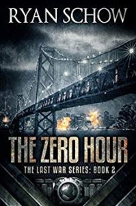
Graphics: This is one of seven books in a post-apocalypse series. The covers follow a pattern: somber colors (brown and gray predominate) with a few highlights, a usually distant shot of a damaged cityscape, an industrial look to the featured parts of the illustration, and carefully drawn architectural details, such as the girders on the bridge in this cover.
The author name always appears at the top, the title and series tagline always low, and the bottom of the cover always features a V-shaped area of metallic parts with a globe in the center.
These elements, or ones much like them, are common to the genre. At a glance a reader knows this is neither a cozy romance nor a self-help guide to carpentry. What isn’t clear is the niche audience to which these books are marketed, in this case older teenagers and early twenty-somethings.
That becomes evident from reading the opening pages, where the heroine is said to be eighteen and her thoughts and language echo those of her real-life cohort. This isn’t to say all the characters are of her age, but the book’s intended audience seems fairly clear.
An older fan of post-apocalyptic novels might set the book aside on discovering the ages of the main characters, but that won’t happen until the cover is gotten past and some of the text is read, which is to say that the cover will have succeeded in its chief task: getting people past it. In terms of marketing, the covers in this series likely are effective.
A persnickety observer might see a few incongruous notes in this cover and some of the others. For example, here the main element is a bridge. Its underpinnings and distant towers already appear rickety, yet its lights remain on. One might expect that electrical connections to the bridge would be the first to go in a disaster, but by leaving the lights on the designer has provided dozens of small highlights that make the shadows all the more effective.
Typography: I have mentioned the regularity of text placement among the seven books. Let’s consider the three elements of each of the covers: title, subtitle, author name.
The title is in a quasi-steampunk font that evokes the 1920s. Notice the high bar on the E, a common sight in lettering of that era. Here the letters are heavily textured, yet that doesn’t make them hard to read. It isn’t so much that they are three-dimensional, though the edges are lightly rounded, but that they look distressed or damaged by fire or projectiles. They imply war. That implication fits perfectly with the subtitle, The Last War Series: Book 2.
The subtitle’s letters are barely a fourth as tall as the letters of the title, yet they are legible. The designer has placed them against a lightly-textured but dark background. They stand out easily, and they are in the same font as the title.
Only with the author name do I have a quibble. Its font has prominent serifs—notice particularly the foot of the R—and doesn’t evoke either the 1920s or disaster.
The letters are legible, being set in a light gray against an almost black sky, but if the author name alone were seen on a cover-in-progress, one might expect the book to be revealed as a romance or literary fiction rather than as a thriller. I wouldn’t call this a poor choice of font, but I would have looked for something else.
Overall: That is a small quibble indeed. I suspect few people will see the slight disconnect between the font for the author name and the remainder of the cover, which, taken overall, has to be considered a success.
The thing that almost compels success in such a cover is the designer’s insistence on keeping to genre. True, there are hundreds of thriller covers that look like this one. There may be thousands. But each makes clear, at first glance, the genre.
In this series of seven, the author has been served well by his designer.

 Title: Double Edged Blade
 Title: Lost and Forgotten
 Title: Gentleman with a Loaded Gun

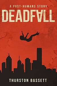 Title: Deadfall