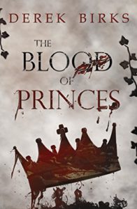
 Title: The Blood of Princes
Author: Derek Birks
Designer: Katie Birks
Genre: Historical novel
Graphics: This story centers around the disappearance of Edward V and his brother Richard, Duke of York. In 1483, at the death of their father, Edward IV, the boys were lodged in London Tower and disappeared from history. Their uncle, Richard, Duke of Gloucester, became king. It commonly is assumed that Richard had the boys, ages 12 and 9, murdered. This justifies the bloody crown on this book’s cover, though one might argue that two crowns should be depicted.
The crown isn’t the only thing bloodied here. Below the crown is a large splotch of blood, and several letters of the title drip with blood. The last word of the title, Princes, is the same color as the blood, but it’s not clear whether this implies that each letter of that word has been dipped in blood or simply that the letters were colored red from the start, even though the other words of the title are black.
If the graphic has a problem, it’s that the blood, which seems to be flowing at least over the letters, is rust colored rather than blood red. The crown looks rusted rather than bloodied. However that may be, there is so much blood that it seems to be overkill (no pun intended). I think the effect would have been more striking had there been less and redder blood, confined to the crown and a few drops falling off it.
At the margins of the cover are metallic-looking vines. It’s not clear what their purpose is. The cover would lose nothing by losing them.
Typography: The chief words of the cover, Blood and Princes, are partly obscured by copious blood. I would have reduced or eliminated blood on the letters. At least I would have kept all four words of the title black. With Princes in dark red, the word competes with the crown for attention. The auxiliary words, The and of, are a little small. Each should be centered over the other words. Having The off-centered serves no obvious purpose.
As with the title, I would have kept the author name in black. As it stands, it’s kerned too widely. The paperback version risks having the author name too near the edges, if the trimming is too generous.
This is the second volume in a series. Why no mention of that? Instead of the big splotch of blood at the bottom, a tagline could have been added: “Book 2 of the Craft of Kings Series.”
Even if all these changes were made, the cover still would look a little bland. Perhaps the title needs to be in royal gold rather than black. That would make the title stand out more, and it would add a dash of color that would contrast nicely with the somber tone of the rest of the cover (even if the blood were recolored to look more like blood than rust).
Overall: The basic elements are appropriate for the story. They just need to be tweaked. To attract those who are attracted to historical novels, perhaps the designer could add, just beneath the title, a phrase such as “A Historical Novel.” That would help readers understand the precise genre. Even without that addition, the cover works, but it could work more effectively with a few changes.

 Title: Forest Child