 Title: Babylon’s Downfall
Author: M. J. Logue
Designer: Rosemary Tree Press
Genre: Historical fiction
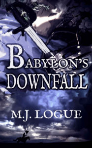
Graphics: This novel is based on a military campaign that occurred during England’s Civil War (1642-1651). Can you tell that from the cover? I can’t either.
The bottom of the cover shows a rider in silhouette. He’s brandishing a torn flag. Perhaps he’s escaping from a lost battle, one of the few survivors. Behind him is a lowering sky. Above him is—what? The clouds behind him are gray, and above them are clouds that are blue, but above those clouds? I enlarged the image to try to make out the rest of the cover, and still I failed.
At the top center and top right are sprigs from bushes. They seem to be taken from photographs. Below them the cover appears to be painted in, down to the level of the blue clouds. This is an odd procedure, having photographic realism at top and bottom separated by an un-photographic and painted-on middle.
Running from the upper left to the center are the hilt and part of the blade of a sword, but they end in something that I can’t make out. Whatever it is doesn’t seem to be a scabbard or a gloved hand or a helmet, but it looks metallic. If a viewer has to squint at part of an image and still can’t make it out, the problem likely is with the image rather than with the viewer.
Nothing graphical suggests either ancient Babylon or a modern (even seventeenth-century) variant of it. When the downfall of a city or empire is mentioned, you expect to see ruins or buildings in flames or falling towers—at least some evidence of destruction—but all we have here is a lone, distant rider, a few hints at foliage, and a cartoonish sword.
Nothing about the cover’s look hints at the book’s genre. The sword and rider might imply historical fiction, but they equally might imply true history or a fantasy novel or even a thriller.
Typography: The absence of a genre indication in the graphics means that one ought to be supplied by way of the text. What’s needed is a tagline that accomplishes that, but there is no tagline. All we have are title and author name. A tagline as bland as “A Historical Novel” would help, though something more explicit, such as “A Story Set in England’s Civil War” or “A 1644 Military Tale” would be better.
The same mushy font is used for the title and author name, the main distinction being that in the title the letters are outlined in black, a silent acknowledgment that the letters otherwise wouldn’t be legible against the muddled background. The letters aren’t particularly legible even with the outlining.
All the text is white, but parts of the background are white too. This makes some letters nearly disappear. Notice how the G in the author name becomes indistinct. The L and O in “Babylon” would have been lost entirely without the black lines around them. For clarity’s sake the title should have been in a different color, perhaps yellow-brown, though that tone appears nowhere else in the image.
The two words of the title are not quite centered above one another, and they are shifted too far to the right. The “air” on the left is more than twice that on the right.
Worse, the title letters are in three sizes. The B in “Babylon” is so large that it draws undue attention to itself. The remaining letters of that word are so relatively small that they receive too little attention. Despite the oversized B, it’s the second word of the title that capture’s one eye. There is no obvious reason why it should, and so it would have been better if all the title letters had been the same size.
The author name is legible enough, but there is no space between the initials. The author is British, and omitting the space between initials in a person’s name is a British typographic custom, but it’s not a custom in American typography, and to Americans the absence of a space looks like an oversight.
For the sake of American readers, the space should have been included; after all, it’s likely that there will be more purchasers in the U.S. than in Britain, not just because the U.S. is more populous but because, in absolute numbers, there probably are more Americans than Britons who are interested in seventeenth-century British history.
Overall: This may be enticing historical fiction, but few potential readers will find out. They won’t get past the cover to the opening text. They won’t discover whether this is a story they are attracted to, if they find the cover off-putting.
