 Title: James and the Rainy Day
Author: Philip Blows
Designer: Gareth Lucas
Genre: Children’s fiction
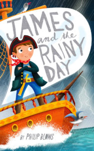
Graphics: It’s hard to find fault with this delightful image. Although one might expect rain to suggest disappointment or sadness, it’s clear that the weather is unable to ruin this boy’s bright spirits—or even those of the two birds, who seem to be smiling also.
Of course, the boy is wildly out of proportion to his ship. In real life he hardly would stand above its railing, and the sail would be above his head. No matter. This is a children’s book, and verisimilitude isn’t expected. What is expected is an attractive image that invokes wonder, and that’s what this image does.
If there is an incongruity that might be caught by a young reader, it might be that on this rainy day the rain seems far in the background. None of it is hitting the boy or the ship. Perhaps that’s part of the storyline, but I wonder if the “Rainy” part of the title might be more effective if splatters covered the whole scene.
Typography: The title and author name seem to be hand drawn. If so, this is a cover on which hand-drawn lettering works. The title is on a billowing sail. I wish the letters had been shaped more to indicate the billowing, being worked more into the bulging shape of the sail.
The only problematic part of the title is the coloration. The lettering, here and on the author name, is the only dull thing on the cover. Perhaps red, taken from the boy’s bandana, might have worked for the title. It certainly would stand out better. Even solid black would be an improvement. The gray just seems too subdued.
A similar comment can be made regarding the coloration of the author name. Instead of red, perhaps it could be in a blue taken from the boy’s pants.
The “O” in “Blows” is filled in. There is no doughnut hole. This parallels the treatment of “A” in the title, but the solid “O,” being hand-drawn, might be taken to be an error in drawing, as though the artist’s pen leaked.
What about “by” before the author name? Almost always this is a mistake and a mark of an amateur effort. (You never see “by” in books from the Big 5 publishers.) In this case, though, I’d give “by” a pass because the young reader might misread the author name otherwise.
He might read “Philip Blows” not as a first name and surname but as part of a sentence, as in “Philip blows up the balloon.” If he takes the surname as a verb, even momentarily, that is an indication that the cover needs adjustment, and the usually improper “by” may be just the trick.
Overall: If this cover were made before the plot of the book even were thought out, on its own it could inspire a storyline. It’s that attractive. The suggested changes are minor. The cover works as it is, even if it could work a little better with a tweak here and a tweak there.
