 Title: Tale of the Music-Thief
Author: Earl T. Roske
Designer: Aubrey Watt
Genre: Fantasy
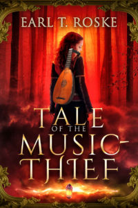
Graphics: I admit a bias. What attracted me to this cover was the lute. I play a similar-looking instrument, the baroque mandolino, and I pay attention when I see such instruments portrayed in art. Here the lute draws the eye even more than does the young woman, but both are nearly overpowered by the red glow of the forest.
The chief source of light is in the distance, but the lute doesn’t appear in shadow, as one might expect, but clearly has a separate light source highlighting it. And then there is a third light source, the glow around the crystal at the bottom. What does that represent?
I would leave out the crystal, even if that item appears in the story and plays a significant role. None of that can be known by a prospective purchaser, so for him the crystal and its glow add nothing. Likewise with the green framing at the top and bottom. The framing serves no obvious purpose, and it clashes in color with the red of the forest.
With those items removed, the title can be lowered, revealing more of the main part of the image. Similarly, the author name can be raised slightly, giving a little air between it and the woman’s head.
Typography: There seem to be two distinct fonts here, one used for the author name and the words “of the,” the other used for the remainder of the title, but even that remainder shows up in two variations. Notice how the letters in “Thief” differ in their strokes from those in “Tale” and “Music.” Each letter in “Thief” has an elongated serif—but why? That variant adds nothing to legibility.
It isn’t obvious why “of the” appears in a font slightly different from the rest of the title. Those little words are in off-white rather than the gold of the other three title words, and they aren’t centered vertically between “Tale” and “Music.”
A final mystery is why the title includes a hyphen. You don’t see a hyphen in such terms as “car thief” or “jewel thief,” so why here? The hyphen is another gratuitous element.
The entire title should be in one font and in just one variant of that font (the one with fewer filigrees), while the author name shouldn’t be in its present font, which is too similar to the other one, but in a sans serif font and in a lighter tone, closer to white, in order to make the author name stand out more from the background.
Beyond all that, the three main title words should be reduced in size. They don’t need to be this large to be read, and in square inches they occupy more space than do the main elements of the graphics, the woman and the lute. While that size change is being made, “of the” should be boosted a couple of points.
Overall: The illustration is good, but it is surrounded by extraneous objects (the crystal and the framing) and cramped by text that is too close and too large. Despite these problems, the cover conveys the genre well enough.
