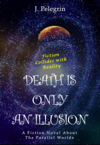
 Title: Death Is Only an Illusion
Author: J. Pelegrin
Designer: J. Pelegrin
Genre: Science fiction
Graphics: The spiral galaxy gives this away as either a science fiction novel or a non-fiction book on astronomy. The ambiguity is resolved by the text, but it shouldn’t have to rely on the text for a resolution. The ambiguity shouldn’t be present in the first place.
Most science fiction novels sport illustrations of space ships or protagonists in exotic uniforms or weird landscapes with multiple moons—all indicators of genre. This novel sports only a galaxy, plus what is seen to be a planet when the cover is viewed at its largest size.
When the cover is viewed at a small size, as here, the brownish object could be anything: the top of a skull, an oddly-colored French beret, a piece of caramel candy. There are insufficient indicators of genre.
As the bottom-most tagline indicates, this story is about “parallel worlds,” so the brown object, which is mostly obscured by the galaxy, must represent such a world. But if the galaxy obscures that world, aren’t the stars in the galaxy far smaller than the partly-hidden planet? Wouldn’t the planet be the largest thing in the universe? There is an astronomical disconnect.
Typography: This cover has four units of text—title, author name, and two taglines—set in three fonts. Each font is inappropriate to the science fiction genre, and each unit of text is hard to read.
The title is in a font that might be appropriate for a children’s book. Here it looks wildly out of place. It looks happy-go-lucky, but the reader of a novel about parallel worlds will expect a story that involves elements of suspense, technological wonder, and danger. This font suggests none of those.
Besides, its thin lines are hard to read against the speckled background of the galaxy. What is needed here is a font with thick lines and probably in a dark yellow, taking a tonal hint from the enormous planet.
The author name is far too small. It should be at least doubled in width and height, and it should be moved further from the top edge.
The tagline at the bottom needs a rewrite. It describes the book as “a fictional novel.” What other kind of novel is there—non-fiction? And then there is the idiosyncratic use of the definite article: “about the parallel worlds.”
The article should be omitted, so the entire tagline would read this way: “A Novel about Parallel Worlds.” That could fit well enough on one line; like the author name, which is in the same font, this tagline would need to be enlarged, though not as much. It and the author name can remain in white.
The other tagline in more problematic. First, it’s in yellow, the only strong color on the cover, yet it’s the least important textual element. Second, it’s in a font that doesn’t match either of the others. Third, it’s at an angle. The tilting adds nothing except difficulty in reading. Fourth, the tagline doesn’t make much sense. What does it mean to say that “fiction collides with reality”?
This tagline should be dropped entirely. It’s not worth trying to save.
Overall: This cover is unmistakably an amateur production. The implication to the prospective reader is that the text is an amateur production also. Such an implication will not boost sales.
This book hardly looks like other books in the science fiction genre. While there should not be slavish adherence to genre conventions, a designer needs to be aware of what works and what doesn’t work. He needs to understand readers’ expectations.
There is no need for science fiction novels to look like clones of one another (unfortunately, many of them do: a key fault of that genre), but any science fiction book needs to announce what it is, without reliance on help from the cover text.

 Title: Islandia: The Lost Colony
 Title: The Legacy: Dax