Case Study 98

Title: Looking Forward

Editor: Jamie Arpin-Ricci

Designer: Jamie Arpin-Ricci

Genre: Religion

Graphics: The editor has collected eleven essays about how to become an effective leader in Christian ministry. You might expect the cover of this book to have a distinctively Christian element to it, but it doesn’t. It has one of those ubiquitous down-the-middle-of-the-desert-highway photos that became clichéd even before indie publishing became popular.

The photo itself is lovely, if you like desert travel, which I do, but it seems to have no relationship to the theme of the book. Why was it chosen? I suspect it was because of the title’s second word, “Forward.” I easily enough can imagine a designer asking “What sort of image suggests forward movement?” and coming up with something in everyone’s experience: driving (forward) down a long expanse of road.

But the road itself is static. It’s not the road that advances but whoever is driving on it, and in this photo there is no hint of a driver. (If there were a driver, he shouldn’t be straddling the center lines.) The temptation to plump for this sort of image is a strong one, which is why so many covers feature open roads, but in this case it was a temptation that should have been resisted.

Yes, the image is attractive in itself, but it does nothing to indicate genre or the purpose of the book, and those are important things for the graphics to do on non-fiction covers. Fictional works have more leeway. Non-fiction covers need to attend to their books’ purposes.

Typography: Let’s start at the bottom. The editor’s name, like all the text above it, is hard to read against the yellow-orange lines of the highway. It’s difficult to find a font and to select a color that will pop against both yellow-orange and the dark gray of the asphalt. It may be impossible. If a road “had” to be used on this cover, one with worn or missing lines would have been better—or the designer could have faded the lines by using a photo-editing program.

Assuming the photo of the road is retained, about all one could do is choose a bolder font for the author name and, really, for all of the text. I would recommend sans serif fonts throughout, because serifs are what are lost to the eye first in situations such as this. The sans serif fonts should be used in their bold variants.

Two other modifications of the editor’s name: the initial letter, J, should be made the same height as the other letters (it’s the only over-sized letter on the cover), and “edited by” should be put in all caps. Normally “edited by” would work well as it is, all lowercased, but, given the problematic background, it needs more oomph.

As I said, all of the text should be sans serif, but it would be good to use two fonts (not one as here), a font for the title and a font for the rest. The title could stand to be in a font with a sense of motion that might be suggested by the shape of the letters, while the rest of the words could be in something akin to Helvetica.

Why is “Forward” in gray rather than white, and why is the word larger than “Looking”? Gray makes the second word of the title harder, not easier, to read against the dark gray road. By making “Forward” gray and larger, the two words of the title become detached from one another—precisely what one should avoid.

Overall: The photo verges on the commonplace. There is nothing distinctive about it and, worse, nothing in it to suggest the book’s theme or genre. That can be deadly for a non-fiction book’s sales.

When designing a cover, it’s important to ask, about each element of text, “Is this legible, even at small sizes?” On this cover, the answer must be, “Not very, and not even at large sizes.” Most of the illegibility arises from the photo—another reason to find another image.

Case Study 42

Title: Stories Aren’t Just for Kids

Author: Christine Dillon

Designer: Lankshear Design

Genre: Religion

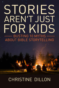
Graphics: The author’s premise is that adults, as well as children, can learn the elements of the Christian faith through biblical storytelling. How to convey storytelling graphically? Where does storytelling occur in everyday life outside a specifically religious venue? Around a campfire. Thus the image.

It’s a natural, but it has drawbacks: it’s small proportionate to the whole, and it’s hard to see details.

The image takes up too little of the cover. The part of the cover that is supposed to convey the genre or what the book is about is minimized unnecessarily. That’s the first problem: the smallness of the round-the-campfire portion of the image.

The other problem is that one almost has to squint to figure out what is being portrayed. Even at the largest available size (when the cover is clicked on at the Amazon sales page for the book), it’s still hard to tell what is being portrayed.

The segment of the image to the right of the fire’s glow looks as though that portion of the photo had been taken while the camera was moving; it’s all a blur.

The silhouette directly blocking the fire can be interpreted more than one way. Is it the back side of a person under a blanket, or is it the back side of a large dog?

The people off to the left seem to be talking among themselves and not interacting with the others.

I would look for a more intimate campfire photo, one with fewer people, a photo where the fire has died down to embers so the fire’s glow doesn’t overpower the scene. I would prefer a close-up shot, perhaps with everyone in shadow. The intimacy of such a photo would add to the sense of storytelling. The photo used on the cover seems to be not of people listening to a single storyteller but just chatting with one another in several small groups.

Typography: The off-white color of the title and author name works well. It suggests evening, and the text is easily visible against the solid background.

To give an alternate photo more room and thus more prominence, the author name could be lowered a little (about half the height of the characters), and the title could be compressed vertically by about one-fourth. That would open up space for a new image that would be where the eye first goes.

The subtitle looks fine with the two rules extending from the first line. They keep the text in the top half of the cover in a rectangle. The color of the subtitle is a little subdued; a lighter shade would help. Other than that, there are no problems with the text.

Overall: This cover would earn an A if the photo were more intimate and more suggestive of the theme. That should be an easy fix. Until the fix is made, and because of the importance of the photo, I’d give the cover, as it stands, no more than a B-.

Case Study 34

Title: His Perfect Love

Author: Sharon K. Connell

Designer: Sharon K. Connell

Genre: Religious fiction

Graphics: From the description at Amazon, this book seems to be part mystery, part thriller, part religious reflection. Having uncovered a troubling secret, the protagonist is on the run, both from her pursuer and from God. Will she elude the one and return to the other?

If that is a fair precís of the book, one might ask why none of it suggested by the cover photo. The photo itself is nice—but perhaps for a book about wildlife. Nothing in the image leads a prospective buyer to think a woman is running scared and that problems external and internal need to be resolved if the story is to have a happy ending.

Another failure of the image is that it tells us nothing about the book’s genre. The snowy egret and its watery background don’t imply “thriller” or “religion.” They don’t even imply “fiction.” They imply little more than “pretty.”

A common mistake among indie authors who design their own covers is that they take images that appeal to them, for whatever reasons, and think the images must appeal to others and that that will be enough. It won’t be. The images indeed may appeal to others, as mere images, but they fail to do what cover images are supposed to do, which is to let readers know what the books are about.

Typography: This cover seems to use but a single font, in two variants: roman for the author name and italics for the title. In both forms it is a thin font that doesn’t play well with background images. The designer realized this and added black drop shadows. If drop shadows are needed, that usually is a sign that the wrong font has been chosen. Drop shadows are used to compensate, at least in part, for typographic design flaws.

This cover offers adequate room for placing the title over the greenish water. The words don’t need to obscure a visual element. This allows leeway in choosing text color. In this case, I would not have used white for the title because the bird should be kept as the chief draw of the eye. To put white text next to the white bird makes the bird stand out less. Given the background color, perhaps a bright yellow would have worked.

As for the title text itself, it should not be in italics, which normally should be reserved for emphasis. The font should be changed to a serif font that has thicker strokes. Two variants could be considered: the normal and the condensed.

If a condensed font were used (but one with thicker strokes), the entire title could be placed on one line, so long as the words didn’t come too close to the left and right margins. (Always keep in mind how paperbacks are trimmed: usually a little more than you’d like.)

If the condensed variant doesn’t seem to work, the normal variant of the font could be used if the three words of the title were stacked and made flush left.

The author name is more of a problem since it rests atop a variegated background.

First of all, the name should be centered, not shunted off to the right. Second, it might have to remain in white to contrast with a relatively busy backdrop. It’s far enough from the bird that white lettering here won’t detract from the avian image.

If the title is put in upper- and lowercase letters, the author name would look best in small caps, assuming the font has a small caps variant. Many fonts don’t. Their regular caps aren’t intended to be used except as the first letters of words. Small caps and regular caps are shaped and kerned differently, though the differences may be subtle, such as slightly shorter legs or serifs for small caps.

Overall: This cover fails to let readers know what the book is about, and thus it fails the most important test. Not only doesn’t it suggest genre, it doesn’t even suggest fiction rather than non-fiction. This could be a novel with religious components (which it is) or a series of straight religious reflections (which it isn’t), but it’s hard to tell from the cover alone.

Case Study 24

Title: Movement

Author: Matthew S. Miller

Designer: Matthew S. Miller

Genre: Religion

Graphics: When I first saw this cover, I knew at once what the book was: an account of a long-distance hike during which the author “discovered himself.” But I was wrong. The text seems to have nothing to do with hiking. It’s a devotional book, designed to “equip you to rediscover discipleship as you find your own personal revolution.”

Why did I make this mistake in genre? Because the cover led me astray. Even the subtitle—A 40 Day Spiritual Journey—wasn’t enough to make me think this was a book about religion because many “self-discovery” hiking books use similar language.

In short, this cover failed to explain (at least to me) what the book’s genre is. This is a fundamental mistake. It is one thing for a cover not to make clear what a book’s genre is. It’s a bigger problem for it to imply an entirely incorrect genre.

There is another problem: the image contradicts the title. The title is Movement, which suggests action, but the image shows a hiker who is stationary. It would have been better to select an image that showed a hiker taking large strides along a trail.

Typography: The author name and title are in a serif font, while the subtitle seems to be in two sans serif fonts. At the least, the subtitle should be in just one font.

Let’s start with the title. Its font, with long serifs, has a chiseled look that might be appropriate on the pediment of an ancient Roman building. The font suggests a static condition, which is contrary to a sense of movement. It would be better to select a sans serif font that, through fluidity of lines, gives a sense of action rather than repose.

Another problem: the title’s letter spacing is too wide, bringing the word too close to the edges of the book. Similarly, the author name is set too close to the top edge, and it is far too small. It might be an interesting effect to enlarge the author name to the point where its length matches that of the adjusted title, though it should be in whatever font is used for the subtitle, leaving the title to have its own font.

As for the subtitle, here it is encased in a box that adds nothing—in fact, the box detracts since it draws the eye unnecessarily. It would have been better to make the two lines of the subtitle the same height and to boost the font several points above the current size of the second line. As it is, the first line of the subtitle is easy to miss.

The letter spacing of the second line of the subtitle seems to have been tightened, for no clear reason. Even with the box there is plenty of room for normal letter spacing.

Overall: This is a good example of how a cover can throw prospective readers off. If only half of them made the mistake I did, thinking this was a book about hiking, that could mean a substantial reduction in sales.

How many fewer copies of Charlotte’s Web might have been sold if that children’s book’s cover had featured scary-looking spider webs á la an Indiana Jones adventure or, worse, spider webs as seen on horror-story covers?

Case Study 4

Title: Rome’s Female Saints

Author: Nicol Nixon Augusté

Designer: André Augusté

Genre: Religion

Graphics: The cover seems to have been designed by the author’s husband. The photo he took is quite good, with the focal point being the saint’s crossed arms, which give a sense of humility and supplication, just what you’d expect from a saint.

The secondary focal point is the pillar, which is darker in tone than the statue and thus is a nice contrast. Perhaps it would have been better to restrict the camera’s focus to the statue, allowing the inlaid floor to become blurred. That would have made the saint’s face stand out better, but otherwise the photo is fine, though it was cropped too close to the head.

Typography: The typography is far less than fine. Let’s start at the top.

The author’s name is nearly invisible at thumbnail size. It’s hard to read even at larger sizes. It ought to be at least three times as tall and wide. Her three-part name (which should be in all caps) has a lot of characters, so a condensed font would be in order, one that has thick verticals that stand out against the visually complex background. There is no need for “Ph.D.” This is a book chiefly of poetry; the author’s academic credentials aren’t relevant.

The revised author name shouldn’t go at the top; there would be no way for it not to overlap the saint’s head. It and all the text should go in the lower third of the cover.

The subtitle is even less legible than the author name, even though it’s larger. Actually, it’s larger in two different sizes, with “Eternal City” being larger than the first part. The script font would be hard to read regardless, but here, in white against a background that has light elements, it’s painful.

The main title not only is in two fonts but is in three sizes, and “Female” has a reddish drop shadow. The three words of the title are in a pale blue-green. Perhaps the designer thought that would say “feminine,” but it’s enough that the middle word of the title is “Female.” All three words should have been in one font. Depending on the color chosen for the author name and subtitle, the title could be in black or a strong color picked up from the image, though black seems the best bet.

Overall: Using oneself or one’s spouse to do the artwork saves time and money, but usually it is an unwise savings. To echo a biblical question, what does it profit an author if she saves a few dollar but loses sales? No book will sell well if its title is hard to read.