 Title: The Lover’s Portrait
Author: Jennifer S. Alderson
Designer: GoOnWrite
Genre: Mystery
Graphics: Let’s start with the background, which appears to be wallpaper with off-white elements set against black. The lower part of the wallpaper has been darkened to accommodate the author name.
What sort of wall would use such wallpaper? Not likely a museum, where walls usually are in neutral tones so as not to draw attention away from the artwork that is hung on or placed before them. Not likely a home either, since the overall weight of the wallpaper is dark, even uninviting. And not likely an office, for similar reasons.
Thus I fail to grasp which venue is intended by the background. The only time I have seen wallpaper remotely similar has been in the restrooms of hotels with lobbies decorated in Nouveau Garish. I’m quite sure that is not what the designer intended to bring to our minds.
Let’s move outward, to the picture frame. This is the key element of the cover.
Even though the frame is filled, it isn’t filled with a painting. Words are within the frame, but we realize the frame actually is empty and signifies lost or stolen art. Unfortunately, the edges of the frame are hard to distinguish from the dark and busy background. That reduces the three-dimensional effect of the frame.
The frame sits so close to the left and right borders that it doesn’t pop enough from the background. Perhaps the designer wanted to maximize the frame’s interior real estate—a worthy goal, but I would reduce the size of the frame by about a fifth. That would put some air around it, and it still would leave plenty of room for interior text.
It would have been better if the background had been simpler. For interest’s sake, it still could feature a gradient: lighter to darker, working downward. A less fussy background would give even more emphasis to the frame and its emptiness.
Typography: Four colors are used for the text: white, black, red, and gold. That is about two colors too many. With so many colors, no one color stands out. Let’s start at the top.
The book’s first tagline is “One painting. Two claimants. Three murders.” Ah, a murder mystery—at least that and maybe something more. Except you hardly can read these words, which are very small and are set against that busy background.
If the frame were made smaller, as suggested above, it could be lowered, allowing room for three centered lines of text at the top, with each line of text about twice as tall as what we see here. Probably the text would need to be bolded, to stand out better against the background (assuming the background stays as it is).
The title is set in a stencil font—but why? If the missing artwork were packed in a wooden crate, one might expect lettering on the crate to be stenciled, but there is no crate here. What we see are a wall and a picture frame. The stenciling seems gratuitous. Given the title, which suggests romance, I would propose a font with notable serifs and perhaps a flowing initial L.
The book’s genre tagline, “An Art Mystery,” lets us know what to expect. It’s helpful for the prospective buyer, but the use of red draws too much attention to it. Of all the text on the cover, it’s the least important. The other tagline, not this one, provides a hint of action; this one provides categorization. That’s important, but it’s not as important, so I would have put this line in black.
To my eye, the most prominent textual element isn’t the title, large and unusual though it is, but the author name, which is just as large and, with its gold lettering placed against black, incapable of being overlooked.
The author name would look better and more professional if it were on one line, in a sans serif font (leave the serifs to the title: all the other text should be sans serif), in all caps, and in a condensed version set bold. Aim for a height equal to the lowercase letters presently used. Lastly, I would change the author name to white, leaving gold for just the frame.
Overall: In terms of what this cover says, it’s fine. It has an intriguing title, the obligatory author name, and two taglines which, in combination, make clear what sort of book this is. The coloration and arrangement of the text need work, and further work needs to be done on the background image.
All that said, the concept is good: an empty frame implies missing art, and that’s what the story hinges on.

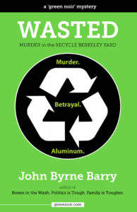
 Title: Wasted
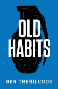
 Title: Old Habits