 Title: Basically Good People
Author: Will Martin
Designer: Paper and Sage
Genre: Humor
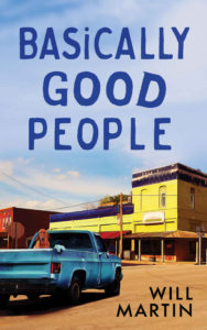
Graphics: This is an anthology of seven stories involving a uniform cast of characters. The setting is a fictitious small town in Missouri. The author says these “linked stories [are] reminiscent of the unforgettable characters and sense of place portrayed in stories by Fannie Flagg and Garrison Keillor.” Does the illustration indicate that?
Hard to say. It does show what must be a small town—the street appears to be dirt rather than asphalt—with a blue Ford pickup that seems to be parked within an intersection. Maybe that’s to suggest the humorous angle.
The only reason I know this book belongs in the humor genre is that I consulted the book description at Amazon. I otherwise couldn’t tell. The illustration doesn’t clearly indicate the genre. There is no action (there are no people), nothing threatening (such as a looming storm), nothing particularly odd. One might dismiss some genres, such as thriller and horror, but then one is at something of a loss.
Typography: The author name, in a black sans serif font set against the light-brown street, is read easily, no matter how small the cover image, but it looks almost too stark for the scene. I would have looked for a sans serif font that had a little curvature to the letters.
The title clearly is hand drawn—but why? The word “Good” is bolded, or at least its last three letters seem to be, even the lazy D, but again—why? All the letters are capitalized, except for the I, but (once more)—why?
I can’t avoid the impression that considerable care was taken with this cover, but then the time ran out, and the designer used a marker pen that happened to be handy. I’m sure that’s not how the title was produced, but to me it looks like a rush job, even though I suppose the designer took pains to effect this look.
Certainly the title is readable, even though it’s blue on blue, but I would have tried another color, one taken perhaps from part of one of the buildings—but not the lighter shades of red.
There already is plenty of blue in the illustration: not just the sky, which takes up more than half the space, but the pickup, which is the most prominent element, and the cornice of the yellow building. Perhaps a burnt orange, as seen at the lower corner of the yellow building, would work.
Since this is not just a book of humor but an anthology, some reference to those facts should have been included, particularly since the illustration doesn’t indicate the genre clearly. A tagline could be set beneath the title, something like “A Lighthearted Rural Anthology.”
Overall: Despite the several problems mentioned above, this is an attractive cover. Its artistic style is uncommon, having an almost Impressionistic sense. At a time when many cover illustrations seem to have been done by the same hand, even when they haven’t been, it’s refreshing to come across a pleasant design, even one that could use further attention.
