

These four covers were chosen by AIGA as among the 50 best covers in their respective publication years. AIGA is the American Institute of Graphic Arts, which calls itself “the profession’s oldest and largest professional membership organization for design.” It has 70 chapters and 25,000 members.
AIGA runs an annual competition called 50 Books/50 Covers, the purpose of which is to showcase “the best work in book and cover design.” The competition began in 1923. From what I can gather, it features covers (and books as a whole, but here I’ll consider these four books only as covers) published by traditional publishers, not by indie publishers.
You might think that with nearly a century of experience, this competition would feature covers that would put those found on self-published books to shame, but not so, at least in my estimation. Here I have selected for comment four representative covers, and I think each one is a failure, though in different ways. Let’s look at them sequentially.
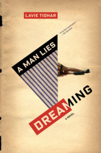
A Man Lies Dreaming, which originally was published by Hodder & Stoughton and appears here in reprint from Melville House, has an intriguing title. It can be taken two ways. It might refer to a man who is lying down and dreaming in his sleep, or it might refer to a man who commits a lie while he dreams. The double entendre is attractive. That’s more than can be said for the cover.
This is a novel, but “A Novel” is almost illegible. The author name is in a red box, but the box is small, and so the name is small. The title is sharply angled. The angling may grab attention, but it makes the words hard to read. There is a promotional blurb from The Guardian, but the blurb is even harder to read than “A Novel.” Textually, the cover is a failure all around.
What about the graphic? The title is A Man Lies Dreaming, but the only thing we see lying down is the lower half of a woman. There is blood behind her knee, so apparently a murder has occurred. However that may be, there is a disconnect between the title and the image.
The graphic treatment has one other element, the background. It’s made to look like a torn and faded paper cover. There is a slight three-dimensionality to it, which is effective and is, to my mind, the most attractive part of the cover. On the left the cover appears to have been torn. Despite the well-done background, I also would call the graphic treatment less than a success.
Let’s look at the second book, Your Face in Mine, which is published by Riverhead Books, an imprint of Penguin Random House.
We know this is a novel because the cover tells us so, provided we can read upside-down text. What is gained by putting “A Novel” upside down, other than brownie points from other designers? It isn’t all that clever a technique, and it certainly doesn’t make the words easier to read for prospective buyers. Perhaps the words are meant to clue buyers that this book is High Art.
The title might suggest that the cover would include, somewhere, a face, whether “yours” or “mine,” but there is nothing facial here, not even in an abstract, Picasso-esque sense. The graphics consist of triangles, parallelograms, and trapezoids, each in a different earth tone, plus a few lines and circles. Those take up about half the acreage, the rest being a flat black background.
Nothing on the cover indicates genre. Is this a murder mystery, a science-fiction fantasy, historical fiction? There is no way to tell, and so the cover fails to provide important information. You likely wouldn’t guess that this is “a daring, ambitious novel about identity and race in the age of globalization,” as described at Amazon. That’s because this cover has been designed for art’s sake, not for marketing’s sake.
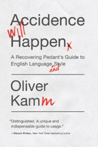
The third cover belongs to Accidence Will Happen, a book about English-language style, published by Pegasus Books. It is the simplest of the four covers and the only one, I think, that “works” at all.
It has two chief problems. One is the small text for the blurb: “Distinguished. A unique and indispensable guide to usage.” Those words are just about legible at thumbnail size, but the words themselves are cotton candy, having no substance. They are useful only because they are the words of a well-known writer, but his name is in text that is smaller still. If you can’t read his name, it isn’t there.
The other problem this cover has is graphical dullness. As with A Man Lies Dreaming, the background is made to look like slightly crumpled paper, but the effect isn’t nearly so obvious here. It needs to be either more pronounced or not used at all.
If this cover hadn’t come out of a prominent publisher, one might think it was cobbled together by a first-time writer whose budget was too small to hire a professional designer. There is nothing about it to suggest that indeed it was the product of someone who makes a living in design. Beyond that, its dullness will make a potential reader think the text must be equally dull.
The fourth book is The Wall, a novel published by Random House. We know it’s a novel because the microscopic print tell us so. But what kind of novel is it? The description at Amazon says The Wall “tells the story of Arthur Landau, survivor of a wartime atrocity, a man struggling with his nightmares and his memories of the past as he strives to forge a new life for himself. . . . The Wall is a magnificent epic of survival and redemption, powerfully told through stream of consciousness and suffused with daydream, fantasy, memory, nightmare, and pure imagination.”
Let’s grant all that, but is any of it suggested by the cover? The photo is of the interior of Liverpool Street Station in London, taken seemingly a lifetime ago. The most prominent architectural element isn’t a wall—something you might expect—but an array of columns. It’s a fine, evocative photo but not one that explains what the story is about. If I hadn’t quoted from the description, you likely would have no idea what the storyline might be.
These covers were winners in design competitions. The judges considered them among the top 50 covers in their respective years, but the judges seem to have looked at the contestants with spectacles quite different from my own. They seem to have awarded points based on techniques thought clever by other designers. (The upside-down “A Novel” is an example.) They seem not to have based their judgments on seeing book covers as marketing tools.
I’m all for loveliness and cleverness in book covers, but nowadays covers need to serve a purpose beyond the merely artistic, important as that may be. Writers want their writings to be read. For that to happen, their books need to be sold, and that’s where covers come into play as marketing tools.
Imagine an entirely blank cover. No words, no graphics—and thus, assuredly, almost no sales. I remember the small buzz that surrounded the publication of The Wit and Wisdom of Spiro Agnew in 1970. It was a book of blank pages. I remember handling the book at a book store. I also remember not bothering to purchase it. I suspect most people who saw it made the same decision.
People don’t buy books that have nothing on the inside (except for journals, I suppose), and they don’t buy books that have nothing on the outside, even if those books have wonderful material on the inside. They never see that wonderful inside material because the covers of those (imaginary) books don’t lure them to the text within.
It isn’t a far step from that to what we see with these four books. They are artsy. They show certain kinds of creativity. One even might find elements of the covers to be interesting or even pretty. But they fail to do what covers need to do, particularly with today’s vast competition among books, and so they fail as covers.
