 Title: Gods Themselves
Author: Catherine Griffin
Designer: Deranged Doctor Design
Genres: Fantasy
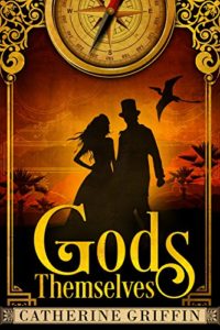
Graphics: Each time I return to this cover, I have a sense that the top has been sliced away. It’s not so much that only half the compass appears. I think it’s that the filigree at the corners seems cut off. If the outer borders of those decorations were visible, then having part of the compass outside the frame wouldn’t be a problem. As it stands, the cover looks as though it’s the victim of someone who was inexpert in using the cropping tool.
That’s the only complaint I can levy against the graphics, which otherwise are quite fine. I mentioned in Case Study 5 that silhouettes are problematic because they usually fail to display action. Here they work, even though there is only a hint of action, with the man looking taut as though caught unawares, and the woman’s hair blowing in the breeze. They’re watching the pterosaur. The man’s hand is clenched. From his top hat we can take it that this story is set before 1870 or so, which means The Wizard of Oz hadn’t yet been written. If it had been, no doubt the man would be saying to the woman, “I don’t think we’re in Kansas anymore.”
The top hat, the compass, and the etching that lightly overlays the sky tells us that this is a steampunk novel. The pterosaur tells us that it has something to do with time travel. The silhouette suggests mystery or the unknown. All in all, a good use of symbolism.
Typography: The author’s name is set in a bar that lies atop the image and obscures the maze-like elements at the lower corners. The design of the bar doesn’t match the design of the rest of the cover, nor does its color come from the same palette. It would have been easy to work in a rectangle where her name would have seemed part of the whole rather than in conflict with the whole.
As for the font used for the author’s name, it has fairly strong serifs, and, while a sans serif font may not have been called for, given the era in which the story is set (Helvetica, for example, was released in 1957), I would have chosen a font with smaller serifs.
The font for the main title is unobjectionable, and the nesting of the two words works well. It’s difficult to know just how to place the words of a title when one is short and the other long, but the designer pulled it off here. But she and the author neglected one or two things: a subtitle and/or a tagline—probably the latter. As descriptive as the illustration is, it would have been helpful to have a few words that give a sense of what the reader might expect to find.
Overall: Despite a few weaknesses in design, this is a book I would have picked up had I come across it in a book store—even though it’s not a genre I otherwise have interest in. That makes me suspect that those who do like steampunk or fantasy stories would be inclined to do more than just pick up the book.
