 Title: Lost Coast Rocket
Author: Joel Horn
Designer: Joel Horn
Genre: Young adult
Graphics: This cover is a lesson in bad design. Maybe something can be learned from it.
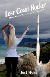
Let’s begin by noting the cover has anywhere from three to five distinct elements, starting with the background photo. The story takes place along California’s Lost Coast, an area not far below the Oregon border. The Usal Creek area in Mendocino County seems to be depicted.
On top of that landscape are plopped two to four other images. The most obvious one is of a girl, pointing northward with her right hand and scratching her head with her left. The scratching seems justified, because she too probably is wondering what she’s seeing.
She isn’t integrated into the photo. She isn’t on-site. Her image has been pasted in—and somewhat clumsily. You can see pixelated irregularities around the edges.
The remainder of the scene is formed from what seem to be three elements. It’s a little hard to say. There may be fewer, but I think the smoke, exhaust, and rocket are separate items. The multi-colored smoke might well be taken from a photo of a missile launch. The rocket certainly is a drawing; when the cover is seen at full size, there’s no doubt about that. The exhaust may be from the same drawing as the rocket, or it may be from an independent drawing.
Whatever the provenance of the several parts, the overall effect is one of hokeyness. A viewer instantly recognizes that this cover pretends to be something it isn’t and that the pretending isn’t the least bit sophisticated.
Typography: The title slants upward, perhaps to suggest a rocket launch, but then rockets are launched straight up, not at an acute angle. In partial compensation the text is placed in italics so that the words remain readable without having to cock one’s head.
Why wasn’t the same done with the subtitle? It too slants upward, but its text remains in roman and so not only is difficult to read but is out of sync with the title. The title font is unobjectionable, but the subtitle font is so ineffective that the designer seems to have added black outlines to the letters.
It would have been better to use the title font and to put the words of the subtitle in small caps, except that changing to the title’s font would have forced the subtitle to be even smaller, if it were to fit in the space provided. The only solution would be a compressed sans serif font.
All that presumes keeping the title as is, but it shouldn’t be kept as it. It should be brought down to Earth, so to speak, by removing the slant and removing the italics. Then the subtitle could be placed under it, in a single line if its new font is chosen prudently.
But what about that troublesome rocket? It’s larger than necessary. If reduced by a third, it wouldn’t intrude in the title and subtitle areas, as it does now. A smaller rocket would make more sense anyway, since the present size makes it look too close to the girl.
The author name is fine as is, except it is off-center and should be shifted leftward. The author name is in the same font as the title now is and as the subtitle should be, but, unlike the subtitle, it can remain in upper- and lowercase.
Mare Tranquillitatis translates as Sea of Tranquility. The rocket doesn’t suggest tranquility, and the beach far below doesn’t seem particularly tranquil either, so what kind of book is this? The cover would be helped by an indication of genre.
Overall: The graphics look cobbled together because in fact they were cobbled together. The designer may have delighted in producing a cover quickly, but, when later wearing his author hat, he likely wondered why he didn’t the sales he had thought he would see.
It’s almost a certainty that the cover hindered rather than helped sales. A look at other books in the genre would have alerted him to what buyers had come to expect in covers of these sorts of books.
