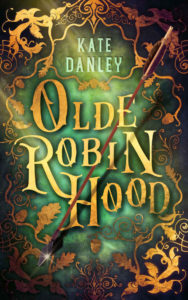
 Title: Olde Robin Hood
Author: Kate Danley
Designer: Story Wrappers
Genre: Fantasy
Graphics: The “Olde” of the title refers to legends about Robin Hood that predate the story that has come down to us. The author invites the reader to “discover the man behind the myth, as you meet the Olde Robin Hood.” That doesn’t mean this is either history or historical fiction. It’s a book that reimagines stories that are older than the one commonly known. Thus the designation as fantasy.
Does the cover indicate that? Not really, thought “Olde” carries a sense different from “Old.” At least we know the book isn’t about Robin Hood on Social Security. Still, it’s not clear that this is fantasy rather than something else.
The image is very busy, partly because its elements lie on more than one level. The backmost part consists of a mottled green base and extensive filigree. The filigree may be an artistic tour de force—it truly is well drawn—but there is so much of it that it overpowers the cover. This is an instance where half as much would be twice as effective.
Placed one level higher are the author name and title. More on those below.
At still a higher level is the arrow, which is the only three-dimensional object on the cover. Unfortunately, it doesn’t stand out well. The brown of the shaft is not well distinguished from other elements of the cover.
When the cover is first viewed at small size or from a distance, the arrow hardly is seen at all. The light-colored title catches the eye. It takes the viewer a moment to realize that within this jumble of angled shapes is a straight shape, and then it takes a further moment to realize, by moving the eyes to the upper end of the shape, that this is an arrow.
That’s a pity, because the arrow is well drawn and by rights ought to get more attention. But it has a further problem.
The shaft weaves in and out of the letters of the title, passing both above and below the E, behind the B, and across the H. This means some letters must be higher off the surface than others and must be considerably higher than the letters on which the shadow of the arrow falls.
Most viewers won’t perceive that irregularity, but they might sense, subconsciously, that something isn’t quite right about the arrow. Even if they don’t, the arrow’s greatest problem remains: it isn’t sufficiently prominent.
Typography: The title hardly can be faulted. It’s a piece of art in itself. Even if the font isn’t accurate to the period in which Robin Hood supposedly flourished, it looks as though it’s from his time. The shadows behind the letters raise them from the mottled surface, and, as I said, the arrow’s path makes it seem that the letters lie on different plains.
The letters at the upper left and lower right of the title have a distressed appearance. Only the large R and N seem free of encrustations. The variety gives the letters additional character (no pun intended). All in all, the title is effective.
The author name is in a modern font and, like the title, it rises above the background due to drop shadows. Whereas the shadows behind the letters of the title go in all directions, implying a light source straight out from the cover, the shadows for the author name all go to the upper right, indicating its light source is in the lower left. This is a lack of continuity that most people won’t see, but those who see it will take off a few points from the score.
The author name is set in a light blue-green that isn’t otherwise seen on the cover. It’s close to what is found elsewhere, but it’s not a match. That’s a discrepancy rather than a problem. The text’s color does make the author name easily visible, and it sits comfortably within a frame formed by the filigree.
That leaves the third textual element, which is missing entirely. The cover needs a tagline indicating genre or even a subtitle. This could be placed, in text smaller than the author name but in the same color, in a frame at the bottom center, where the densest ornament now resides.
Overall: This cover is done well, but parts of it are overdone. One gets a sense that the designer got carried away. Well, that’s better than having a cover that omits several necessary items—though this cover omits one, a genre indicator. If the filigree were less exuberant, and if the arrow were more prominent, the cover would warrant no complaint.
