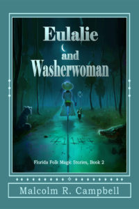
 Title: Eulalie and Washerwoman
Author: Malcolm R. Campbell
Designer: Jack Stollery
Genre: Fantasy
Graphics: The illustration is set off in a box surrounded by thin rules. Below the box is a line of dingbats, and below that line is a box containing the author name. Wide borders, in aquamarine, are on the four sides. I have no idea why.
The illustration is complex and should be as large as possible, for visibility’s sake. It ought to occupy the whole of the cover. The only text outside the illustration is the author name, which could have been placed inside. That would make the multiple rules and dingbats gratuitous. Even now they serve no evident purpose.
As for the illustration, it’s hard to make out what the various objects are, even when the illustration is seen at maximum size at Amazon.
On the right is a crocodile and on the left what may be a dog. Trotting next to the woman is a cat—but is that a woman at all? She (or it) has no legs. Immediately behind her is a yellow, black, and blue object that I can’t make out. Sometimes it looks like a golf tee, at other times like a short Phillips screwdriver. No doubt it’s something else, but what?
On the pathway are the digits 41144. They apparently aren’t a zip code. The story takes place in Florida, and that zip code, in real life, is found in Kentucky. The woman (or whatever) is approaching a railroad crossing, but there is no sign of a train. The trees suggest a swamp, but do train tracks run through swamps?
The illustration is well done technically, but it’s a jumble. It gives no indication of what the story may be or even what the genre is. It could be fantasy (which is how the author describes it) or horror or thriller or something else.
Typography: A gradient seems to have been applied to the words of the title. The letters are brightest at the upper left and dimmest at the lower right. Even the brightest letters aren’t particularly bright. On the whole, the illustration is dark, so a brighter title would provide welcome contrast. It might look best in yellow.
The brightest element of the illustration is the crescent moon. To accommodate it, odd spacing has been used for the title. The space between the first two lines is greater than between the last two. It would have been better to switch “Eulalie” and the moon, putting the latter above the former but leaving space for the tagline.
The tagline should be set in all caps in a sans serif font. Its present size is about right. It should be placed at the top, above the repositioned moon. It and the author name can remain in white.
The author name, lying outside the illustration and in its own box, draws too much attention to itself. It should be set in the same font as the tagline and should be moved to where the tagline now is. This presumes that the illustration is enlarged to fill the whole of the cover.
Overall: On this cover, it’s easy to fix the text but not so easy to fix the illustration. The crocodile can be taken to indicate danger; it works as a symbol. The dog can be taken to represent loyalty; it also works symbolically. The number on the pathway means nothing to anyone who hasn’t read the book and therefore it does nothing to recommend the book to a buyer.
This may be an example of an author insisting that things that will become plain in the reading be shown on the cover. The impulse is understandable, but it needs to be sublimated. What has meaning to an author often will have no meaning to anyone who hasn’t seen the manuscript.
