 Title: The Inhabitants
Author: Kevin Flanders
Designer: Kevin Flanders
Genre: Horror
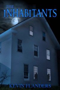
Graphics: This is the first book in a trio. The covers are identical, except for minor alterations. Different windows are lit, different silhouettes appear, the exterior of the house has Christmas decorations and icicles on the cover of the second volume and blood and icicles on the cover of the third. The color scheme changes slightly, but on each cover the house is seen at night, with the moon giving background light.
This is an inexpensive way to produce three covers at not much more than the cost of one. The savings must have been minimal, though, since this is an author-designed production, and the image of the house probably was obtained at little or no cost. The only real cost was the time used in manipulating the illustration.
The three stories concern a haunted house in which mass deaths occurred years ago. The house later was turned into apartments, and the stories are about how renters deal with one another and with malign forces surrounding them. Apparently not a few of the renters are malign themselves.
From one volume to the next the inhabitants change (perhaps the ghosts recur from story to story), and the three covers signify that by showing lights and silhouettes in different windows. The first volume’s cover shows two silhouettes at windows on the ground floor. The men seem to be peering out the windows The third volume shows only the upper parts of two silhouettes on the top floor. Those people seem to be trying to claw their way out. Below them, blood streams down the exterior wall.
All in all, this is a simple but effective arrangement, but it has limitations. The third volume, with the blood, clearly marks itself out as horror. This first volume doesn’t. There is nothing horrific on this cover, but there is a sense of spookiness, given the silhouettes and the darkness. This cover might belong to a thriller or a suspense story as easily as to a horror story.
Typography: There are but two textual elements, the title and the author name. They are in the same font and the same blue.
The font is not inappropriate for the genre. It has a reverse glow, with the interior of the letters being brighter than their outlines. Oddly, in the title the letter I is smaller than any of the other letters, but in the author name that letter is the same size as the others. This is especially disconcerting in that the first letter of the main word of the title is an I. If this was done purposefully by the designer, he should undo it. It serves no purpose.
That is a small problem. A bigger problem is the color used. Blue is exquisitely wrong here because it fails to stand out. The entire cover has a blue cast to it, so the text makes blue on blue. This would have been the place for a distinctive color, such as yellow for the title. (I would use white for the author name.)
The title consists of two words, the short “The” and the long “Inhabitants.” It’s not easy to put them on one line. That would be adding four units, counting the space, and “Inhabitants” already looks cramped. One could resolve this by changing to a more compressed font, but an easier solution is to change the title.
Why not simply “Inhabitants”? Dropping the definite article gives more focus, and a slightly different sense, to the chief word, and it would have the happy effect of removing the ill-fitting article. Even with that change, along with the change in color, the lone remaining word would need attention. It’s too wide and needs to be compressed slightly, so that there would be about half again as much space on either side.
The author name should be where it is (though slightly raised) but in a sans serif font. The title’s font is so distinctive that it shouldn’t be used elsewhere on the cover. Once is enough.
The cover needs one more textual element, either a subtitle or a tagline. Using the house’s address, the subtitle might read “Horror at 99 Deepwoods Drive.” That tells the genre, and it indicates that the house itself is important to the story. A tagline could be something like “A Tale of Residential Horror” or “Renters Check in But They Don’t Check Out”—something to make clear what sort of book this is.
Overall: The illustration is simple but effective, but it is more effective in the second and third volumes of the trio than in this first volume. It needs assistance in the form of a subtitle or tagline that specifies the genre, and it needs text that more readily stands out from the image.
