 Title: The Buckeye
Author: Troy Allen
Designer: Mariah Sinclair
Genre: Historical fiction
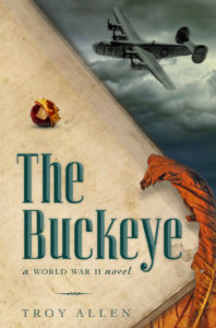
Graphics: The graphics are particularly well done. There are three focal points: the title, the B-24 bomber, and the curled, dried buckeye leaf. (I gather that the bomber in the story is nicknamed The Buckeye.)
After those, two other things catch the eye.
First is the buckeye seed that is above the title. It looks much like an acorn. The real-life seed, when separated from its cap, has the look of a male deer’s eye: thus the eye of a buck.
I admit I’m of two minds regarding this particular rendition.
The seed occupies what otherwise would be empty space, and that’s good. It brings burnt orange coloration to the left side of the cover, and that also is good. To the knowing, it indicates that the leaf comes from a buckeye tree, and that is yet another good thing.
But the seed is not easy to make out at thumbnail. It might have been better to show the seed next to its upturned cap or to show it enlarged. Or both.
The next thing to catch the eye is the pale journal paper. When the cover is shown small, it’s hard to make out that this is paper. It simply looks like a mottled surface. But when the cover is enlarged, faded handwriting can be made out—plus a water stain at the lower right.
If the handwriting were about twice its current strength, it still would look faded, but it would be able to be discerned no matter how small the cover might be viewed. Any enlargement, though, should not be at the expense of the legibility of the subtitle or author name, each of which should be fine if revised as suggested below.
Typography: What immediately catches the eye is the elegant presentation of the title. The font is Corvinus, which was released in 1934, making it perfect for this World War II story. It not only hearkens back to the period, but it actually was from the period.
If anything, I would like to see the title a little brighter. The font is a tricky one, with dark and light elements abutting one another, with the light elements appearing wider than the dark even though they’re not. The words have a subdued feel, and the light elements are a little difficult to make out against the beige journal page.
One way around this would be to leave the text as it is and lighten up the page, bringing it a third of the way from what it is to the white that it presumably once was. Another way would be to remove some of the gray in the light green elements of the letters, making them greener.
The subtitle, “A World War II Novel,” tells us two things: this is a novel, and it’s a novel based in a particular historical period. Of course, we likely would surmise that already, having seen the bomber even before taking in the title. The only fault of the subtitle is its size. If the font came in a condensed variant, I would use it instead; that would allow the text to be boosted by a few points.
The same font is used for the author name as for the subtitle. Note that the letters are kerned widely, a common technique that works especially well on period pieces, as here. But here the wide kerning ends up counterproductive because the added width prevents the author name from being as large as it should be.
If the letters were kerned normally, and if the text were allowed to extend slightly further to the right than it now does (but not to the very edge of the journal paper), the author name could be considerably larger. It would give the author more credit, and it would balance out the title somewhat. As it stands, the author name and subtitle seem scrunched by the title.
Overall: This is a fine, professional-looking cover. Not only is each element appropriate to the story and period, but each, clearly, has been crafted with care.
The changes I propose are minor. They would change this from a cover that pleases any viewer to one to which viewers would say “Ahh!” If the average self-published book had a cover this nicely done, self-publishing as a whole would have its reputation raised considerably.
