 Title: Shanghaied
Author: Carey Fessler
Designer: Carey Fessler
Genre: Children’s fiction
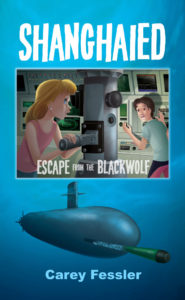
Graphics: The story is about two twelve-year-olds trapped on a submarine the crew members of which were turned into mutants through a “radioactive incident.” Do the cover graphics suggest that? Only in part, I’d say.
The main image, in the central box, shows the boy and girl. She is looking through the periscope. He seems to be startled by something he learned from the instrumentation. Thus tension is shown, but there is no hint of anyone else being aboard the submarine, let alone mutants, and there is no indication that the kids have been shanghaied.
Nevertheless, the illustration is well done: her face is larger, being closer to the viewer, but his face is more brightly lit; they end up with equal prominence. The scene is highly detailed, down to the radar screen and the other monitors. By comparison, the image of the exterior of the submarine suffers.
First of all, is this the submarine they’re on, or is it an enemy’s submarine? Its contours are strangely bulbous, and what’s that coming out of it? No doubt it’s a torpedo, but, when the cover is seen at small size, it looks like a green pencil with a dark brown eraser. Even when enlarged, it hardly seems shaped like a regular torpedo.
The images compete against one another—and not successfully. The better image shows the protagonists. It should have been the sole image, though redrawn to occupy all of the cover. If that were done, there would be room to insert a menacing presence in a shadowy area toward the rear of where the kids are standing: a mere hint of a mutant would do.
Imagine if the boxed illustration were removed and all that remained were the torpedo-shooting submarine on a background of blue. That would make for a dull cover and not one likely to catch a child’s eye. Then imagine the boxed illustration taking up the whole space. What ten-year-old could resist?
As it stands, the cover indicates the genre well enough. This isn’t a history of World War II submarine warfare. It’s a pre-teen thriller. The boxed illustration looks the part; the submarine, not so much.
Typography: The title is fine. The same word has been used as the title of lots of books. Its presentation here is at once easy to read yet not dull. The characters in this font sit at different positions relative to the base line, and that works well for the kind of book this is.
If the graphics were reconfigured as proposed, with a revision of the boxed illustration taking up all the cover, the illustrator would need to include an un-busy area at the top where the title could reside without conflicting with fine detail.
That same area should hold the subtitle. Now, the subtitle is placed indiscriminately atop the illustration and in letters that are partially transparent. The words “from the” are far too small. Perhaps the designer thought that making them the size of the other words would make the subtitle too long for the interior of the box. Maybe so, but that should have been a clue that something was amiss with the original placement.
Even in the current scheme the subtitle should be moved to beneath the title. The submarine could be shrunk (it doesn’t have to be as large as it is), and the title could be compressed vertically. Those adjustment would provide uncramped room for the subtitle, which should be set in one line with all characters the same height, except that the font shouldn’t be the one used for the title. It should be the one used for the author name. That way, the subtitle would be maximally distinct from the title.
As for the author name, it’s fine as it is, though it should be in white, like the rest of the text. If the boxed illustration is enlarged to cover the whole cover, it may be necessary to change the color of the author name—and perhaps the color of the title and subtitle. That would be determined mainly by the new background color.
If several alternate colors would seem to work, the designer should choose one that picks up a color in the illustration, such as yellow or gold from the girl’s hair—but not pink from the back side of the boy’s pants. (And why are his pants that color anyway?)
Overall: I suspect this cover’s main weakness, the attempt to use two illustrations at once, arose from the designer’s desire to convey as much of the story as possible. That is a temptation that usually must be resisted.
Designers often acquiesce to authors’ request for covers to include multiple items that represent multiple parts of the story. Often, those things have meaning only to the authors; they can’t mean anything to the readers until the readers have read the books.
At other times, such as here, designers want to include things that will make sense to prospective readers (in this case, the submarine), but those things aren’t necessary to convey the sense of the book. They just end up cluttering the cover.
