 Title: Garden of Fiends
Editor: Mark Matthews
Designer: Zach McCain
Genre: Horror
Graphics: This is a collection of eight fictional stories about addiction to drugs and drink. The book’s purpose is to warn of the dangers of addiction and to show hope for recovery.
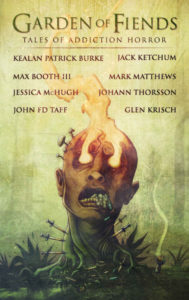
The genre is horror. How well does the cover suggest the genre? Pretty well, I’d say, since it sports an image not unlike those painted by Hieronymus Bosch. We see a disembodied head that has mouth agape and eyes aflame (in the worst sense of eyes being aflame).
When seen at small size, portions of the image are hard to make out. Are those swords piercing the neck? On closer inspection, they’re seen to be hypodermic needles. And what’s in the mouth—or coming out of the mouth? Some items are hard to identify. It turns out that some are medicinal capsules.
The background to the image is a sickly green, an appropriate color under the circumstances. The background is lighter at the top, darker at the bottom, and it’s splotchy. That gives it interest—far better than having just one, solid color—but it means that small items at the bottom, which are dark themselves, don’t stand out well.
One of the hallmarks of Bosch’s paintings was their precision and clarity. That fifteenth-century artist succeeded in making even the smallest objects in his paintings comprehensible in their appearance, if not in their meaning. This image doesn’t pull that off, the small objects at the bottom looking like an undifferentiated jumble.
Still, the overall effect works. This is a “horrible” image (particularly the eyes) because the book’s subject is horrible: the horror of mind and body being destroyed by addiction.
Typography: There are three typographical components: title, subtitle, and list of authors. Given the prominence of the head, the title seems too small by comparison. It doesn’t stand out enough. A more compressed font, with thicker lines, would have been better.
The distressed effect given to the present font (and to all the text) is a good one, but it does make each letter harder to read than it otherwise would be. How to compensate?
The title is in green. While the font for the title ought to be changed, a font change alone may not be enough to make the title stand out sufficiently from the background. We now see green on yellow-green. To give the title the attention it deserves, it may be necessary to change the revised text to black. The distressed effect could be kept, its negatives being canceled out by the black of the lettering.
The names of the eight contributors are in deep red. Despite being so much smaller than the title, the names stand out better, but they do suffer from a busy background.
The names appear on four lines, with the spacing between the lines being irregular: there is less space between the second and third lines than between the other pairs. The spacings should be made equal, and they should be made smaller, about half the size they now are.
That would move the names a little further from the busiest part of the image, but they still would be competing against the background. It might be prudent to return to the image and lighten its upper half, making a more pronounced gradient beginning just above the skull. This would have the happy effect of helping the title too.
Lastly, the ornament that separates the top line of names from the subtitle should be removed. It serves no purpose. Blank space works just as well.
The subtitle is the least legible text. It is in red, like the author names, but, unlike them, it’s not bolded, perhaps to distinguish it from them. That could be achieved as well, and the subtitle could be made easier to read, if it, like the title, were put in black.
Note that all the text has been squared up, left and right, except for the subtitle, which is indented on both sides. This helps mark off the subtitle from the names beneath it. Also helping is the wide kerning of the subtitle. (Speaking of kerning, some of the names have problems with letter pairs.)
Overall: The cover’s feel is one of off-putting-ness, and that’s appropriate. It’s an ugly cover, in a good sense: the stories deal with ugly realities expressed fictionally, and the cover indicates what the reader will find inside.
The lower part of the image is indistinct; it could use Boschian attention. The text can be made more prominent and easier to read. The changes needed would be minimal.
