 Title: Harps Upon the Willows
Author: M. B. Gibson
Designer: Panagiotis Lampridis
Genre: Historical fiction
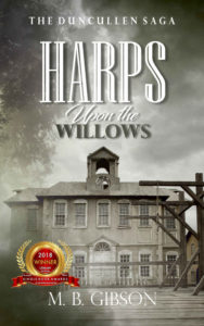
Graphics: This story takes place in County Tipperary in 1766. The Irish venue isn’t clear from the cover image, which could be taken for many other places.
The building may be the seat of the town’s government, given its bell tower. While the first thing to catch the eye is the building, what then catches the eye are the scaffolds. Without them the image would just be an image of an old building, but with them the image begins to tell a story.
The cover is in black and white, with brown tones for the scaffolds and the building off to the right of the main building. This implies that the original photo was in color with the color then drained from most of it. The overall effect is one of dreariness. There is no bright, uplifting element in the image, and that may be precisely the sense of the book.
I mention what catches the eye first, but in that regard I refer only to the image. What actually catches the eye is the lone area of color, the seal in the lower left.
The small text indicates that this book was the winner in the literary fiction division of the Kindle Book Awards. That may sound like an official, Amazon-sponsored contest, but it’s not. It’s one of those contests where authors pay a submission fee and hope to be awarded a seal like this one.
The seal itself looks impressive, but it mars the cover. The seal would look fine on the back of the paperback version and in advertising, but it throws the cover off. It obscures part of the building and, worse, completely overshadows the building—and that scaffolds too. It largely destroys the aura the image otherwise would convey.
Besides, the seal is just too small to read. At thumbnail size one barely can make out the award year, 2018. Everything else is in microscopic text. Even at the Amazon sales page for the book the seal is illegible, until one clicks on the cover and sees the largest cover image.
What this means in practice is that the seal, as seen here, tells the viewer nothing other than that the book received some sort of award. That isn’t enough consolation for throwing off the cover.
Typography: The five lines of text come in four distinct fonts. The author name and series tagline are in one font, with the latter in a bolded version. Each of those lines is set against a background that has light-colored areas, and in those areas the thin-stroked font is difficult to read. The designer may have thought that this font evoked the era of the story, and that may be so, but timeline verisimilitude should take back seat to legibility. A font with thicker strokes should have been selected.
The title comes in three lines, each with its own font, with each font wildly distinct from the others. The main word, “Harps,” is read easily even though it is in white against a whitish background. What saves it—and the two following lines—is a drop shadow. The font itself looks like it might have used in the credits for a 1940s motion picture produced by Darryl F. Zanuck.
The final word of the title, “Willows,” is in a markedly different font. Whereas the font used for “Harps” has interior spaces, the one used for “Willows” is solid, and it’s solid gray. It’s as though the two words are unrelated.
Between them are sandwiched “Upon the,” rendered in italics, with the descender of the P falling behind the first L in “Willows.” That small three-dimensional effect is well done, but, when seen at a distance, “Upon the” seem cramped between the other two lines. These words, like “Harps,” are in white, which makes one wonder all the more why “Willows” isn’t.
All four words of the title should have been given a muted color, something more pronounced than the vague brown of the scaffold. These words need to stand out more than they do, and they need to do that without relying on the artificial respiration of drop shadows. The cover could use a little color—nothing garish, such as the seal (which should be removed) but enough to draw attention to the title.
Overall: In many ways this is an attractive cover, or at least it would have to be called that if not for the intrusive seal. It’s understandable that an author would want to tout the winning of an award, even if it’s a pay-for-hire award, but touting usually is best proclaimed elsewhere than on the front cover, particularly if the touting ends up distracting from an otherwise carefully composed image.
