 Title: Sparks
Authors: Matthew Cash and E. M. Dehaney
Designer: Matt Hill
Genre: Horror
Graphics: This is an anthology of fifteen stories, each having something to do with electricity and most of them being in the horror genre, though others qualify as science fiction or fantasy.
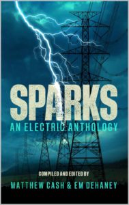
The illustration makes it doubly clear that this book involves things electrical. Not only are there high-tension electrical transmission towers, but the towers are being stuck by bolts of lightning. It’s a double whammy.
On closer inspection it becomes evident that, while the towers may have been taken from an actual photograph, the lightning bolts have been drawn in—not, one suspects, because the designer couldn’t find images of towers being struck by lightning (those are easily found) but because he wanted the lightning to illuminate not just the towers but the title.
This works effectively: we see a shaft of lightning sizzling down the right side of the A, and the only true sparks on the cover fall not so much from a struck tower as from the struck letter.
The cover image is well balanced, with bright lightning in the upper-left quadrant and a near-black tower in the upper- and lower-right quadrants. There is enough dark landscape at the bottom for the author names and a tagline, though there isn’t as useful a spot for the subtitle. Despite that inconvenience, the visuals are effective.
Typography: The textual treatment is quite fine. The lone title word, “Sparks,” stands out well, even though its color isn’t bright. The letters have been given a mottled appearance that makes them more interesting than they would have been if shown plain. It’s as though they have been pitted by repeated lightning strikes. The most concentrated mottling is on the right arm of the A, now under electrical attack.
The subtitle is not as legible as the title. It picks up its color from the background sky, and in some spots it is hard to read against the clouds. Perhaps the words’ color could have been more saturated.
However that may be, the subtitle gives a sense of what the book is about, and such a sense needs to be given because the one-word title, standing on its own, could work on a multiplicity of genres. A book titled Sparks could be, as here, a horror story, or it could be a romance, or the story of a dog named Sparks, or a biography of Alessandro Volta.
But does “An Electric Anthology” say enough? The one thing it says clearly is that this book is an anthology. The ambiguous “Electric” leads one to suspect that the anthology consists of works of fiction rather than non-fiction, as in “I Sing the Body Electric” (title of a short story collection by Ray Bradbury and, before that, of a poem by Walt Whitman).
But “Electric” isn’t enough to convey to us the book’s genre. That could be done by adding a tagline at the top of the cover or, in the same place, a short blurb from a well-known writer of horror stories. Imagine something like “‘Shocking horror stories.’ —Stephen King” (though probably a lesser-known author would have to suffice).
The names of the co-authors and co-editors stand out sufficiently from the dark backdrop. The line above their names, “Compiled and Edited by,” may be necessary to head off the mistaken idea that this is an anthology of works written only by them. If so, this becomes an exception to the rule of not using “by” when referring to an author.
In almost all cases it’s obvious that a name on a cover is the name of the author. Prefixing “by” does nothing but tell the reader that the author is an amateur (the designer likewise). On this cover, though, the use of “by” is justified and even helpful, as part of a phrase that explains who’s who.
Overall: This cover has many strengths and almost no weaknesses. I would give it an A-.
