 Title: New York Orphan
Author: Rosemary J. Kind
Designer: Magic Owl Design
Genre: Historical fiction
Graphics: This book is about an Irish immigrant boy whose parents die while fleeing the potato famine. In pre-Civil War America he is put on a train, relocated westward, and shuffled off to a status little better than slavery. How much of this does the cover convey?
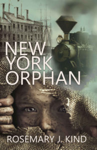
The graphics consist of three photographic images. The most arresting is the lower one, which takes up about half the cover.
A dirty-faced boy peers through a hole in a gunny sack, the quintessential repository of grain or potatoes on nineteenth-century farms. The fingers of his right hand enlarge the opening, and his eyes seem filled with inquisitiveness and apprehension. This image works well with the book’s theme because it shows the orphan of the title, his dirtiness suggesting a difficult and unhappy childhood.
What about the other photos?
The locomotive sets the time frame. Clearly this isn’t a twentieth-century story. It takes place much earlier. But if we don’t know the gist of the story—that children were transported long distances by train, to get them away from overcrowded orphanages in New York and other port cities—would it have meaning for us? I don’t think so, unless there were a subtitle that made reference to the train. I would have left this photo off.
Similarly for the third photo. It takes a moment to realize that this building (which is a grain repository, according to a sign that can be read only when the cover is enlarged) must be at a pier because immediately behind it we see the rigging of a sailing ship. The building on its own doesn’t tell us the story’s era—such buildings existed well into the last century—but the partial image of the ship would, if we could make it out easily.
I suppose the third photo is meant to suggest immigrants’ voyages, but, as with the photo of the locomotive, it doesn’t do that unless one already knows something of the story. Thus I would omit this photo also.
That would leave only the photo of the boy, but that is how it should be. It far and away is the focal point, and the eye shouldn’t be drawn away to other images.
A viewer can’t tell whether the boy’s image, before being cropped, included other material above or below what we see. If it did, there may be room for the text atop additional portions of the gunny-sack. If not, a good designer could make graphical transitions above and below what we now see.
Typography: The cover has but two textual elements, the title and the author name. They are in the same spare font, which works well for the historical period. Assuming the reconfiguration of the images as mentioned above, so that the gunny sack is extended above and below the current image, the text would overlay the gunny sack.
That likely would require that the author name be set in bold because the sack alternates light and dark areas and thus the present thinner letters might not stand out well enough against parts of the new image. The title probably can be kept as it is, since its size is much larger, but its letters may need to be bolded also.
Two things are missing from the cover, an indication of genre and a tagline suggesting elements of the story.
The former can be handled by adding something as simple as “A Historical Novel.” Without such an indication, one could take the book to be social history, since it otherwise looks like books of that sort.
(In fact, even as the cover now stands, it reminds me of the cover of James Agee’s Let Us Now Praise Famous Men, the Ballantine edition of which featured a pensive and impoverished Appalachian child on the cover.)
A genre indicator is needed, but this cover needs something more. It needs a tagline that hints at the flight from famine, the forced train ride, and the immigrant boy’s struggles while living in near-servitude. Such a tagline should be put at the top of the cover, while the genre indicator should be put below the title.
Overall: The upper two photos try to convey elements of the storyline, but they don’t succeed because their significance can’t be known until the viewer is told something the cover remains silent about. That silence could be overcome through a judicious tagline, but the image of the boy is so powerful that I would focus the entire cover on him, leaving off the other, distracting photos.
The storyline still would need a bit of explication, and the genre would need to be made clear, but the result would be a cover that would fascinate anyone who looked at it.
