 Title: The Moonstone
Author: Evelyne Contant
Designer: Boudesign
Genre: Fantasy
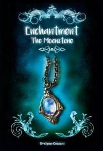
Graphics: Remove the text and filigree from the cover—then what do you have? A pendant suspended in space, against a hazy background. What genre does this imply? Probably none. It could imply fantasy, the genre this novel actually belongs to, but it could imply several other genres of fiction and might even imply a non-fiction genre, such as gemstone making. In other words, the cover doesn’t succeed in announcing what kind of book this is.
The most prominent part of the image isn’t the moonstone and isn’t its case or its chain. It’s the glow in the background, which draws attention to itself without setting off the pendant adequately.
And what about the chain? It disappears under the design that separates the image from the title. It would have been more effective if the chain had disappeared off the top of the cover, perhaps becoming progressively attenuated as it did so.
The moonstone itself fails to stand out against the background or even from its case. The background “haze” should have been a different color, less bright and less quick to fade into the black that occupies too much of the cover.
The strongest graphical elements are the four filigrees. Usually such devices act as partial frames, focusing attention on an object at their center, but here the three large filigrees seem to float aimlessly, while the fourth one, under the title, has no clear purpose except to indicate that the title isn’t the chain—a mistake few people are likely to make.
All four filigrees should be removed. By doing so, more space would be available for enlarging the pendant image and enlarging and rearranging the text.
Typography: Almost always the title is the largest text on a cover. The most common exception occurs where the author is famous and his name is enough to effect sales. Look at novels displayed at airport book stores. You’ll see that the ones in the eye-level racks sport tremendously large author names, with titles given secondary status.
But those are exceptions. On most covers, the largest text is found in the title.
Nt here. It may seem that “Enchantment” is the title, but actually it’s the series title. There are three books in the series, and this is the first. Its title isn’t “Enchantment” but “The Moonstone,” something that doesn’t become apparent until you look at the book’s sales page.
It would have been better to make “The Moonstone” large and “Enchantment” smaller and better yet to make it clear that “Enchantment” is the title of the series, using a line such as this: “Book 1 in the Enchantment Series.”
The author name is illegible at thumbnail size. Even at the sales page at Amazon it can’t be deciphered. You have to click on the cover to bring up a still larger image.
The author name ought to be as large as the present title. Since the title font is artistic, the font for the author name should be simple, preferably sans serif, and the text should be set in all caps, perhaps with the letters widely kerned. The new font should not have thick lines because the title font itself has lines that are not thick.
Overall: This cover may have taken the designer a fair amount of time to put together, but it gives the unfortunate impression of being slapdash. The four filigree elements, in particular, look as though they were pasted on quickly, with little thought about their purpose and how they might draw undue attention to themselves.
The cover’s greatest failing is not making clear the genre. To some it will say fantasy, but to others it will say romance or science fiction or something else. Someone might even mistake it for Wilkie Collins’ The Moonstone, the first widely-read detective novel.
This kind of oversight—not making genre clear—can be deadly for sales. If someone is looking for a fantasy novel but thinks this book falls into a different category, a sale will be lost.
