 Title: Deadfall
Author: Thurston Bassett
Designer: Pulp Studio
Genres: Post-apocalyptic, thriller
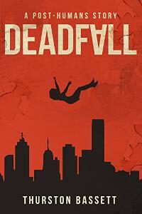
Graphics: The red background doesn’t much look like a sky, but that clearly is what it is, and no one will be confused by it. Red is better than blue here because it gives a sense of anxiety rather than calm.
What about the silhouette? Usually silhouettes work poorly because they don’t convey action well. Here the action is clear enough: a body is falling. Given its size relative to the cityscape, we assume the body is much closer to us than are the buildings, and we are left to imagine the origin of the fall: from a nearby building just out of sight or from a plane or helicopter? It could be any of those. At least there is no mistaking the idea that the woman will be dead in a few seconds.
What the illustration lacks is any connection to the tagline. Nothing in the image says “post-humans.”
Typography: Let’s start with the author name: white against black. You can’t ask for anything more legible. Nothing to criticize here, but the title and tagline could use a little help.
Usually inverted letters cause more trouble than they’re worth (trying to be cute usually does), but here the inverted A works well because it looks like an arrow or funnel pointing downward, the same direction the body is falling. If there is a failing with the title, it’s that it’s pushing too close to the edges of the cover. It should be about twice as far in on the left and right. Given that the author name is the brightest text and so attracts the eye more than it should, as compared to the title, I’d recommend a brighter yellowish tone for the title.
The tagline is a little hard to read. It should be the same height as the author name, and there should be more space between it and the title, which should be moved down about a third of the way to the present position of the falling body, which in turn should be moved down a little. That in turn probably would necessitate the cityscape being moved down too, but there’s plenty of room for that without altering the position of the author name.
Overall: This is a competently done cover. There is nothing remarkable about it: nothing remarkably good but nothing remarkably bad either. The thing that stands out most is the inverted letter, a fairly common technique in thrillers and similar genres. The cover could have worked as well (maybe even better) if the genre were detective story (“who threw the woman off the balcony?”) or something else.
