 Title: The 1-Hour College Admissions Essay
Author: Craig Machen
Designer: Ebook Launch
Genre: Self-help
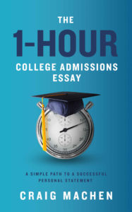
Graphics: It takes but one glance to recognize that this is a non-fiction book. The graphics follow a standard pattern: solid or slightly shaded background, a centered photo or illustration, and type that is clean and simple.
The background is a gradient from left to right. I would have had the gradient—if I included one at all—go from top to bottom, from lighter to darker. Why? To suggest an off-the-cover light source that could account for the stopwatch’s shadow, which is below the stopwatch, not to its right, as the present gradient might imply.
What about the stopwatch itself? Its hand is at about the eleven-minute mark. I wish there were a way to have it indicate either a full hour or an hour that has just begun, but that would interfere with the graduation cap, so what we see is fine. The cap is a nice touch, even though caps are worn at graduation, not at matriculation. No matter. The cap immediately brings to mind higher education, and that’s the point.
My only reservation with the graphical treatment is that I’d like to see the stopwatch and cap occupy a little more room, though I admit I’m at a loss to see how that could happen without impinging on the text.
Typography: There is just one font here, and it’s a good one. Its lines are spare, yet it has a little distinctiveness: notice the slight movement on the foot of the R.
The key term in the title is “1-Hour,” an appeal to high school students who want to handle this part of the onerous college admissions process expeditiously. It’s proper that “1-Hour” be in particularly large letters, but those letters would stand out better if they weren’t set in dark blue against a blue background that, on its right, comes close to being dark blue. The letters should take the yellow from the cap’s tassel. That would help the cover from over-relying on one color. The remainder of the title looks fine.
The same can’t be said for the subtitle, which is illegible at thumbnail size. The subtitle needs to be larger. There is room, left and right, for it to expand by about a quarter in width and height. That still might not be enough to make it legible, so I would change it to yellow also. That would leave two colors for the text, white and yellow, rather than three, as would be the case if only “1-Hour” were put in yellow. The more I look at this cover, the more I think that blue on blue doesn’t quite work—thus the swap to yellow.
Overall: There is little to fault here—not surprisingly since the design comes from a professional firm. A change in color, an the enlargement of the subtitle, and a reconfiguring of the gradient wouldn’t take ten minutes but would be enough to bring this cover from a solid B to an A. Even in its present form the cover does its job.
