 Title: A Whitewashed Tomb
Author: Rebecca Loomis
Designer: Rebecca Loomis
Genre: Dystopian fiction
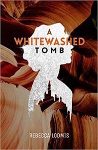
Graphics: The background graphic seems to be a photo taken at Antelope Canyon in Arizona. In itself it’s a lovely image, but what does it have to do with a dystopian theme? The opening pages of the book refer to gray, sterile surroundings. This photo suggests something quite different.
Much the same can be said of the white silhouette. It’s clear enough that the protagonist is a woman, so the silhouette serves at least that purpose, but the title leads us to imagine that the cover would show a white tomb rather than a white silhouette. And what does the overlay imply, the silhouette placed over particolored rocks? How do the two images go together? They clash more than they cooperate.
Each of the graphical elements, the three-dimensional rocks and the two-dimensional silhouette, is fine in itself, but they don’t work together, and they don’t work to tell us what this book is about or what its genre is. Most dystopian novels signify their genre by having covers in which grays and deep blues predominate. Such colors are absent here. Such covers usually feature architectural elements that suggest post-disaster ruins or a partial recovery from disaster. Again, this cover has nothing of the sort.
I suspect this is a case of a do-it-yourself author-designer juxtaposing images she likes even though they do little to advance an understanding of what the book is about. This is a common fallback position for authors on a budget, but it’s an example of false economy.
There are countless pre-made covers available in the dystopian genre, many of them with images of young women. Such covers can be purchased for as little as $100. Assume the author of this book bought such a cover.
She has set her ebook price so that her royalty from Amazon will be nearly $5. A more genre-obvious cover certainly would yield additional sales. She would need to sell only 20 additional copies to recover her investment in a more appropriate design. It’s likely that a cover that fairly screams the genre would result in far more additional sales than that.
This book has received favorable reviews, but it hasn’t sold widely. I suggest that the author redo the cover and relaunch the book. Almost certainly she will recoup enough to pay for a cover that clearly signals the genre, and she might luck out and see far more sales than she has seen so far.
Typography: Given the graphical problems, and assuming the author doesn’t seek out a professional designer, this cover could use a tagline that indicates its genre, such as “A Dystopian Novel.” If such a tagline were added, I’d put it where the author name now is and would move the author name to the top. But that’s a workaround and only a partial one. There’s only so much that text can do if the image is off.
The author name is far too small. It ought to be doubled in size, with the color changed to a brighter white so the name will stand out better against a rocky background that itself has light tones.
First-time authors (the author identifies herself as such) often are over-modest, putting their names in letters as small as their (soon-to-develop) reputations. That’s a mistake. Their names should be as large as those of well-known writers, even if not as large as those of truly famous writers whose books sell precisely because of their names and not because of their titles.
On this cover, the title is more troublesome than the author name. The font is uniform, but the coloration is not. There actually are three colors, with “A” being darker than “Whitewashed.” The only word that stands out well is “Tomb” because it is black against white, but its letters are decidedly smaller than those of the other title words, for no obvious reason. I would make “Tomb” the largest word of all, even over-sized, perhaps stretching it to be as wide as “Whitewashed.”
But what to do about “Whitewashed”? The word itself suggests that it should appear in white or white’s opposite, black. As it is, the word is in a reddish color that is too much like portions of the image: precisely the wrong choice.
If the silhouette is to be preserved, I would make it smaller and move it lower so that it’s beneath the title, and I would put all three title words in white, moving them up a little. As mentioned above, I would make “Tomb” much larger, but I would keep the other words at their present size. This would not be a complete fix for the cover, but at least it would make the textual elements legible and more prominent.
Overall: A few decades ago, an author could get by with a cover that didn’t clearly identify the genre and that had graphical elements that gave little hint about the storyline. That no longer is the case, the competition having become so great.
There must be tens of thousands of books within just the dystopian genre. A designer need not be slavish in preparing a cover that prospective buyers immediately will recognize as belonging to that segment, but certain conventions need to be kept in mind if a book is to have prospects of decent sales.
