 Title: Camouflaged Sisters
Author: Lila Holley
Designer: Purposely Created Publishing
Genre: Memoir
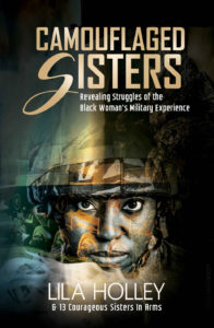
Graphics: This book consists of short memoirs by fourteen black women who served in the United States military. Unsurprisingly, given the book’s theme, the cover features the face of a female soldier. She seems to be wearing orange-colored camouflage, but that actually is a portion of an overlaid image of a military vehicle. Her helmet can be made out—or at least inferred—at thumbnail size, but that’s about all that can be made out, other than her face.
If this cover had no text, it might be hard to guess what the other elements of the image were. At arm’s length, they seem a mish-mash of somber colors, with a few points of brightness. Only when the cover is enlarged can one make out the military vehicle and what appears to be a mountain ridge on the right and smoke at the bottom. Despite these flaws, the cover has an attraction, perhaps because the woman’s eyes are the clearest and most contrasting element.
Typography: Let’s start at the bottom. The author is one of the contributors to this book, and she wanted to give the other contributors acknowledgment not just in the introductory pages but on the cover itself—thus the line beneath her name: “& 13 Courageous Sisters in Arms.” The problem is that those extra words are difficult to read, being so small. Even the author name, in thin letters set against a variously-shaded background, is hard to read.
The author name should be kept in the same font and even at the same size but should be in bold and in a brighter white. Then the letters should be kerned widely, to stretch the author name most of the way across the cover, so that it fills about two-thirds of the open space on either side of the present arrangement.
That would allow the next line to be set in a larger point size, one large enough to stretch the words exactly as widely as the author name. That would boost the height of the letters by nearly half, making them more legible. (In the process the preposition “In” should be lowercased, following the convention that prepositions and other “small” words aren’t capitalized unless they begin a sentence, headline, or title.)
Now to the title. It looks fine as it is. The color tone is just about right: slightly subdued, to go along with the tone of the illustration. The text is large enough to read at all sizes, and the stylized S gives the curve-less words a little distinctiveness and perhaps a feminine touch.
The weakest text treatment is found in the subtitle, which, like the credit to the other contributors, is set in too small a font. As positioned here, there isn’t much leeway for increasing the font size. Too much increase and the second line of the subtitle will butt into the right margin. It’s almost there as it is.
What I would do is reconfigure the subtitle into three lines: “Revealing Struggles/of the Black Woman’s/Military Experience.” Then I would increase the size of the text until the rightmost letter of the longest line was flush with the right edge of the final letter of the title. This would make the subtitle larger than the line under the author name. There should be no interfering with the image, since there is plenty of room atop the helmet for the rearranged text.
Overall: One imagines the process of cover design, with the designer sitting before a large monitor, carefully adjusting his creation until every small element meets his satisfaction.
The large monitor allows him to position images and text with precision, but it also might lull him into not taking into account that buyers’ first views of the cover will be not full-screen on a large monitor but at thumbnail size, perhaps even on a screen as small as a phone’s.
The chief problem with this cover is the legibility of the text other than the title. Fortunately, there are relatively simple fixes—or, at least, relatively simple lessons to learn for the designer (for when he works on a similar project) and, perhaps more importantly, for an author who is thinking about what sort of cover an upcoming book should have.
