 Title: Wasted
Author: John Byrne Barry
Designer: John Byrne Barry
Genre: Mystery
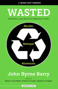
Graphics: The description at Amazon describes this book as “part mystery, part love triangle, part midlife crisis, and part political satire,” but that’s not what the cover says, at least not if you look at the graphics and don’t bother to read the smaller words.
If you do read the smaller words, you see “mystery” once and “murder” twice. That should be enough to tell you the book is a murder mystery, but what if you don’t read the words (which are not particularly large) but just notice the graphics? You likely will think this is a work of non-fiction, something about recycling, because what does catch your eye implies that.
The largest graphic element is the recycling symbol. It’s ubiquitous in our society. Whenever we see it, we think of garbage, sanitation, and the like. That will be the first impression here, unless other cover elements immediately counter that impression—but they don’t. They reinforce it.
The next most prominent element is the black circle in which the recycling symbol is positioned, and the other most prominent element is the green background. Taken together, these three elements suggest not a murder mystery but an environmental handbook.
That suggestion is all the stronger with the one-word title, which many may read simply as Waste rather than as Wasted. Drop out all the smaller text, but leave the author name, and you’d think this book might be a complaint about pollution or over-consumption, and that’s a problem, at least for the author.
Some prospective readers will take one glance and move on, misunderstanding the book’s genre. Thus, instead of helping sales, the cover may hinder sales.
Typography: There appear to be two fonts here, one for the three words within the circle, another for everything else. In its plain form, in the bottom-most text, the font appears weak because its lines are thin. In its bold form, as in the title and author name, the font is legible. I’d have kept this font only for the title and author name and would have used a sans serif font for the remaining text, including the words in the circle.
As for those words, why do they have periods after them? They aren’t sentences and wouldn’t make sense as sentences. Given the stark nature of the recycle symbol, the three words probably would look better in all caps. With upper- and lowercase they don’t stand out enough.
The subtitle is far too small. It disappears at thumbnail size, as does the series tagline at the top (“a ‘green noir’ mystery”). If this text were in a condensed sans serif font—that is, the condensed version of the sans serif font that should be used everywhere but for the title and author name—it could be twice as tall. As it stands, there is too much discrepancy between it and the title, and one may wonder whether it really is a subtitle or something else.
I mentioned the last line of text, which is the title of another book by the author. Is that book well known? Will someone looking at this cover say, “Oh, sure. I remember Bones in the Wash!” I suspect not.
This line and the line above it (“author of”) should go on the back cover of the paperback version and on the inside of the digital version. Unless this prior book is likely to be known, mentioning it here is little better than saying “this author has written another book,” which isn’t much of a selling point for the present book.
Overall: In part this book is a satire, so it is proper for the cover to include satirical elements. The three words in the circle (“murder, betrayal, aluminum”) are satirical because no one expects the third word. There is a tongue-in-cheek quality here, but it largely is lost because the graphics suggest a non-fiction genre.
This cover is a good example of cleverness getting in the way of the message.
