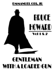
 Title: Gentleman with a Loaded Gun
Author: Emmanuel Obi, Jr.
Designer: Emmanuel Obi, Jr.
Genre: Thriller
Graphics: The first problem is that this is a floating cover, the fault of using a white background. At thumbnail size the illustration and text seem unanchored. Fortunately, at the Amazon sales page a thin rule and slight drop shadow have been added, giving the cover boundaries.
The only graphic is a silhouette of a man in a trench coat. Is he walking toward us or away from us? It’s impossible to say. His feet are in a line, making him look like he has but one leg, and we can’t tell which way his feet are pointing.
The title tells us that he has a loaded gun, but there is no hint of a gun in the silhouette. Perhaps he has a concealed carry permit, but it would have been better to show him holding a gun in a slightly extended arm.
Typography: When I first saw the cover, I presumed the author was Bruce Howard and wondered why the double-volume notice was placed directly under his name. Then I realized that Bruce Howard is the protagonist and that the author name is at the top in small letters.
Let’s begin with the font. It’s the kind one might have found on theatre marquees decades ago, but here it does little but make for difficult reading. If it’s meant to evoke a certain era, it fails. Only the man’s hat suggests that the stories take place no later than the 1950s. It would have been better to use a more legible font.
The protagonist’s name is much larger than the title. If the protagonist were famous—say, Sam Spade or Philip Marlowe—that might make sense, but few readers ever have heard of Bruce Howard. With rare exceptions, the title should be the largest text on a cover, with the author name next largest. Here the author name is the smallest, which is why I thought the protagonist’s name was the author name.
Instead of “Vol 1 & 2” (notice the lack of a period), I would have used “Books 1 & 2,” which is the more common formulation and gets around the problem of using an abbreviation. I would have put the series information at the bottom, something like this: “Books 1 & 2 of the Bruce Howard Series.”
Back to the author’s name. It has an underline, which serves no purpose, and “Jr” should be followed by a period. The font needs to be boosted several points, but first there needs to be a new font, one for the author name and series information, another for the title.
Overall: No prospective buyer will suspect that this cover was designed by a professional, and surely others will have the confusion I had with the protagonist’s name being taken for the author name.
The few reviews the book has garnered praise it for its prose, but how many will see the prose if they can’t get past a cover that looks amateurish to them? A cover should be like a door that invites one to open it, not a door from which people shy away.
