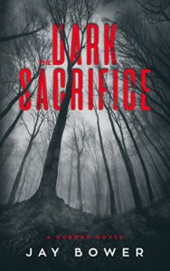
 Title: The Dark Sacrifice
Author: Jay Bower
Designer: MibleArt Design
Genre: Horror
Graphics: There is an element of spookiness in the photo, a function of the camera angle, the distortion of the trees, and the black-and-white palette. But does the photo suggest “horror”? Apparently not in the mind of the author, who added a tagline that says “A Horror Novel.” Such a tagline wouldn’t be needed if the cover image clearly indicated the genre.
The book opens with this line: “Ten-year-old Todd lay motionless on the bloodstained sacred altar.” Immediately the reader connects the title to the story. Why wasn’t the cover image chosen to match? An image of a bloody altar—say, a rustic one made of massive rocks—not only would have matched the title but would have made clear the genre. There would have been no need for the tagline, as least not as written.
Typography: Step back from the monitor and look at this cover. Which text stands out the most? Right: the author name. It’s white against dark gray, and so the contrast is strong. It can be seen from a distance.
Now look at the title and subtitle. The chief reason they don’t stand out as much isn’t the choice of font or even the text size. It’s the color. This is another example of red text against a dark background. Usually the offending background is dark blue, but gray can be as poor a choice, as here. I presume the designer chose red for the title and subtitle because this is a horror story, and horror implies blood, right? But symbolism shouldn’t outweigh legibility.
Now consider the title. How many words does it have? At first glance it appears to have two: Dark Sacrifice. But look carefully to find the tiny The that is only as tall as the strokes of the other letters are thick. Why this great disparity in size? It would have been better to make The the same size as the other letters. There is plenty of room for it on the first line.
Better yet, though, would be dropping The entirely. It isn’t needed. It adds nothing. When titling a book, as when writing its text, one should strive to eliminate words that aren’t doing productive work, and in this title the article adds nothing.
Now let’s look at how the title lettering is used. The letters are maneuvered behind and in front of the trees’ branches and trunks. Any particular branch passes behind some letters and in front of others, almost suggesting an attempt to mimic an M. C. Escher illustration. The result is that the letters look blotchy and so are somewhat difficult to read at thumbnail size.
Overall: It would not have taken much to make this a strong cover: a different color for the title and subtitle text, the elimination of a word, and the use of an image that doesn’t settle for “spooky” but says “horror.”
