Title: A Sidekick’s Tale
Author: Elisabeth Grace Foley
Designer: Seedlings Design Studio
Genre: Historical fiction
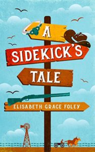
Graphics: In Death Valley, at the intersection of two far-from-civilization dirt roads, is Teakettle Junction. The wooden directional sign there is adorned with dozens of battered teakettles placed by passersby. The teakettles and the sign give the site a Wild West flair. Similarly with this book’s cover.
Here the sign has four direction arrows. Instead of naming destinations they give the title and author. Hung on the sign are three items symbolic of the story’s era and plot: a rifle, a cowboy hat, and a wedding ring. The latter is a bit hard to make out, even though its size is grossly exaggerated. Th silver and white of the ring are too similar to the pale blue of the sky and the white of the clouds.
In the background are galloping horses pulling a wagon, a windmill, barbed-wire fencing, and five inappropriate birds. I call the birds inappropriate not because they’re there but because they seem to be seagulls, not the hawks or vultures one would expect to find in an end-of-the-nineteenth-century story set on the plains.
But that’s a minor point. All in all, the illustration is clever and conveys what it needs to convey. Aside from changing the birds, I would have saturated the colors more—particularly the sky—and would have made the rifle larger, to match the hat in relative size. (The ring would have to remain large; if it were reduced to its true size, relative to the hat and rifle, it would be invisible.)
Typography: There is but one font, used for both the title and the author name. It works well and suggests the locale and era. Many fonts that try to do the same overdo themselves. They end up looking like caricatures rather than authentic representations of a certain time and place. Not so with this font.
The author name is long. That could make placement difficult, but here there is no problem. Her name is legible (and it even sounds like a name from the era in which the story takes place).
The only thing missing, in terms of words, is a tagline. One easily could be placed at the top, if the sign were lowered slightly and if the two birds at the top were removed. The book description at Amazon says A Sidekick’s Tale is “a hilarious tangle involving an emerald ring, a fearsome aunt, a scheming suitor, and a team of runaway mules.” A compressed version of that would work well as a tagline, and it would confirm that this Wild West story is humorous and fun.
Overall: This is an effective cover. I read the first few pages of the book to see whether the cover gives a true sense of the story, and it does. Many covers fail that simple test, leaving some buyers regretful. They think We’re Having Grandma for Dinner is about happy multigenerational relationships only to discover it’s a culinary horror story. No danger of that with A Sidekick’s Tale.
