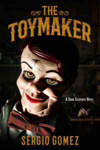
 Title: The Toymaker
Author: Sergio Gomez
Designer: Teddi Black
Genre: Suspense
Graphics: Charlie McCarthy not only was the most famous dummy in American entertainment (Edgar Bergen was his ventriloquist) but seems to have been the prototype for scary dummies that appeared later. Charlie himself never was scary. He always dressed in a tuxedo and sported a monocle, but he had eyes and a smile that later, horror-movie dummies emulated.
Even though Charlie always was joking, it has been frightening variants of his visage that have come down to us in movies and, as here, on book covers. The Toymaker features a spruced-up dummy—not as elegant as Charlie but still, in jacket and bow tie, a sophisticated looking guy.
Three aspects of the dummy stand out: his leering eyes, his too-red lips, and the cracks on his forehead and neck. This is a dummy that has been in some sort of fight, and he has come away victorious, at least temporarily. He’s looking for another spat.
The tilt of the dummy’s head and the deep shadows clue us that this will be an uncomfortable read, which is just what a fan of suspense fiction wants, of course.
Only at expanded size does the image reveal shelves in a toy shop. It might have been good if the background were brighter so the venue would be more obvious. If we didn’t have the title before us, we’d be hard pressed to know where the story takes place.
Despite that inconvenience, this cover’s graphics are first rate.
Typography: The same can’t be said of the typography, or at least of some of it.
The title is well done. It looks like a sign that might hang outside a toy shop. Its cracked wooden texture is doubly appropriate, suggesting that this shop sells carved wooden toys and linking to the cracks in the dummy. The curve of the title follows the curve of the dummy’s head.
If the title has a weakness, it’s that it looks subdued. The center-left portion of the cover is so bright, with the light shining on the dummy’s face, that the title could use some lightening of its own.
The author name also should be lighter, to match the title, and it needs attention. It’s the right distance from the bottom, but it overlaps the dummy’s white collar, which makes a couple of the letters less readable than they ought to be. This could be fixed by darkening the lowest portion of the dummy, bringing up the black that otherwise is behind the author name.
The problems with the title and author name are almost insignificant. Not so with the genre tagline, “A Dark Suspense Novel.” It floats awkwardly, and it’s too small to be legible at thumbnail size. Where to put it? That will be determined largely by its revised size. It needs to be large enough to read—or it needs to be gone.
Assume the tagline is doubled in size. If left where it is, it would stretch so far left that it would cover the dummy’s mouth. That wouldn’t do. What then?
One possibility would be to put the tagline in the same font as the title and to curve it to fit beneath the title, with all the tagline’s letters being of uniform size. This might require the dummy’s head to be lowered a little, but that would intrude on the author name.
The solution would be to reduce the size of the head slightly (it would be equally scary if only 90 percent of its present size). That would give extra room for the text at both the top and bottom.
If that revision weren’t made—if the tagline weren’t moved beneath the tile (where it would best, I think)—a fallback solution would be to stack the words in three right-justified lines: “A Dark/ Suspense/ Novel”. Those three lines, kept in white, could be place about where the present tagline is.
As with the text that otherwise would go beneath the title, the font should be changed to all caps, not upper and lower caps as at present (the present format actually has the upper caps bolded, which is quite unnecessary). The revised tagline not only would be more legible, but it wouldn’t approach the dummy’s face as closely as it now does.
Overall: If it weren’t for the genre tagline, this cover would rate at least an A-. If the tagline were repositioned (preferably under the title), and if the title and author name were brightened, and if the latter had all its letters set against black or near-black, then this cover would deserve full marks.
