 Title: 1612
Author: Harald Johnson
Designer: Harold Johnson
Genre: Historical fiction
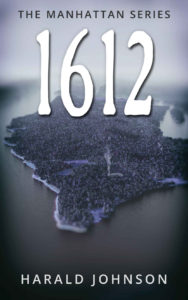
Graphics: This is the second book of a four-part series. Each book uses the same illustration of what Manhattan Island may have looked like in the seventeenth century. The only change, from book to book, is the color palette. This one is blue-gray. The others are brownish-tan, green, and red.
If the series tagline weren’t present, few people would know what the pictured island might be. Once a viewer sees the tagline, there is a small “Aha!” moment, but it passes quickly. The illustration is unexpected, but it tells us nothing other than that Manhattan once was wooded. Interest quickly fades.
If the illustration makes for a bland cover for one of these four books, it makes for a less than bland cover by the time one sees the other three covers. They clearly are knockoffs of one another.
Typography: Each book in the series has three textual elements: title, series tagline, and author name. For each book the title is nothing more than a four-digit year: 1609, 1612, 1625, and 1640. The numbers, in a rough-hewn font with a thin drop shadow, are eminently readable. The titles can be seen from across a room.
But what do the titles convey? They set the story’s period with specificity. When we move from the first book in the series to the second, we know we’re skipping three years, but what attraction is in that? The titles do make clear that the four books form a series, but the repeated illustration does that just as well. It would have been better to have for each book a “real” title, one that intrigues, sets up a problem, or mentions a character.
The series tagline, “The Manhattan Series,” is easy to read. It is a little too close to the top; it and the title should be moved down, with the title then being moved down a little more. (Not to worry: there is nothing in the illustration that will be harmed by that.)
The author name is in the same clean font as the tagline. The former is against a light color, so it properly is in black. The author name is against a dark color, so it properly is in white.
The cover verges on the monochromatic and doesn’t need to. I would put the title in maroon, not to make it stand out—its size insures that it will stand out regardless—but to give a little warmth and variation to an otherwise sterile cover.
Overall: Perhaps the author-designer felt tickled when he came up with the idea of using the same illustration on four covers and with the idea of using dates alone as titles. Sometimes what seems at one moment to be cleverness ends up not panning out.
Nothing on the cover indicates genre. This could be historical fiction, but it could be straight history too, or it could belong to some other genre. Perhaps a second tagline, indicating what sort of book this is, would have been useful.
