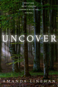
 Title: Uncover
Author: Amanda Linehan
Designer: Amanda Lineham
Genre: Young adult, suspense
Graphics: The background image is a forest scene, obtained from a stock photo company. What we see represents less than half of the original photo which, when seen as a whole, has a brighter feel. The portion used on the cover is darker. It shows a few rays of sunlight coming in from the left, but otherwise there is what some might consider a sense of gloom.
The story is written for teenagers. After her best friend is killed in a car accident, the heroine, according to the book’s description, finds “herself trapped in the dark, making all the wrong moves. In order to reclaim her freedom, she must find a way out of the darkness.”
Well, the cover has plenty of darkness, even though the photo was taken in the daytime, but does it convey a sense of being trapped or of having lost one’s freedom? Not really. It’s a lovely forest scene, but it could represent many things—or nothing much at all. To some it might have a sense of foreboding, to others a sense of delight at a new day.
If one already knows that the story involves a protagonist who feels trapped and unfree, then the image works, to a degree. But it should work without otherwise knowing what the plot is. The image should point to the plot, not the plot to the image.
Beyond that, the forest scene gives no indication of genre. Yes, this might be a place through which someone runs in fear. It equally might be a place where a thru-hiker spent the night, as explained in his how-I-hiked-the-Appalachian Trail memoir. It might be any of a number of things, since it doesn’t specify genre.
When self-published authors design their own covers—and this is especially true for works of fiction—they often, as here, select photos or illustrations that remind them of scenes in their books. To them, the images fit, but the fit won’t be obvious to prospective readers who otherwise don’t know what the books are about.
The lack of genre-sense in graphics can be overcome, in part, by using a tagline that makes the genre clear, but such a tagline should be supplementary to genre-explicit graphics, not in substitution for them.
Typography: The title, “Uncover,” covers too much space. It comes too near the left and right edges, thus running the risk of having its right end snipped off if the paperback version is trimmed too closely—something that happens with distressing frequency at printers. The letters of the title have been too widely kerned and should be moved closer together, with the spaces between them being reduced by one-third.
The letters seem to have a light glow or haze added to them, perhaps to give an ethereal sense. Whatever the intention, the glow or haze makes the letters stand out less from the background, not more, and so should be eliminated on that ground alone.
There is another reason they should go: they conflict with the rays of sunlight coming in from the left and with the gentle lightening in the background. The foreground is darker than the background, and it should be kept that way. The glow or haze brings unneeded light to the text and thus to the foreground.
Like the title, the author name is spread too widely and should be brought in. It is in the same font as the title but should be in a plainer, sans serif font, so the title will stand out more. The new font should have thicker strokes, since the current font struggles against the busy, if dark, forest duff.
The most problematic text is the tagline at the top. It is too near the top, is set on too many lines, is in the wrong font, is too small, and includes unnecessary punctuation.
I would set the text in two lines: “What She Went Looking for/ Isn’t What She Found”. This makes the reading easier and keeps the two parts of the sentence together, each on a separate line. Notice that I have omitted the ellipsis, which adds nothing. I even have omitted a period at the end of what normally would be considered a sentence that requires one. Here, the sentence acts more like a headline and so should not have concluding punctuation.
By resetting the tagline this way—reducing it from four lines to two—half the space is freed up. The tagline can be moved away from the top by putting its new first line where the present third line is. In the process, it should be put in the same sans serif font as the author name, and it should be doubled in height. This would leave it a little smaller than the author name, which is appropriate.
Being smaller and being set against a busier part of the image than is the author name, the subtitle may need to be bolded to stand out sufficiently. At its present size, and with its present font, it is illegible at thumbnail size.
Overall: This cover is pretty, but its graphics fail to explain what the book is about. The book even could be mistaken for non-fiction. The solution lies in using an image that indicates genre. This is all the more important when a book’s title is ambiguous, as here. “Uncover” could suggest many things to many readers. Their thoughts need to be focused, instantly, by graphics that point the way.
