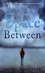
 Title: The Space Between
Author: Rachel Sanderson
Designer: Zoella Rose Designs
Genre: Young adult
Graphics: At first it’s hard to tell what the image is, at least at thumbnail size. At full size it’s clear that we’re looking across a plain at a distant ridge, with roiling clouds above and ground fog below.
If the image is supposed to evoke “space between,” it doesn’t quite work since the fog obscures the space between the woman and the ridge. It would have been better to choose an image that shows a large, flat, unobscured plain with hills and clouds in the distance.
Suggestion: a wintertime shot of Death Valley’s famous Racetrack playa, looking south to north at the Grandstand outcropping of rocks at the far end. In such a photo there would be no fog, yet in winter there often are roiling clouds over Death Valley.
As on far too many covers, here the protagonist (I presume that’s who it is) has her back to us. This might be a case where it makes sense, since she’s looking across a void. Nevertheless, rear views (and views of rears) have become cliché. There no longer is anything catchy about them.
On close inspection it looks like the image of the woman was pasted onto the background. Yes, there is a hint of shadow behind her, and it goes in the right direction, given that the light is coming from in front of her. But she doesn’t look like part of the scene. Perhaps she would have, had there been footprints behind her on the wet grass.
Typography: The tagline at the top (virtually invisible in this image) says this book was “shortlisted for the 2016 Ampersand Prize.” That’s nice, but it’s not really a selling point. It would have been better to include a subtitle or a tagline that explains what the story is about.
In fact, is it a story? From the title alone, one might imagine something to do with physics or geography. There isn’t even the customary notice that this book is “a novel.”
The font for the author name is fine, and the letters are well spaced, but they shouldn’t be black. Perhaps a light blue, taken from the lightest tone of the woman’s denims, or perhaps just plain ol’ white. The black is just too hard to read against the darkness of the ground.
The title text is bad in two ways. The font is too thin for the image, and its colors (three of them) are poor: light blue for “space,” medium blue for “the,” and dark blue for “between,” all of them partly transparent, for no obvious reason—and why is the article tucked into “space”?
This cover needs a font with short serifs or no serifs and with thick verticals, and all three words should be a uniform color with no transparency. But which color?
White would seem to be contraindicated since the clouds have much white in them. So maybe black. As it is, “between” stands out reasonably well, and it would stand out even better if it were solid black. If the first two words were put on one line, and if all three title words were in uppercase, they could rest not far above the ridge, thereby giving more emphasis to the notion of distance.
Overall: To do this novel justice, it probably would have been necessary to fight the impulse to use a long-distance background image. Such images make it too easy for a designer to take shortcuts, and they’re overused. However that may be, there really was no excuse for the title treatment. The intent may have been to make the words look mysterious, but the result was to make them look hard to read.
