 Title: 5 Secrets of Story Structure
Author: K. M. Weiland
Designer: K. M. Weiland
Genre: Self-publishing
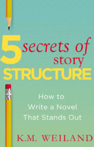
Graphics: The graphics are minimalistic: a background with a slight color gradient and parts of two pencils. That’s it.
Only the pencils can carry meaning (the background could have been any of a number of colors). What meaning do the pencils convey? Writing, certainly, but they don’t necessarily imply writing a novel, which is what this book is about.
Nowadays, few book writers write with pencils. Nearly all of their words are composed at keyboards. If the designer wanted a graphical element that indicated book writing, something other than pencils might have been more appropriate as leading viewers toward the theme of the book.
Beyond that, the book is about writing novels, so a generic image of a novel—at least an image that implies fiction rather than non-fiction—would have been a step up, yet even that wouldn’t quite do it.
The book focuses on how to structure a story, so an image that indicates structuring, organizing, or building might have been better still.
Typography: Each of the three typographical elements—title, subtitle, and author name—needs adjustment. Let’s start with the title, which is a mishmash: two colors, two fonts, and four sizes for just five words.
Each color is a poor choice. Neither pops well against this background, the red for the usual reason and the yellow because it’s too close in tone to the greenish background.
The oversized “5” is fine, and the large “Structure” is fine enough in terms of size, but it crowds the edges of the cover, and its letters are crammed together. Some of the letters actually touch one another. “Structure” should be in a more condensed font that could be set as tall but with adequate space between letters and away from the edges.
“Secrets of Story” comes in two sizes and two styles, roman and italics. If the italics were chosen for emphasis, it’s not clear why the preposition would be emphasized. It’s the least important word. Similarly, there is no obvious reason why “Story” should be smaller than the other words in the phrase: it’s no less important.
The italics should be removed entirely and the words put into a sans serif font, even if not the same sans serif font used for “5” and “Structure.”
As for using red in the title, that actually reduces clarity. It’s easy for the eye to go to the red first, resulting in “Secrets of Story 5 Structure.” Or the yellow text could be read by itself, since it’s much larger than the red text, making the title seem to be “5 Structure.” These problems could have been avoided by using a single color, such as black, for the title.
The subtitle needs a thicker font. If white is to be used against a light-colored background, the letters need weight, and fatter strokes will provide that.
The author name should not be in red but in black, like the revised title. Its font (which may or may not be the same one used for “Secrets of Story”: it’s hard to tell) is too thin-stroked and ought to be sans serif.
After those fixes, the author name needs to be moved in from the right edge of the cover. Although this book appears only as an ebook and not as a paperback, it should adhere to paperback conventions: keep in mind what might happen if the paperback is trimmed too tightly, with the right edge of the cover going the way of the blade. If graphics or text are too close to the edge for a paperback, they’re too close for an ebook too.
Overall: This short book’s cover likely was thrown together quickly by the author-designer. It’s understandable that she may not have thought it worthwhile to invest time or money in producing a more professional cover, but a few alterations (particularly to the text) could help the cover substantially.

 Title: The Best of Funds for Writers
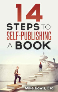
 Title: 14 Steps to Self-Publishing a Book
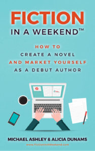
 Title: Fiction in a Weekend