 Title: Pens Plows & Gunpowder
Author: J. P. Irvine
Designer: Cara Willenbrock
Genre: Poetry
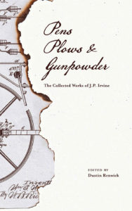
Graphics: The editor describes J. P. Irvine (1835-1892) as “the most forgotten Midwestern poet of the nineteenth century.” These are Irvine’s collected works. The editor hopes to salvage him and his poems from obscurity. Does the cover help do this?
There is but one element to the graphics, set off to the left of the cover. At first I took it to be an old map but on closer inspection saw that it is page from a patent application. What is the significance of this? There’s no indication. The drawing looks nineteenth-century-ish, so that fits, but is it supposed to tell us something about the poet, about the overarching theme of his poems, or what?
What made me think, at first glance, that this was a map was the burned edge. It brought to mind the opening credits of the old television show Bonanza, where a map of the Ponderosa ranch is set aflame. I wonder whether other viewers “of a certain age” might have the same reminiscence.
The larger part of the cover has no particular artwork. It consists of a tinted background that is lightly speckled, giving the impression of old-timey paper: thus map against paper. I suppose the speckles are better than nothing, but the vast open space makes one think less of the Old West (or the Old Midwest) than of a lack of creativity in filling the void.
Typography: The title is in a font that evokes the nineteenth century. Curiously, the title as shown on the cover isn’t quite as it appears at Amazon. On the cover the serial commas are missing. At Amazon the cover is given as Pens, Plows, & Gunpowder, which is proper and preferable. Why the commas are missing isn’t explained.
While the title font is appropriate, the letters are far too small. That may be because the image was placed first and the remaining space was considered by the designer to be unable to hold larger text. That should have led to the reconfiguration of the image.
I would reshape the image to fit in the lower half of the cover so the title has space to spread across nearly the whole width in two lines: “Pens, Plows/ & Gunpowder,” with the possibility of the ampersand being centered on a line by itself. Then I would choose a hue a red for the title, making it the one non-sepia element.
If the title needs work, the subtitle need more. It is the only line that explains what the book is about. If we had only the title to go by, we might think this to be a work of history, perhaps about the 1605 Gunpowder Plot in London. We almost certainly wouldn’t think it to be a collection of poems.
In fact, even with the subtitle as is, we wouldn’t necessarily guess that the “collected works” are poems. That suggests that the line should be rephrased to read “The Collected Poems of J. P. Irvine.”
In any case, the subtitle should be set in two lines: “The Collected Works [Poems]/ of J. P. Irvine.” To keep to the period feel, a serif font can be used, but not one with pronounced serifs. The font for the subtitle shouldn’t compete for attention with the font for the title.
That subtitle font also should be used for the author name, which in this case actually is the editor name and which should be set in all caps in a single line near the bottom of the cover.
Overall: This cover’s chief fault is lack of genre specificity. Even if we can read the small text, we can’t be sure what is behind the cover. It could be poems, but it also could be non-fiction essays or short stories.
The title font tells us more or less the era, and the image does the same, if confusedly. The elements of a good cover for poems are here, but they need reworking. Until they get it, I’d rate this cover no higher than a C.
