Case Study 101

Title: From Pit to Park

Author: Janet Roberts

Designer: Ebook Design

Genre: History

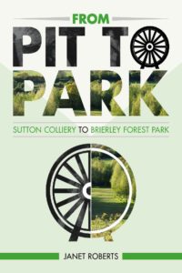
Graphics: This is an account of how an abandoned English pit mine was turned into a park. The designer wanted to show the “before” and “after” and chose to do so partly by using a free-standing image and partly by making the text itself into images.

The free-standing image is in two parts. The left side is half of an illustration of a spoked wheel, the whole illustration being used as the letter O in the title. 

What does this wheel represent, other than the pit mine in general? Was it part of a pulley system by which ore was hauled to the surface? Was it something else? There’s no indication.

The wheel isn’t solid black. It actually uses a black-and-white photo for its fill. The photo seems to be an old one of a mine worker. The same man appears more clearly in the second T of the title. You have to look close to see him there and closer still to see him in the wheel. At thumbnail size you can’t see him at all. 

The right side of the free-standing image is a circle, with lines mimicking the left side, but this circle isn’t a spoked wheel. It’s a recent photo of the park that has replaced the mine. It’s the only part of the graphics that doesn’t require the viewer to pause to figure out what he’s seeing.

Typography: The title comes in three segments. The initial word, “From,” is easily overlooked since it is so much smaller than the other words. It would be better to make all four words the same size and to put them in two lines: “From Pit/ to Park”. That would require a more condensed font, but it would prevent readers from seeing the title as having only three words.

It would have another advantage. It would remove the preposition “to” from the end of a line. Prepositions should be kept, whenever possible, with the remainder of their phrases.

The biggest problem with the title is the transformation of the letters into images. It doesn’t work well. When the cover is seen at thumbnail size, the words “Pit to” seem to be mottled gray, and “Park” seems to be green and dark green. It’s only when the cover is seen at a larger size that one perceives that the upper line has that black-and-white photo as its fill while the lower line uses the same recent photo as is used in the free-standing image.

Since the spoked wheel is used below, as part of the free-standing image, there is no good reason to shoehorn it into the title as the letter O. It confuses the reader, who will be confused enough trying to read text that really consists of photos. 

The subtitle doesn’t stand out well because it is dark green letters against a light green background. It would have been better to make the subtitle black. If it were to remain green, the lone word now in black, “to,” also should be green. It presently draws too much attention to itself. 

The best text is the author name, but it ought to be at least twice as large. At least it’s legible, even at a small size. 

Overall: This seems to be a case of the designer trying too hard, adding symbolism in too many places. If the type were kept to straight type, with the proposed modifications, and if the free-standing image were the only image in sight, this cover would be far better.

Case Study 95

Title: Deranged Justice

Author: Jeffrey A. Nix

Designers: Jeffrey A. Nix and Daniel Wills

Genre: Biography

Graphics: This is the story of the author’s great uncle, who was hanged 1919 for having committed a double murder and who had committed other murders before those.

The relevant scenes of the story took place in and near Columbus, Georgia, which I presume is the city we see in the background. The photograph, circa World War I, is unobjectionable in itself. It lends an old-time feel to the cover, but it doesn’t lend much more. The scene would be meaningless to anyone not intimately familiar with how Columbus looked a century ago. It’s not as though this is a photo of 1919 New York with the iconic Flatiron Building in the background.

The chief problem with the background image lies with the foreground image. The noose (which doesn’t have a rope attached to it) is the most three-dimensional element on the cover, but even the two-dimensional newspaper seems to float above the background. The newspaper has been scissored above the author name. It might have been better to continue the newspaper to the bottom of the cover, laying the author name over it.

It would have been better yet, in that case, to eliminate the background photo entirely. The noose could be rotated clockwise and moved slightly right, so that it bleeds off the page. This would hide the absence of a rope. With the background now clear, there would be no problem arranging for the title and subtitle to be in attractive letters that stand out well.

Typography: The biggest problem with the text is that it’s hardly visible. The headline in the newspaper is far more legible than the title, subtitle, or author name. Why? Because the headline is in black, which contrasts well with the faded newsprint.

The text placed by the designers is in white and is surrounded by light-blue ghosting. The ghosting is an acknowledgement that the white of the letters wasn’t enough. The designers recognized that something was wrong, but they applied the wrong fix. They should have backtracked and changed the color of the text.

Before that, they should have done something else with the text. They should have chosen different fonts.

A stencil font is used for the title and author name. This particular stenciling isn’t easy to read under any circumstances, and here, when set against a varying background, if fares poorly. And it doesn’t seem to serve a purpose. The story is about crime and justice, but this font doesn’t evoke thoughts of police and courtrooms. It’s a font you expect to find on the outside of wooden crates piled high in a warehouse.

Given how busy the central part of the image is, with the noose and newspaper, what was needed was a strong but simple font, one in a strong color, such as maroon, which would play off well against the brown tones of the central part of the image.

The subtitle is set in italics in a serif font. If the new title and author name font has serifs (and it probably should, but modest ones), the subtitle should be set in a sans serif font and definitely not in italics. For greater contrast, the subtitle should be in all caps, assuming the title and author name are in upper- and lowercase, which would be preferable for them.

Placement of the title and subtitle will be tricky.  A larger, appropriately-fonted title will take up all the space where the title and subtitle now are. Where to put the revised subtitle? It might look fine if placed to the left of the noose’s windings. That would place it over the black, gray, and white of the cityscape, so it would need to be in a contrasting color but one that would pair well with the color of the title.

Overall: