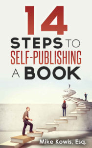
 Title: 14 Steps to Self-Publishing a Book
Author: Mike Kowis
Designer: Octagon Lab
Genre: Self-publishing
Graphics: I tried to count and came up with about three times fourteen steps in the illustration, each step being a book. It would have been nice if the designer had been able to match the number of steps to the number in the title.
Perhaps he used a stock illustration and felt constrained, though it seems he easily enough could have trimmed the illustration at the man standing furthest to the right. That man happens to be standing on the fourteenth step (or book). A snip of the graphical scissors would have made for a perfect numerical match.
Even without numerical accuracy, the illustration is on point. This book is about publishing your own book, and the author tells you how to do that in fourteen steps—thus an illustration that shows books as steps is just right.
If the illustration were modified as I propose, it could be moved up slightly from the bottom and in slightly from the right. As presently positioned it is cut off without obvious purpose. Despite that, the illustration works well.
It does have two minor drawbacks. One is the wall behind the steps. The transition to the upper part of the cover is too abrupt. I would feather the wall, making it a gradient that fades out at the level of the top step. The other drawback is the overall subdued colors of the illustration. Perhaps the designer could brighten up the people or even some of the books.
Typography: The title font is clean, as one expects for a how-to book, and all the words are legible, even at thumbnail size, but why are the words in three colors (red, gray, black) and five sizes? To my eye, the most grating thing is the size differential between “Steps” and “Book.” They appear to be in the same font and ought to be at the same size, particularly since both are black and bold, but “Book” is notably bigger.
It may be harder to tell, but “to” and “a” also are in different sizes. That makes four mismatched words. I would make “Steps,” “Book,” “to,” and “a” all the same size and in the same font. I would remove the bolding because those words otherwise overpower the key title words, “Self-Publishing.”
If the four lesser words are made uniform, the lines will be of unequal length, given the differing number of characters. I would kern the bottom line wider, to match the length of the two lines above it.
Those key words, “Self-Publishing,” are fine as they stand. So is the oversized top line, but I would put “14” and “Self-Publishing” in a brighter red. This cover looks faded compared to most how-to books, which commonly have bold colors. There should be hints of boldness here.
The final bit of text is the author name, which has two problems: it’s too small, and “Esq.” should be jettisoned.
What does being an attorney have to do with teaching self-publishing? Nothing. (I can affirm that because, long ago, I practiced law.) If “Esq.” were removed, there would be plenty of room to enlarge the author name, which should be set in all caps to match the rest of the lettering.
Overall: As it stands, this is a good cover, but it easily could be refashioned into being a top-rate cover. I would give it a B in its present condition. It wouldn’t take much for it to earn an A.
