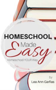
 Title: Homeschool Made EAsy
Author: Lea Ann Garfias
Designer: Lea Ann Garfias
Genre: Self-help
Graphics: Homeschooling is becoming ever more popular, so there must be an increasing need for books about how to get started in it. This one promises an easy introduction. To what extent is any of that indicated by the graphics?
On the right side of the cover is a stack of books. Some of them are thick and look formidable. These likely aren’t books to be used when instructing children of elementary-school years. Someone looking at the books might think, “If those are the sorts of books I need to master to teach my children, maybe homeschooling is beyond me.”
If a stack of books were to remain the chief graphical element, then thinner books, more along the heft of those actually used with children, would seem more appropriate. But is a stack of books the best way to go anyway? There isn’t much inviting about many pages piled atop one another. This might have been a good cover for a bespoke illustration or, if the budget didn’t allow that, for a low-royalty illustration that better exemplifies the materials used by most homeschooling families.
The books on this cover bleed beyond the right edge and half of the top and bottom edges, thus marking where the cover stops, but what about the left edge and the other half of the top and bottom edges? It’s as though they aren’t there because the cover uses an almost-pure-white background. This problem persists at the Amazon sales page for the ebook edition. Before uploading the cover to Amazon, the author-designer should have added a thin black rule all around the cover.
Next let’s look at the disk. It provides a good contrast to the books. They are rectilinear; the disk is round. It isn’t a mere circle, which would have been a little dull. Near its perimeter are two concentric cutouts, providing sneak peeks of the books, and the edges of the disk are jagged and might suggest a pinwheel.
Typography: There appear to be three fonts, one for “Homeschool,” one for “Easy,” and one for the rest of the text.
The title word that stands out best is “Easy,” not just because it is the largest text but because it’s the only text in color, in this case red. (This is an example of the proper use of red text: against a light background.)
The most important word of the title is “Homeschool,” but it hasn’t been given the prominence it deserves. Its size has been constricted by an attempt to keep it within the disk, and the choice of font isn’t optimum. The designer should have selected a more compressed yet still thick-stroked font so that its point size could be boosted. “Homeschool” ought to be half again as tall. Compression will take care of part of that, and the word can occupy some of the empty space to its left.
Yes, under the current arrangement, that would force the word beyond the border of the disk, but there is a solution to that: enlarge the disk. It need not remain wholly within the bounds of the cover. If the diameter of the disk were increased by a third, the right side could extend over the right edge, just as the books do, while the left side could come close to the left edge of the cover.
Enlarging the disk would provide several benefits. It would give space for a larger “Homeschool,” it would become the focus of graphical attention (that honor now is held by the books, not the disk), and the text within the disk would have room not to extend across the two cutouts. Notice how the tails of the L in “Homeschool” and the Y in “Easy” become obscured when they are placed over the books in the background.
The remaining words of the title and subtitle, “Made” and “Homeschool Your Way,” are adequate as they are, but they would look better if they were bolded. The other words—especially once the initial title word is enlarged—vary too much from these words in strength.
The final text to consider is the author name. It’s too small. Its placement is fine, but it ought to be in a font that is at once compressed and bolded. That would allow the letters to be boosted by a few points.
However that works out, it’s necessary to omit “by,” which signals not that this book was written by the person whose name follows but that this book was written by an amateur. If a name stands by itself on a cover, viewers immediately will think it’s the name of the author. There is no reason to add a verbal arrow.
Overall: This cover has good things going for it, particularly the attractive disk and the font and color choice for “Easy,” but the cover also needs work, chiefly in terms of sizing and placement.
If the disk and text were adjusted as proposed, the cover would earn a solid B. If a more enticing illustration could be found, the grade would be higher still.
