 Title: Deranged Justice
Author: Jeffrey A. Nix
Designers: Jeffrey A. Nix and Daniel Wills
Genre: Biography
Graphics: This is the story of the author’s great uncle, who was hanged 1919 for having committed a double murder and who had committed other murders before those.
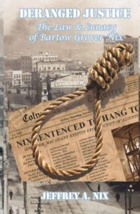
The relevant scenes of the story took place in and near Columbus, Georgia, which I presume is the city we see in the background. The photograph, circa World War I, is unobjectionable in itself. It lends an old-time feel to the cover, but it doesn’t lend much more. The scene would be meaningless to anyone not intimately familiar with how Columbus looked a century ago. It’s not as though this is a photo of 1919 New York with the iconic Flatiron Building in the background.
The chief problem with the background image lies with the foreground image. The noose (which doesn’t have a rope attached to it) is the most three-dimensional element on the cover, but even the two-dimensional newspaper seems to float above the background. The newspaper has been scissored above the author name. It might have been better to continue the newspaper to the bottom of the cover, laying the author name over it.
It would have been better yet, in that case, to eliminate the background photo entirely. The noose could be rotated clockwise and moved slightly right, so that it bleeds off the page. This would hide the absence of a rope. With the background now clear, there would be no problem arranging for the title and subtitle to be in attractive letters that stand out well.
Typography: The biggest problem with the text is that it’s hardly visible. The headline in the newspaper is far more legible than the title, subtitle, or author name. Why? Because the headline is in black, which contrasts well with the faded newsprint.
The text placed by the designers is in white and is surrounded by light-blue ghosting. The ghosting is an acknowledgement that the white of the letters wasn’t enough. The designers recognized that something was wrong, but they applied the wrong fix. They should have backtracked and changed the color of the text.
Before that, they should have done something else with the text. They should have chosen different fonts.
A stencil font is used for the title and author name. This particular stenciling isn’t easy to read under any circumstances, and here, when set against a varying background, if fares poorly. And it doesn’t seem to serve a purpose. The story is about crime and justice, but this font doesn’t evoke thoughts of police and courtrooms. It’s a font you expect to find on the outside of wooden crates piled high in a warehouse.
Given how busy the central part of the image is, with the noose and newspaper, what was needed was a strong but simple font, one in a strong color, such as maroon, which would play off well against the brown tones of the central part of the image.
The subtitle is set in italics in a serif font. If the new title and author name font has serifs (and it probably should, but modest ones), the subtitle should be set in a sans serif font and definitely not in italics. For greater contrast, the subtitle should be in all caps, assuming the title and author name are in upper- and lowercase, which would be preferable for them.
Placement of the title and subtitle will be tricky. A larger, appropriately-fonted title will take up all the space where the title and subtitle now are. Where to put the revised subtitle? It might look fine if placed to the left of the noose’s windings. That would place it over the black, gray, and white of the cityscape, so it would need to be in a contrasting color but one that would pair well with the color of the title.
Overall:
