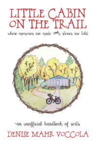
 Title: Little Cabin on the Trail
Author: Denise Mahr Voccola
Designer: Denise Mahr Voccola
Genre: Memoir
Graphics: This book is about the value of family story-telling—that is, passing along accounts of the little things that happen within a family. Does the cover suggest such a theme? It’s hard to say. From looking at the first pages of the book, it isn’t clear how a cabin fits in. Perhaps it was where the author’s family often gathered and where they learned and told family stories.
The illustration itself is fine, though it’s a pity it takes up so little of the cover, being circumscribed by a circlet of branches and leaves.
It would have been better if the illustration were squared and enlarged, making it the full width of the cover. As it stands, some things in the illustration are difficult to make out, such as the bicycle and whatever is in the bicycle’s front basket. (Flowers? I can’t tell even when the cover is enlarged.)
The circlet is a nice, homey touch, but it draws too much attention to itself, and it forces the illustration to be constricted because the circlet needs to be kept away from the edges of the cover—which, come to think of it, are hard to locate, since the background is white and there is no border. At the sales page at Amazon a thin border and a drop shadow have been supplied automatically; the cover should have had at least a hairline border added to it before it was uploaded.
Back to the implications of the title, which seems to echo the title of Laura Ingalls Wilder’s best-known work, Little House on the Prairie. The illustration reinforces the idea that the centerpiece of the book is the cabin itself. There isn’t anything from which a viewer can infer story-telling. Thus the graphics miss the mark.
Typography: The font used for the title and author name suits the locale. The font’s rustic style suggests that this will be a homey read. It’s hard to tell from this borderless image, but the title is too close to the top of the cover. The two lines of the title are too close together: the C of the first line nearly hits the second T of the second line.
I don’t know whether this font has alternative characters. If so, it would have been good to use a smaller C in the author’s surname. The two large C’s draw too much attention to themselves, but that’s a quibble. One might counter by saying the double-C’s add character to the cover.
The subtitle and tagline are in a quite different—and quite difficult to read—font. Cursive fonts usually are difficult to read, especially when used for more than one or two words. What may look fine at full-monitor size often becomes a head-scratcher at thumbnail size.
In the subtitle, the conjunction “and” is set above an ornament. The two are impossible to make out at small sizes. Even when the cover is enlarged the word and ornament look odd—and inappropriate. Why are they there? They do nothing to enhance legibility. Maybe the designer thought they looked pretty. If so, this is an example of cuteness undercutting utility.
The tagline above the author name begins, oddly, with a tilde. Again, why?
The tagline is set slightly larger than the subtitle. Usually a subtitle is larger than a tagline, or the two are set at the same point size.
The subtitle could be enlarged to match the tagline’s size if its wording were modified slightly. I would omit the second use of “are” (and the ornament) so the subtitle would read: “where memories are made and stories told”. That would free up the equivalent of about five characters, allowing the text to grow—and to be brought in a little from the sides, since it’s a little wide.
Overall: This cover likely will appeal to a certain audience, just given its down-home-ness, but the poor legibility of some of the text and the hard-to-make-out illustration will cause other potential readers to look elsewhere.
It’s not possible, when designing a cover, to be as Pauline as one might wish, to be “all things to all men,” yet that aim ought to be a guiding principle during design, at least if one’s goal is to have a wide readership.
