 Title: I Remember the Time . . .
Author: Kim Hemphill
Designer: Cathi Stevenson
Genre: Memoir
Graphics: The author (a male, not a female: don’t be misled by the name) tells how he was run over by a train when he was three and how his disfigurement resulted in his living in an abusive home, suffering taunts throughout his school years, becoming homeless as a teenager, and falling into substance abuse—and how he overcame all of that.
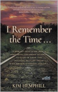
The cover photo was taken by the designer not, apparently, at the site of the accident but at a more visually attractive site. Wise decision. A cover needs to attract prospective buyers. It needs enough verisimilitude to be faithful to the story, but it mostly needs to catch the eye.
This photo does that well. It’s a well-formed image, with the camera set low, for two reasons. First, the camera angle makes the rails seem to converge in the exact center of the cover. The track disappears into trees. One almost gets a sense of motion. Second, the low angle allows the child’s shoe to be well positioned.
I presume this wasn’t the author’s actual shoe but one mocked up for the purpose: it seems to have not just a thick line of dirt across the top but also a splotch of blood (perhaps ketchup). The shoe catches one’s attention, at least when the cover is viewed at a larger size. At thumbnail size, not so much, and that’s too bad. It’s a nice touch. It lends drama to the scene, which otherwise would be pretty but not dramatic.
Another thing to note is that the designer took the photo at sunset, thus resulting in ruddy clouds. That gives the photo three blocks of subdued color: red at the top, green in the middle, gray toward the bottom. That said, the cover looks dark overall. It should have been adjusted to lighter tones in an editing program. Still, it’s a fine image.
Typography: The typography isn’t as successful as the graphics. All of the text is off-white, but it should be bright white, given how dark the photo is. Even the larger letters don’t pop enough.
Imagine that the title were mentioned within a paragraph. If the title came at the end of a sentence, how many periods would you expect to follow it? (Correct answer: four.) If it came in the middle of a sentence and it was necessary to omit a few words immediately following it—that is, to have an elision represented by an ellipsis—how many periods would follow it? This time, six: three as part of the title and three as the ellipsis. That would make for awkward reading. And if the title came at the end of a question, how would it look to have a question mark follow three periods? It wouldn’t look very good.
I mention this because it’s almost always a bad idea to include punctuation in a book’s title. All kinds of confusions can arise. Imagine a book called How Are You? If you wanted to ask someone what he thought of the book, you’d have to write, “How did you like How Are You??” if you want to preserve the title. If you drop one of the question marks, a reader would think the title was simply How Are You.
In the present case, I would eliminate the ellipsis at the end of the title. It doesn’t add much to the sense; it may not add anything to the sense, depending on the reader. It will add to the confusion.
The author name should be a little larger, if this font is retained. (It’s used for everything but the blurb at the top.) The font’s thin lines tend to disappear against busy parts of the background. Other than that, the author name is fine.
Not so with the long tagline. Its major problem is legibility. It needs to be in a sans serif font that has thicker strokes than the present font. A condensed version would be preferable, so the text can be boosted a few points without having the lines come too close to the cover’s edges.
The first line ends with the indefinite article. It shouldn’t. “A” should begin the second line. “Bullying” should be brought up to the third line, to keep the thought unit together (“abuse and bullying”). “Happiness” needs to be followed by a comma, else the phrase “happiness and love” can be read as an appositive for (that is, a restating of) the word “success.”
This leaves the promotional blurb at the top. It’s the smallest text, and it suffers the most from being the wrong color: it doesn’t stand out well at all against the reddish sky.
The blurb should be in the same sans serif font as the subtitle, and it needs to be larger. I would put the first sentence on a line by itself. The other sentence I would divide this way: “A riveting read that will make you appreciate/ all that you have.”
The person quoted is identified as an “ARC reader”—that is, an “advance reader copy reader.” An ARC is a copy sent to select readers before publication, in hopes that they will supply useful promotional blurbs.
This blurb is nearly ideal, but the reader need not be identified as an ARC reader. Most buyers won’t know what that means. The designation makes her comment no more valuable that it would be if her name stood by itself.
Overall: As it stands, this is a good cover. Its legibility problems could be overcome in part simply by making all the text bright white. That would earn it a solid B. Making the other changes would bring it a much-deserved A.
