 Title: Tea and Madness
Author: C. Streetlights
Designer: Laura Hidalgo
Genre: Memoir
Graphics: The description at Amazon says this short book is a “memoir written in prose and poetry” that recounts the author’s multiple travails, including depression and the loss of a baby.
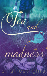
The indistinct image (the indistinctness seems appropriate here) shows a woman—presumably the author—with teapot in hand, walking away from a jumble of cups and saucers lying in the grass. The disarray of the tea set and the multiplicity of cups suggests a lack of self-composure or aimlessness.
You don’t normally see tea sets outdoors. You expect to find them arranged on rectangular kitchen tables or small round tables at restaurants or coffee shops. There’s something jarring about seeing such accoutrements abandoned outdoors. It looks as if the woman has had her fill and, perhaps in dejection, is walking away, not bothering to clean up after herself.
Or is she going off to find more hot water? It’s hard to say. Either way, the impression is one of unease, and that fits the “madness” part of the title well.
The only graphical element other than the photograph is a silhouette of a teapot. It is used as the container for the genre tagline, which tells us that this is “a memoir.”
Typography: That tagline is helpful—we might have little idea what the book is about otherwise—but the words are too small to be seen at thumbnail size. They should have been set in a condensed font and in two lines, with “a” centered over “memoir.” That would have allowed the letters to be taller and therefore more legible.
The title seems to have been composed in two fonts, one for “Tea and” and the other for “madness.” The fonts are similar, but close inspection shows that letters common to both parts are drawn differently. Look, for example, at the A and E.
The conjunction “and” is orange, while the other words are in white tinged with yellow. This gives “and” undue emphasis, which is doubly unfortunate in that the ascender of the D in “madness” is used to connect to the teapot, with the uppermost part of the ascender being orange tea coming out of the teapot. The orange in “and” detracts from the orange in the ascender.
Another problem is that the large swirl coming off the T in “Tea” comes too close to the cover’s edges, at both the left and right. The title thus looks cramped. This problem can be solved by reducing the size of the title. There is plenty of leeway for that, since the title is so large.
Lastly, “and” seems oddly placed. I would have put it below “Tea” and to the left of the teapot. There is room for it, though it might need to be slightly smaller. If repositioned, “and” would tend to draw the other two words together. As it is now, the title looks bifurcated, almost as if there were two titles.
The author name has several problems.
Its thin font is hard to read against the cups and saucers. Even a thicker font would have trouble being read unless it were lowered so that only grass appeared behind it, but that would require that the entire background image be raised, to show more grass at the bottom.
The color that works for the title doesn’t work for the author name because its letters are too small. White should be used instead. And the author name needs to be brought in from the left and right edges. Most of that could be accomplished by reducing the large space between the author’s initial and her surname and by shifting the period that follows the initial closer to the C.
Overall: This cover’s greatest strength is its photo. Its weakest is the sizing and coloration of its text. Fortunately, the textual problems can be remedied easily.
It is particularly important to make clearer the book’s genre. Thus “a memoir” needs to be more prominent. If adjusting the text, as suggested above, doesn’t do the trick, it may be necessary to enlarge the teapot silhouette.
