 Title: Tilting
Author: Nicole Harkin
Designer: Nada Visual
Genre: Memoir
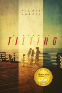
Graphics: This is the author’s account of her family, particularly problems involving her father. Although the credits page doesn’t say so, I presume the cover photo shows members of her family and was taken several decades ago. The photo has been put through a filter, the figures, deck, and fencing now appearing indistinct. The central third of the image is lightened, or is it that the outer two thirds are darkened?
Either way, it isn’t easy to make out details. Perhaps this is deliberate, there being nothing of note to note. Family photos often are that way. Perhaps this scene is mentioned somewhere in the book and is considered by the author to be a “significant moment.” If so, it holds no meaning for the reader who hasn’t yet read the book.
The cover looks artsy, but does the image tell us anything about what’s inside? If the words “A Memoir” were omitted, would a reader realize this book’s genre? I wouldn’t. I’d guess it to be a novel. The artsy-ness suggests that to me, since the image reminds me of images that appear on novels published by traditional publishing houses.
The most prominent thing on the cover isn’t the photo and isn’t the text. It’s the seal of approval, which reads: “The Wishing Shelf Book Awards 2017 Gold Winner.” Unfamiliar with that award, I looked it up.
It was set up in 2014 by a British fellow who didn’t care for the way other book awards operated. It’s one of those ubiquitous awards where author submit their books, pay a fee, and receive in return—if chosen as winners—a handsome certificate and the inclusion of their names on a list that no one other than applicants is likely to see.
In other words, this is no Newberry Award or Booker Mann Prize. If a book received an internationally-known award, it would make sense to feature notice of that on the book’s cover, but what does a seal from the Wishing Shelf Book Awards tell us? Very little, really, and that has to be weighed against the seal’s intrusion onto the cover’s artwork.
Here the intrusion is notable. The seal is the most eye-catching part of the cover, but I can’t imagine any prospective buyer saying, “I’ve got to get this book—it won the Wishing Shelf Book Award!” The marketing value of the seal will be low, but its interference with the moody cover will be great.
It would have been better to put the seal on the back cover of the paperback edition and to make mention of the award somewhere in the opening pages of the book.
Typography: The text is minimalistic, both in quantity and style. There are but five words, one for the title, two for the author name, and two for the tagline. The fonts are spare, one for the title and another for the other words. Fonts with prominent serifs would be inappropriate here. These fonts work well with the horizontal lines of the image, particularly the fencing.
It’s proper that the title word, “Tilting,” tilts. I wonder whether making it tilt the other, “wrong” direction might have been good, suggesting thereby that something was amiss. After all, the memoir is about a family in which, apparently, much was amiss. You might say that’s inconsequential.
What’s not inconsequential is that the title doesn’t stand out well. Its letters could be kerned more tightly and enlarged. Like the photo, they appear screened. It would be good to see how they would look if they were at full strength, thus becoming the only part of the cover (other than the seal of approval) that pops.
The author name is far too small, and the series designator (“A Memoir”) is smaller still. Each is kerned widely—but not equally. They should be the same size in height and in spacing, and they certainly should be taller, to make them decipherable at thumbnail size.
Overall: This cover deserves a high score for its artistic feel but a low score for its marketing effectiveness. It’s a pretty cover, but it’s also pretty hard to make out parts of it, and that seal grates.
