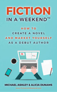
 Title: Fiction in a Weekend
Authors: Michael Ashley and Alicia Dunams
Designer: Book Cover World
Genre: Self-publishing
Graphics: This book is a lead magnet. It’s designed to get you to a website through which you can sign up for a course on novel writing. The authors have a similar course for non-fiction writing. They hold themselves out to be experts in getting books written. Does the cover convey such expertise?
The graphics are minimalistic. The background is a lightly patterned pastel blue. The pattern is so light that it’s visible only when the cover is seen at expanded size. Otherwise the art consists of a clip-art style illustration: laptop, coffee mug, phone, pen and paper, disembodied arms.
Again, the cover must be seen at its maximum online size, such as when clicked on at the book’s sales page at Amazon, for another element to be seen: the laptop screen shows a two-page spread the righthand page of which is labeled with the name of the book, Fiction in a Weekend.
This would have been a cute technique had it been visible at thumbnail size, which is the size at which people first will see the cover. They won’t visit the book’s sales page unless the cover already has done its job, at which point the words on the laptop will be superfluous.
Typography: All the text on the cover, even the smallest, seems backed by a light glow, an analogue of a drop shadow. The glow has the same purpose as a drop shadow: to make text distinguishable from its background. If, as here, all the text needs help to pop from the background, that means there is a problem either with the background or with the text. If the background had been lighter, such as pale yellow, the glow wouldn’t be needed.
The lines of text alternate between red and black, with the red standing out more because it clashes with the blue background. Since the red stands out more, the lines of text in red catch the eye better. That’s fine for the first word of the title, and it’s fine for the third line of the subtitle since “and market yourself” is a key promise by the authors, but it’s not fine for the first two words of the subtitle, “How to.” Why emphasize them? And why emphasize the authors’ website address, which is given on the bottom-most line of the cover?
There are two extraneous bits of text. The website address is one of them. It ought to be on the back cover of the paperback edition and on a “Contact Us” page in both the electronic and paperback editions. It doesn’t belong on the cover—and, for years now, website addresses have not needed the prefix “www,” which ought to be dropped.
The other bit of extraneous text is the trademark symbol attached to the last word of the title. It serves no legitimate purpose, either graphical or legal. The symbol used is for unregistered trademarks. As a rule, titles of single books can’t be trademarked, though series titles can be.
This is a stand-alone book (the authors don’t have a companion volume for non-fiction), so it would seem that its title wouldn’t be eligible for trademark protection even if that protection were applied for formally. Conclusion: omit the trademark symbol.
I see a problem with the subtitle that likely eluded the authors. The last six words can be read as “[how to] market yourself as a debut author.” Why would anyone want to market himself as that? Why would he want to emphasize that this is his first book? That isn’t something first-time authors shout from the housetops, at least not toward prospective buyers.
They indeed may shout the happy news of first publication to their family and friends, but they don’t advertise their freshman status to the public at large because that would do nothing to help sales.
I know, I know. What the authors of this book meant was something like this: “As a debut author, here is how you can market your book” or “Book marketing tips for the debut author.” But that’s now how the subtitle reads to me and probably not how it reads to others.
On the whole, all the cover text looks small, aside from “Fiction.” The line spacing in the subtitle is wide, so there is plenty of room for taller text, though that would necessitate a more condensed font. Similarly, the author names ought to be nearly doubled in height. There will be room for that when the website address is removed and the names are put on two lines.
I would put the author names in red and would make all four lines of the subtitle black. The title should be all in red, thus making a color balance between it and the author names.
Overall: This book promotes book writing, not cover design, but it needs high-quality graphics to suggest the authors’ expertise as authors. It doesn’t have such graphics. What it has, even if done bespoke, looks like the clip art that is bundled with hundreds of programs. There is no sense of graphic originality. Much the same can be said of the typography.
When a book touts its authors as experts, it needs an expert look, something this cover lacks.
